


What colors should you use when painting the figure? Anna Wypych shares her philosophy and methods in this free article.
Painting the Figure: Skin Tones
BY ANNA WYPYCH
I’ve always thought that the most difficult thing to paint is the human body. When I’ve talked with other painters, who have a deep passion for other subjects, I discovered that for them the hardest thing is to show structure in still life or show expanse in landscape. The truth is, painters view things as difficult to paint when those things fascinate them, when the number of nuances overwhelms them. For me, it was and still is the human body.
The human body is so complex in its colors, structures and textures, transparency and softness, that in a small area of the skin you can see a million shades. I have always seen “too many” colors; they tend to “explode” in my paintings. I had to learn how to understand them and use them consciously, so that they could constitute a harmonious whole—the human body. To know more about them we have to start from local colors.
Local Colors
Old Masters used so-called “local colors.” What this means is that they tried to bring out the benefits of pigment in its purest form. Red was dark in the shadows, and intense bright red in the light. Changing this was treated as a mistake and an evidence of bad skills. This was particularly important in the case of expensive pigments, such as ultramarine, which simply was not allowed to be connected with other shades, because in doing so it lost its value. The blue color was always pure blue, and green, pure green.
Later, when paints became cheaper and easier to produce, pure pigments stopped being so expensive, which allowed artists to treat them more freely. This was the moment when artists began to experiment and break pure colors. They used more and more shades and started studying the relationships between the individual colors. In my opinion we get the best results by using pure local colors next to carefully selected shades. With this diversity we get the most interesting combinations.
Combinations of Colors
A gray rectangle surrounded by a dark gray background will seem darker than the same surrounded by a light gray background. That’s how our perception works. Our brains adapt optically to what we see. Everything has to match to everything else. The same is true for colors—identical red will seem to differ in shade when surrounded by a blue or yellow background. Thus, the colors appear different depending on the setting we put them in. Interior designers and decorators would have more to say about this.
Leonardo da Vinci, in his genius, used this mechanism fantastically. Surprisingly it was the clients who were deciding which colors would be used in a painting by da Vinci. The more the client was willing to pay, the more expensive pigments the artist could use. The color blue, for example, became an indicator of social and economic status. Artists had to sign an agreement, and the price depended on the amount of ultramarine pigment used. Leonardo used a cheaper counterpart, and then juxtaposed colors in the painting in a way to make this inexpensive alternative look like the more expensive one.
Another great example of using color properties is Byzantine mosaics. We know that the colors lying on opposite sides of the color wheel are the most contrasted with each other. When we put them side-by-side, both will look more saturated, more intense. When we look at mosaics closely, we see that the golden background for religious scenes is not filled only with golden pebbles. We also notice here and there a single blue or green one, which optically highlight the gold.
The same is true for turquoise backgrounds enriched with red blocks. In both cases, the procedure is not visible at first glance. We only notice that the surface of gold or turquoise seems to be incredibly intense, almost vibrating. That’s how you can make the colors appear more saturated.
Painting the Figure: Reflected Colors
In addition to the colors matched in various combinations, we have to keep in mind the surface of the object—that we are trying to oppose it with another object that has its own texture. This is really important and we have to remember it simultaneously.
Different surfaces reflect the light and thus color in different ways. Imagine a red apple freely lying on a white background. Now we exchange half of that white background for black cloth. The part of the apple that has contact with whiteness will reflect a little white, and the part on the black will seem more intense.
Each side will look a bit different. On the gleaming structure it’s easier to perceive this phenomenon, but it occurs on any surface. In addition, the apple will influence the background as well. The whiteness in the background will seem a bit pinkish, while against the black it will appear as a very deep red (or depending on the hue—reds and blacks, more purple or dark blue).
Now, let’s replace the black fabric with a blue one. All the colors look a bit different, don’t they? Let’s go a step further and surround our apple with objects of different colors (the more intense the colors, the easier it will be to see) and various surfaces. For example: yellow fabric, black ceramic vase, green plastic gloves and what we have in hand. Notice what happens with colors.
Not only does each of them affect the background color and vice-versa, but they start to interact with each other and bounce off each other. Each object has in its color something from the objects around it. So it is in the painting, all the colors affect each other. Each local color of each item is reflected in the colors around it, and together they form a harmonious whole.
The Body
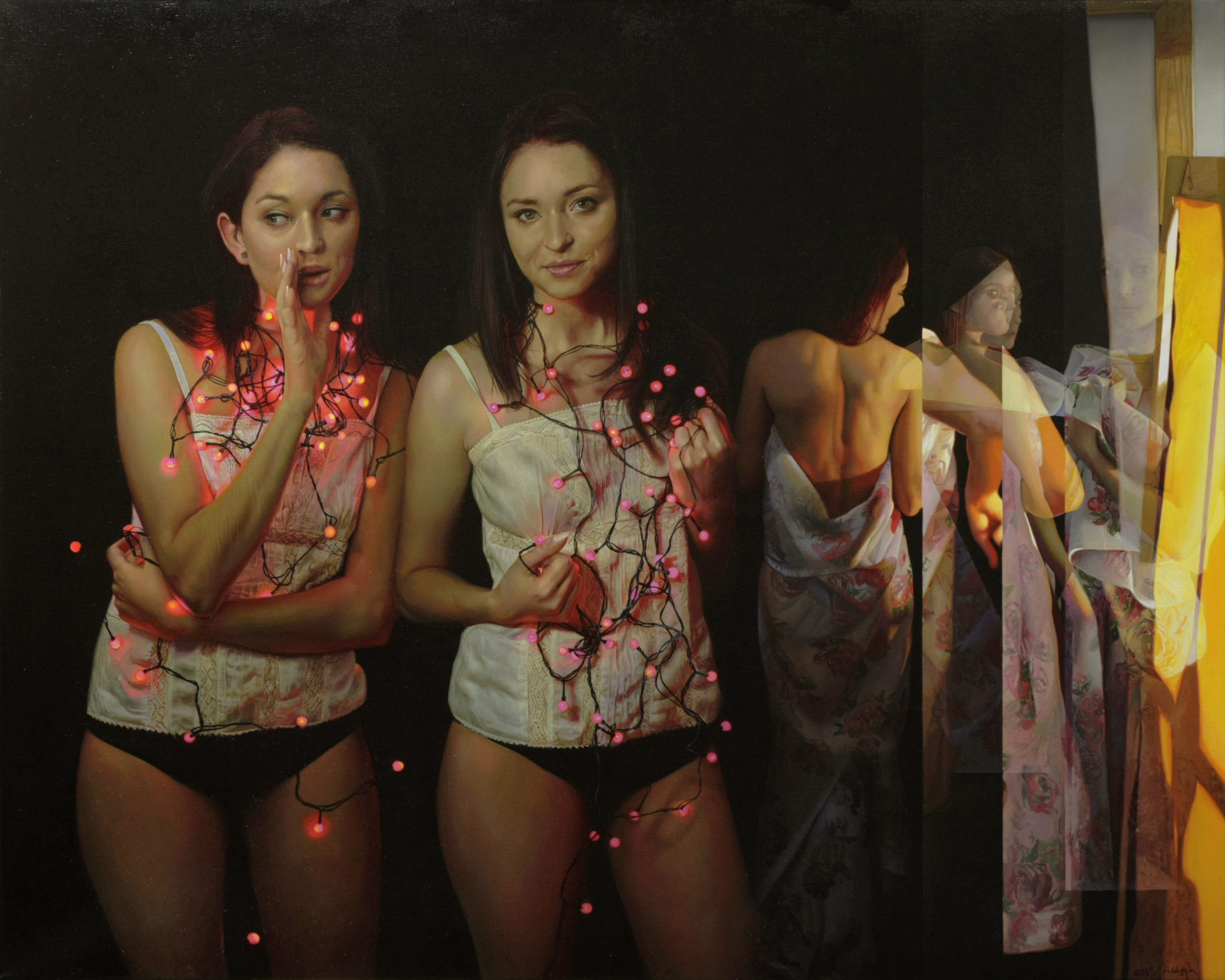
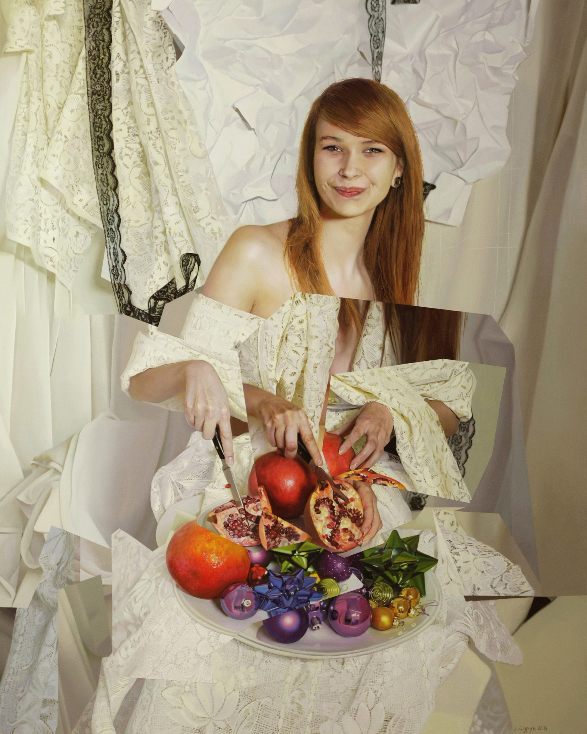
The same principles and phenomena are at work when we paint the human body. The skin of a model will look different, depending on what he or she is dressed in and surrounded by. In the shade of her or his skin we see the reflections of the surroundings.
To make things worse, we have to take notice of the kind of light—whether it’s cold or warm, its intensity and temperature, and even the humidity of the air. Skin looks different in a warm humid room than in a cool, dry room. And these are only the external factors. There are three other, more internal and human issues that are worth noting when painting a human body:
1. The model – who we paint. What is the character and nature of this particular person? It’s all you can see in the attitude, the grimace of the face or in the eyes. The person you paint is alive, so he or she constantly changes. It matters how the model feels that day, her or his mood, whether they are rested or if something’s bothering them. The face of a person who has just awakened is different than the face of a person who feels drowsy; it is different than someone whose life is under constant pressure, and different than someone who has a happy, stress-free life.
2. We – ourselves. During painting, reality is filtered by us. And the same things that might influence the model may also affect us. It’s a fact: we choose different colors when we are sad, or when we are happy. We also have to add to this our attitude towards the painted person—if we like her/him, or if it’s the first time we’ve met.
3. The last important aspect, and the most crucial for me, is what actually I want to pass down to the viewers. On what do I focus? What story would I like to tell? What emotions to demonstrate? Simply decide what and why I want to paint this particular artwork. This is huge topic for another text, so I will not mess with it here.
But How to Paint These?
Flake white + titanum white + intense yellow + two kinds of red (tomato and raspberry) + pink, violet, light blue, light green + dark hot bronze + every color that will come to your hand.
I was taught that painting itself is easy—you should only put the right color in the right place. This is true, but it is easier said than done.
When painting the human form, I am focusing on showing the widest range of skin tones, and I have worked out my own way for the colors of the body. I paint a lot of layers, over many days, so that each new layer is set down when the previous one is dry. The first layer is the most important as it sets the majority of colors. I put down too-strong colors, exaggerating, and do not limit myself when I start.
I connect colors boldly. I put them down sternly, not caring to nicely unite them. I care only for one thing: texture. It should not be visible. Therefore, after the imposition of these colors, I use a brush with goat hair (very soft) for blending. It is not for smoothing edges between colors, but to eliminate texture (if it is hiding somewhere). We do not want it to show from underneath in the layers that follow.
Each subsequent layer is for matching, linking and smoothing the colors from the “crazy” layer. I try to “civilize” it. While setting the first layer I try to show everything that I wrote above about colors. Everything happens at the same time and I perceive a million shades, a million colors. In the layers that follow I sculpt this, until it becomes good enough. I give up some of the colors; some of them I make calmer, to make others shine more intensely.
Slowly I arrange colors to form a harmonious whole. Painting itself seems to be simple, but it requires a lot of time, work, and patience. The hardest thing is to see all those shades.
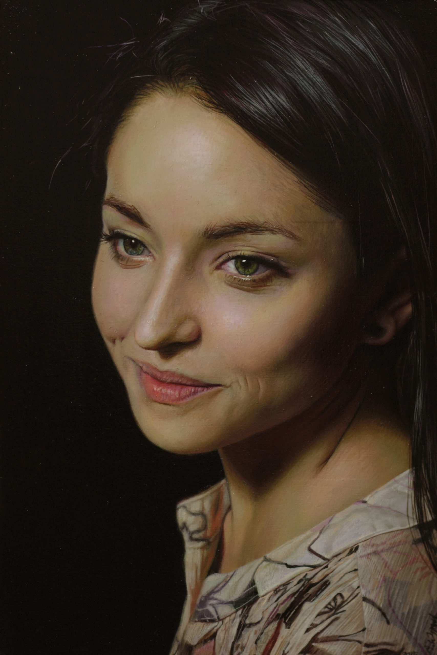
Once when I was studying one of the works of Old Masters I noticed a curious thing about working on the shades of human body. The skin consists of a combination of warm and cold shades—both of the same luminosity but different in color temperature.
When painting the face try to add little bit colder—almost imperceptibly—greenish hues around eyes and mouth, and the lower part of the jaw, and warm bright intense rose hues on the cheeks, forehead and top of the nose. The whole face will seem not only more three-dimensional as a result, but also more “lively.”
When painting the rest of the body, it is worthwhile to add some violet accents (not too much), which will suggest the veins beneath the skin. It will add more authenticity to the skin. When painting a bright, almost white skin, which the Old Masters loved, it is good to use lot of yellows and reds in shallow shadows, and cold greenish bronze in deepest shadows.
That’s my philosophy, my perception, and my ways of painting the human body, which I have worked out through the years. I’m still looking for perfection. Every person has a different character and temperament, there is no universal for every painting. Each person has to work out his own way, which I encourage you to do. Good luck with your exploration!
Connect with Anna Wypych:
Website | Instagram
Related Article on painting the figure, by Anna Wypych:

”")

Great article. Thanks.
I’ll love to see a demo on your Youtube channel.
Comments are closed.