


A basic understanding of color temperature can bring much light and life to a painting. Here, Marc Anderson shares some common color mistakes and how to fix them.
The following is part of a series featuring a leader in the art community who will be joining us on the faculty of Plein Air Live, March 6-8, 2024, with an Essential Techniques Day on March 5.
It’s Getting Hot in Here, So Let’s Talk About Color Temperature
By Marc Anderson
For new painters, temperature is one of the more misunderstood attributes of color. On the surface, the concept seems rather simple. Blue, green, and violet are cool, while red, orange, and yellow are warm. Child’s play! And if we dig a little deeper, we can see that each hue can bend warm or cool. For instance, lemon yellow leans towards green, making it a cool yellow. Cadmium yellow deep bends closer to orange, ergo warm yellow. Piece of cake. So how do beginner painters run afoul of color temperature? Here are a few common mistakes and some ways to avoid them.
Be BOLD!
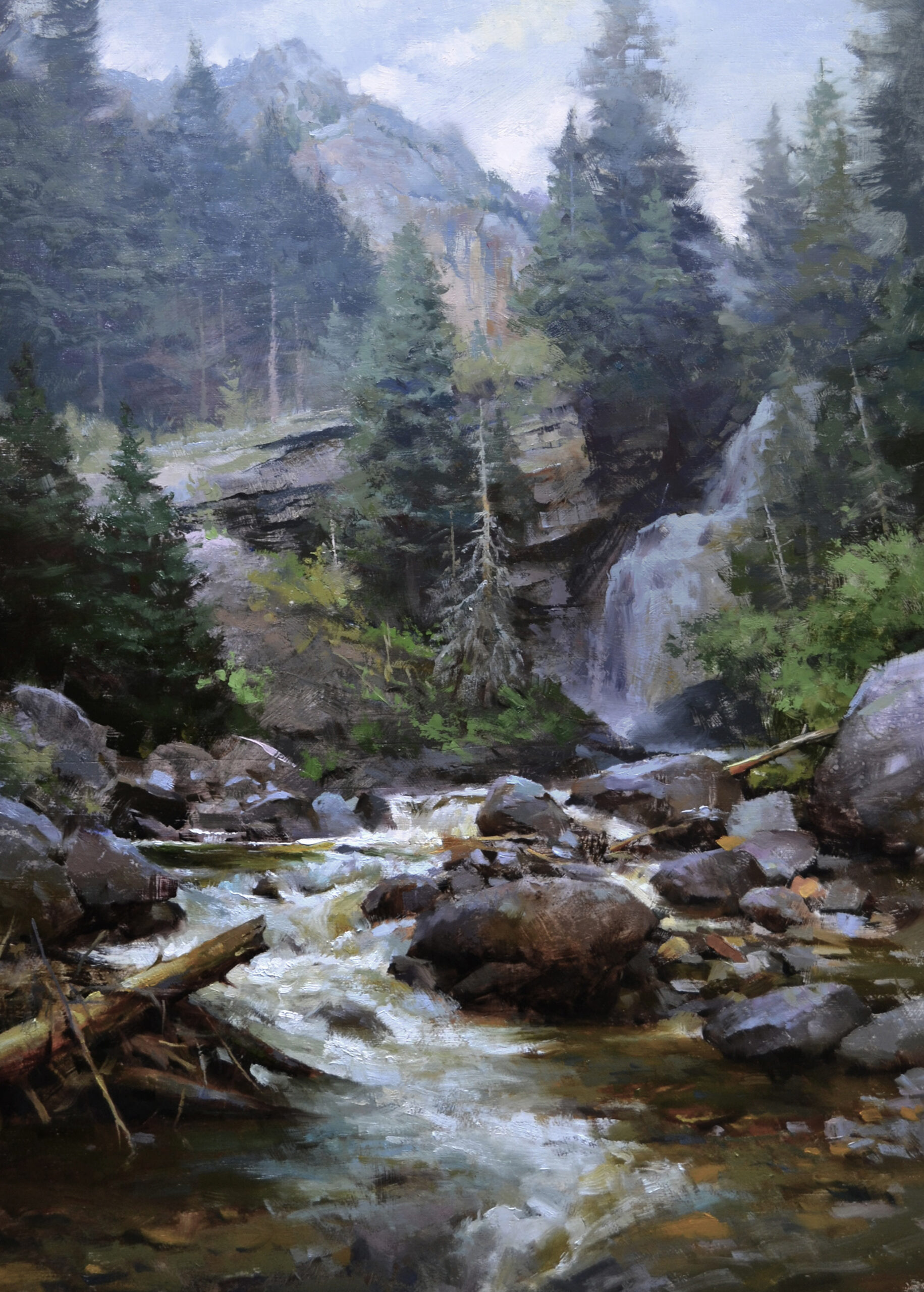
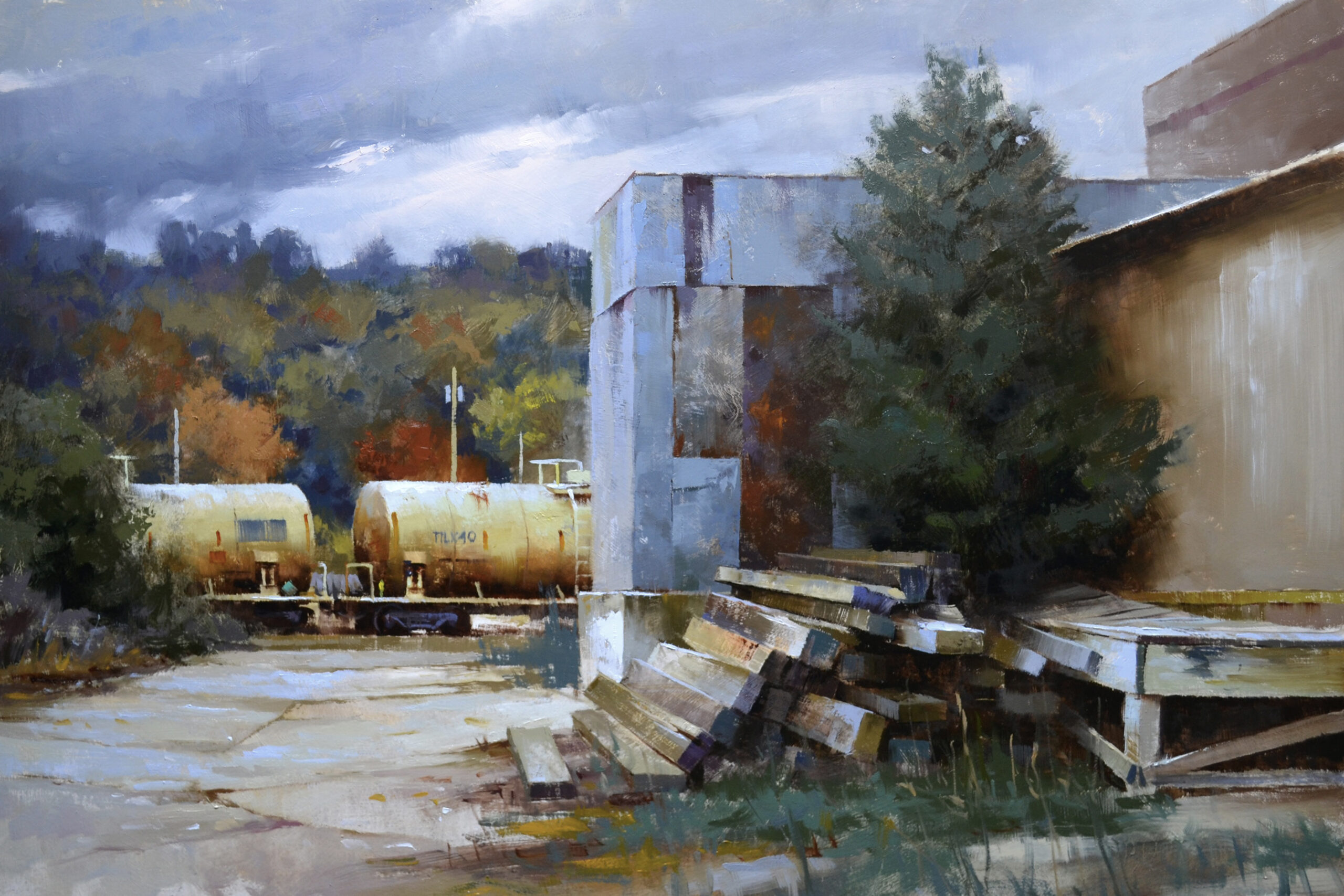
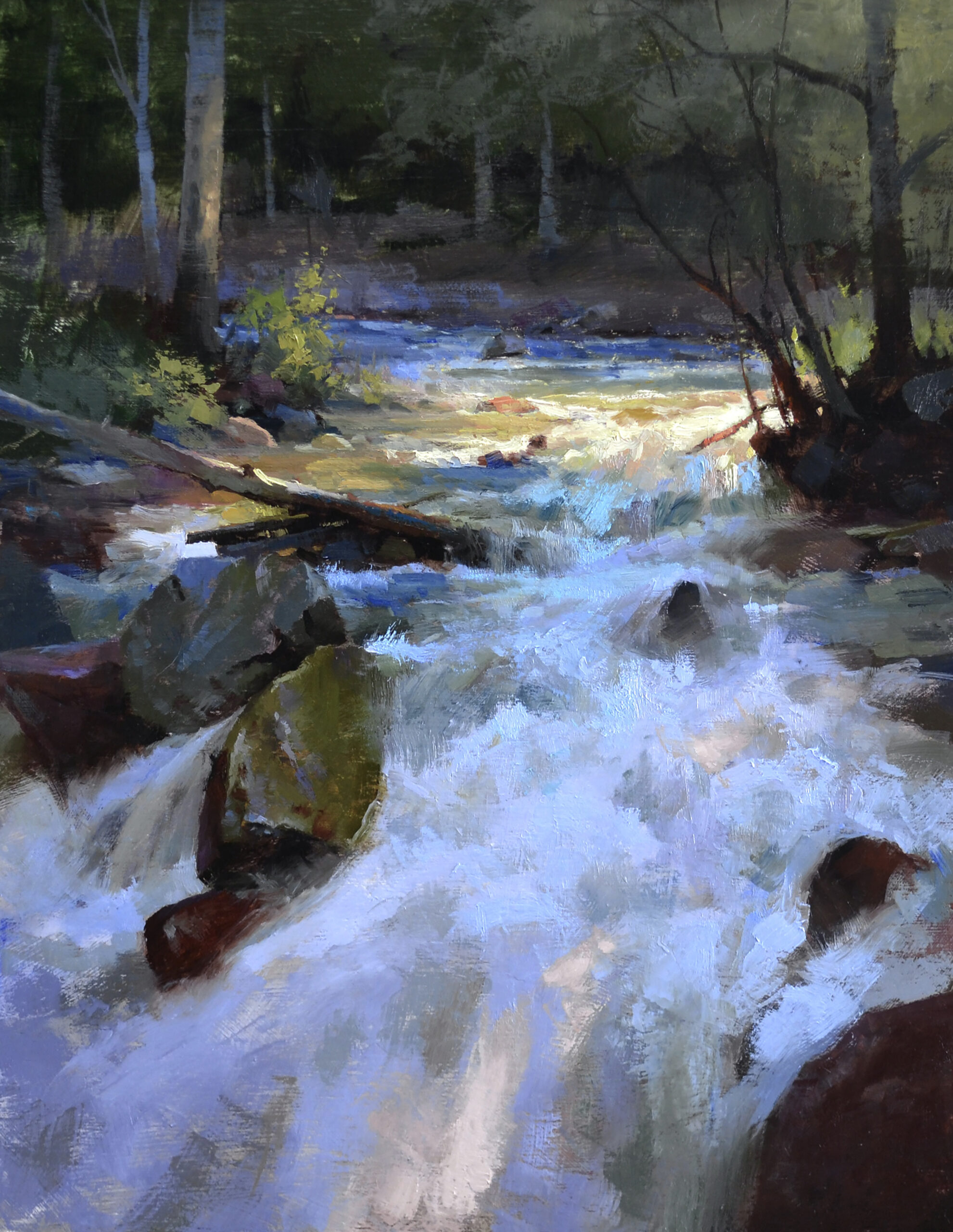
I often have students who don’t push the warms warm enough or cools cool enough. Color temperature matters because it gives the viewer important visual clues about what is happening with the light. For instance, on a sunny day, the light will be warm, and the shadows will be cooler by comparison. When that relationship isn’t pushed far enough, the light can feel flat and lifeless.
These understated temperatures frequently occur in warm, high key areas, such as highlights. Lightening the value of a color by adding white has a chalky, cooling effect—like sweetening your coffee with toothpaste. The warm highlights will lose their punch—though so will your coffee breath, so it’s a mixed bag, I guess. As you add white, try adding some red or orange as well. This will keep the color warm while still lightening the value.
Another way to fight the scourge of ambiguous temperature relationships is to simply mix your light and shadow colors right next to each other on your palette. By seeing them side by side, you can more easily assess the warm/cool relationship and if you’ve pushed it far enough. Once it looks right on your palette, take a bow, acknowledge that you’re a color mixing god, and get those colors on the canvas!
Whoa, that’s too bold!
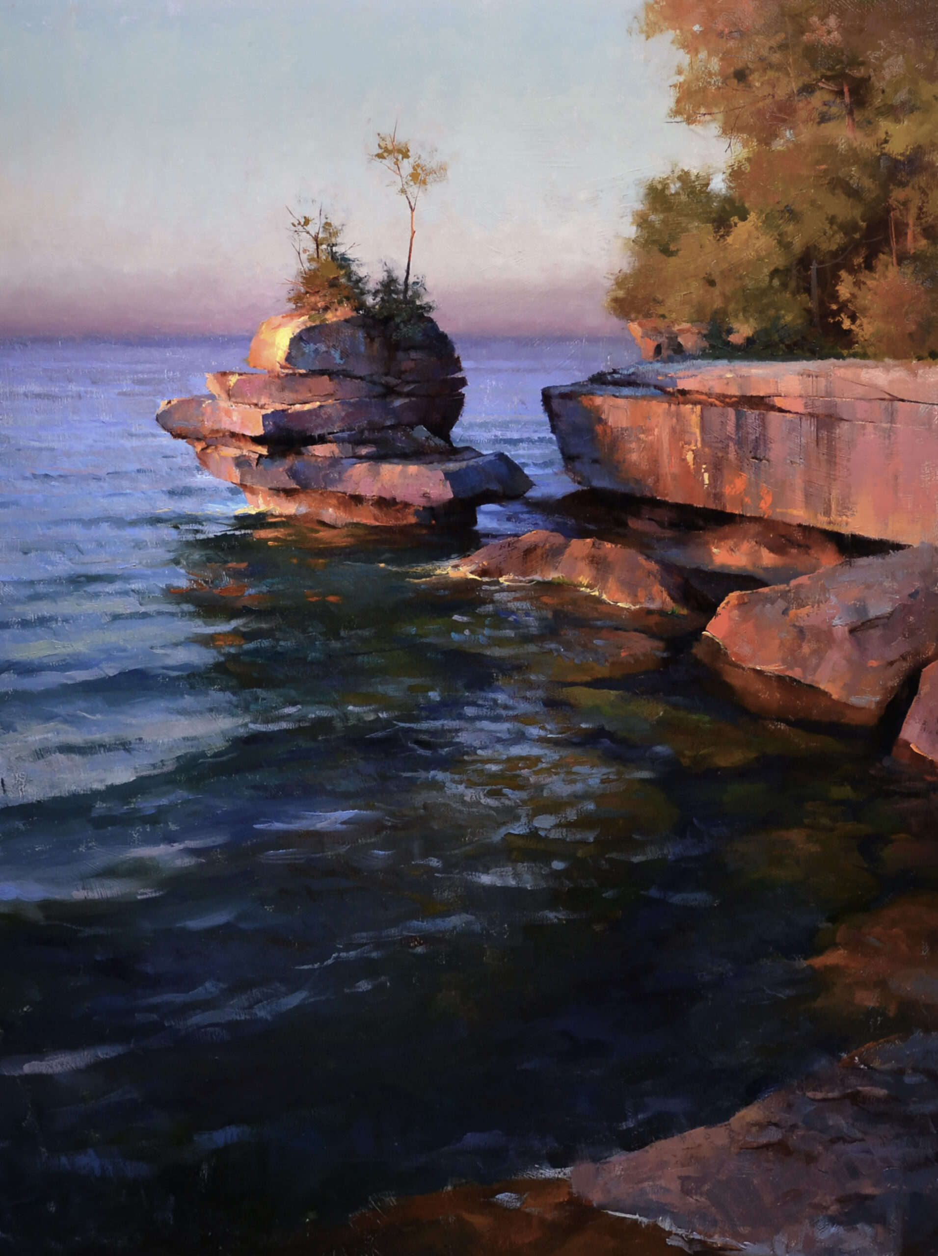
There are some intrepid painters among us for whom the previously mentioned issue has never been a problem. You’ve heard their battle cry: “Damn the torpedoes, the shadows must be blue!” You know who you are. To capture a sense of authentic light, we have to be mindful of context. For example, at sunrise and sunset, there can be strong red or orange light, which can have a dramatic effect on all the objects that the light hits. In that context, a phthalo blue shadow will stick out like… well… a phthalo blue shadow. In reality, that shadow will be much warmer but will still feel cool when compared to the very warm sunlit areas. Consider the context; it’s all relative!
Of course, there are much deeper conversations to be had here. I mean, I didn’t even mention the Kelvin scale or wavelengths or (insert nerdy science term). But even a basic understanding of the warm/cool relationship can bring a lot of light and life to a painting. With some thoughtful color mixing and maybe a dash of the “Damn the Torpedoes” attitude, you’ll be on your way!

Visit Marc Anderson’s website at mandersongallery.com.
Join him at the 5th Annual Plein Air Live virtual art conference: PleinAirLive.com.

”")

Great writing … and painting too! Will you add orange or red to warm your lights (rather than a yellow) primarily for a sunrise or sunset painting, or will these rich warm colors work even at midday?
Comments are closed.