


Drawing in ballpoint pen is the same as working with watercolors. See how in this step-by-step portrait drawing demonstration.
BY DIMELZA BROCHE
When I first began to learn how to draw with ballpoint pens, the challenge attracted me immensely. I also needed something to distract me from the painting I was working on.
I was finding it hard to translate to canvas the idea I had in my head, and in a way I was also questioning my love for art. I was frustrated, the painting was fighting me and it was winning gloriously.
When I find myself in a situation like that, and believe me when I say it has happened several times, I always step back and decide to work on my sketchbooks until it feels right to face the canvas again. Of course it doesn’t mean I’m giving up on that painting; it means that I need to look at it with a fresh set of eyes.
To do so I usually work on a few color studies, some charcoal drawings, or as in this case, I start experimenting with a new material. The thought of creating something new on my sketchbook is exhilarating and even more so when I find myself unable to finish a painting. It is quite the process.
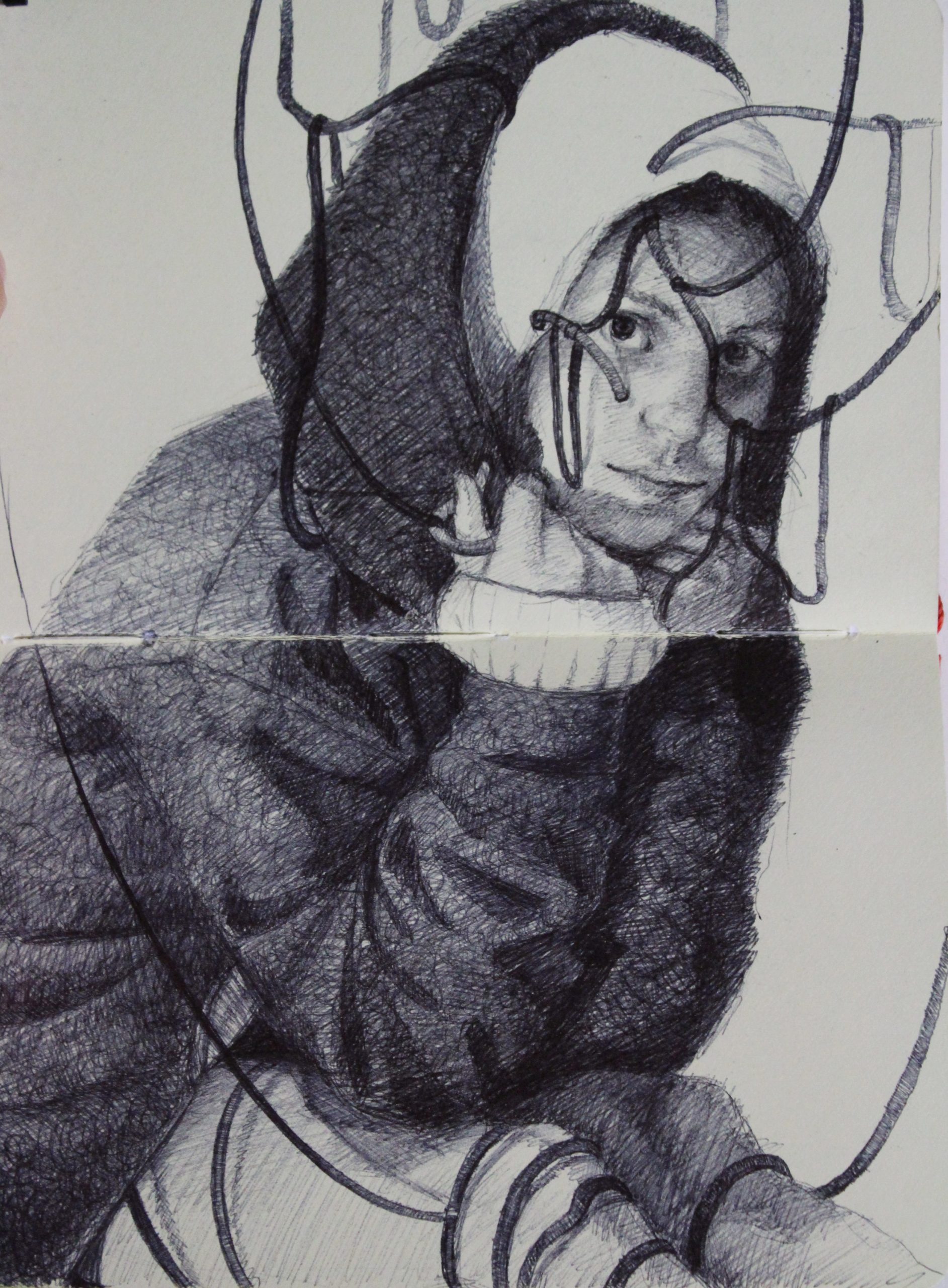
My energy level goes to a hundred percent and more than once I find myself working in my studio until 3:00 a.m., tired but happy to be drawing. That’s how I was a few weeks ago when I was working on the ink drawing “Emily.” I discovered the amazing possibilities of working with pens and I immersed myself in the whole process of drawing small portraits in my Moleskine sketchbook.
But before I get into any detail about the portrait “Emily,” I have to say that I always start my creative process by first choosing the right photo for reference.
Sometimes I spend hours looking through my picture folder in search of a photo that, as I often explain to friends, speaks to me—the one picture that stands among the rest. Once I have selected a photo as reference I try my best not to exactly reproduce the image on the canvas or paper.
I’m not interested in doing something that looks “just like a picture.” I like to use the commodity photography provides but I also like to work from observation. And making a piece of art that reflects this is my own personal goal as an artist.
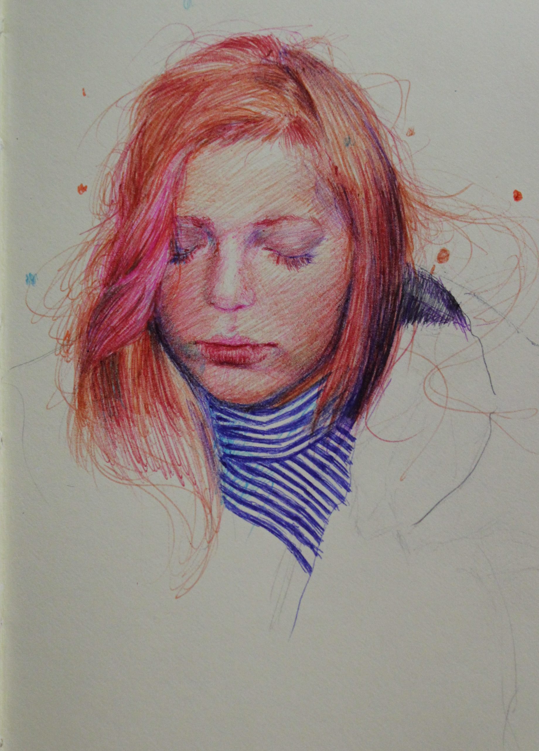
Now, “Emily” came to life after many unsuccessful drawings with colored ballpoint pens. Early on I learned that using pens is the same as working with watercolors. I have to preserve the white of the paper for the highlights, and if I make a mistake there’s no way to fix it unless you cover it up with something else, which can be fun.
A very important thing I also discovered with my first color drawings was that I had to be careful when I was building up the different layers. Working lightly was the key to using different colors and also helped to minimize the mistakes.
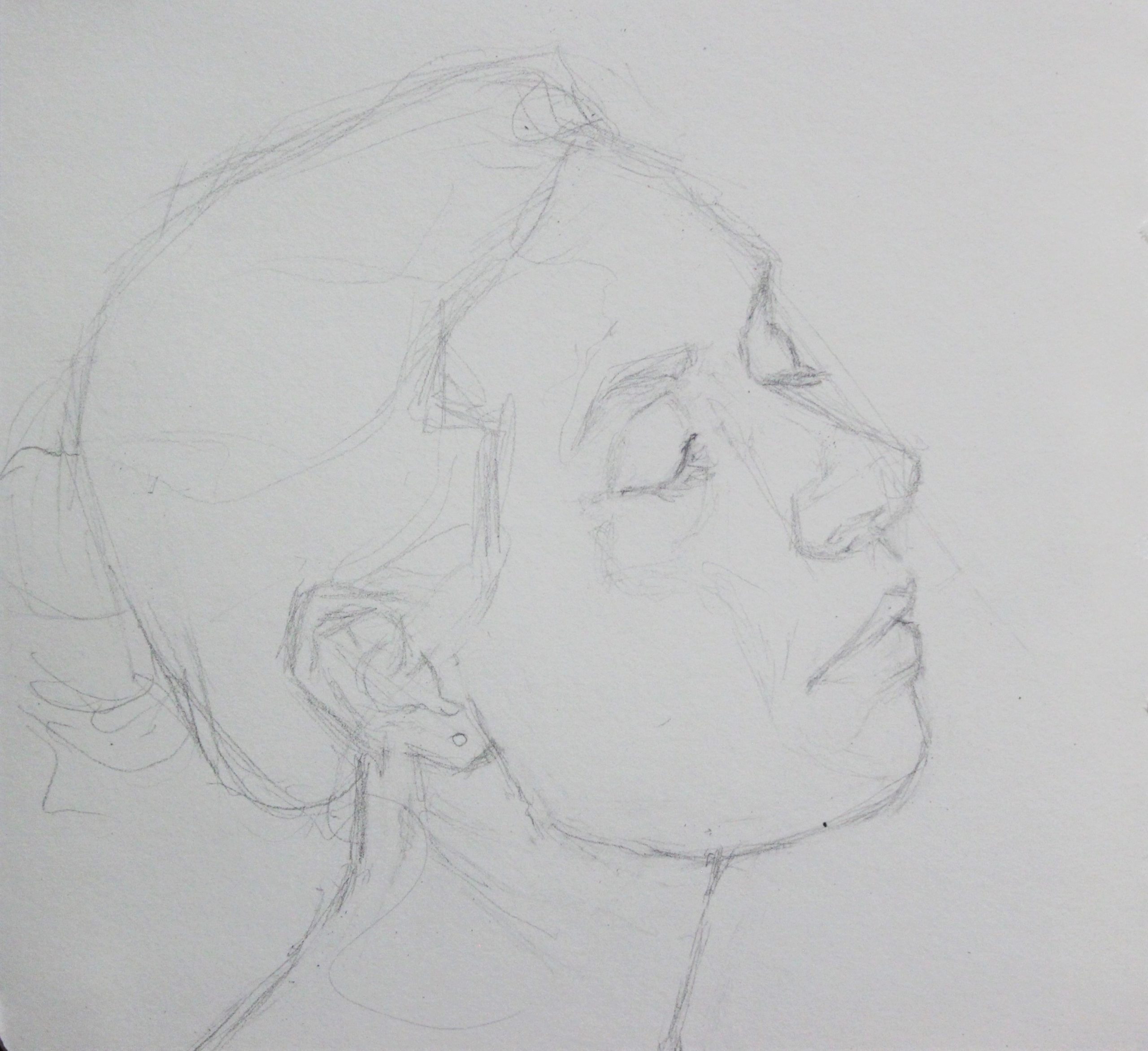
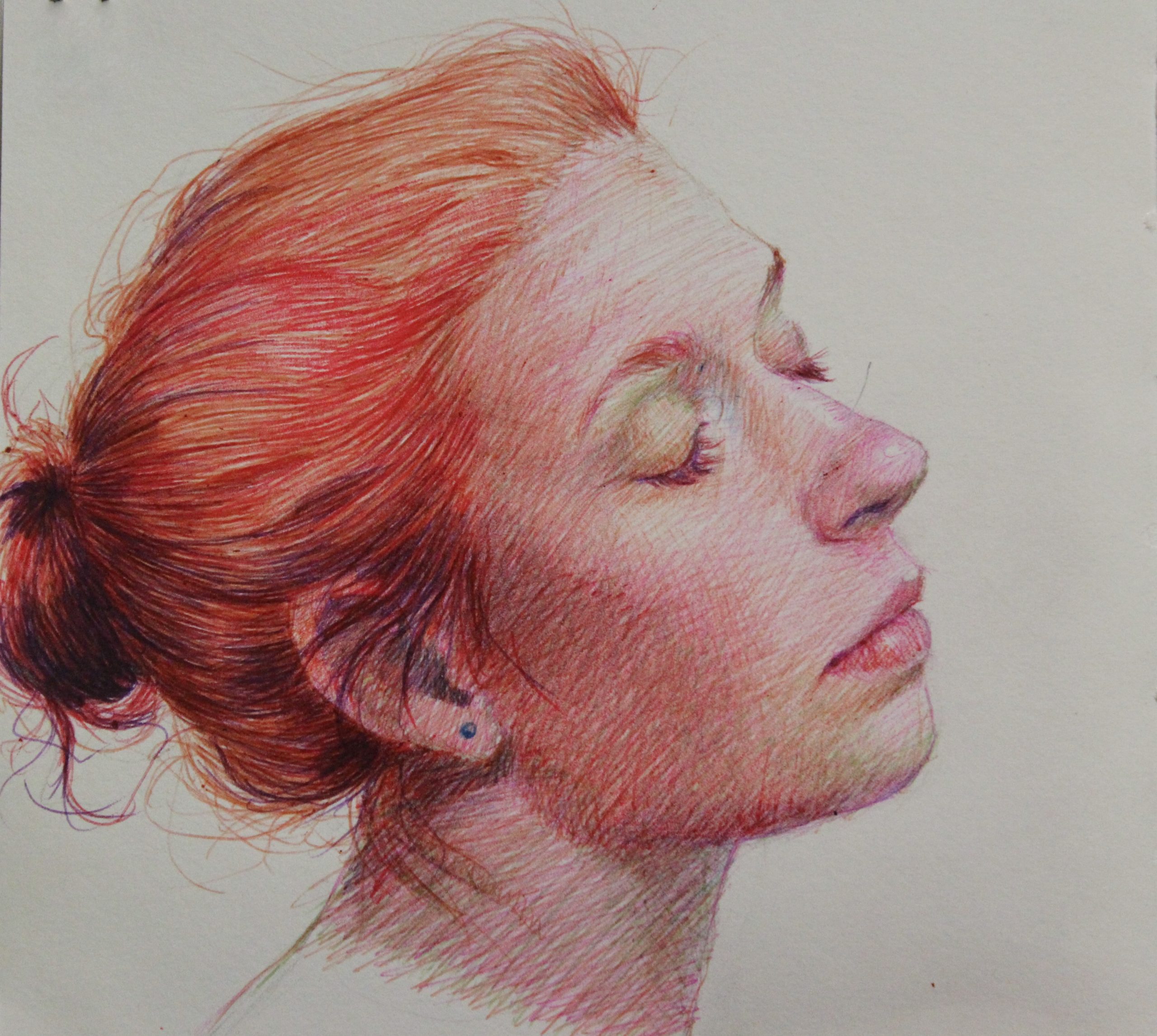
Image 1
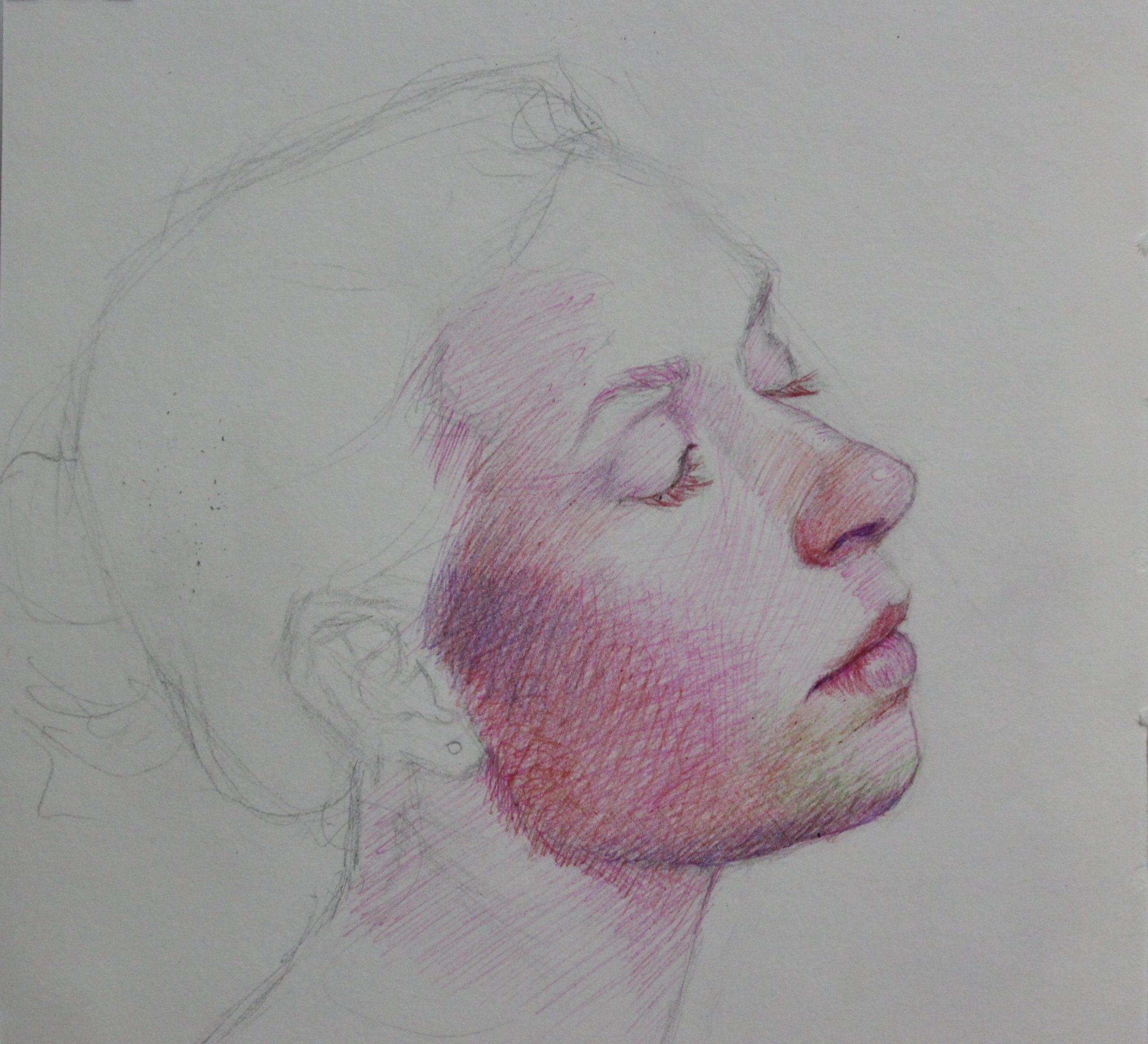
Above, I worked on the drawing with a pencil instead of just starting with the pens like I have done with the other portraits. By doing this I was making sure that my drawing was right and that I was doing a true likeness of my model. I kept the pencil drawing very light and I tried to avoid erasing too often since I didn’t want the paper to degrade before I even started drawing with the ink.
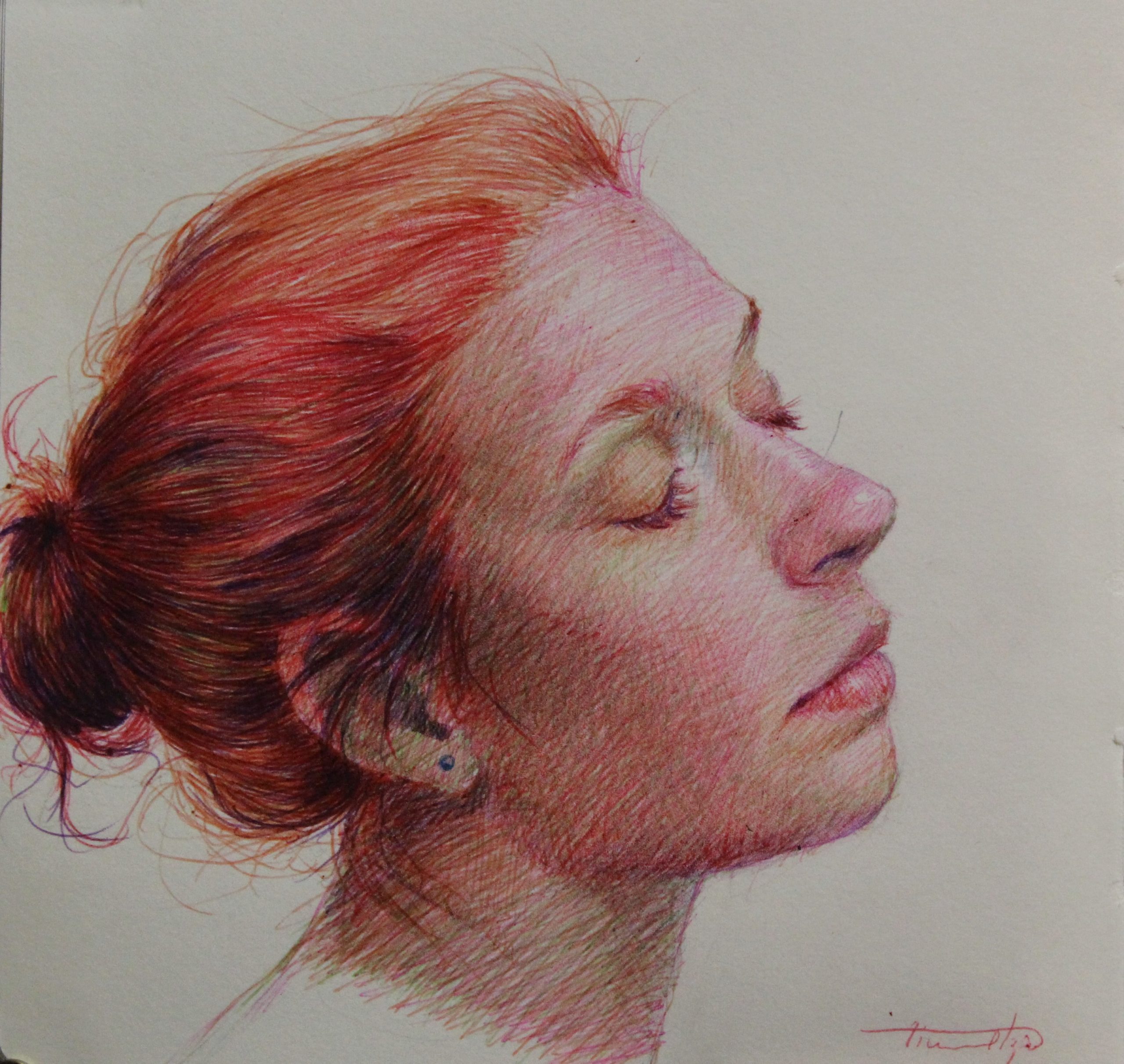
Images 2 and 3
For this part I started my first layer with light pink ink. This helped me set the skin tone and build up more layers of colors, which for this portrait were red, green, purple, blue, orange, and yellow.
Drawing the nose, lips, and cheekbones with the pink helped me set up the value first. Once I was sure I had the right areas covered with ink I decided to start applying a light green color around the mouth and eyes. I did this to accentuate the warm tone on the model’s skin.
Once I was done with the first layer I went over the pink color with yellow ink and some touches of purple as well. The yellow ink tied together the pink and green I had used on the first layer.
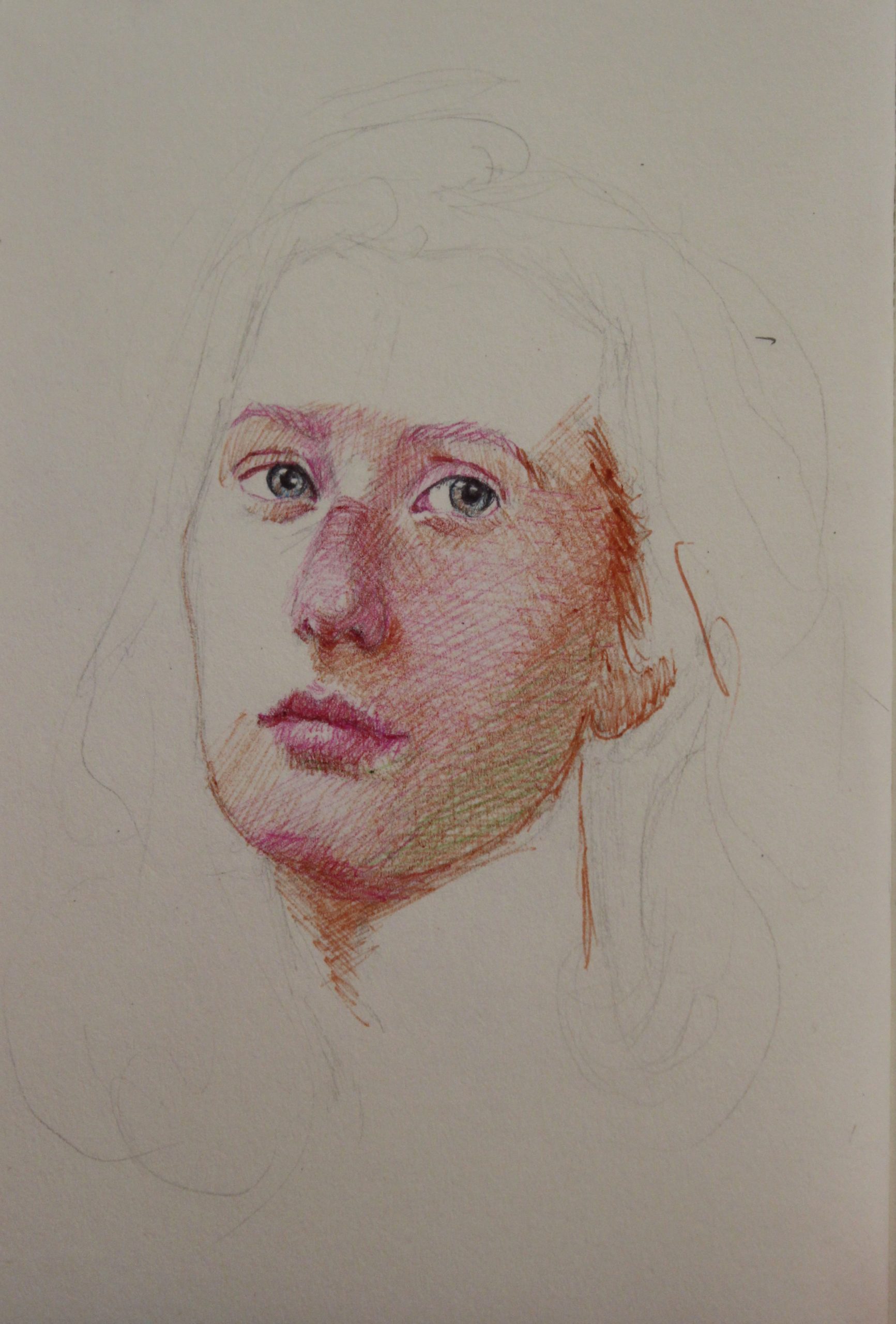
Images 4 and 5
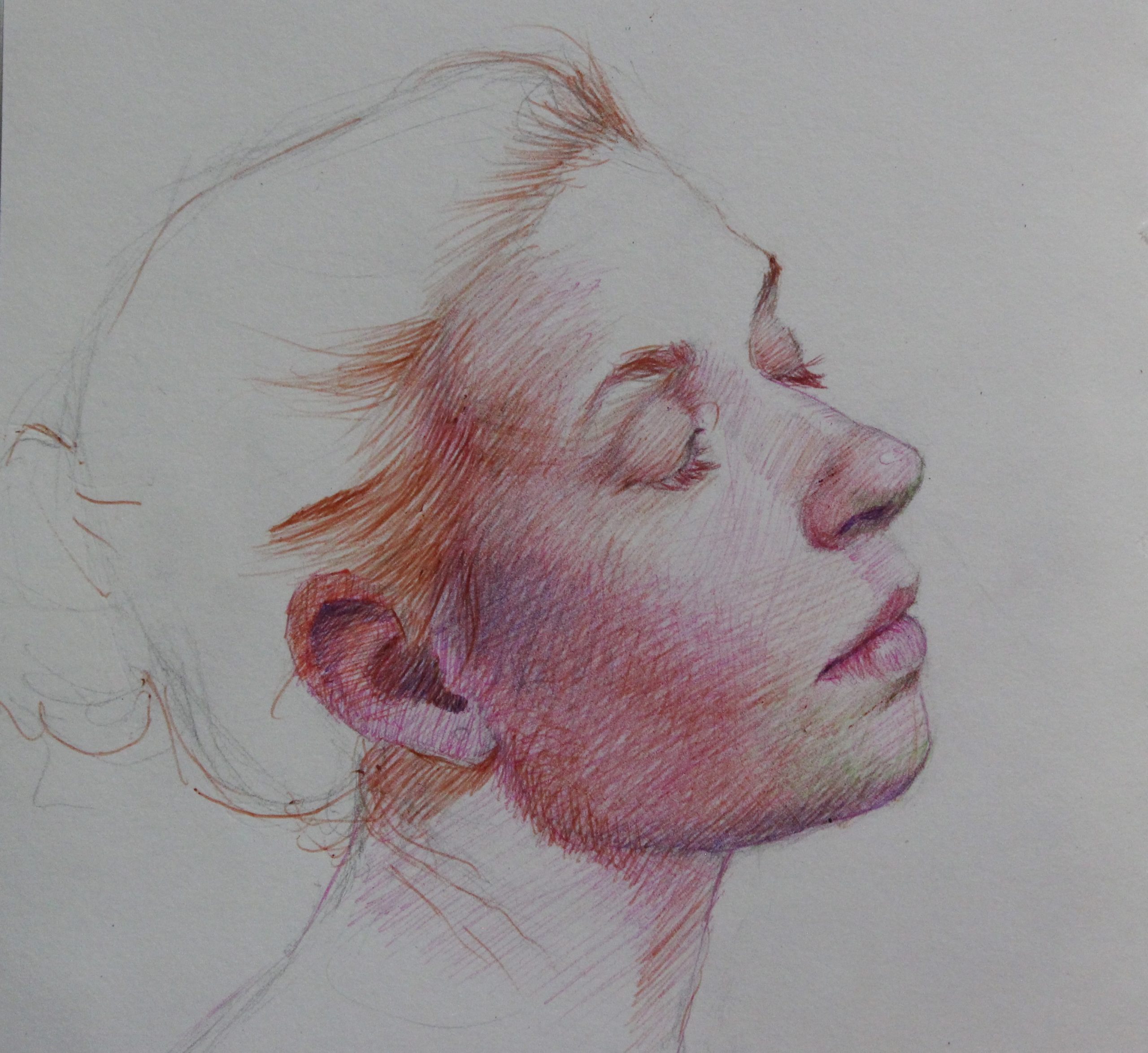
Here I drew more of the face, neck, and hair. I wanted to get rid of the white of the paper and only preserve the small touches of light on the girl’s nose, lips, and forehead.
For this portrait I wanted to have variation on the pen strokes and I decided that in the light areas of the drawing I would follow the shape of the model’s face.
Now, to achieve the shading effect on the areas of the cheekbone and neck I decided that crosshatching was the way to go. I used more red, yellow, and green for the face and I started to do more detailing on the nose, lips, eyelids, and eyebrows.
For the hair I used orange and red as a general base color. I didn’t focus on the dark areas of it since I left that for the last steps.
To darken some areas like the neck, ear, and eyelashes I used purple combined with dark green ink.
For this small portrait I didn’t use black ink at all because it gives the drawing a different look.
Images 6 and 7
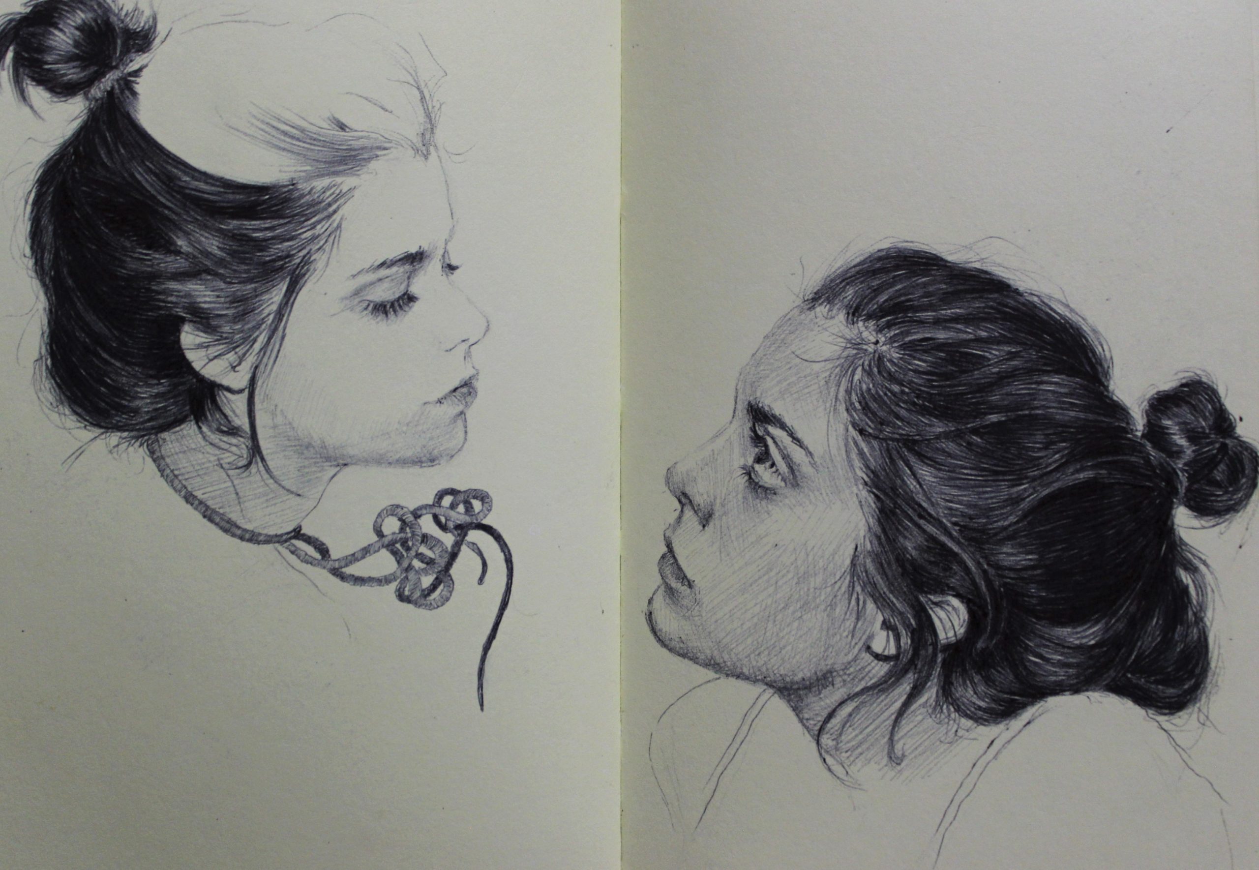
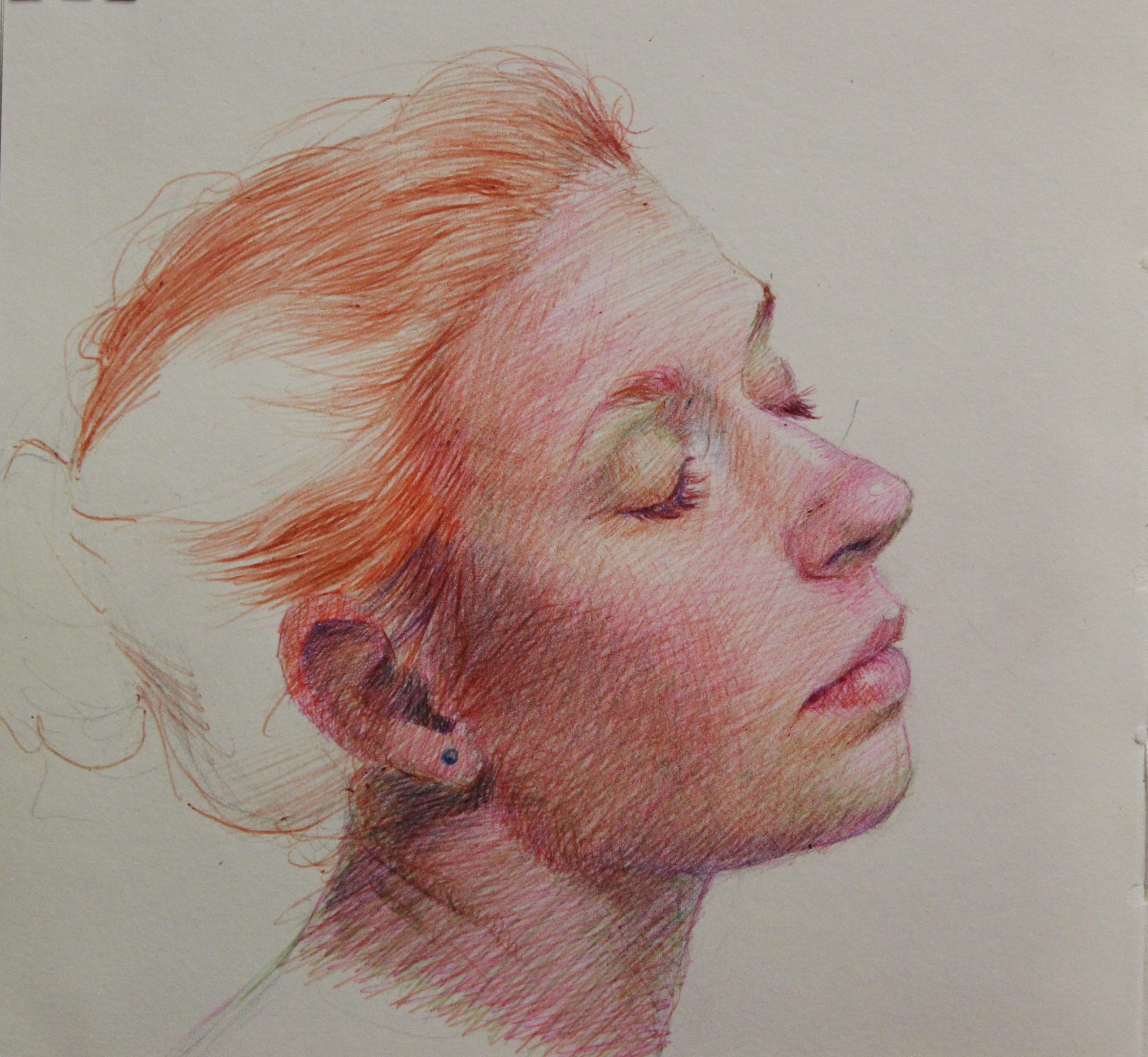
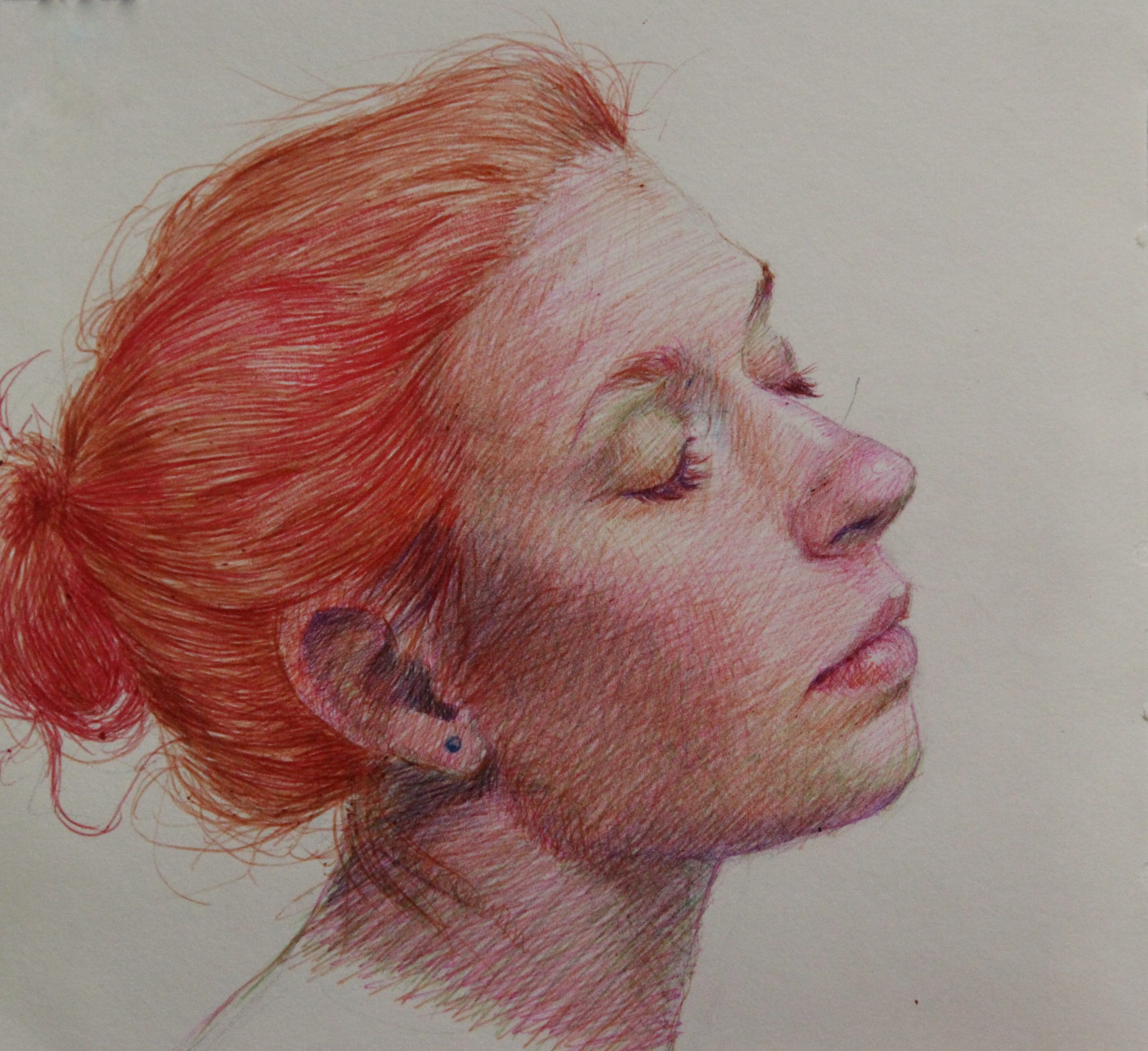
Here I just focused on finishing the hair and adding a few details on the face. Drawing hair can be a little scary and time consuming; it often ends up looking terrible. But I have learned after trying so many times that it is not as difficult as it might seem, it just takes a little more time out of my schedule.
In this portrait, however, my main concern was the face, and so I didn’t care much to style my model’s hair as I did on my other small portraits, since my main focus was to keep this drawing simple.
I retouched the nose, lips, and eyes a bit more, making sure that the shape was right. I also went over the entire face with the green pen to give it the final touch. And that was it—my experiment with the colored pen was done for the moment.
This portrait gave me the time I needed away from my difficult painting and it was a new process to apply in my future work.
Deciding to step away when a painting is not working is the right thing to do. At least for me it is. It relaxes me to work on my small sketchbooks because I know that I can always turn the page and start working on a new idea.
A sketchbook drawing or painting is just a note, a process that I can apply to one of my paintings; it is not a final work that will be exhibited. This helps with not feeling the same pressure I feel when I work on a big canvas. It also leaves me energized and ready to continue working on the painting I was finding difficult to handle.
Going back and forth between different paintings, sketches, and color studies is a process that keeps me busy and interested. The key for not giving up is to walk away and look at the situation from another perspective. I usually get to the point where I’m not satisfied with my work; but that’s how it’s supposed to be. Many artists feel the same and it’s what drives them to create more, to experiment, and to take risks with their art.
Learn more about Dimelza at: dimelzabroche.wix.com/fineart
Related Article >
”")

