


Using bold color with a limited palette is a simple tool to add to your composition arsenal, especially when painting with pastels.
Painting with Pastels: Set the Mood with Bold Color and Intentional Edges
BY COREY PITKIN
Using bold color with a limited palette is a simple tool to add to your composition arsenal. The right choices can establish your intended attitude right off the bat and draw your viewer in. Once you have them, use edges to direct them to the important parts of your painting.
Painting with Pastels: Color As A Character
Color is often the first aspect of your art that people see. Before they have investigated a narrative or even identified what you’ve rendered they have taken in your dominant color scheme. So why not use that to your advantage? Why not smack them with your color immediately? Make them fall in love before they even know what hit them.
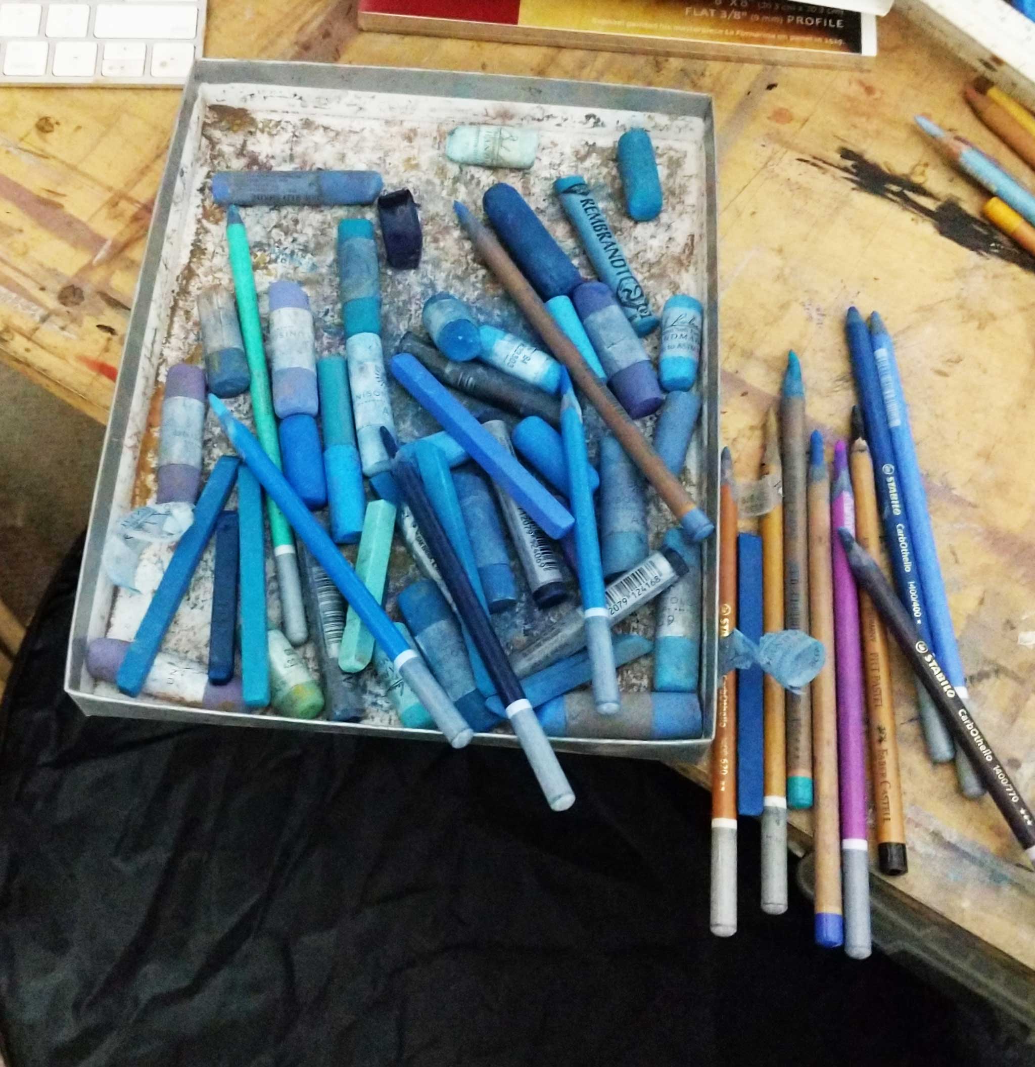
Using bold color effectively requires a plan. When I begin one of my pastel paintings I start by setting aside the colors I intend to use. I need to make sure I have enough of a value range to create a painting with punch. I want a dominant color scheme that is easily identifiable. I want a couple secondary colors that harmonize with my dominant color but are distinct enough from it to stand on their own.
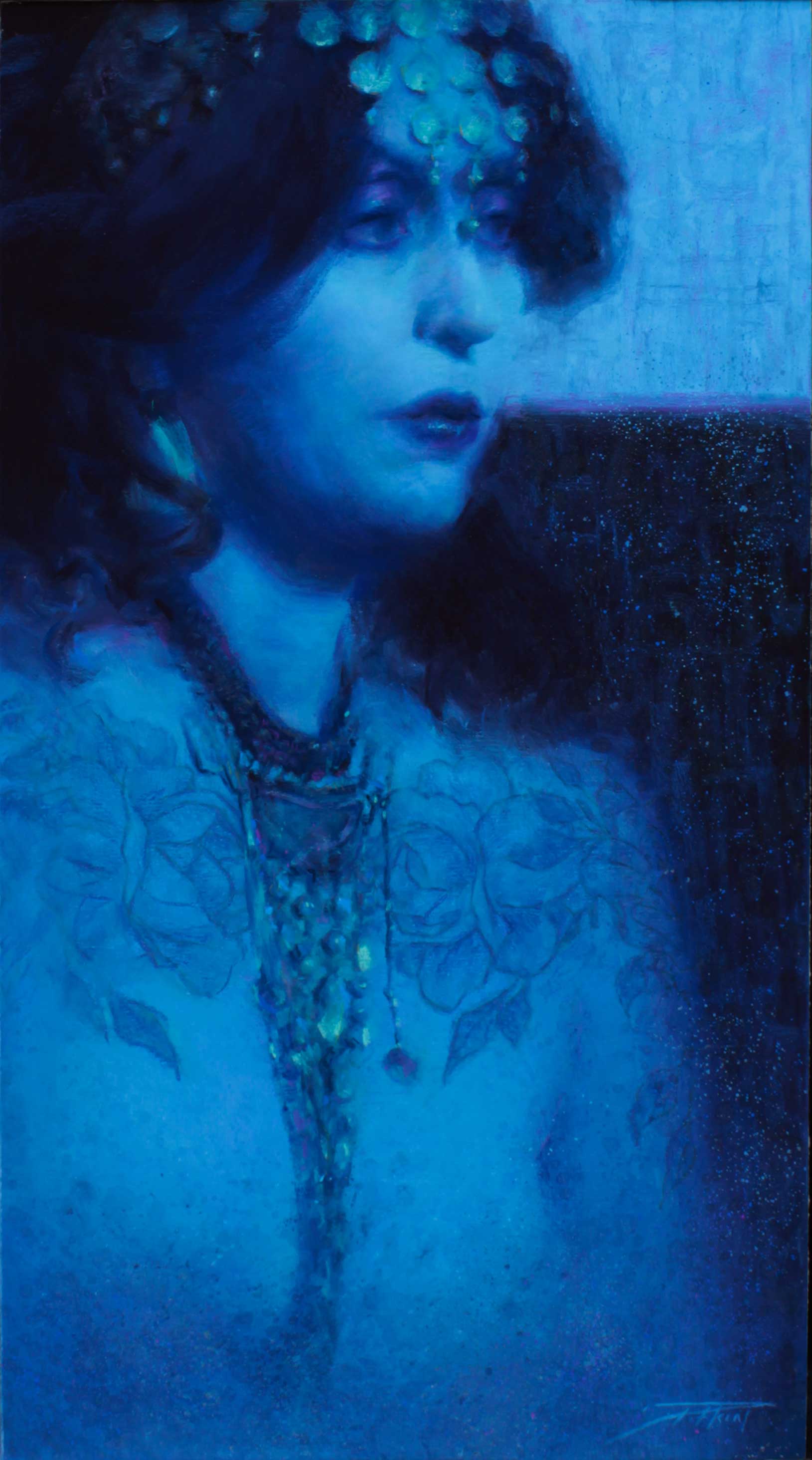
In the painting “Cassiopeia” (above) my dominant color is a vibrant aqua. I’ve compressed my value range to run from about a four to a 10, discarding white and my lightest blues. I’ve chosen two secondaries — a green teal and a magenta violet. In pastel it is easier to set up these relationships than in oil: I set the selected pastels together and check for colors that don’t “go” with each other. A disharmony is easy to spot. You can accomplish the same in oil by mixing up a few piles of the colors you intend to use and then making any adjustments to the harmony that might be required. If a color starts to drift into disharmony, add more of your dominant color to the pile.
So why blue for this pastel? This shade is about as far removed from any “flesh tone” as you can get. By painting the figure in such a narrow color gamut I’ve made the color itself a character in the painting.
The blue is as important to the ideas behind the painting as the woman is. With a value pattern leaning toward the darker end of the spectrum and using cold colors the painting evokes the middle of the night, interrupted and already half-forgotten dreams, lit by a flickering television screen. Witching hours and infomercials. The costume choices are compositional tools, leading the eye along a column of dark values and sudden pops of color.
Related Article on painting with pastels > An Incomprehensible Situation
Painting with Pastels: An Aside About Edges
Edge control is an incredibly effective tool to create a mood, and one that is often underrepresented in contemporary representational painting. Part of this is because many of us are painting from photographs which are, by nature, hard-edged.
Soft edges are the 2D representation of our binocular vision. Cameras only have one “eye,” so all the edges are harder. If you paint from photos (and I do) you need to look more closely at your edges and exaggerate the softness of them.
Painting from life as often as you can will help you to know where your photo reference is failing you.
I’ve taught drawing and painting workshops for years and the concept of edges is one that students often struggle with. So here’s a primer:
An edge is where things meet (but you knew that). At their most basic edges come in two flavors: hard and soft. A hard edge occurs when a form turns sharply or there is a large value change between two forms. A cube has harder edges while a sphere has softer. But if the sphere is white against a black background then it will have harder edges than the same sphere against a light background. If the value difference between the objects is so small that they seem to blend into each other it’s a lost edge. Lost edges feel mysterious and ethereal.
So how do we use them? More than any other technique available to us, edges convey depth. Soft edges recede into the distance while hard edges come forward.
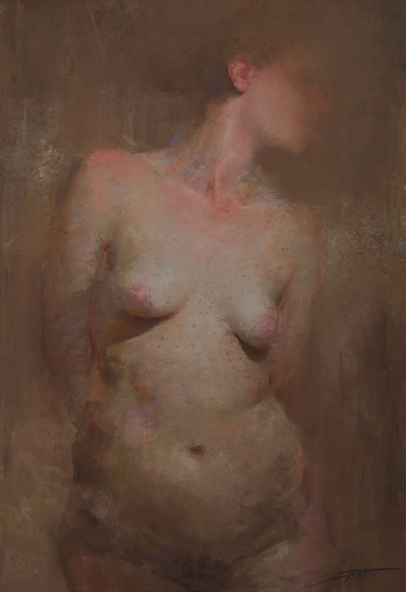
Putting a hard edge on the corner of the bottom lip tells the eye that this form is in front of the far side of the face. But hard edges attract the eye so use them sparingly. I make an effort to soften all my edges to some degree and then sharpen only those that I want to be hard. In portraiture, keeping the edges soft between the face and nameable forms like eyes and mouths will make these forms feel like they are a part of the face instead of sitting on top of it. If all of your facial features are hard edged, your portrait will look like a Mr. Potato Head.
Are there exceptions to this rule? Of course. A hard edge also makes something look — harder. Rocks, anvils, foreheads: sharpen up a couple of the edges along the contour to give them more substance and heft. Keep edges hard on the highlights of a shiny object to make it appear shinier.
Keep in mind that rarely does the entire boundary between two forms have the same edge throughout. Varying edges within the form and along the contour implies smaller forms. Don’t want to include the frown lines on a portrait? Vary the contour’s edges to imply them. You can keep the design of the big head shape intact but the viewer will subconsciously recognize the small plane change.
For pastelists like us, edges are particularly tricky because pastel is a naturally hard-edged medium. I find that lightly passing a pastel pencil or a hard pastel stick over the boundary between the two forms is effective for altering edges without smudging them together with your finger. I won’t say I never blend with my fingers, but I only do when I need a large, soft-to-almost-lost edge. Over-blending pastels mixes the pigments together and muddies up your colors and values very quickly. Using another pastel to modify your edges keeps your color fresh. Using a color that doesn’t exactly fit in with the local color of the form that you’re painting is an opportunity to add pops of additional color, like the violet on the underside of the bottom lip above.
About the Artist: 
A predominantly self-taught artist, Corey Pitkin’s hunger for the mastery of drawing and painting techniques borders on the obsessive. His work is inspired by both old master painters and contemporary artists, crafting portraits and figures with their feet planted firmly in the past yet eluding art that feels musty or dated.
Pitkin’s award-winning oil paintings, pastels, and charcoals are collected internationally and have been published in American Art Collector, International Artist Magazine, and the Pastel Journal. On the rare occasion that he’s not in the studio, Corey can be found conducting workshops on portraiture and painting technique. He currently lives in Broadalbin, NY, with his wife Esther and children Anastasia and Xavier.
Connect with Corey Pitkin:
Website | Instagram | Facebook

Visit EricRhoads.com (Publisher of Realism Today) to learn about opportunities for artists and art collectors, including:
- Art retreats
- International art trips
- Art conventions
- Art workshops (in person and online)
- And more!


”")
