


On color mixing for artists > While color can be a powerful tool for artists to communicate emotions and ideas, its complexity is often paralyzing.
The Conundrum of Color
by Amy Lind
Richard Schmid said, “Color is to seeing what flavor is to eating. It is by far the most sensuous element of the visual field, and for many artists, its allure is the sole reason to paint.” I could not agree more. But while color can be a powerful tool for artists to communicate emotions and ideas, its complexity is often paralyzing.
Just as a chef combines different ingredients and spices until the taste combination is a perfect medley, so too an artist mixes an array of different colors until they exist in a harmonious combination that is pleasing to the senses. That is, if harmonious is the artist’s objective.

Of course, every artist has different goals and intentions for their work, and therefore they use color in a variety of ways to communicate different ideas and emotions. Much as each artist’s hand makes unique marks or strokes, so each artist also has unique color sensibilities and preferences. Sometimes, however, an artist may know what color ideas they want to depict, but struggle to achieve their desired effect when translating it into pigment.
Now then, let’s equip ourselves with knowledge and tools to help overcome insecurities we may have about working with color and color mixing, so we can have the confidence to move forward and enjoy the process of exploring color in our artwork! For starters, we’ll learn or refresh our memory of basic color principles and then move on to eight helpful tips for depicting subjects in nature using colored pigment, such as paint.
Difference Between Light Colors and Pigment Colors
For me, it is the allure of natural light and its effects on the colors of the human figure that inspire me the most to paint. While it may seem like an obvious concept, it’s important to understand that we cannot actually paint with light. We are limited by the illusions we can create with pigment in order to achieve the look of brightness or darkness that exists in nature. Richard Schmid put it simply when he said, “God creates color in a variety of ways, but paint can only produce color one way—by reflecting light.”
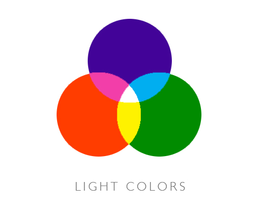
The colors in light are known as “additive colors.” When they are mixed (or added) together, they become lighter as seen in the figure below. The three primary colors in light are red-orange, green, and blue-violet. When they overlap, they mix to form the light secondary colors yellow, magenta, and cyan. When all three of the primary light colors overlap, they create white.
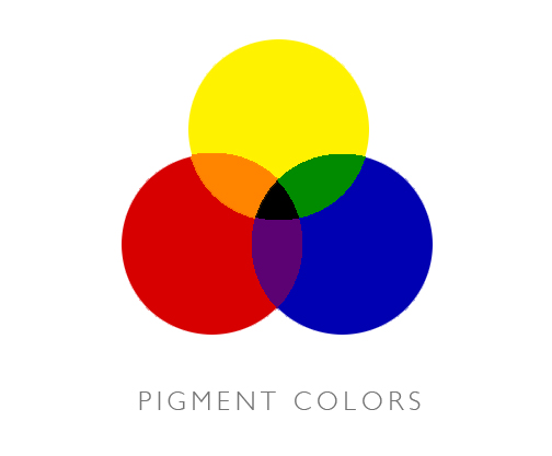
By contrast, the colors we see on the surface of objects function much differently than the colors we see in beams of light. When light falls on the surface of an object, certain wavelengths are absorbed (or subtracted) while other wavelengths are reflected. Thus, the colors in pigment are known as “subtractive colors,” as seen in the figure below. For example, blue paint appears blue, because it reflects light rays in the blue portion of the spectrum and absorbs all the other light rays.
Color Mixing Fundamentals – The Color Wheel
An artist’s color wheel, which was originally developed by Sir Isaac Newton, traditionally has twelve colors, as seen in the figure below. You can mix the three primaries—red, yellow, and blue—to create the three secondaries—orange, green, and violet. Further, the primaries can be combined with the secondaries to create the six tertiaries—red-orange, yellow-orange, yellow-green, blue-green, blue-violet, and red-violet.
An artist can produce a full range of colors using the primary colors, but they cannot create pure primary colors. Without tubes of paint in the primary colors, an artist can only create less saturated versions of the primaries. It should be noted that in nature you would rarely find objects that appear to be one of these twelve colors in its purest form.
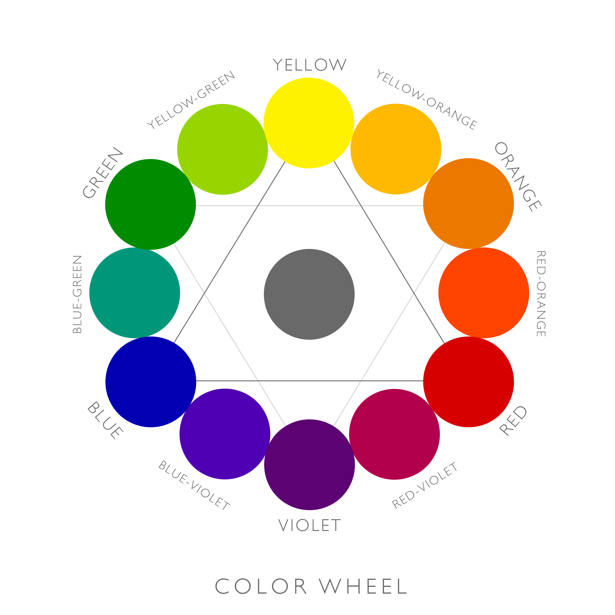
“Complementary colors” are directly opposite one another on the color wheel. When complementary colors are placed next to one another, they intensify each other; this phenomenon is known as simultaneous contrast. Conversely, if you mix complementary colors, it is like you are mixing the three primaries and the result is a low-intensity, de-saturated gray. “Analogous colors” are next to one another on the color wheel and when mixed together their intensity is not noticeably lessened.
Color Properties – Hue, Saturation, and Value
When referring to different colors, we define them by their name or “hue,” such as “red” or “yellow.” “Saturation” refers to the relative purity or intensity of a color. Colors are at maximum saturation in their purest form, and their saturation is lessened as they are mixed with their complementary colors. “Value” is how light or dark a color is. When mixing pigment, an artist can alter the value by adding black or white.
Another way of achieving a lighter value is by applying the pigment thinly, allowing a lighter ground, such as canvas or paper, to show through. Another way to darken a color’s value is by mixing it with darker colors other than black, giving the color more tension and depth. Interestingly, mixing pigments of equal value creates a darker pigment, because more wavelengths are absorbed.
Temperature – Warm and Cool Colors
“Warm” is a term used to describe hues in the red/orange area of the color wheel, while colors in the blue/green area of the color wheel are referred to as “cool.” It is important to remember, however, that these terms are relative. There is not an intrinsic color temperature to each pigment, but rather it changes and looks warmer or cooler compared to the colors around it.
For example, you can see in the illustration of colored squares that the red-violet color on the left side appears cooler when placed next to a warmer orange color, whereas the exact same violet color appears warmer when placed next to a cooler blue color.

Relativity of Color & Effect of Light on Color
Have you ever painted a wall in your house and noticed that the color of the paint on the wall seemed drastically different than it appeared on the little paint chip in the store? Well that is because color is relative and it changes depending on the light sources, adjacent colors, and surrounding reflected light. This relative nature of color makes it hard for a predictable color system to exist.
Perhaps the lighting in the paint store was fluorescent and you were wearing a blue shirt while initially picking out the paint chip. Both of these things would have contributed to making the gray paint chip appear cooler. So now that you have painted your wall at home, you are surprised to see the gray paint appear much warmer. Your incandescent lights at home, which have a reddish-yellow cast unlike the blue cast of the fluorescent lights at the store, along with your brown wood floors are making the gray walls appear warmer.
To make matters more confusing, you have a lamp sitting next to a red sofa, reflecting a “pink” hue on the walls. Moreover, the natural light coming in the windows will affect your perception of the color as well and it will change depending on the time of day. Natural light appears warmer just after sunrise and just before sunset, and during the middle of the day the light is more neutral. However, the mid-day light can appear bluer under heavy clouds. Different exposures (northern vs. southern) and your position on the earth will also affect the cast of the light.
Geesh!! No wonder we often have trouble analyzing and interpreting color! Well rest easy knowing that it is quite complicated, so we have every reason to be perplexed! So, might I suggest arming yourself with the following tips.
1. It’s important to trust your eye and believe what you are seeing. Always remember that color is influenced by different lighting conditions, adjacent objects, and reflected light.
We have what is known as a “visual memory,” in which we learn the “local color” of things. For example, bananas are yellow and grass is green. But you must consider the fact that the local color of an object is affected by surrounding light and objects. Let’s say, for example, that you were painting a banana on top of a purple tablecloth. It wouldn’t look unified or feel like it’s resting on the table until you add the purple influence of the tablecloth along the edge of the banana where it touches the tablecloth.
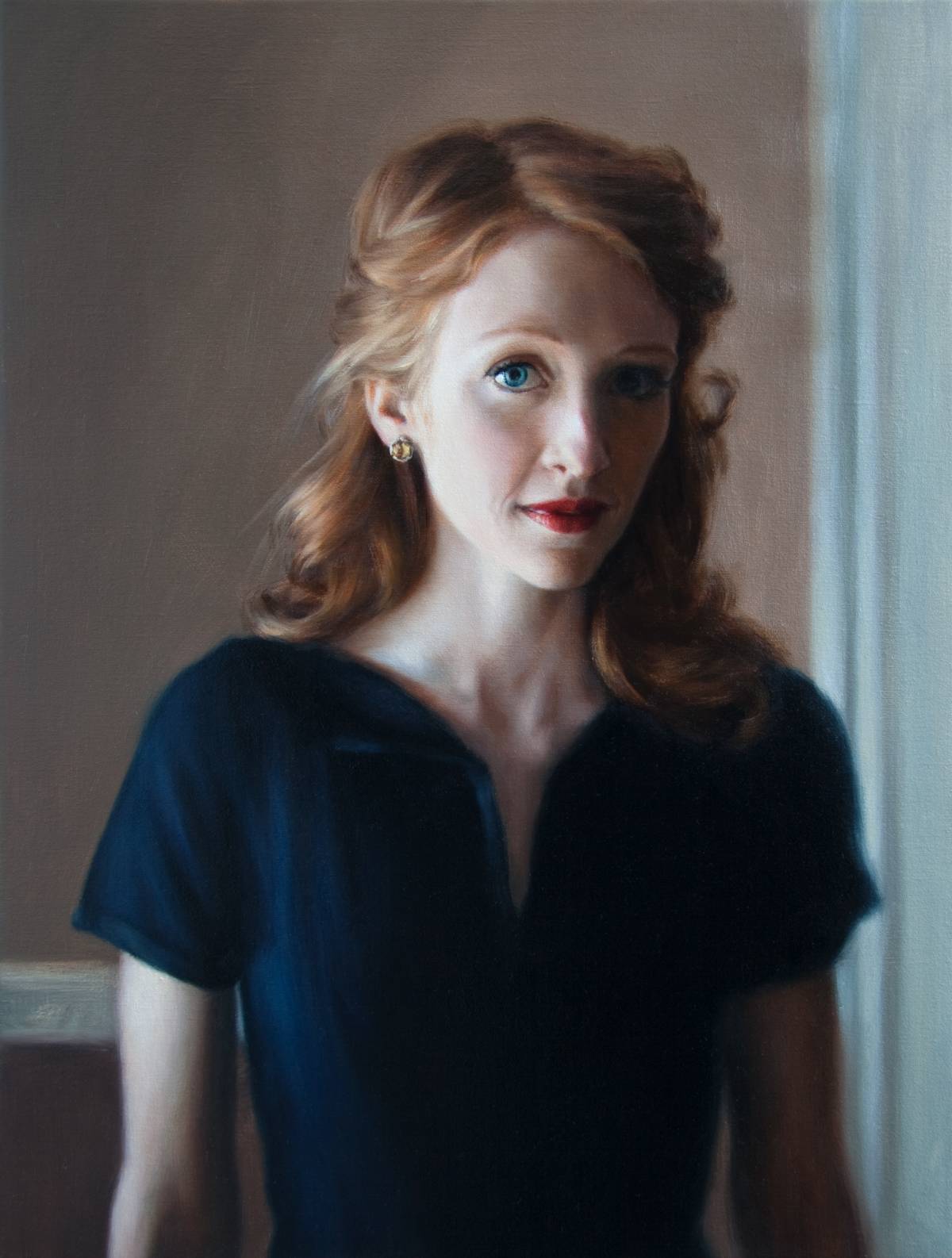
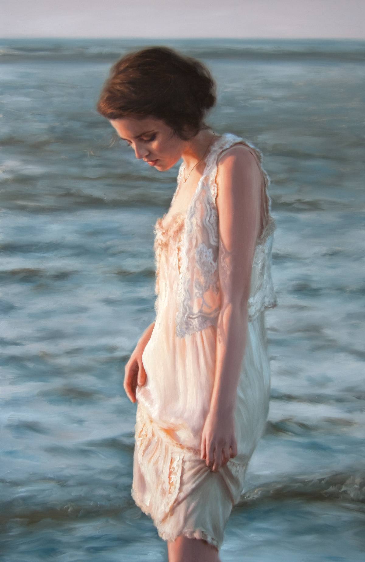
Our visual memory can trick us into painting things the colors we think they should be instead of the colors they actually are. For example, we may think that the exterior of a house is white, so we paint it on our canvas using our tube of white paint with the addition of black for the shadow areas. When viewed under morning or evening light, however, the white house may actually be a warm yellow-orange in the light areas and a cool blue-violet in the shadow areas. This idea can be seen in my painting Morning Solitude. The woman’s clothes are “white,” but at sunrise they appear to be yellow-orange in the light areas and blue-violet in the shadow areas.
This leads me to my favorite trick, which is almost always foolproof . . .
2. Warm light produces cool shadows and cool light produces warm shadows, so simply look to the shadow area if you’re having a hard time determining the temperature of your light source. In fact, a good rule of thumb is that the shadow will be the complementary color of the light.
But don’t let this fool you. You still have to look for the intricacies within these general light and shadow colors, as they are affected by the colors around them. This idea can also be seen in Morning Solitude. Let’s take a closer look at the shadow areas, and you’ll see that the shadow color shifts from more blue to more violet in different areas. The blue ocean and blue sky reflect onto the right side of her dress making that shadow area more blue than violet, whereas the warm local color of her skin blends with the cool shadow on her arm and face, making those shadow areas more violet than blue. Also notice that the terminating line between the light and shadow areas is a warm orange color.
3. I cannot count the number of times I have heard that “warm colors come forward and cool colors recede.” While this can be the case, the opposite can also be true if all the color and value relationships are accurately depicted.
4. When mixing pigment color with any other color, you are creating a new color and the temperature changes as well, even if you mix it with black or white. In fact, it’s important to note that white is the coolest color, and it will make any color cooler when mixed with it.
A little color mixing trick: Since adding white to a pigment color makes it cooler, it’s easier to mix light values that are cool compared to mixing light values that are warm. So having a cool light source (as natural light often is) is to your advantage when mixing the lighter values.
5. Since we cannot create the brightness of light that exists in nature with pigment, we need to be aware of the limited color and value scales of pigment. This means we may have to paint some areas darker or less saturated than they actually are in order to accentuate a brighter area.
Helpful hints: Mix your own version of black using colors such as Ultramarine Blue and Alizarin Crimson to create a deeper black. Also, when depicting a light source, it should be the brightest value in your picture.
6. “Color harmony” in nature is produced by light, and each light source has its own unique balance of color. More obvious color harmonies are created when the light leans heavily towards one color, such as warm natural light at sunrise/sunset.
The key to creating an image with harmonious color is to determine the light source’s dominant color. Then you will notice that dominant color throughout the light areas, and you should use less of its complementary color. By less, I mean use a de-saturated version of its complement. This is because the dominant color is affecting everything, even its complementary color, making it less intense. By weaving one main color throughout, you will in effect be helping to unify your picture.
7. Keep in mind that working with color should be fun! Color can play a big role in capturing the viewer’s attention and defining form in addition to having a strong impact on the viewer’s emotions.
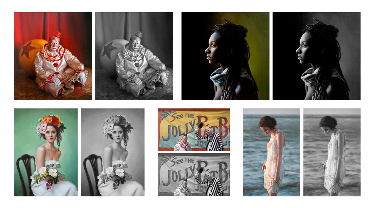
The joy in many paintings for both the artist and viewer often exists primarily within their use of color. Compare my color paintings below to the adjacent versions that have been changed digitally to black and white. You will see in the black and white versions that many of the different colors actually have quite similar values, and the contrast in the color paintings helps to create the illusion of depth and form. Not to mention, color helps to shows a sense of vitality.
That being said, color is like music. It often contains slow and subdued notes so that the quicker, louder parts are more powerful. In some of my paintings, I have intentionally kept the color fairly monochromatic and de-saturated, except for a few areas of more saturated color to emphasize a focal point.
8. Finally, use a “simple” palette. In other words, only use the colors necessary for your subject matter and the way you paint.
Juliette Aristides put it eloquently when she said, “A great painter can transform any palette into an excellent painting; an inexperienced artist can have an extensive palette containing the very best colors and still turn the color to mud.” You’d be surprised at the complex range of values and temperature shifts you can get from using a limited palette of just a few colors. One benefit of keeping your colors to a minimum is that it’s easier to maintain harmony and unity when it comes to color mixing.
An artist’s palette will likely differ from artist to artist. You may find a system of colors that you will always work with, or like me, it may be ever changing. Currently when painting the figure, I typically select from the following paint colors: Zinc White, Titanium White, Cadmium Lemon Yellow, Cadmium Yellow Medium, Yellow Ochre, Raw Sienna, Burnt Sienna, Cadmium Vermillion, Alizarin Crimson Permanent, Burnt Umber, Raw Umber, Viridian, Ultramarine Blue, and Ivory.
If you are just learning to work with color, I suggest you take simple subject matter and paint it three ways –
(1) using a limited palette of, say, Ultramarine Blue, Burnt Sienna, and Titanium White;
(2) using a full range of pigment but mix and paint it with the goal of getting the colors as “exact” as possible; and,
(3) using a full range of pigment and an Impressionistic application of purer color.
These tips should help you to become familiar with the possibilities of paint mixing while you search to find your color voice!
Learn more about Amy Lind at www.AmyLind.com.
Browse more articles on color mixing for artists here.

”")
