


A conversation on figurative art with Carolyn Anderson that changed my life >
Me: What do you look for when you start your painting?
Carolyn: I start with something that catches my eye.
(long pause)
Me: What’s catching your eye for this painting?
Carolyn: See that shape here? That’s kind of interesting.
Me: Huh?!
Fireflies and the Art of Design
by Kevin Beilfuss
With this simple, albeit brief conversation, I realized that Carolyn was seeing things much differently than I was! I had always been taught to draw the figure as if you were constructing the subject itself: “This is how you draw the head.” “This is how you draw the eyes.” “This is how you draw the nose.” “How many heads tall is the figure?” Etc.
I was drawing the subject without regard to the design of the painting as a whole.
What was catching Carolyn’s eye in the subject was the negative space between a mother and her child’s head as they read a book together. She was not as drawn to the subjects themselves, as she was to the negative space that allowed her to see gesture, and design. Our conversation was short because I didn’t know what further questions to ask, but what I learned over time, as I tried to comprehend what Carolyn was seeing, was that the subject can become secondary in importance to the overall design of the painting.
I was up late one night, struggling to figure out how to put into words for my workshop students just what I was seeing when I viewed a subject as a painting. It was at that moment that the idea of fireflies came to mind. Our eye’s main focus is to seek out detail. Imagine yourself outdoors at dusk with the sky a blanket of darkness. Suddenly a spark of light appears and vanishes. Then another spark appears, then another. With each spark our eye moves to a new position. Our eye is trained to go where something is visually grabbing our attention.
When approaching a painting, the concept of fireflies can help the artist understand how one’s eye is naturally led around a subject. The eye will always seek out something new and different to focus on—basically, it seeks out contrast. Contrasts come in the form of value (lightness/darkness), “activity vs. passivity,” and contrasting colors and textures. All of these contrasts—these “fireflies”—will catch the eye’s attention.
Let’s take a look at these fireflies individually and see how they can help us design a painting.
Value
If a subject has a strong light on it, there will be distinct light shapes (where the light is reflecting off the subject), and distinct dark shapes (where the light is being absorbed by the subject (a shadow is being cast, or a turning of the form.) Most artists seem to start with a fairly light background (canvas, panel, or paper). Even if there is a tone on the surface, it is usually not darker than a middle value. We start to draw these dark shapes against our lighter backgrounds, thus producing a contrast. Getting these dark shapes in the right relationship to one another is what will make the subject before us, look like the subject before us.
As an artist, if one chooses not to paint the subject exactly as they see it, but rather thinks as a designer, the value structure can be altered to make a possibly more interesting design, thus allowing room to use more color in the shadow areas. For example, the shadows can be lightened, and not painted as dark as they appear when squinting. As long as the shadow shapes are darker than the lights on the subject, they will read as a shadow. So value contrasts are the firefly I seek out first when designing a painting.
Activity vs. Passivity
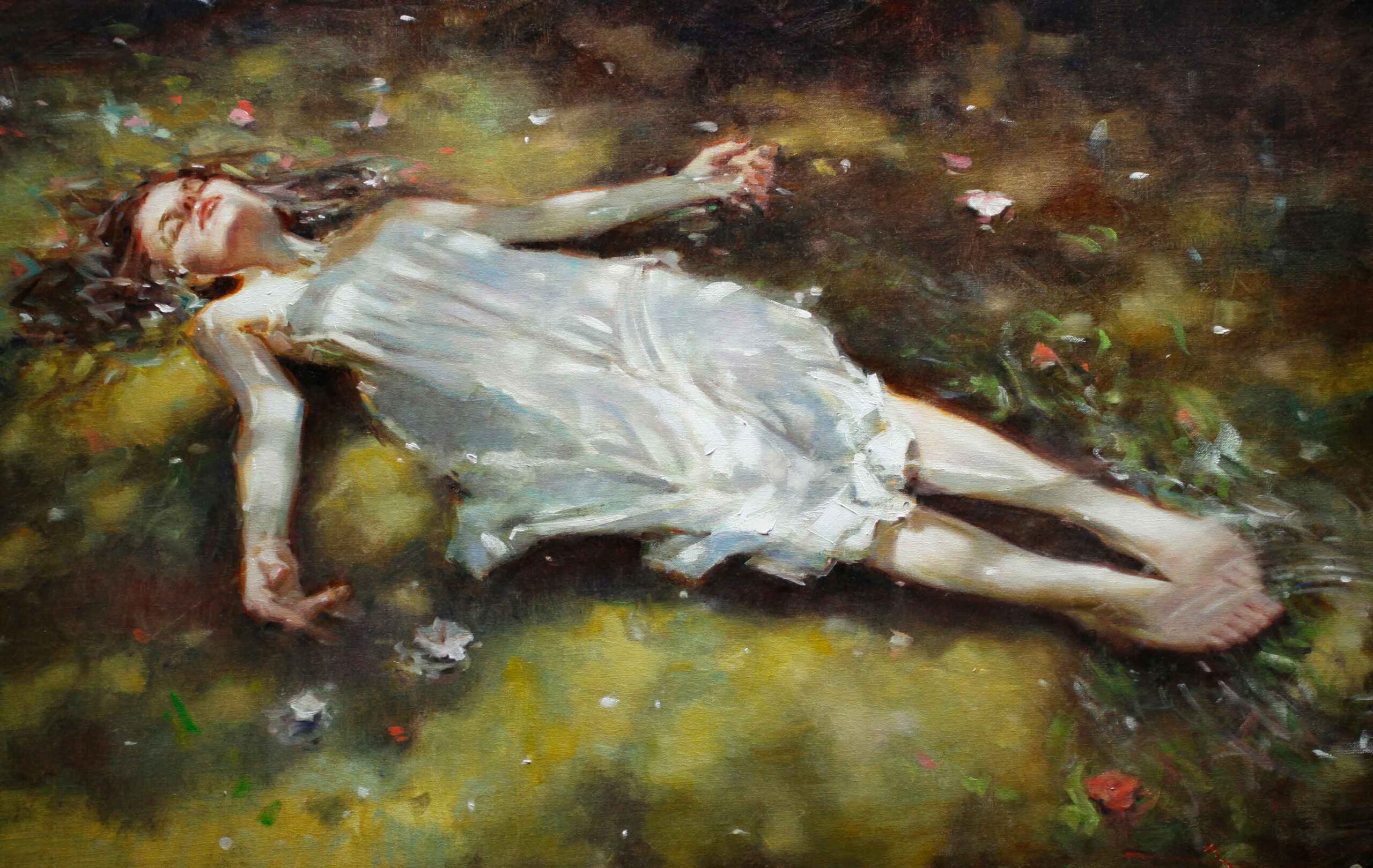
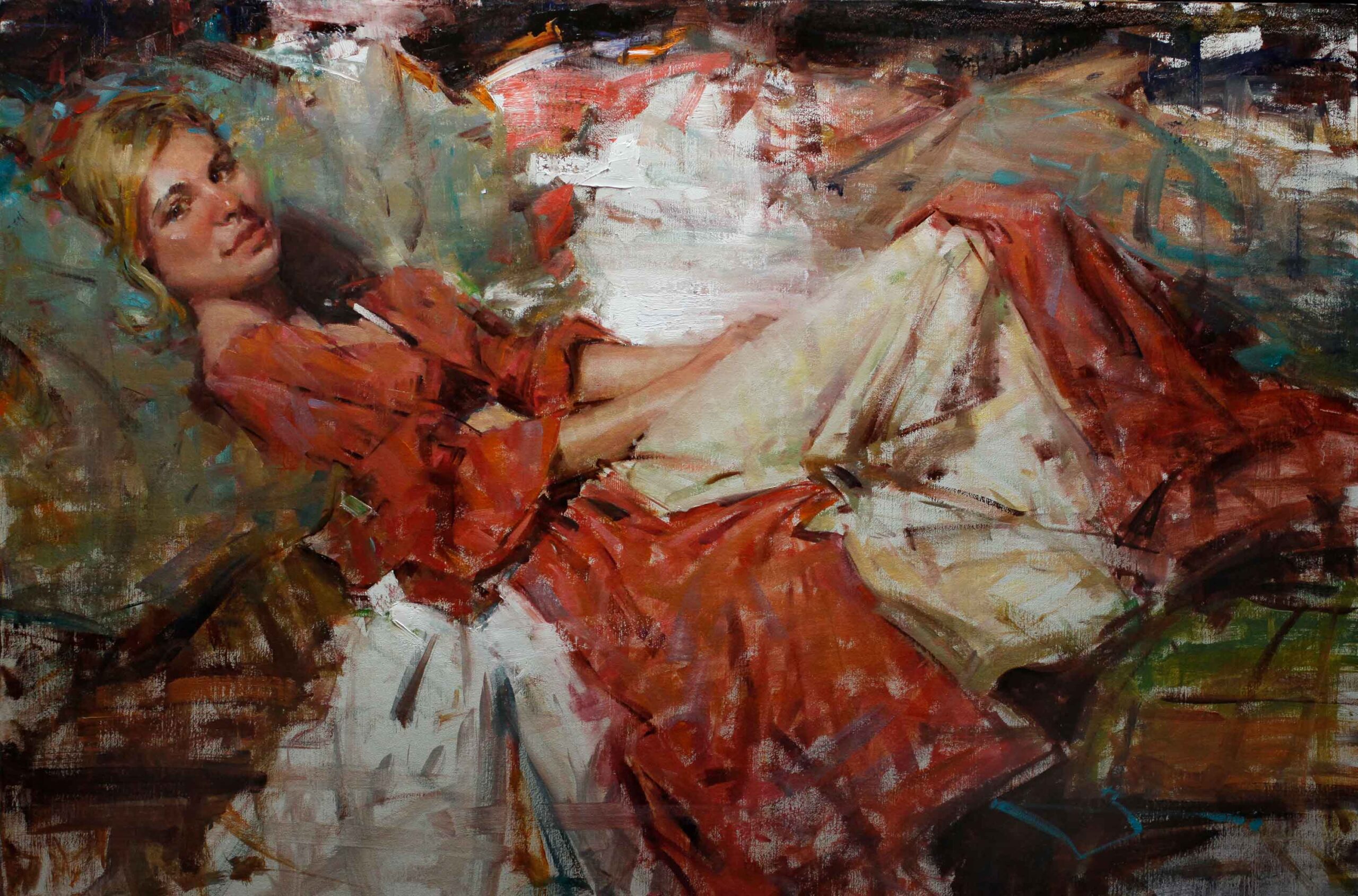
Finding the “active” and “passive” passages of your subject is probably the most difficult “firefly” to describe. The easiest way to explain this phenomenon is when viewing the nude figure. It is especially easy to see when the body twists, or bends. Where the muscles are bearing weight, they will become taut and full to keep the model in balance. This is known as the active side. On the opposing side you will find the muscles becoming more relaxed and stretched to allow for the activity of the muscles opposite them. This is known as the passive side.
In the weight-bearing areas you will find activity—there will be sharper angles, more pronounced shadow shapes, more tension. Folds and creases in the skin occur around where the muscles are tight and where the form bends—just like the folds in fabric where it is cinched.
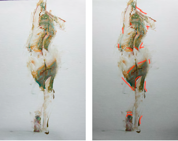
All of these details act as fireflies to draw our attention, and this is also where I find the negative space to be the most interesting. In the passive areas the form will appear softer, with more gentle, longer curves. It is in these areas that one can decide to loosen an edge, or have the form meld with the background. It is also in these areas that I like to “edit” out unnecessary information. The old adage “Less is more” is a concept to keep in mind. Allow room for the viewer to “fill in” areas of the painting. There’s no need to spell everything out for them—they’re smarter than you may think!
Color
I have a theory on color: it doesn’t matter! My main focus when approaching a painting is not to capture the subject exactly as I see it. I am more concerned with creating a design for the painting than I am with getting the exact color temperature hitting my subject. By approaching a painting from an abstract point of view, the gesture and rhythm become the main focus. The subjects in my paintings are usually human beings, but when designing a painting, the subject could be anything. When approaching a painting in this way, one is less concerned with capturing the likeness of the subject and is instead more focused on playing with the color harmonies.
I remember a day back in art school (I’m surprised I can remember back that far!) when I had a huge mental block. As I looked between the model and the colors on my palette, I could not for the life of me figure out what colors to mix to capture her flesh tones. As I tell students now, “Just put something down!” Why stand there wasting time, when you will be able to judge immediately whether the color (or value) you just put down will work for the painting or not? It was out of this frustration of trying to figure out the exact color I was seeing, that I decided to use some “funky” colors to loosen up.
I find now that I will use bright blues, greens and pinks in the early stages of the painting to keep me from over-thinking the color issue. I usually place these bright color notes in the areas where my “fireflies” are, thus also keeping me focused on the overall design, and where I want to lead my viewer’s eye through the painting.
My final thoughts on color—for now—are that as long as the color is in the right value relationship (in the shadow, or the light), then it doesn’t matter if it is “correct.” As an artist, you’re the boss. Does the color fit within the boundaries you have set for the painting? If it does, then nobody can tell you that you’re wrong. If it works, it works.
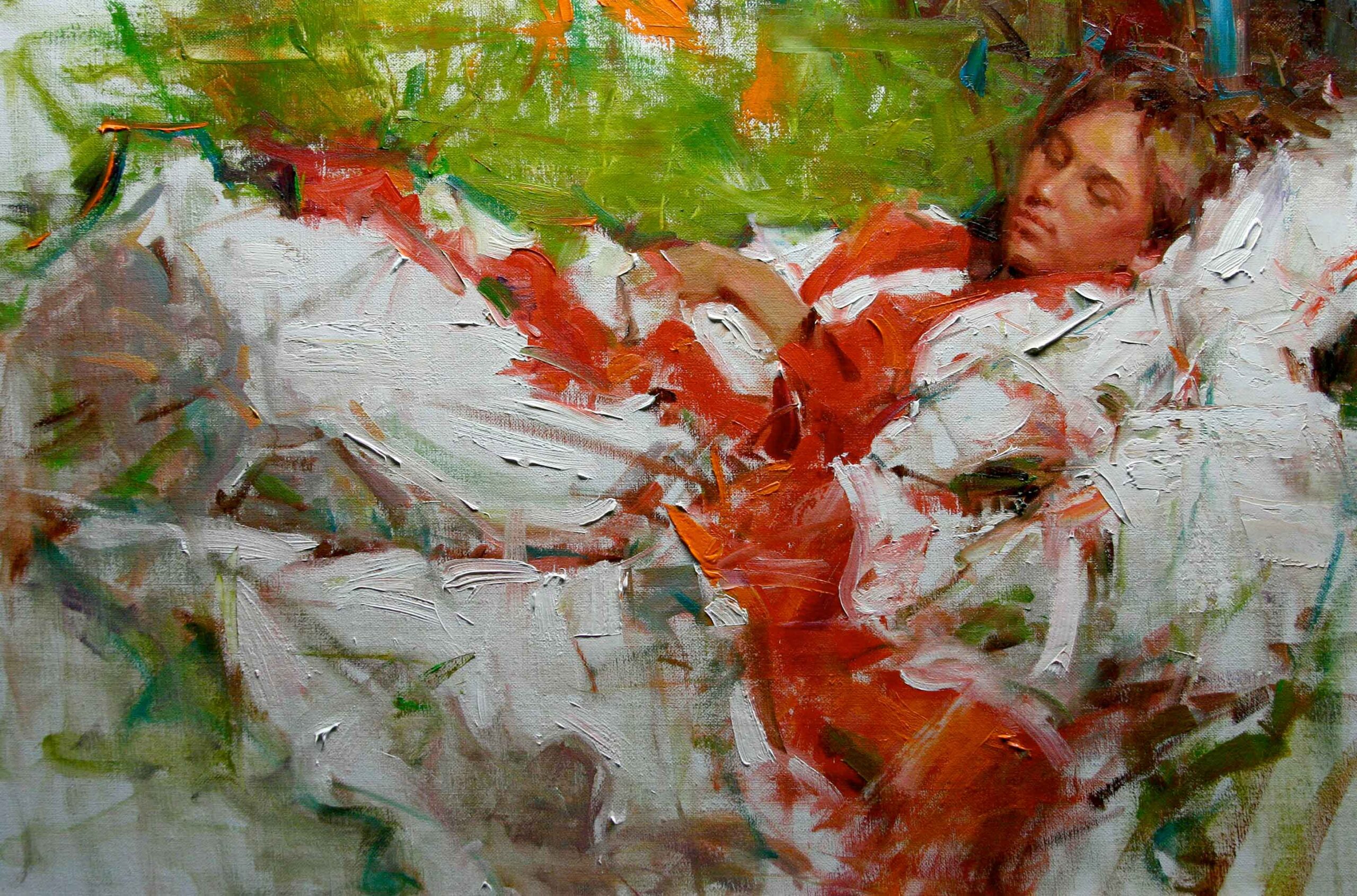
Texture
The last form of fireflies I see when creating a painting is in the use of texture. The relationship of thin areas (where the canvas is showing through), against thick bold paint applications creates another example of contrasts to catch our eye’s attention. For me this relationship is just as important as those I already mentioned. Our eye tends to go to the bold, thickly painted areas. There may be only a few of these passages. But in the same way that small areas of bright color will leave the viewer with the impression that the painting was colorful, the viewer here is left remembering the whole painting as deliciously thick!
Even as our eye tends to gravitate to the textured areas, I find I usually paint the skin of the model (especially women, so as to appear soft), with thinner applications, yet surround those areas with the bolder paint. These juxtaposed areas will catch the viewer’s eye, and lead them through the painting. For me, the relationship between different textures in a painting draws me in more strongly than a painting where the surface texture is consistent.
So, as I sit and think back on my conversation with Carolyn, I have to stop and say “Thank you.” I don’t know if this is actually the way she thinks, but by allowing me to figure out what works for me, she gave me a great gift of discovery—the ability to grow, and learn for myself! What I have learned is that designers no longer have to be allocated to the
“commercial art field.” As “fine artists” we should not ignore, but rather explore this role in our own paintings.
To all you designers out there—let the firefly be your guide.
About Kevin Beilfuss
Kevin lives near Chicago with his wife Janice, and son Drew. To view more of his work, see gallery representation, and workshop schedule, visit: kevinbeilfuss.com.
Become a Realism Today Ambassador for the chance to see your work featured in our newsletter, on our social media, and on this site.

”")
