


On painting from photos > In this guest blog post, Chantel Barber shares a step-by-step demo of how she used reference photos and creative freedom to recreate a commissioned portrait painting.
Add movement, color, brushwork, light, and story into your paintings with Chantel’s video workshop, “Painting From Photos.”
Painting From Photos > How I Painted a New Version of an Old Commission
BY CHANTEL BARBER
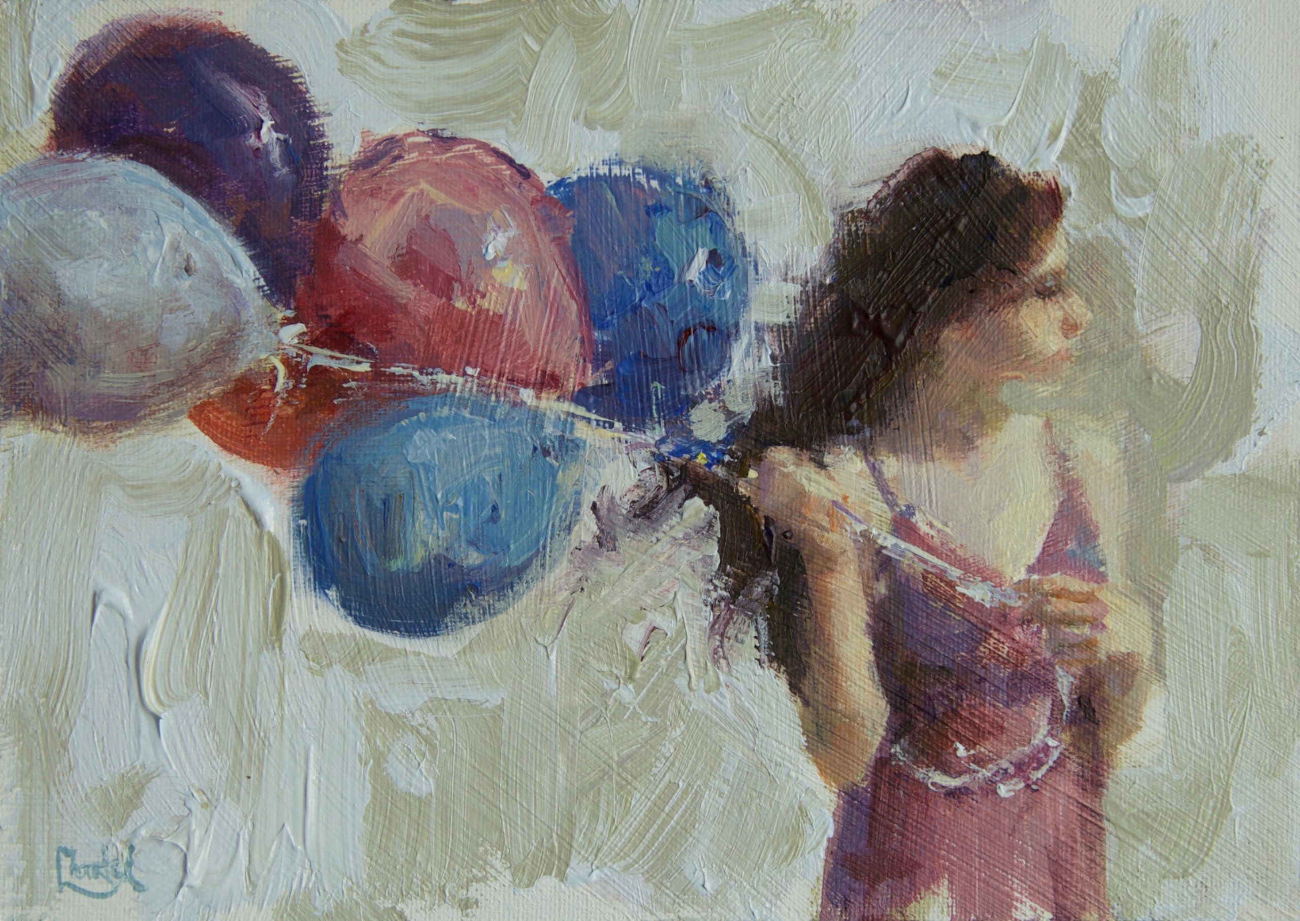
One of my favorite types of commissioned work is when a client tells me how much they love an earlier work and asks if I would be willing to recreate it (with artistic license of course) for them (typically) in a larger format. This is how “Into the Wind” came about. It is inspired by “Holding On” a smaller 5×7 painting done a few years ago. My client loved that piece and asked if I could create something similar in a 12×16 format.
I prefer being involved with the creative process from the start – in both working from life or taking photographs using a Cannon EOS 5D Mark II. To paint this commission, I had plenty of reference photos (taken over a two-hour time period with a model), along with the original small painting to use as inspiration.
Taking and working from my own photos is so important, and not just for copyright reasons. Being on the spot enables me to remember how the light looked, what colors were intense and which ones were muted, and how the values were reading – all important when it comes time to create a painting. Working directly from images on a hi-res computer screen allows me to see colors in the shadows, along with their temperature shifts. I believe temperature shifts are an important way of rendering volume and space.
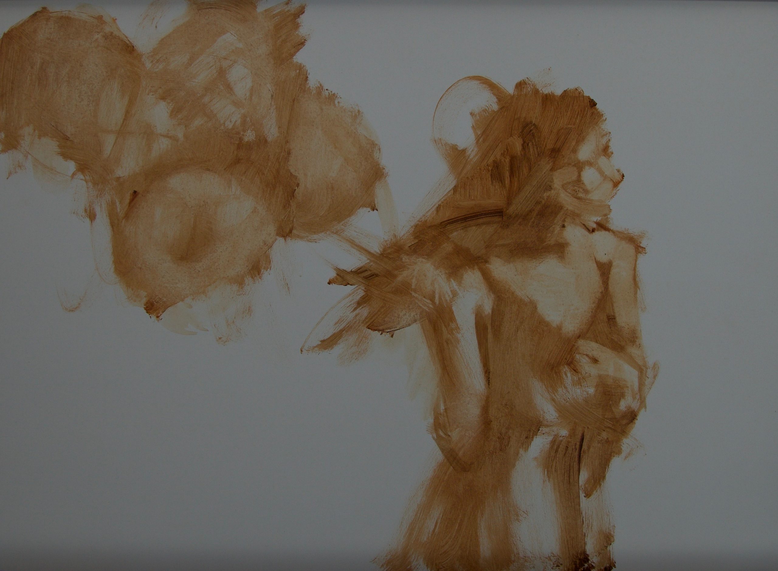
When beginning the painting, I closed my eyes and reminisced about the day I took the photos of my model. There was a strong wind blowing, creating a beautifully lyrical rhythm between the figure and the balloons. Even in the early block-in stage it was important to capture that essence. So, after a few moments of dreaming, I opened my eyes and began to paint the story I wanted to tell.
Big masses (shapes) were used to start developing the body, along with representing the angles of the arms and torso. Shapes were used to indicate the features and planes of the head and balloons. Once I was satisfied that the angles felt right and the overall body was believable, I could move forward.
In these early stages of painting I often think of a favorite quote: “Too much reality in a picture is always a disappointment to the imaginative soul. We love suggestion and not hard facts. A picture should be music in form and color, with the subject matter the vehicle.” – John F. Carlson (found in Carlson’s Guide to Landscape Painting, page 118.)
It is important to remember that a photograph is a reference or ‘model’ – it inspires the painting only. As an artist, I am not copying photos. Keep in mind that a camera sees the world through a single lens, as if one eye was covered, therefore losing the critical element of depth perception. A camera’s world is flat. One way to produce paintings that are more spontaneous and filled with depth is to simplify (not rely on) photographic details. Think about the way our eyes see – not everything in our vision is highly detailed. That is one reason why I always look for new ways to crop reference photos and recompose subject matter into an interesting composition.
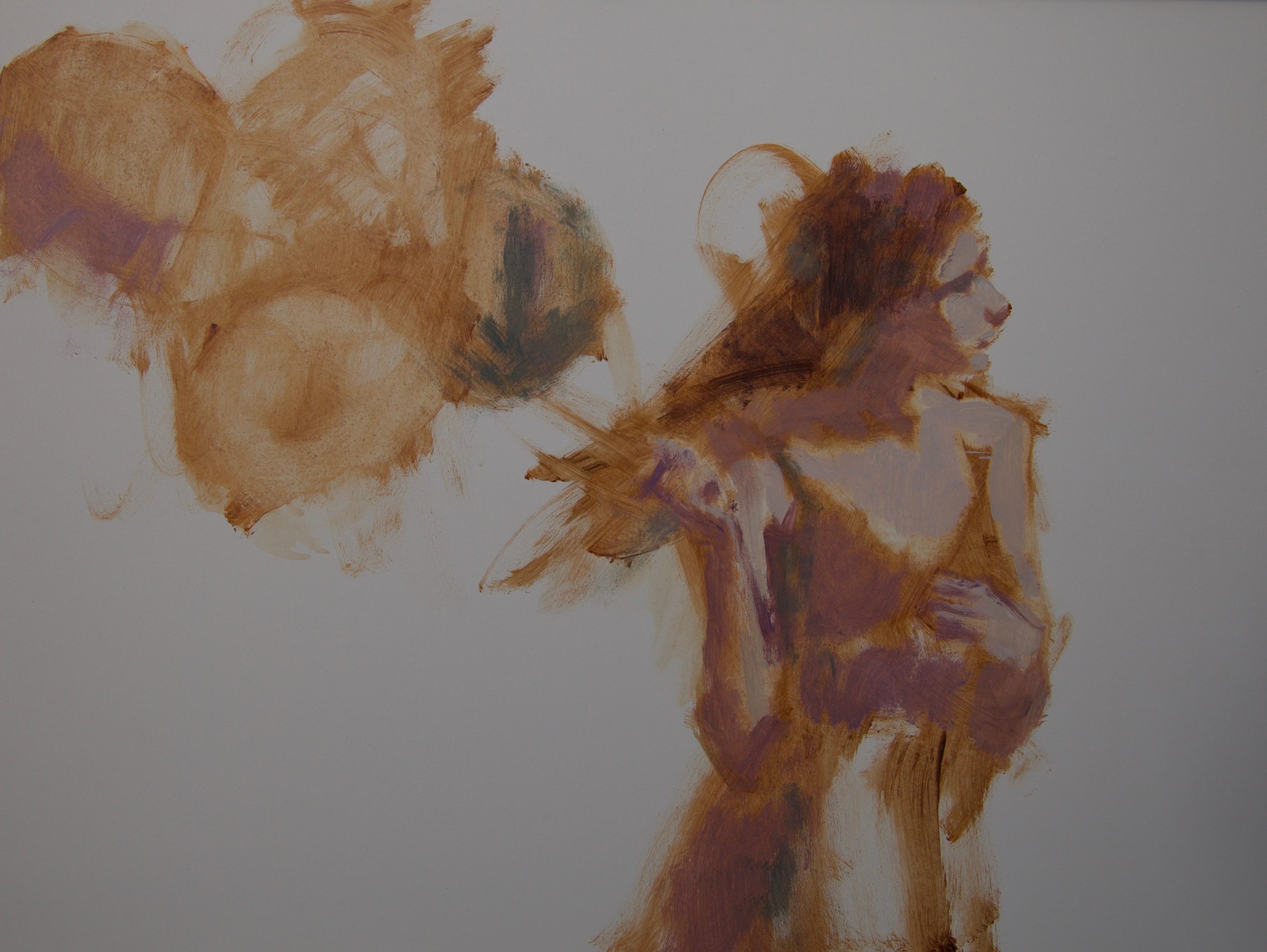
Keeping things open and flexible for as long as possible makes sure my focus stays on the big shapes for the moment and gives consideration to how they were relating to each other. Creating any painting is largely about copying shapes. Squinting often helped in seeing true shapes, values, and edges, along with simplifying the block-in process. Every stroke of paint that was laid down continued to refine the drawing. Working the painting all over kept all aspects developing at a similar pace and helped with maintaining color harmony.
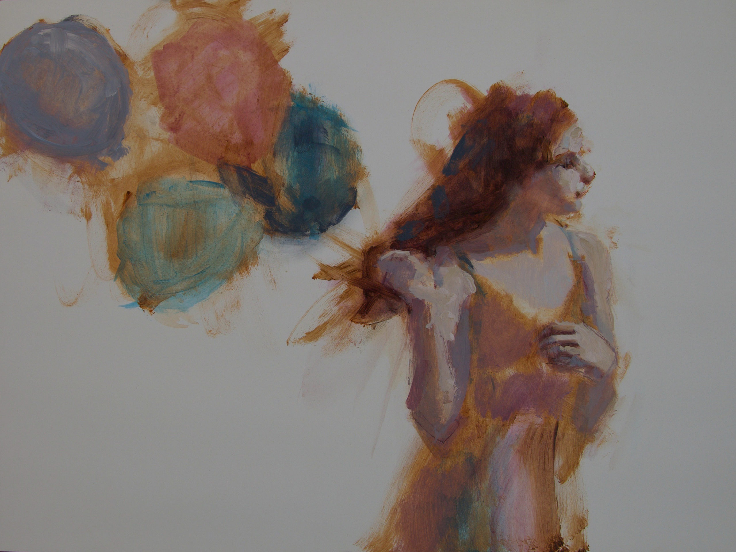
Even with all my good intentions, I realized I had allowed her left hand to become too detailed too quickly, and its placement felt awkward. I restated it again more simply so that it could be reworked without looking overworked. It was at this point that a slight misgiving began to nag at my subconscious. Maybe this painting wasn’t going to progress along almost effortlessly, looking as if it just appeared on the panel.
For me, it is a joy creating a painting where every stroke laid down looks beautiful and is in just the right spot. But sometimes a painting can only be created through a hair-pulling sort of ordeal. And though I may not like admitting it, those are the times when I emerge a better artist.
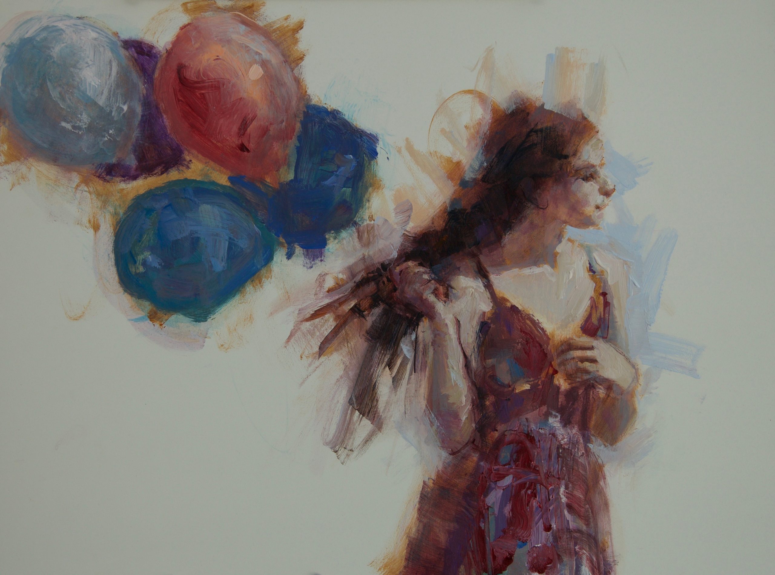
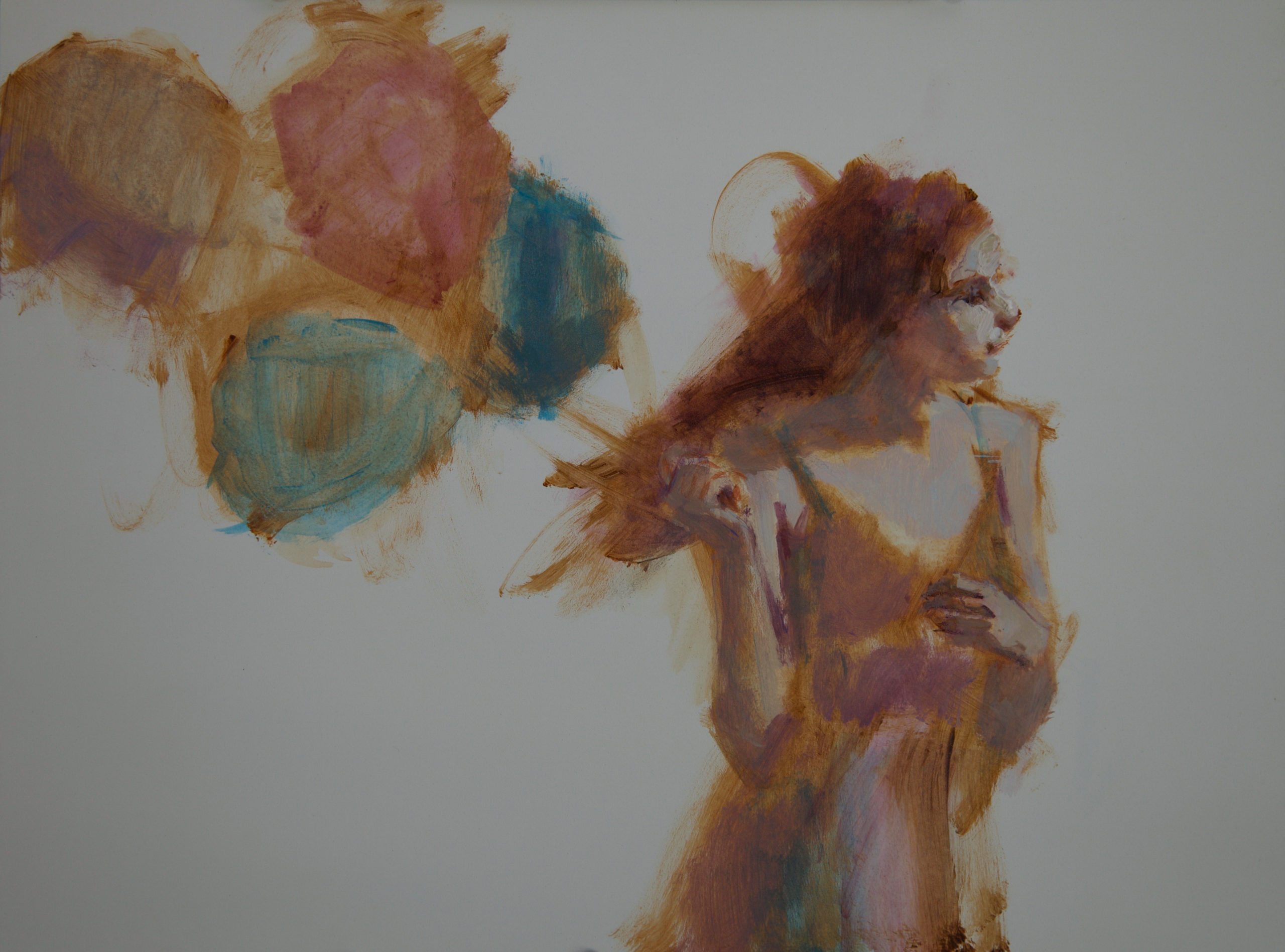
As I continued working on the painting, I had another moment of reservation about how easily it was all going to come into being. Even though I had already simplified and restated the mass of her left hand, when I had started developing it anew, it became a problem again. Not only the hand, but the wrist and arm still felt awkward. Though I was pleased with how her dress was coming along, I did not like the value pattern created by the balloons that had begun to take shape.
I decided it was time for lightly sanding down the areas that weren’t working. One thing that is so fabulous about many of the surfaces I work on, is that they stand up to sanding with a fine grit sanding sponge. When the sanding was complete, it had given some great passages of texture that could be incorporated into fabulous edge work.
But after several more hours of working, I knew I was now smack-dab in the middle of a painting where my hair was going to be pulled in all directions before it was resolved. So much had become overworked. The balloons felt like they were weighing her down instead of lifting her into the wind. Even the blue notes in the sky had become heavy and were overpowering the figure. It seemed that there were too many equally intense and bright colors – which tends to deaden the viewer’s eye. I had overcorrected her chin, thereby losing the beautiful rhythm between the tilt of her head, neck, and shoulder that was achieved early on.
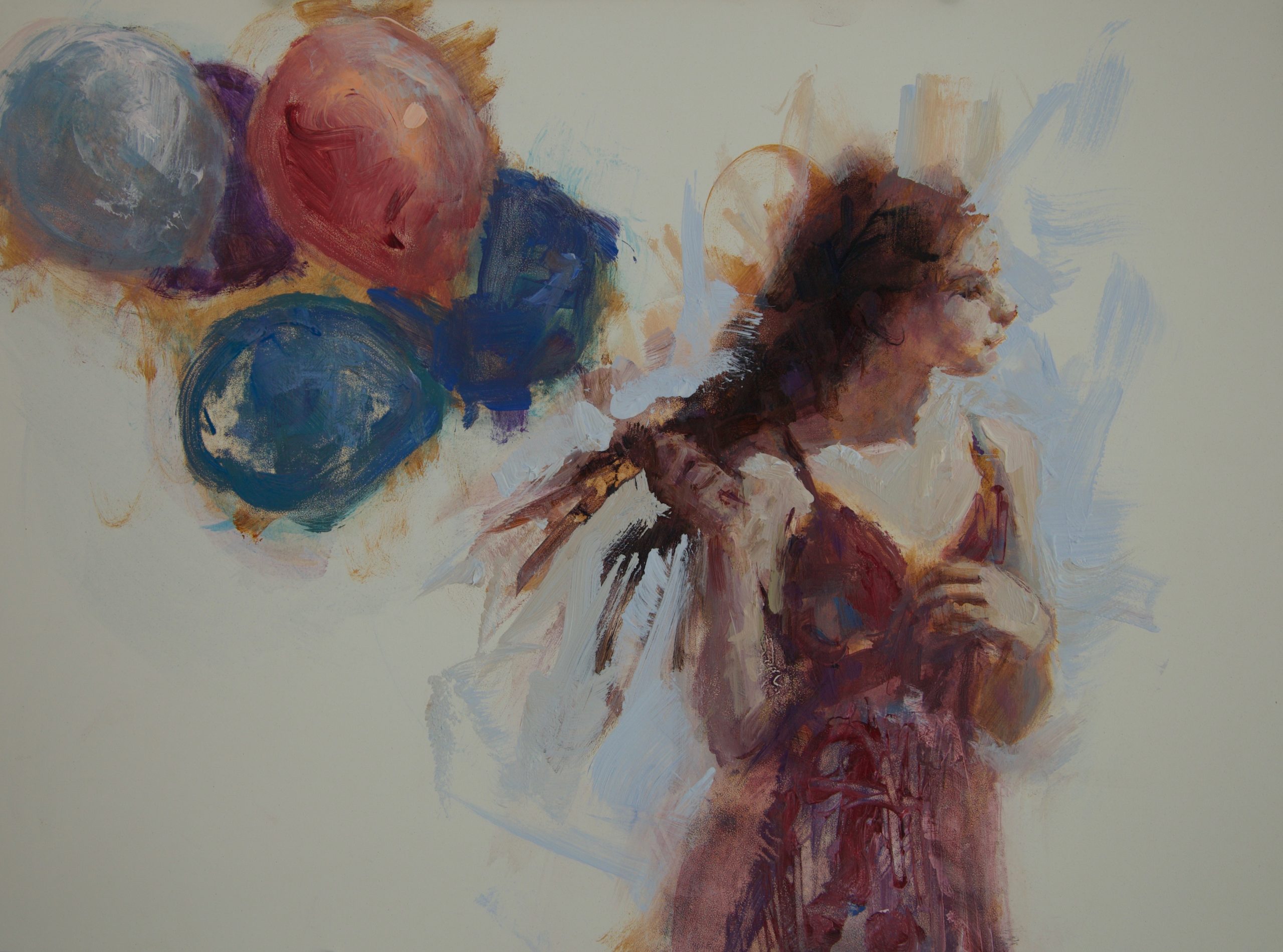
I had to make a choice. Did I want to start again, or could I breathe new life into what I had in front of me? I took the painting and sanded off all of the areas that were offensive, leaving just enough so I could rebuild it again, and took a long coffee break. Did I mention the chocolate I ate with the coffee?
Fortunately, I had documented the earlier stages of the painting with photographs. I went back and studied them. I decided that it was after I had taken the fourth picture in my process shots that the painting had gone wrong. I put this image up on my computer screen, along with the original small painting next to it, and began making the necessary adjustments to recover the effects I had lost.
Using both a mirror and value viewer to aid me, I recomposed the balloons, and her profile, avoiding my earlier mistakes. I found that because of all the sanding I had done, I had even more great passages of texture that could be incorporated into fabulous edgework and mark-making.
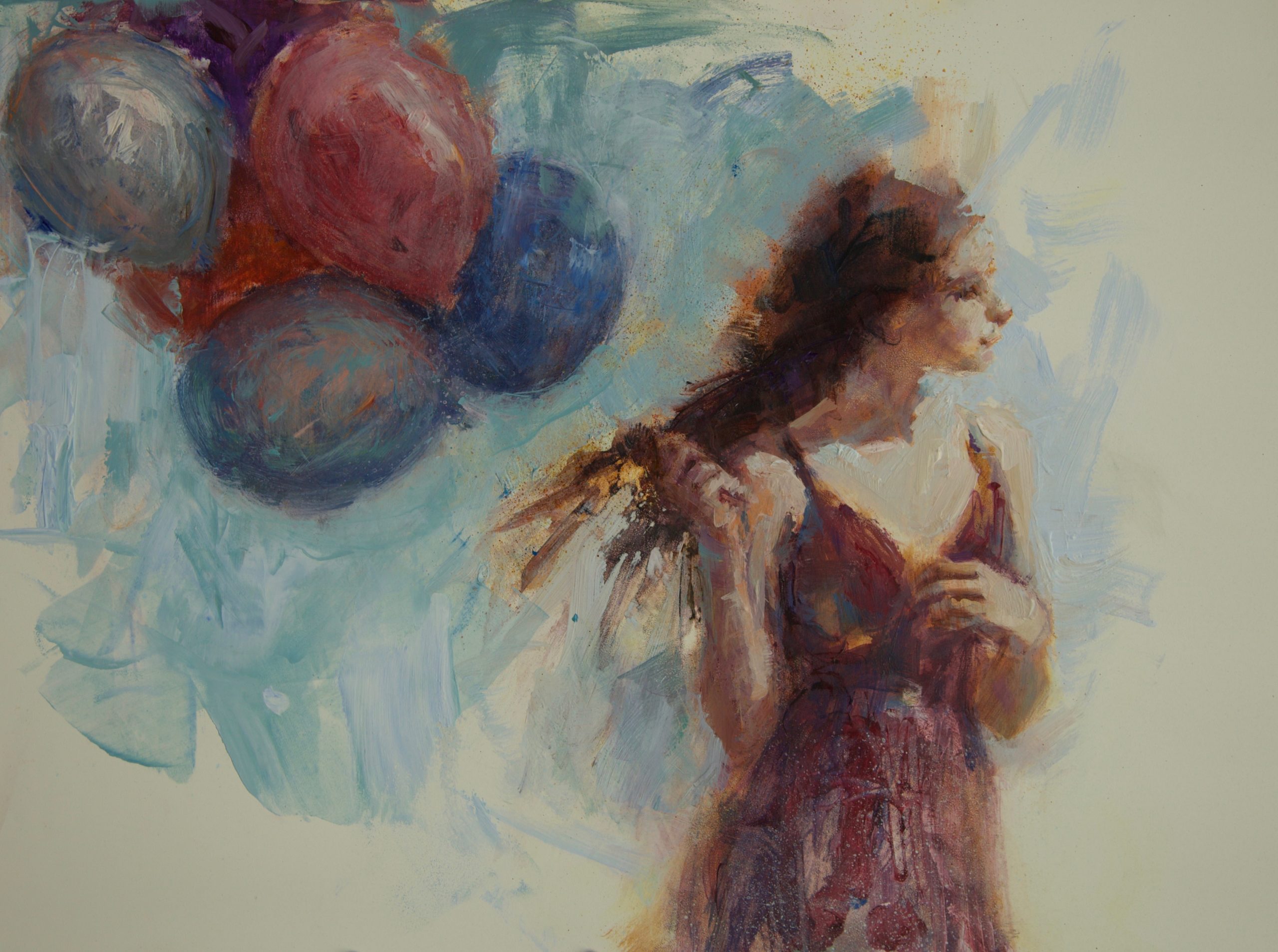
Eliminating some of the intense colors in the balloons and background, made the other colors really sing! Now I could add finishing details in just the right places, still leaving room for the viewer’s imagination to run free. In the end, all of the sanding, wiping off of paint, and reworking of passages, paid off. The effects achieved were beautiful and the painting looked effortless. You would think the entire piece had only been a joy to paint. I loved the finished product – which always is a prerequisite to my signature! It is a great way to mark the end.
Realism Today covers artists and products we think you’ll love. Linked products are independently selected and linked to for your convenience. If you buy something using a link on this page, Streamline Publishing may receive a small share of that sale. This article is sponsored by the PaintTube Video Workshop, “Chantel Barber: Painting from Photos“
.


”")
