


On painting composition > Through careful development of design, Zhaoming Wu takes the subject to a higher level and develops the conversion from idea to visual usability.
By Zhaoming Wu
zhaomingwu.com
Why should I draw with lines? Because it’s a way of carrying the emotions.
Why should I paint with the point? Because it’s the feeling of loneliness.
Why should I build with planes? Because the world needs to be more tolerant.
Using composition, value, shape, color, and edges to express many moods—those found in the subjects and in me.
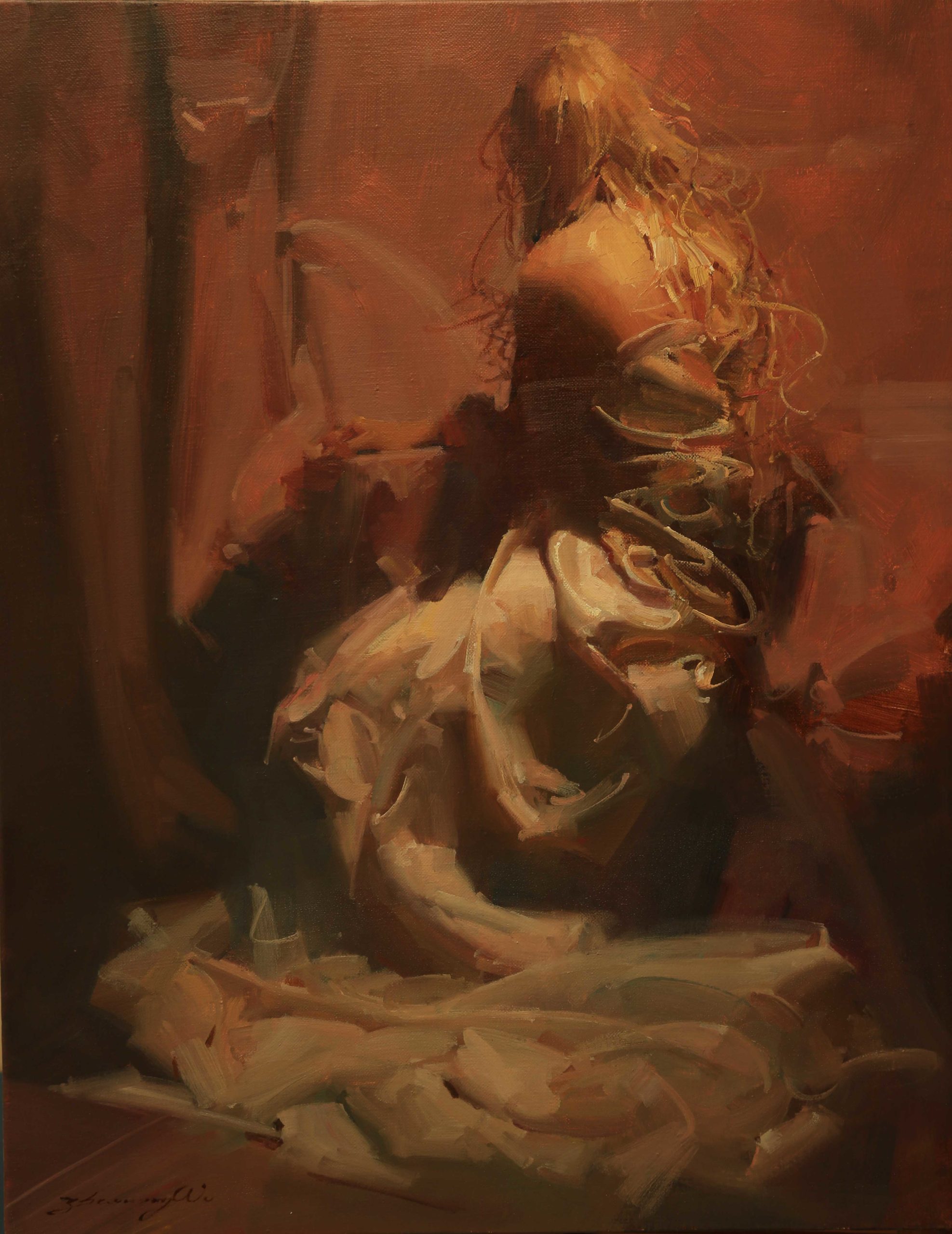
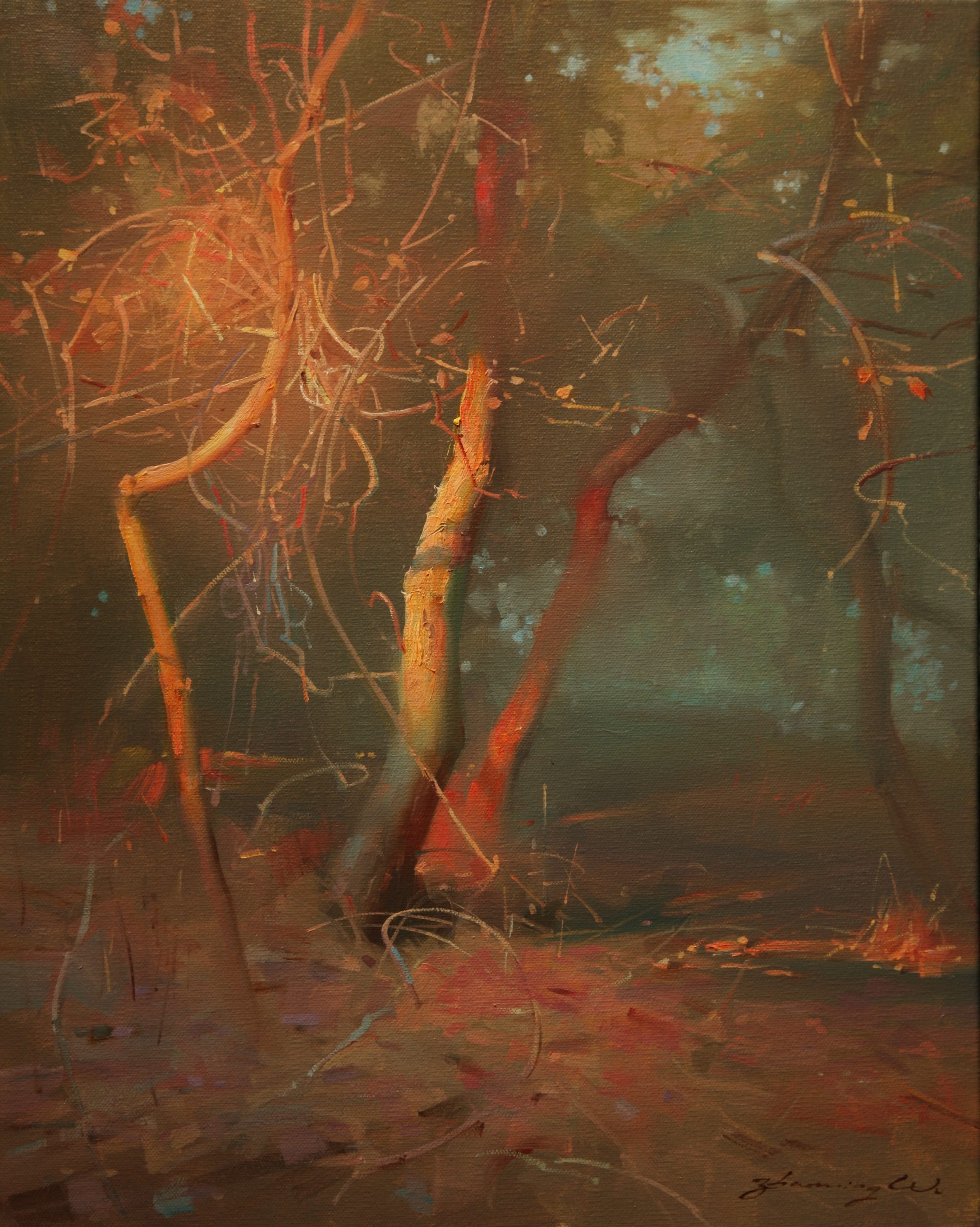
From hills drenched in sunlight to a lovely model swathed in cascading folds of material, I find constant inspiration in the dramatic shapes that occur in nature and in the human figure. But the subjects I find are really just the starting point, the essential building blocks that I arrange, adjust, and change to suit the feeling I am after. Through careful development of design, I take the subject to a higher level and develop the conversion from idea to visual usability.
Use Line, Point and Shape to Activate the Visual Field in a Painting Composition
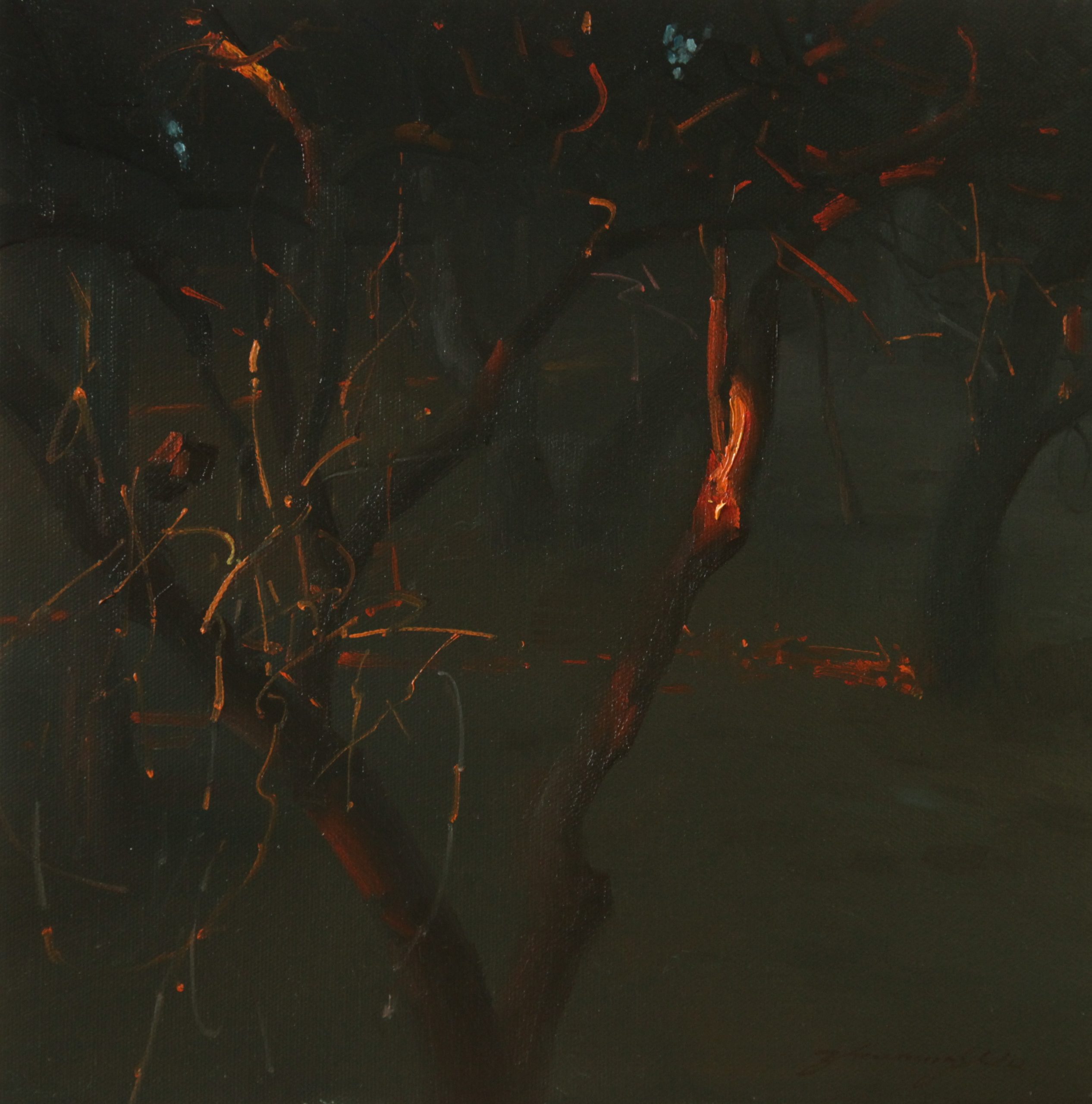
Although my paintings feel contemporary, the design principles actually date back to traditional Chinese painting and calligraphy. For example, the progress of traditional Chinese calligraphy starts from the point of a Chinese brush, extends to line, and become a stroke of shape. The theory of modern design already exists in Chinese calligraphy; every stroke is designing. One of the first steps in composing a new painting is to determine what I call the point and the line and the shape.
A point is the smallest and most basic element—it could appear as a leaf, a piece of rock, a bright spot, a very small shadow, etc., in the nature or the subject of painting. These can vary in size, value, regularity or irregularity, and can be used alone or as a unit in a group which forms a line or shape in the image. Points can be used to form a value or pattern—placed close together they form a darker value; further apart they form a lighter value.
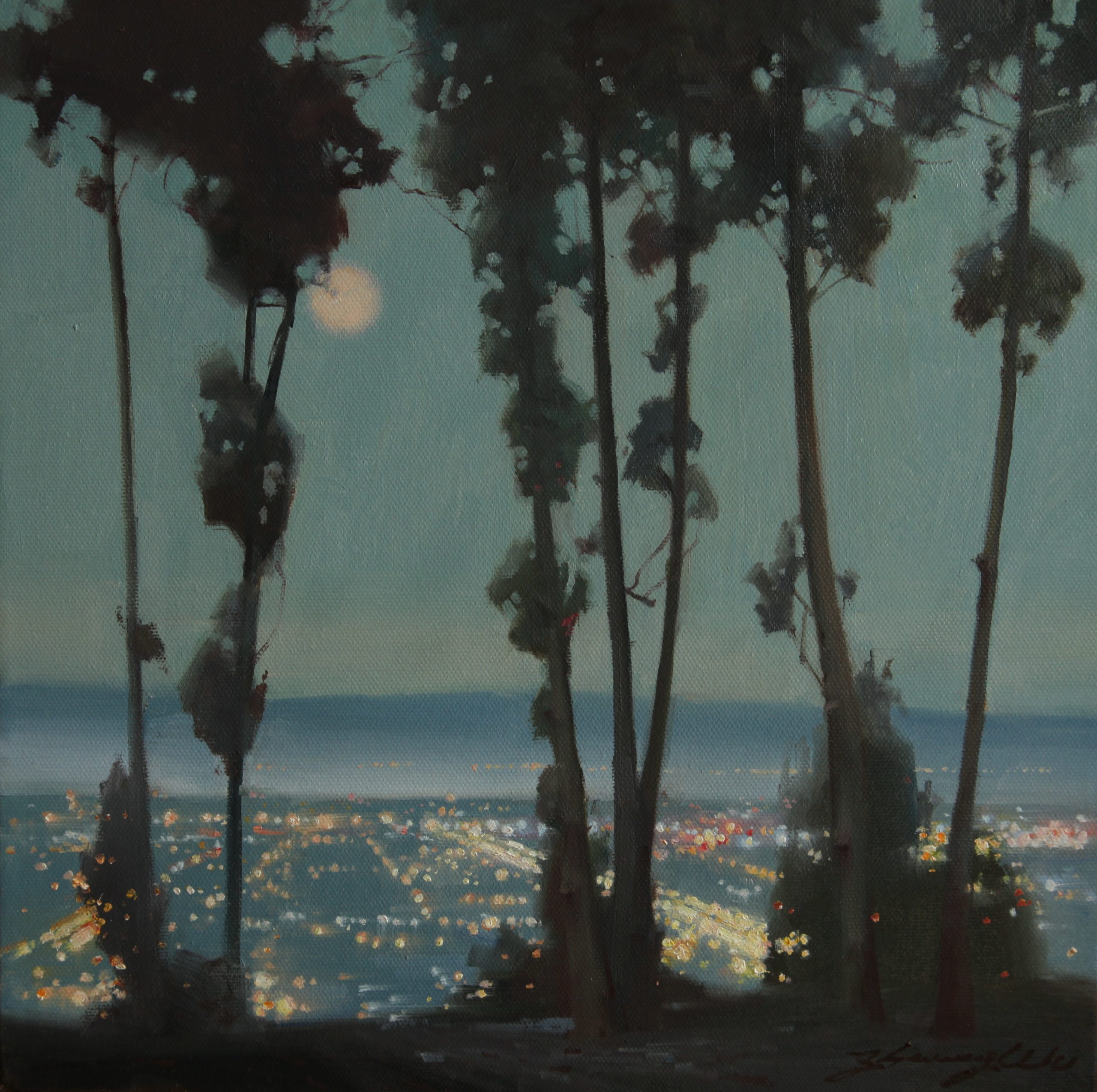
A line can be straight, curved, or organic—it could appear as the branch of a tree, a folded piece of cloth or edge of a dress, and can vary in thickness and value. They can be very important in providing directional movement in the work, leading the eye through the image. Together they can form shapes, patterns, and textures, and can help lead the eye back into space in a landscape or other image. They can also form empty or filled shapes.
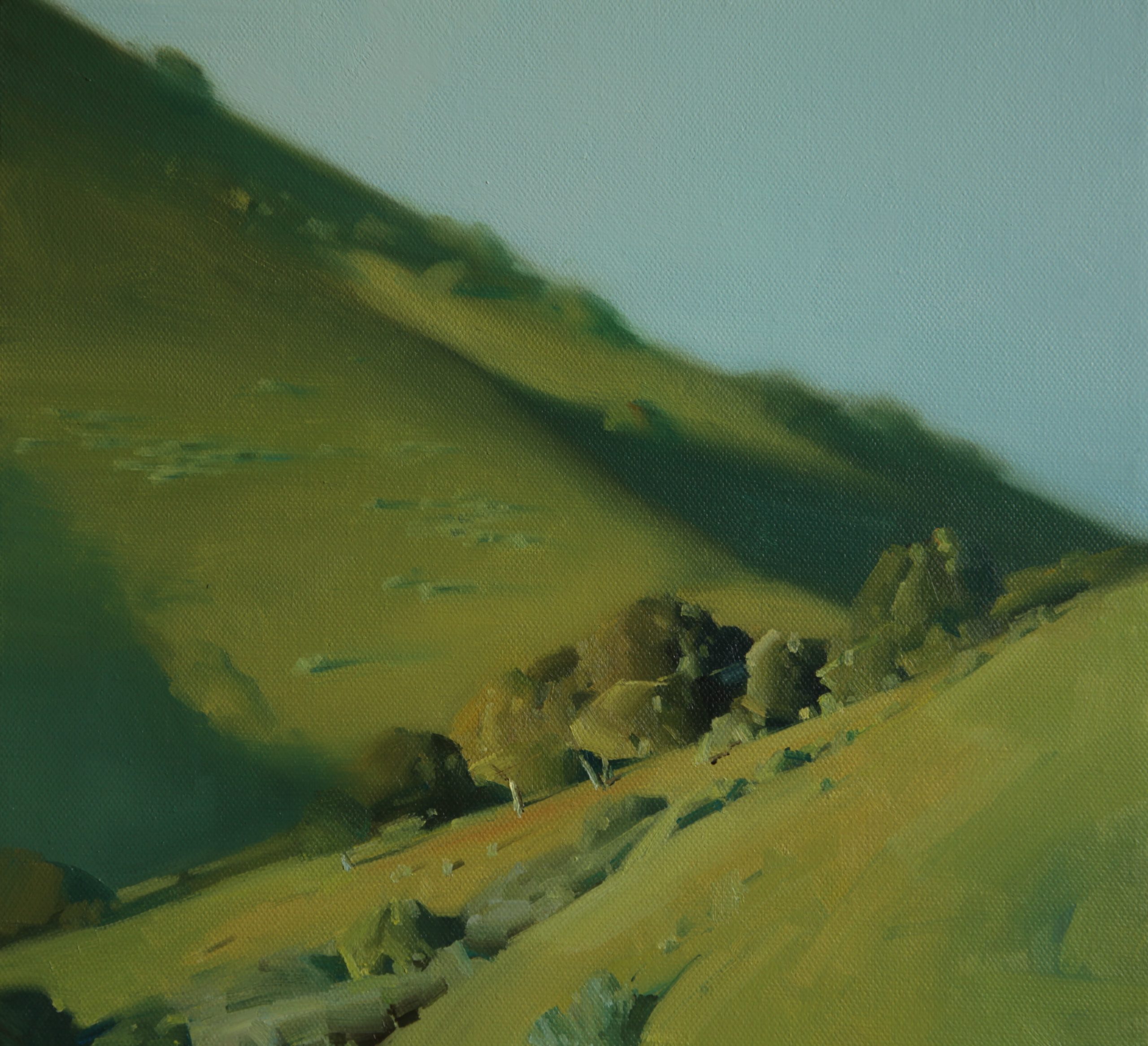
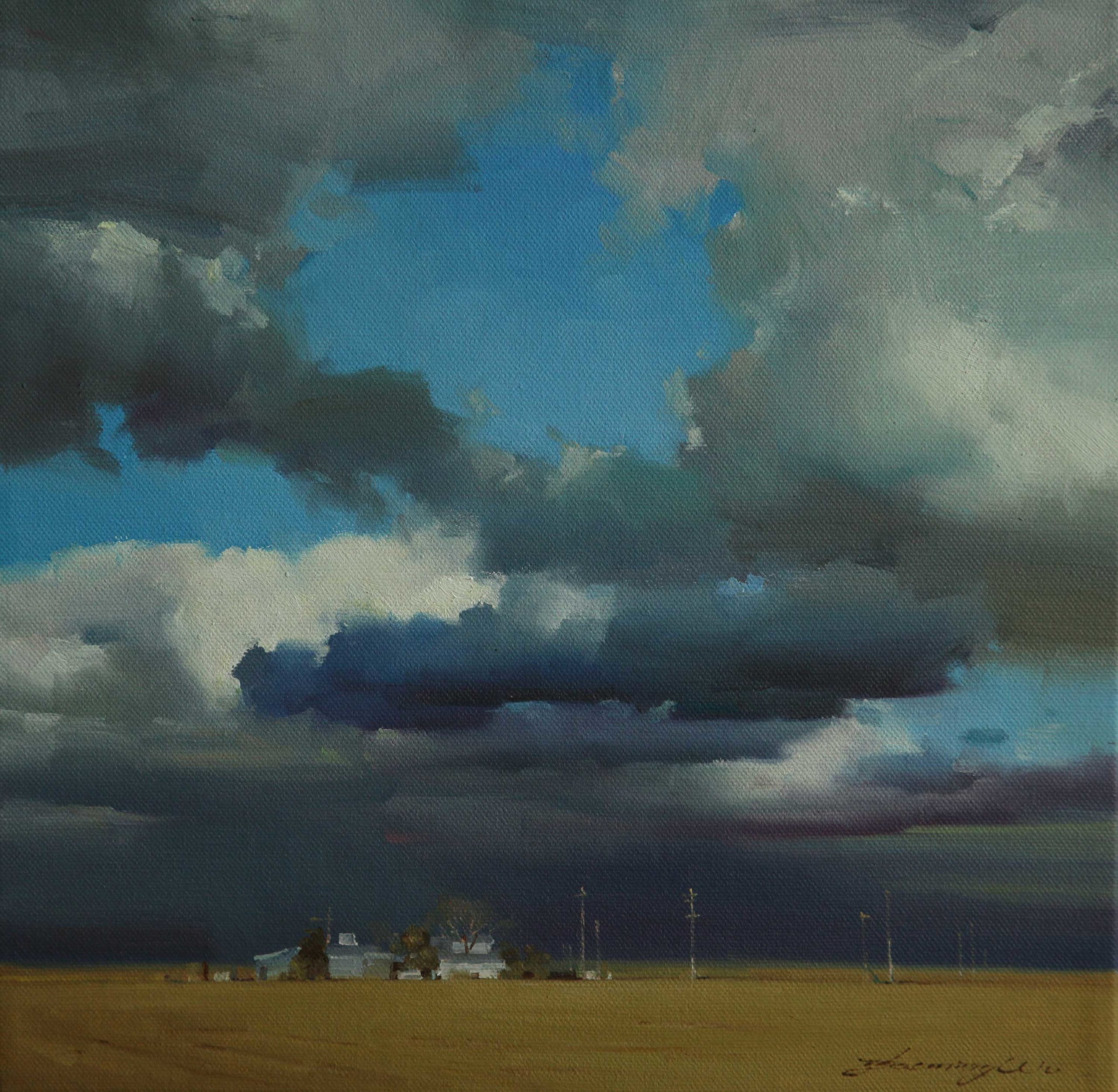
Shapes or masses can be organic or geometric in nature, such as a large shadow, a wall, or a big sky, and they can be solid or empty. They can be used alone, or as units in another larger shape. They can also form patterns, and be used in the division of space in an image, and distribute the “weight” in an image. They can also vary in value or color, as well as in size, which helps to establish spatial depth. Using similar shapes can help unify a composition; varying the shapes adds variety and interest. There is an effect called counterchange, meaning areas of dark shapes on a light area, and nearby areas of light shapes on a dark area.
Although a painting can be built on two or even just one of these three elements, I prefer to build my compositions on a mixture of all three, and use different ways to organize the elements to carry the different moods.
The main design functions include leading the eye path around and through the painting, stabilizing the composition with balance and neutralizing of elements, directional movement created by elements, and considering the total space. I work this out by drawing a series of little thumbnail sketches. When I’m drawing these thumbnails, I look at the subject and ask myself, where are the lines? Where’s the point? Where are the masses, or what can I group together to make a mass? Where do I want them on the canvas?
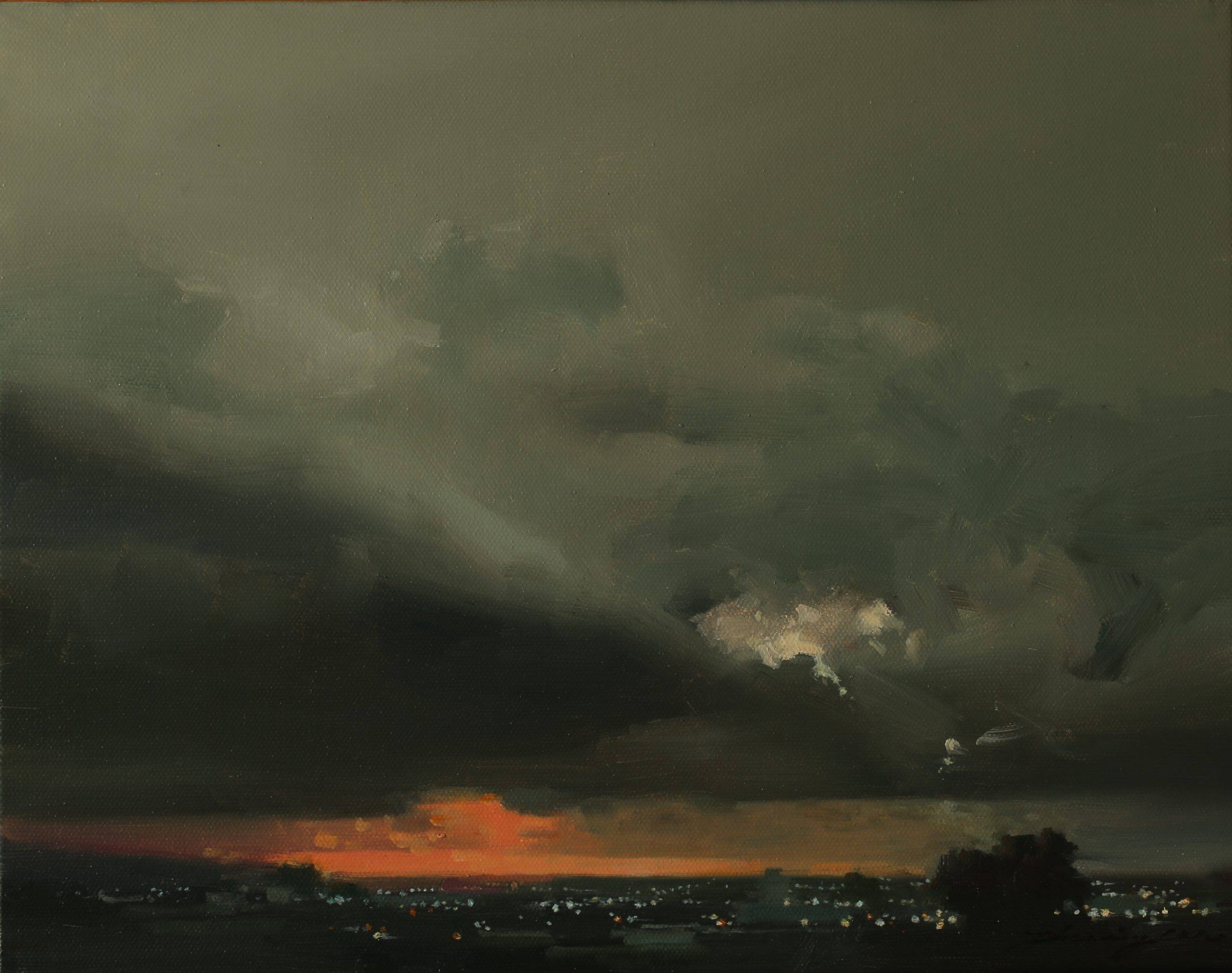
Sometimes the foundation for rhythm and movement is where the point meets the line. A strong diagonal will give the painting a quick movement and fast pace, while a more horizontal line tends to give the painting a more static feeling with more stability. The point is there to balance the line and it either stops the viewer’s eye from moving too quickly along a diagonal, or it encourages the eye to keep moving around a horizontal. I decide between the two based on the overall mood or feeling—exciting or quiet—I want the painting to be.
From there, I arrange the rest of the shapes to balance and support the rhythm I have begun to establish. In addition to creating a sense of movement and pace, I also want to use composition to give the paintings a contemporary twist. I really love traditional landscapes, but they use more horizontal formats and horizontal lines. I want to break that up and do something different and have a unique look in my paintings by bringing some abstract qualities into my landscapes. To achieve this, you should not be afraid to depart from the reality of the subject and make modifications. Using design principles, I change a lot of what I see and edit the shapes to make the composition work.
Applying Formal Qualities
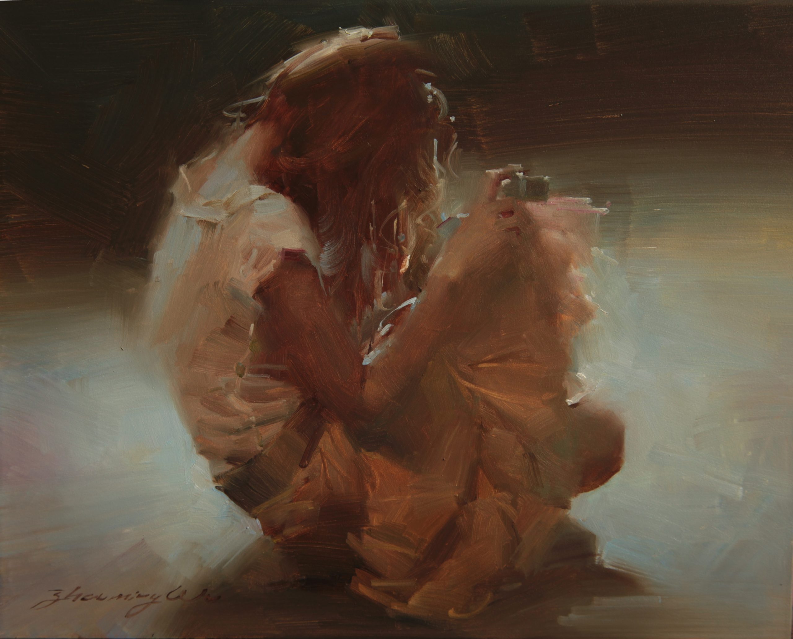
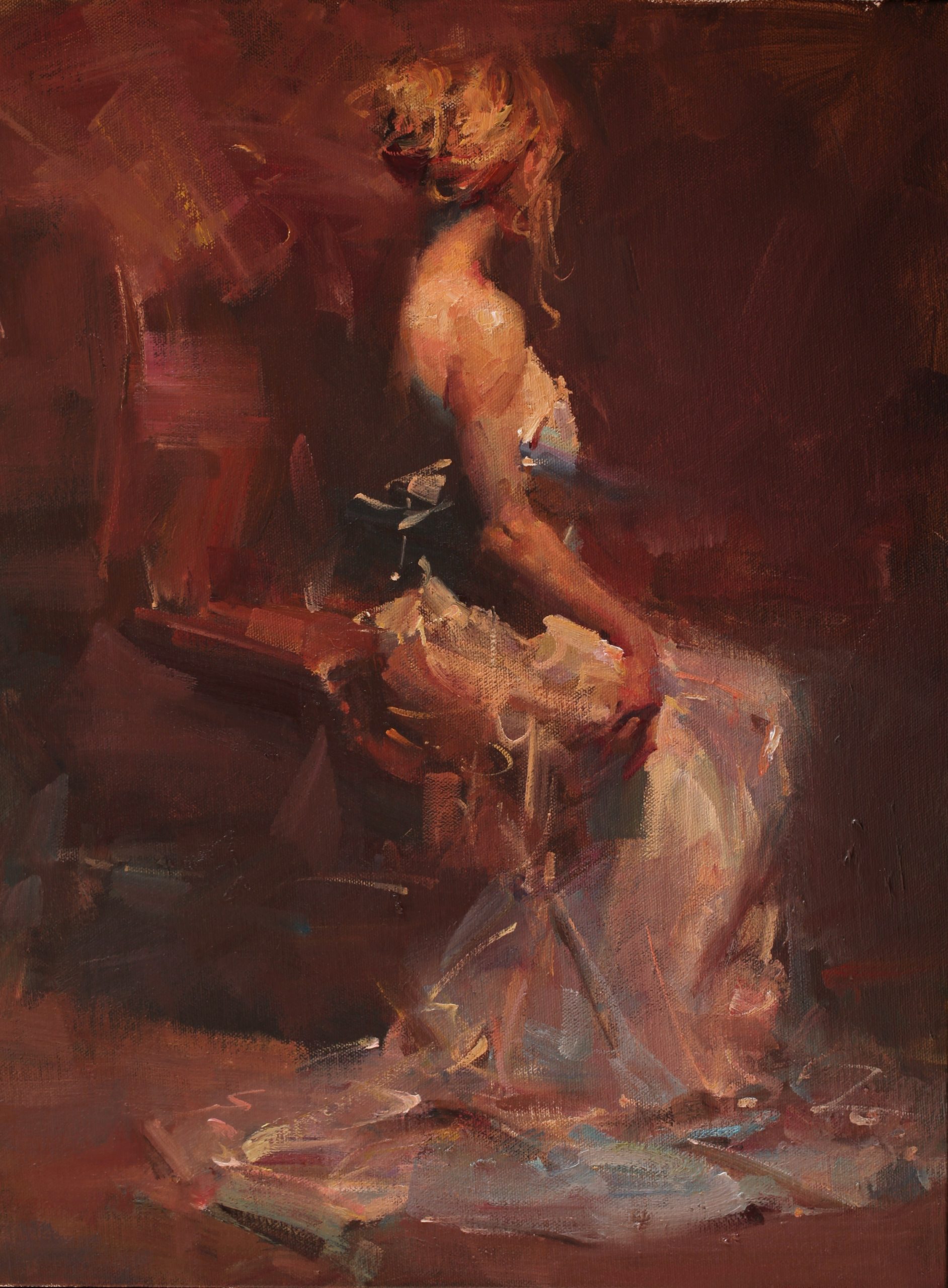
While I am arranging the shapes in the thumbnail sketches, I also work out the main values of these shapes. And again, the choices are based on mood. I always have three general groups of values—lights, middle, and darks—but I don’t use the full range of values from white to black. I let one general value dominate, depending on the feeling I want to paint. If it’s a somber or heavy painting, I plan a low-key painting with mostly dark values. If it’s a happier painting, I do a high-key painting that’s mostly light values. Whatever dominates the subject or whatever mood I want to suggest becomes the key of the painting.
The color palette also contributes to the feeling in each painting. I work with two “systems” or ways of thinking about color. One is the traditional way of working with the local colors we see as they’re affected by the light, while the other system flows from my training in graphic design and my knowledge of the psychological effects of color. So for example, if I want a quieter painting, I use the dulled-down, neutral colors that make me feel quiet. But if I want a lot of energy, I exaggerate some of the colors and make them very intense. All of the paintings begin on white canvas, with Burnt Umber or Van Dyke Brown to block in the darker values. The range of colors comes later as I build up layers, working dark to light.
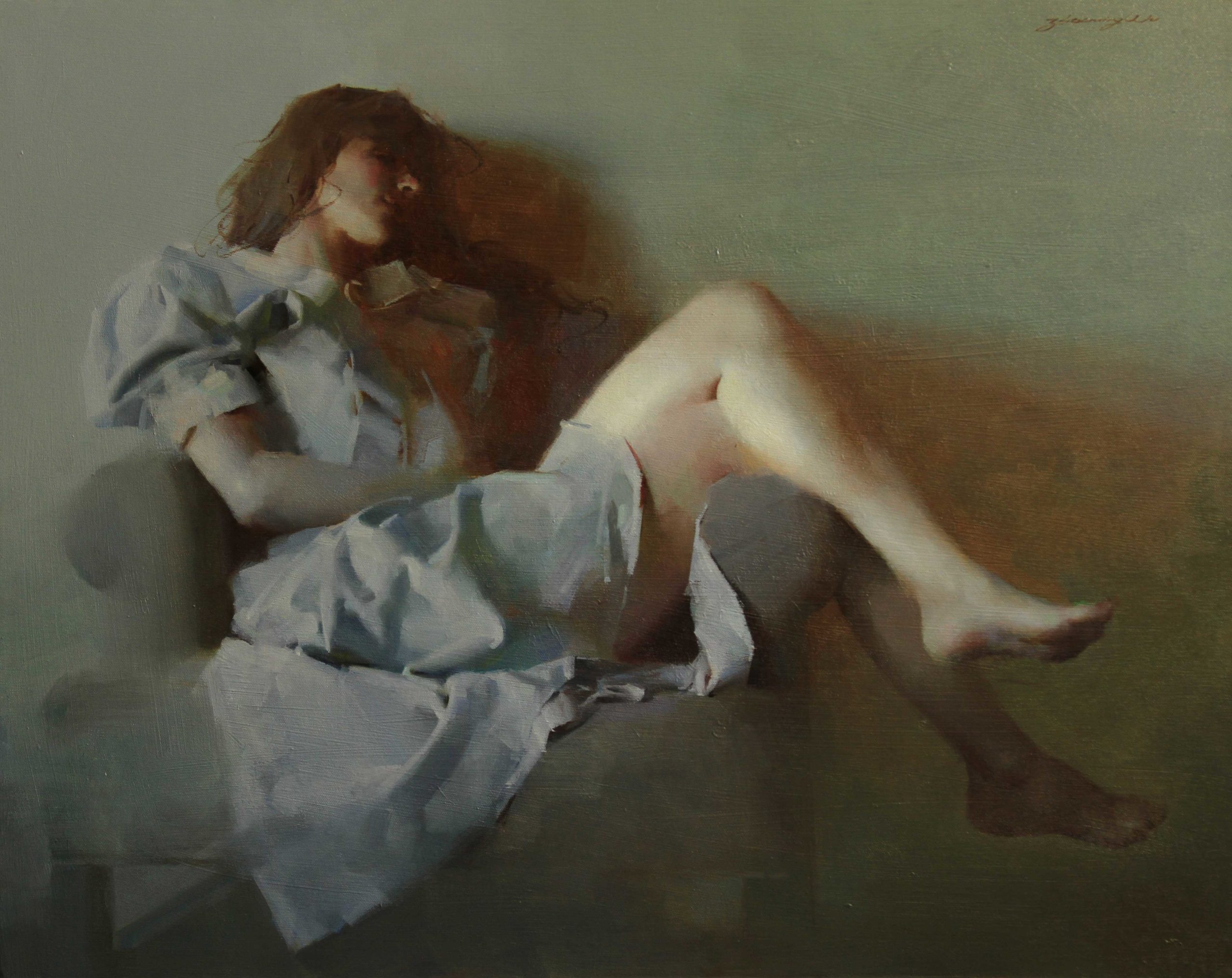
Perhaps one of the most important qualities in my work, however, is my use of brushstrokes and edges. Edge control is one of the hallmarks of my personal style. I am very sensitive to soft edges; a lot of people may be painting sharp edges but I have a greater affinity for the soft edge. I see soft edges where a lot of people would put a harder edge, but my spirit guides me to use soft edges. The edges serve another function as well: guiding your eye through a painting. I often have as many as four focal points within a painting, and edges are the means of guiding you to the most important one first and then the others. I create a path for your eyes to move across each canvas. Soft edges allow some areas to become less important, which encourages your eye to move along the eye path, and harder edges act as pauses or stops along the path.
Similarly, I use brushstrokes to direct your eye. In large, flat, less important areas, I tend to use thinner paint with little emphasis on brushstroke. But in the main focal areas, I use less medium and heavier paint, and give the brushstrokes a little more action. Regardless of the types of strokes I am making, I consistently use really big brushes—as in a 1½-inch brush for an 8 x 10-inch painting—to lay in the basic values and colors. My favorite brush is the fan brush. I can easily make a soft edge with it, but it can also be used to make a harder edge or used on its corner for fine detail . . . using a very delicate touch.
Mixing It Up
Some years ago, a few of my gallery representatives expressed frustration about how to best exhibit my paintings, which are obviously tied to abstraction, yet rich with mood and dimension. They said the work looks too contemporary next to traditional paintings, and too traditional next to the avant garde and conceptual work. I just laughed. I want my landscapes to be traditional, representational art with a modern twist. With me, it’s an ideal blend by design.
.
Become a Realism Today Ambassador for the chance to see your work featured in our newsletter, on our social media, and on this site.

”")
