


On painting a posthumous portrait > Consider these points when someone wants you to paint a loved one who has passed, and learn how to make the most of your resources. The following is part of a series that features the best artists who are teaching others how to paint through online workshops at PaintTube.tv.
How to Create a Vibrant Posthumous Portrait
BY PATRICIA WATWOOD
In my years of creating portraits, I’ve had a number of commissions to paint historical figures. Posthumous projects are quite common, as it is often after someone has passed away that his or her family and colleagues want to celebrate that person’s life and contributions. I’m going to share several of my strategies for making a dynamic and lively painting that captures the personality of the subject, even when you are working from photo references and historical material.
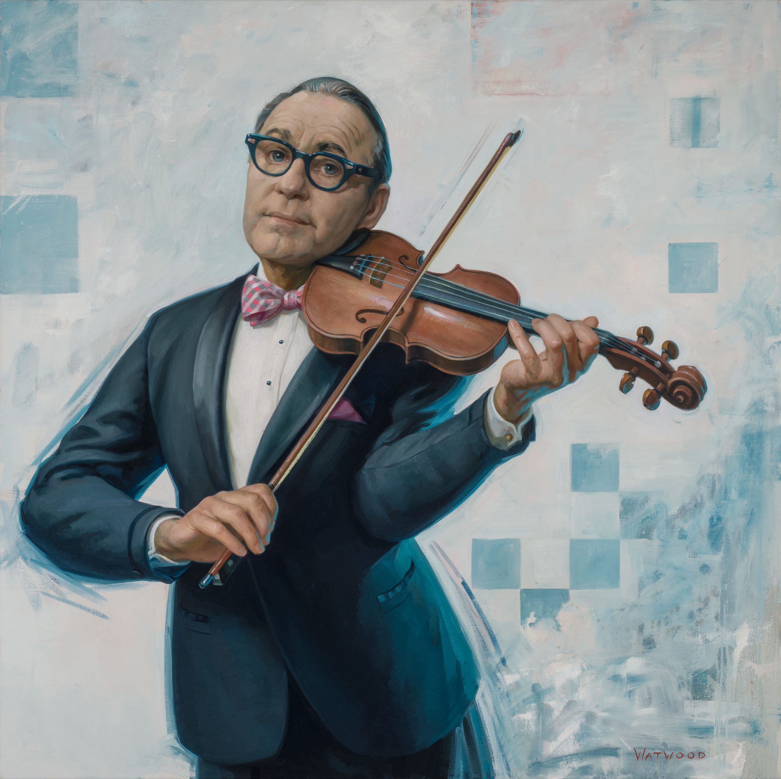
Recently, I had a commission to paint the American comedian, Jack Benny. Often, formal commissions are of some sober and serious type, like an academic or a politician.
I was excited to portray an entertainer and capture the light-hearted, dynamic energy of the mid-century American icon.
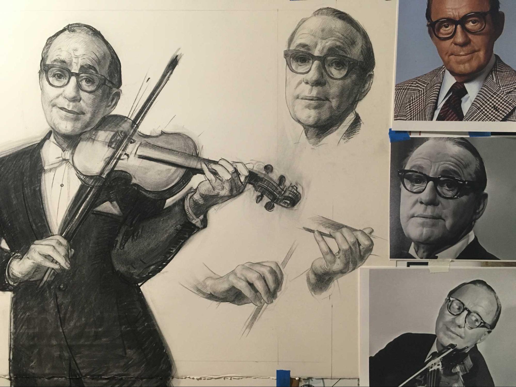
The most important references I rely on are good photos. First, I want to gather as many different images as possible. I want to see the subject at different ages in adulthood. Being a famous celebrity, Mr. Benny has decades of photos that are easy to research online. It surprised me how different he appeared at different ages, body weights, and states of health. The fullness of the cheeks, hairline, jawline, facial creases, and even the proportion of the nose and ears all transform over time, and some photos look more like “him” than others.
I need to understand the wishes of the commissioning client, and the consensus of the public or family as to what that person “looks” like, in an iconic sense.
For example, if I needed to portray George Washington, I would want to refer to the famous Lansdowne portrait by Gilbert Stuart as defining what the “real” George Washington looked like in the public eye.
For a private individual, I ask the people who knew her best, “Which smile or expressions make you say ‘Oh, that’s her!’?”
I consider what age and dress best personify that person to the intended audience of the portrait, and at what time in her life she made an important impact. All these considerations should factor into the image you want to capture.
The Importance Of A Good Photo Reference for a Posthumous Portrait
To create a good portrait painting, you need to have one good primary photo reference. This can be one of the most challenging problems, as the photographer (amateur or professional) may not have the same goals as is required by the portrait painter. Most important to me is good lighting.
Good lighting for the painter is a single-direction light source and a visible shadow edge that shows the terminator of the light. This shadow edge is the most important visual cue to revealing the three-dimensional structure of the face.
I need that sculptural knowledge of the forms of the face in order to recreate a solid and naturalistic likeness. Often, photographers prefer a very flat or softened lighting. This effect blows out all the lights of the face and shows only a soft and vague shadow edge. This can create a flattering photo, because it softens the creases and contours, and emphasizes the eyes and mouth. However, it is very challenging to work from because I can’t see the 3-D structures.
I will only be able to put in as much volumetric information as I can glean from the references.
A photo that shows clear light and shadow shapes and distinct highlights gives me the greatest amount of information.
Multiple photos can assist my process. I want to see the face from several angles, so that I have a better understanding of the dimensions.
Many photos show the sitter from the front, and make it difficult to see how much the nose projects or how much distance there is from the side of the face to the profile. Even if supplementary photos aren’t well lit or would not serve well as a primary reference, any additional photos can help me develop a 3-D visualization of the head.
Determine The Gesture And Pose
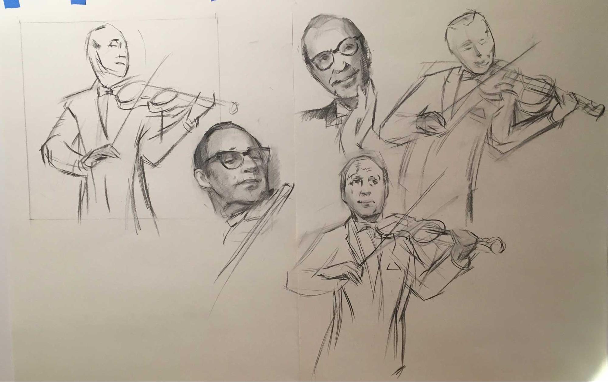
The next consideration is how to design a gesture and pose that will be characteristic of the subject’s way of moving or standing, as well as dynamic and well suited to the pictorial composition. I study the references and try to get a feel for common expressions, gestures, and ways that the sitter stands or holds his or her head.
For my Jack Benny project, not only could I use photo archives, there’s also ample video available. This was wonderful for helping me get a sense of Mr. Benny’s characteristic stances and expressive moods. Of course, he was hilarious, with a charm that irrepressibly bubbled up into his eyes and smile. I wanted the viewers of the painting to find Mr. Benny’s ebullience contagious, and feel delighted and enlivened by the painting.
Mr. Benny was famous for playing his violin to comedic effect, so I immediately got enthused about portraying him playing the instrument. I knew it would be fun to paint the violin and bow, with all their flowing graphic details.
The gesture of musicality and performance would help convey Mr. Benny’s blithesome presence. After watching a lot of performances, I did several gesture drawings of him with the violin to experiment with which pose conveyed that energy and composed well in the picture’s rectangle.
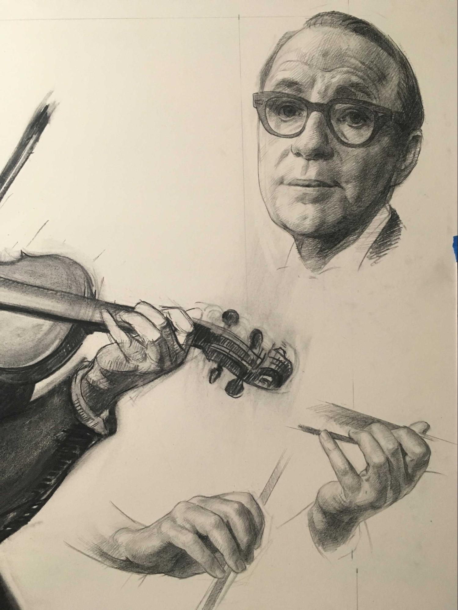
Once I had decided on the pose and gesture, my next step was to assemble some better reference material. I hired a professional violinist, who visited the studio and played for me. When he arrived at my door, he smiled and said, “You ordered a violinist in a tuxedo?” He amiably played for me Finally, I made a preparatory drawing in which I put together the entire pose, and settled on the final design of the head, hands, arms, and violin. This drawing was in charcoal on paper, about two-thirds the size of the final portrait.
One other piece of reference for this project was a delightful find. I was searching around for some idea of the right coloration for Mr. Benny. Most of his reference is in black and white, or older photos with that sepia-tinged color.
What color were his eyes? Was his skin tone pinkish or tannish? Was his hair black-grey or brown-grey? When you only have black and white there’s a lot to fill in.
Happily, I discovered a marvelous color reference—a Post magazine cover of Mr. Benny painted by Norman Rockwell! Thanks to eBay, I bought a copy of the cover. He had painted Mr. Benny from life (there was a photo of their sitting), so I knew I could trust Rockwell’s eye for the interpretation of coloration and skin tone.
When working from photos, it’s best to keep the color design somewhat simplified. It helps to have a bit of a schematic plan for the skin tone that uses warm and cool, and not just a value range. I narrowed down the colors on my palette, and decided on some dominant colors to use throughout the composition. I used Prussian Blue, Venetian Red, Raw Umber, Yellow Ochre and later some Turquoise (with some other basic hues), which created an overall color design of warm pinks and cool blues.
I kept with these color notes in all the elements of the painting to create unity. In other projects, when all the historical reference is black and white, I hired a model that has the right coloration, and created a color study in oil to use for the color key.
Any posthumous project must, by necessity, rely heavily on photos. This can make the process just a little boring and flat for me creatively. I find that whatever realistic details I can add “in real life” can enliven my process and the finished work. Clothing, in particular, is most successfully painted from life using a mannequin.
For Mr. Benny, I shopped for a vintage tuxedo jacket and pink checkered bow tie (eBay!). He was famous for his dapper and loud fashion choices. A tuxedo seemed right for both his “who me?” comedic pretense, and gave me strong graphic contrasts and sharp shapes for the composition.
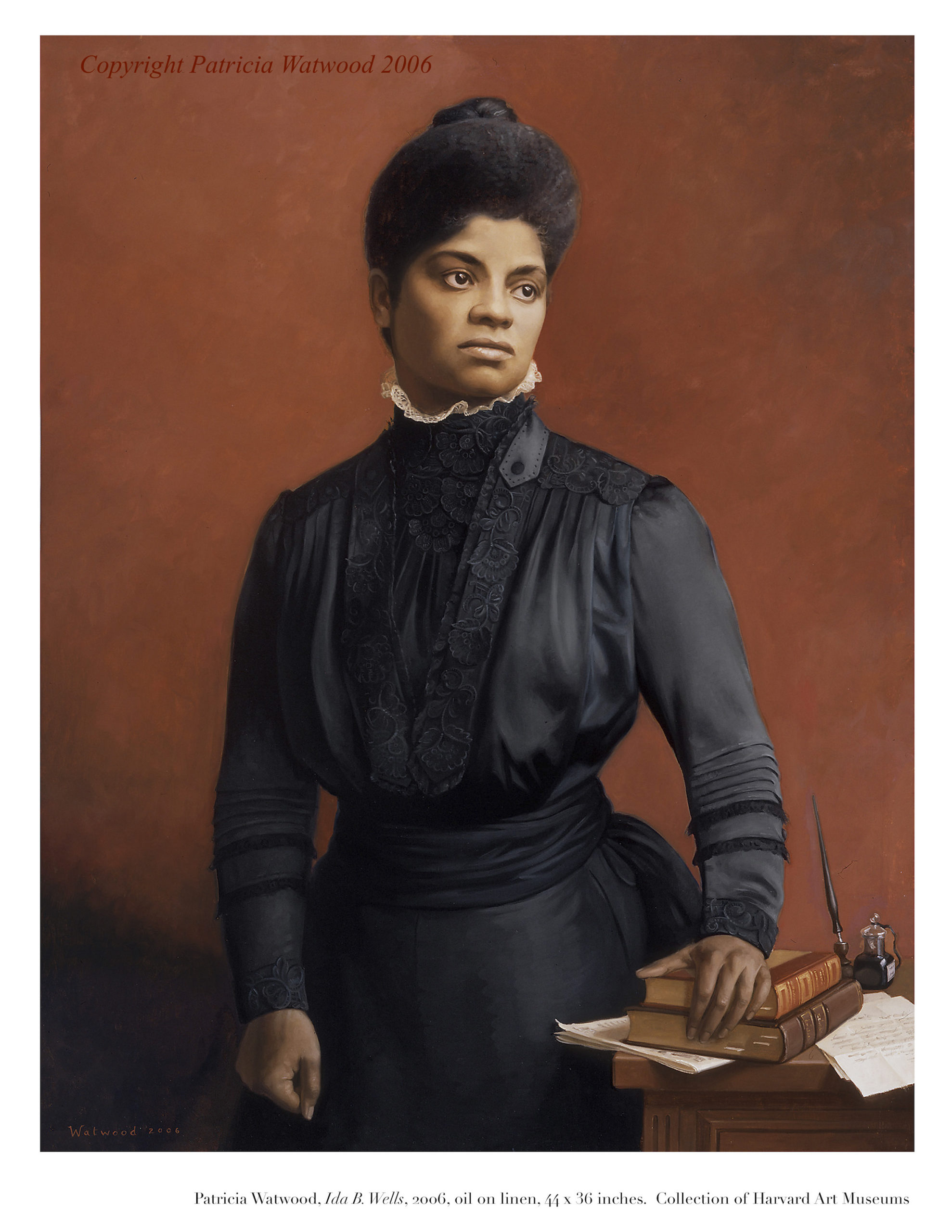
For my Ida B. Wells project (below) for Harvard University, I rented a vintage period dress, accurate to her time, and painted the dress from life. This adds tremendously to the realistic details, vitality, and overall quality of the painted work.
For the Jack Benny portrait, I chose a square format for the painting and a light background to contemporize the style and avoid a staid traditional design, which suited neither the subject nor the client. Whenever possible, I consider the color, brightness, décor, and overall emotional style of the setting where the work will hang and coordinate my composition accordingly. The light background and pale squares were inspired by the graphic designs that were used in the Jack Benny TV program, and nods to the mid-century design of his time. The energetic gestural lines create the illusion of performative movement, as well as serve as a foil to the tighter realism of the figure.
Posthumous and historical projects can be tremendously rewarding, in spite of the many extra steps required to pull them off successfully. Clients find great solace in a meaningful work of art that commemorates a beloved subject they are mourning. Institutions can help revitalize their relationship to their institutional history through adding a portrait that helps tell the story of who they are and what they value.
As we culturally reckon with the omission of the people of color and women who have made significant contributions, a posthumous portrait can be a significant symbol that steers toward a future of a more just and beautiful world. As an artist, honoring the important people who have shaped and loved our world with a portrait has been a great privilege in my working life.
ABOUT THE ARTIST
Patricia Watwood is a figurative painter based in Brooklyn, NY. Watwood is a leading figure in the contemporary classical movement. Her subjects are primarily women and figures, often using allegory and mythic imagery. Her work is in public and private collections, and has been exhibited at the Beijing World Art Museum, The Butler Museum, St. Louis University Museum of Art, The New Britain Museum of American Art, and the Forbes Galleries, among others.
Her commissioned portraits hang in institutions such as St. Louis City Hall, Kennedy School of Government and Harvard University. She has produced instructional videos including “Creating Portraits from Life,” with PaintTubeTV, and is a featured art instructor with Craftsy. She has an MFA from New York Academy of Art, and was a founding member of the Water Street Atelier. Website | Instagram
Preview Patricia Watwood’s Streamline Premium Art Video Workshop, “Creating Portraits From Life” here:
Discover How to Create Beautiful, Expressive, and Lifelike Portraits
This 8 Hour video tutorial shows a complete portrait demonstration and teaches you how to break down the complex process of creating a portrait into three basic steps of a charcoal drawing, an underpainting in 3 colors, and then a final pass in full and naturalistic oil colors. Learn the classical techniques of the French Academy with a modern palette and contemporary style. Start here with “Creating Portraits From Life” with Patricia Watwood.


”")
