


Historical painter Todd Price shares what he’s learned about painting realistic landscapes and scenes in oil to help you get to “that spiritual place where you start to fall inside the work.”
By Todd Price
www.nightowlstudio.net
If there is such a thing, I feel like a natural-born artist. I’ve always had a passion for art, long before I knew what that meant. Growing up, I had a complete distaste for school. I was a terrible student from the start. In fact, I skipped my second day of kindergarten – it was just too much structure for me. I worked my first math problem on that day hiding under a large pine tree in my neighborhood. I did the math – just how many years was this whole school thing going to take? What I got out of my disappointing calculation was that if I could move into some imaginary space with a blank sheet of paper and pencil I might just be able to muscle through it.
So as long as I can remember I’ve been most comfortable alone with a pencil or paintbrush in my hand. I did, however, love reading American history. Going back to the seventh grade, we had a mandatory Ohio History class where we read Allan Eckert’s “The Frontiersmen,” which really charged me up and made me the artist I am today. Reading about the frontier history of middle Ohio and the Ohio River Valley fueled my passion for learning all I could about American history, from the early days of discovery through the American Revolution and beyond – always looking west to the Great Divide. I’ve been painting the American story in one form or another ever since.
I am a self-taught artist, training myself through working hard at it while studying the work of the great masters. I’ve learned more from studying the brush strokes and layers on a museum piece than any teacher has been able to teach me. Learning how to make a person feel the weather, hear the wind, and smell the air in a two-dimensional space is a true gift that very few artists have achieved, but it can be done, and I’ve spent the last 50 years of my life trying to figure it out. I feel like I’m getting closer but nowhere near where I want to be.
As I move into the fourth season of life I can’t help but wonder – will I ever figure out how to create the perfect painting? To date, I’ve never been 100% satisfied with any painting, which leads me to believe that perhaps I’m searching for something more than that.
What I’ve Learned Along the Art Path
Over the years I’ve had the opportunity to help a few promising artists with the ins and outs of painting in oils. Figuring out how to set up a studio, purchase your supplies, and start a painting can be daunting, especially when you’re at an art store standing in front of a rack of 100 different tubes of oil paints.
So the first thing I like to do is take some of the mystery out of the basic materials – the different brushes, substrates, paint brands, etc., that’ll get any artist up and running with the least amount of frustration and cost.
Using a Limited Palette:
I’m always shocked when students set down a Santa Clause-size bag full of high-end brand oil paint. If for nothing else, just the cost of it all, but there’s no need for half of the paints anyway. Use a limited color palette. Keeping your palette to a minimum number of colors makes revisiting a painting later a lot easier when mixing and matching colors that may have been mixed weeks or months before.
Below are the nine colors I load onto my palette:
• Titanium White
• Yellow Ochre
• Burnt Umber
• Raw Sienna
• Prussian Blue
• Naples Yellow
• Cerulean Blue
• Magenta
• Cadmium Yellow
Especially for landscape paintings, I’ve found I can create just about any color I need out of these nine and get right back to them when bouncing from painting to painting, as I do when preparing a larger body of work for a show. Of course, there are exceptions when painting wildlife and military subjects where a cadmium red, cadmium orange, or rich green is needed. But overall, I start with the colors listed above.
You’ll also notice I do not use black, except on rare occasions where there’s no option, and even then, in very small amounts for detail and not as a mixing color. Black is a contaminating color and I advise all new artists to mix a custom black. The fact is, I’ve had the same small 0.4 fl. Oz. tube of black for over 10 years and it’s still nearly full.
How I mix black paint:
I might mix and make my custom black a little different depending on the painting but typically, I mix a combination of Prussian Blue/Burnt Umber/Magenta. I may also add Cerulean Blue and raw sienna. It just depends on how the other colors in the painting will react when they collide with the custom-mixed black.
Picking your subject:
Start simple, adding more complex elements as you become more comfortable with color, composition, and balance.
When folks ask me about a good subject matter for their first oil painting, I say landscapes. Clouds, trees, and open fields give new artists the freedom to move about in a painting without much worry about doing it “right or wrong.”
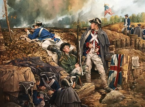
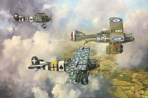
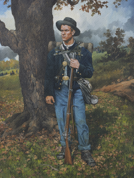
However, this does not mean landscapes are easy (or any other subject for that matter). To make the viewer stop in their tracks while walking past a painting takes time and practice. Over many years of painting what I call “historical landscapes,” I’ve developed a few techniques that help me quickly get on target while capturing the vastness of a sprawling mountain landscape, the mood of a hushed woodland stream, and the wild creatures that dance inside these spaces (human or otherwise). (Stay tuned at RealismToday.com for my upcoming step-by-step demonstration on how to paint a landscape.)
Build your painting as you would a house; the foundation being the background and horizon line:
Keep it loose. You’re just roughing in the idea at this point. You’ll be revisiting all areas with the details of shape and color as your work progresses. Start with the furthest thing back and keep it light! You have a long way to go as the painting moves from light to dark towards the front. Begin with roughing in the lay of the land. Use a thinned light color for the horizon line (I like to use a transparent cerulean blue, thinned with Gamblin Megilp).
When moving from back to front, think of the painting in horizontal steps moving back to front starting with ¼ tones, then mid-tones, ¾ tones, and shadow, saving your darker colors and detail for last.
Taking these simple steps will simplify the beginning of the painting and get you moving in the right direction – that spiritual place where you start to fall inside the work.
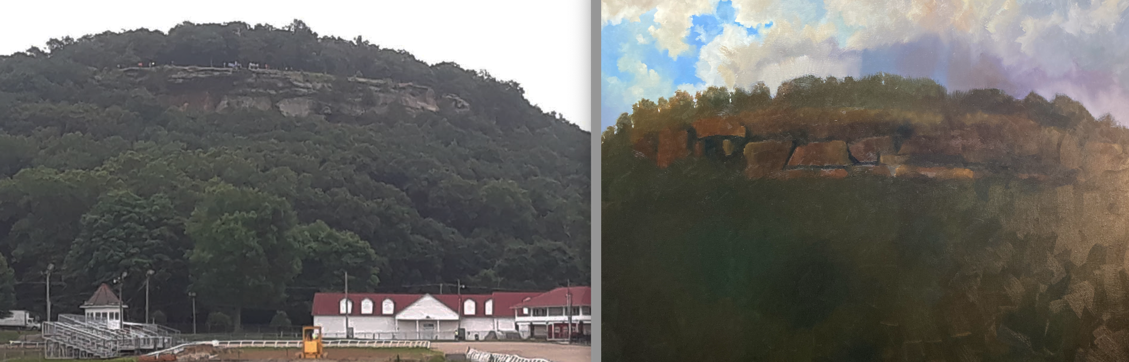
Don’t be married to your reference:
When using reference photos, as I often do, do not feel like you must paint it pixel by pixel. Free yourself, it’s perfectly fine to move, remove, or add elements as needed for balance and composition, especially as it relates to a subject such as clouds, which can offer the perfect balancing element.
The image below shows my reference next to the painting in the early stages as I start blocking in key elements and setting the mood. This is a historical place so the rock formation must stay as it is, as it relates to shape and size, however, that doesn’t mean I can’t change the light, weather, and time of day.
Distance, light, and atmosphere set the mood:
Before you start, decide what kind of day or night your painting will represent. In fact, your painting should be finished in your head before you even start. Will it be early morning, midday, or evening? What’s the weather like? Is it clear, cloudy, stormy, etc.?
Pick your poison:
What is it that’s going to separate your painting from a dozen other landscape paintings in the same room? Know your audience, especially when the crowd is full of folks whose main interest is art, heavily influenced by history. It’s fun to take a modern landscape and rewind history back to a day before photography was available. It gives the viewer a chance to see what things might have looked like before the introduction of modern times.
Save your details:
Diminish the details in the background and middle ground of your painting. When painting a landscape, think of it in four separate layers as you work back to front. Too much detail in the two furthest back areas of the painting leaves you with nothing left to dazzle the viewer in your two closest layers, which usually contain your main points of interest.
Learn more about Todd Price and view his paintings and prints at nightowlstudio.net.
***
Become a Realism Today Ambassador for the chance to see your work featured in our newsletter, on our social media, and on this site.
”")


Todd,
Thanks for that great article. Those are some gorgeous paintings. It’s pretty amazing that you’re self-taught. You were obviously paying attention to the teacher.
Your landscape “Waiting Out the Storm” is a nice combination of realism and the spirituality of the Hudson River School. It would certainly stand with Bierstadt, Durand, and Moran. Well done!
I checked out your web site. Truly breathtaking work. Congratulations on some superlative art!
Comments are closed.