

Demystify the role of transparency and opacity in your oil paints for better results on the canvas.
The following is part of a series featuring a leader in the art community who will be joining us on the faculty of Realism Live, November 9-11, 2023.
Get to Know Your Oil Paints: Transparency vs. Opacity
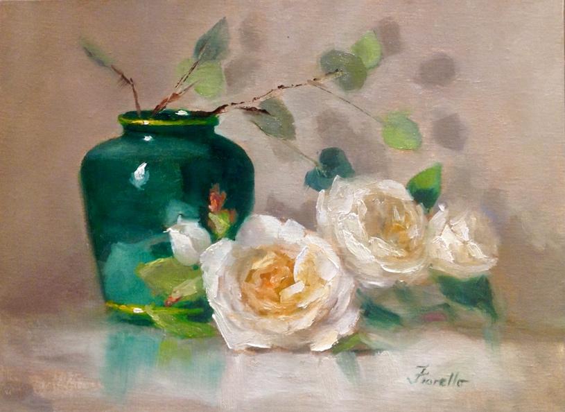
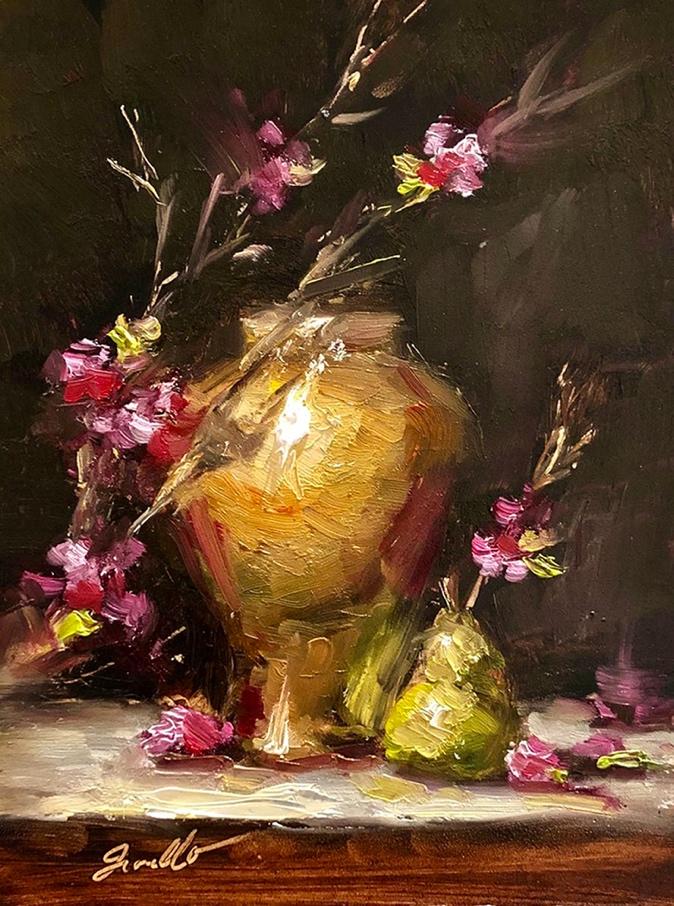
By Pat Fiorello
(patfiorello.com)
As artists, we think about our paints in terms of hues, color temperatures, values, and intensity. But there is another aspect of the physical characteristics of our paints that is important and that is the distinction of transparency vs opacity. Understanding the different capabilities of transparent and opaque paints gives you a powerful addition to your painting tool kit.
One major visual difference between the two types of paints is how light comes back to your eye from the painting surface. With opaque paints, the light hits the surface of the paint and bounces back to your eye. Transparent paints operate more like a sheer veil of color. The light will hit the paint and since it’s transparent, will penetrate through to the ground (whether white watercolor paper or a white canvas) and will bounce back thru the transparent paint and back to your eye. In this way, it is like backlighting, which gives transparent paints their luminosity and glow.
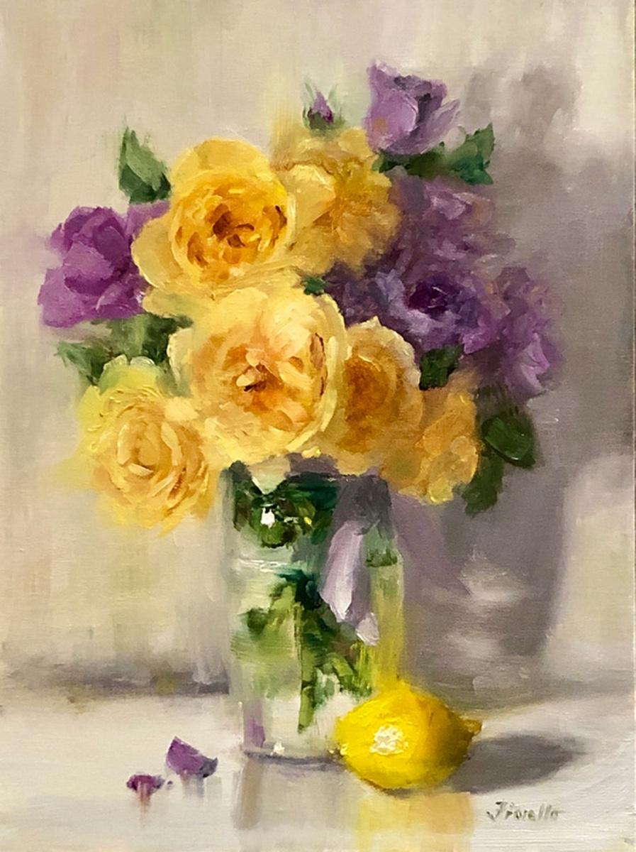
In my own painting, luminosity and clean, bright color is important, so I generally start exclusively with a transparent wash/underpainting. This allows me to keep the color clean and avoid mud. I share this method in my workshops and go into greater depth on the topic in my instructional video, “Vibrant Flowers,” available through PaintTubeTV.
Opaques have the benefit of coverage with heavier body to create thick, impasto strokes. Transparents can provide contrasting thinner passages, and allow you to optically mix, since you can see one color through another.
For example, if you lay a transparent blue, like ultramarine blue, over a yellow, you will see green. The transparent blue will not totally cover what’s beneath it. Transparents are often very dark in mass tone. When two are mixed together, you can get some really dark darks. Yet when white is added to a transparent paint, it can act as high chroma opaque. Try adding a touch of white to transparent phthalo green, permanent rose, or Indian yellow.
How to Tell if a Paint is Transparent or Opaque
There are several ways to distinguish between the two types of paint.
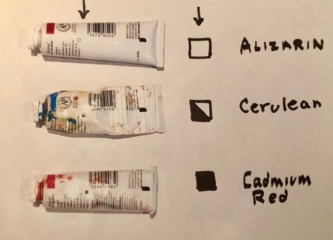
– First, often on the paint tube itself there will be a small box. If the box is empty, the paint in the tube is transparent. If the box is solid, then it’s opaque. If there is a diagonal line, that paint is semitransparent, somewhere in between. Unfortunately, not all brands carry this indicator on the package, but many of the major brands do, so take a look at your paint tubes. For those tubes that don’t have the box, they often note on the back label if the paint is opaque or transparent.
– If there is no indication on the package itself, look on the website for your paint brand.
– For some paints, like transparent red oxide and transparent oxide brown, it’s easy. Transparent is right in the name.
– A quick test you can do for yourself to determine which of your paints is transparent or opaque is to make a vertical line of black acrylic paint or ink. Let it dry. Then run a horizontal stripe of any color over the black line. You will see that opaque paints sit on top of the black line. They appear to advance in front of the line. Transparent paints seem to go behind the black line because they don’t have the same covering power as the opaques. In my example below, I used cadmium yellow, yellow ochre, and Indian yellow for the yellows; cadmium red, alizarin, and permanent rose for the red family; and cerulean and ultramarine blue for the blues. I also included titanium white, transparent oxide red, and viridian.
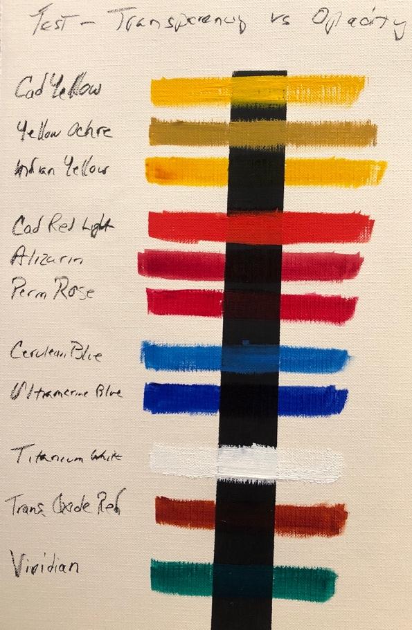
You can clearly see for yourself that the cadmiums, yellow ochre, cerulean and white sit on top of the black line where the transparent colors, like Indian yellow, seem to pass behind it. With their excellent covering power, the opaques cover up the black line, but transparent colors cannot completely cover the line.
(Note this same exercise can be done with watercolors. Opacity is a function of the pigment, not the medium, so an opaque paint in oils is also opaque in watercolor.)
I encourage you to do some experimenting on your own with the paints you have, to better understand which are opaque and which are transparent and discover how each type offers particular benefits to your own painting process. The paint in our tubes not only varies in color but in covering power too.
Happy Painting!
P.S.
If you’re curious about how I create my most vibrant paintings, check out my latest video course, Vibrant Flowers – Paint Your Garden. In this course, I dive deep into my “T.C.U. Method” and the most common mistake I see artists make — and, of course, I show you how to steer clear of it. If you’ve ever been intimidated by painting flowers, be sure to check it out.

”")
