


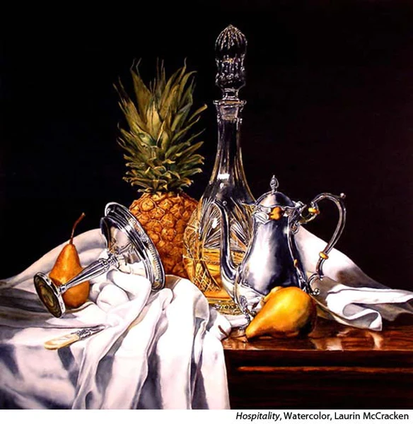
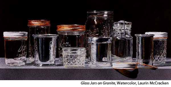
For the watercolor realism artist Laurin McCracken (“Watercolor Realism: Glass & Wood” and “Watercolor Realism: Silver & Crystal”), the beauty is in the details. Influenced by the Dutch and Flemish Still Life painters of the 16th and 17th centuries, McCracken brings an incredibly high level of detail to his realistic watercolors. He approaches his work strategically. First, as a photographer, he will spend hours setting up and photographing a good reference photo. He then spends hours more drawing and painting his subjects, expressing the smallest glint and reflection.
Your training is in architecture. How did the world of architecture prepare you for painting realism?
My training as an architect helps me to see details, especially the nuts and bolts of how things are manufactured or created. It helps to be able to paint an elaborate silver coffee service if you understand what it takes to create the decorative chasing on the side of the coffee pot.
In terms of running a business, architecture because it is both a left-brain and right-brain profession, it gave me the ability to be organized and to create a marketing plan and business economics.
When you are physically composing your still life scenes, what are you trying to create in the set up itself? What’s important to have in place?
Creating an interesting story about the objects is the goal of a good still life composition. The correct placement of the objects and the correct lighting can help the viewer’s appreciation of how the objects are created. The placement in the objects can tell the viewer something about the relative relationship between the objects.
Where in your process do you think and plan design? How much of that happens in your head before you’ve begun vs while in the photo or thumbnail stage? Is it all planned before you mix your first wash?
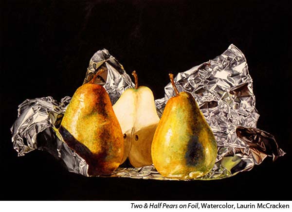
I use every approach in designing a still life composition. Sometimes I see an object and immediately think of a still life setup. This happened when I returned from the grocery store with apples, pears, and a roll of aluminum foil. That became a series of paintings of fruit on aluminum foil.
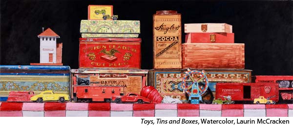
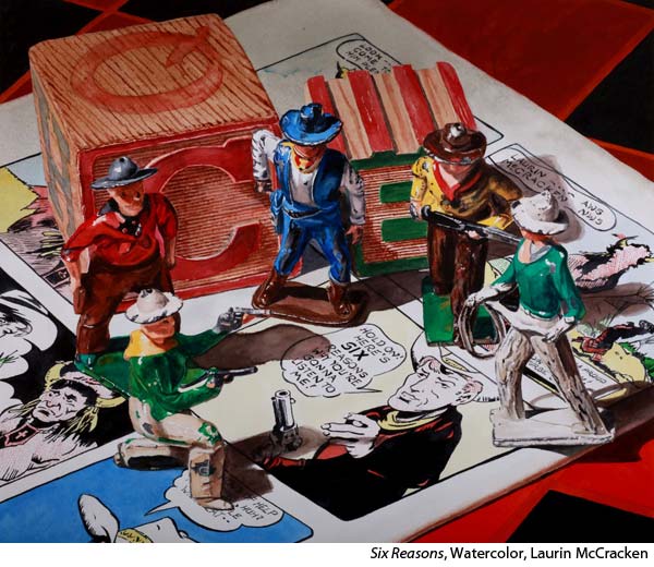
Recently, I did a thumbnail sketch of some bottles and turned that into a still life setup. Sometimes the object just leads me to an assemblage that works as a painting as in “Toys, Tins and Boxes” (see below).
Could you talk to us about which design principles or elements you enjoy playing with most? How do those specific principles or elements show up in your work?
As I assemble objects for my still life paintings I am always thinking about certain design principles such as “an odd number of objects is more interesting than an even number” and “the best lighting for a still life comes from the left.”
Many of these “rules” are so ingrained in my thinking that I don’t consciously think of them. They just happen.
One of the things I must always be conscious of is the juxtaposition of objects in still life, especially the adjacencies. If one object is in the foreground and another is in the background, but from the viewer’s point of view they seem to be almost touch, the viewer can not tell which is forward and which is further back. Simply moving the most forward object so that it overlaps the object behind it allows the viewer a greater ease in understanding the placement of the objects in the still life.
We’ve asked about process specifics but could you walk us through your process in general?
While every still life comes together in its own peculiar way, there is a basic approach I take in creating a still life.
I set up my background, with or without a piece of cloth or a piece of lace. I then start with three simple objects. I use them to determine the best placement for my light. I typically use only one light source. I move the objects around to try and improve the general composition. I also turn them to determine where how the light best strikes the object. I use the light to increase the dimensionality of the objects.
At each move or turn, I will probably take an image. The great thing about digital photography is that each image is very inexpensive and fast.
Then I start adding more objects sometimes one or two at a time, constantly moving and turning them to create a more interesting composition and to react to the light and the relative position to each of the other objects. Many times, I will get to the point where I have too many objects in the photo and too much going on in the setup and then I will start eliminating objects until the most ideal composition comes together.
The process of moving the photo to the paper: I put all the images in my computer and then go through them, full screen and eliminate the obviously poor shots. Then I will select out those that have the best possibility for becoming a painting.
I have learned that not all good photos make great paintings. I then narrow the best images down to two or there and think about them for a while, sometimes months. I will then go back to these images and make prints of them and think some more.
When I finally make my choice, I will move the image onto a portable memory device and project them onto my watercolor paper using a very high-resolution projector. I will then trace as much of the image onto the paper as is possible. Here is where I often find some weak adjacencies. From there I will move my paper to my painting board and add the last of the details to the drawing. I usually make large prints of the image, 13”x17”, and I will paint from those prints.
The drawing process for a full sheet painting can take 4 to 6 hours.
So many of us want to paint fast. What do artists miss if they are trying to move too fast? What kind of freedom can be gained in slowing down?
I have often said that watching me paint must be about as exciting as watching grass grow. While many of my watercolor friends believe that if they are spending more than an hour on a painting they are wasting their time, my paintings often take 100 hours or more. The more I look at something the more detail I see and the more detail I want to paint.
If you are going to paint a high degree of realism, in any medium and especially in watercolor, you cannot do it quickly. Often, I have to adjust my expectations of how much detail I can paint because it is not physically possible, or I would never finish anything. I use the time that I am painting to listen to music, plan my next move in the painting I am working on, plan my next marketing strategy or solve the problems of the universe.
For realism, where do new artists even begin? Knowing what you know now, where should they focus their studies if their goal is to paint realistic watercolor?
A. Begin by looking. You can’t paint the details unless you can see the details. One of the most difficult things to teach my workshop students is looking more closely at an object and seeing the details. They look at a cut crystal bowl and see the roundness of the bowl and some cuts on the side, but don’t look closely enough at those lines in the bowl to understand how they were created and therefore how to paint them.
You also have to forget what you think something looks like to realize what it really looks like. You have to connect your brush with your eyeball and bypass your brain.
B. It also makes big difference if you have the right tools to use in creating watercolor realism. I mostly use rounds with which to paint. I started out using 0 and 00 size rounds. Then I was shown that #4 top-grade Kolinsky rounds, such as Escoda’s Reserva line, can make as fine a line as a 0 and they hold a lot more paint.
Painting on the proper surface also makes a big difference. I use Fabriano Artistico Soft Press paper. It is smooth enough so that it will hold the detail, but soft enough to be able to work the paint into the paper to create the roundness of a silver teapot.
Helpful Links
- Visit Laurin McCracken’s website
- Learn how to paint realistic watercolor still lifes
- Become a Realism Today Ambassador for the chance to see your work featured in our newsletter, on our social media, and on this site.

”")
