

In this new demo, Oliver Sin shares his process and tips for creating a realistic sepia portrait, including common mistakes artists make in each stage of a portrait drawing.
Bonus – Click here for Oliver’s new workshop, which teaches a step-by-step “Analyze-First Approach” that helps artists create portraits with dimension, character, and classical beauty.
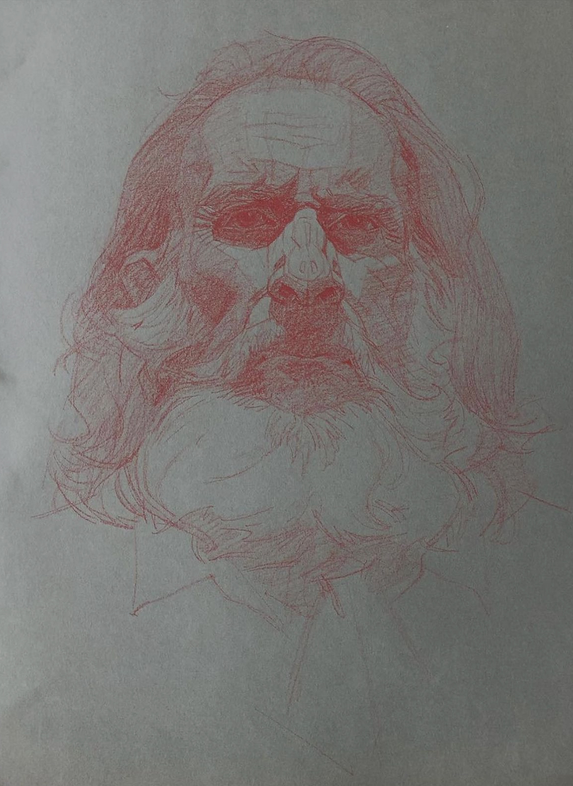
1. Laying the Foundation

Process: Use a Stabilo #645 CarbOthello pastel pencil on 18×12″ Strathmore Pottery Green toned paper to sketch the basic shapes and planes of the head.
Purpose: This creates a strong blueprint for the portrait. The accuracy of this step will determine how solid and believable the final piece feels.
Tip: Think of the head as a series of simple planes—forehead, cheeks, jaw—before adding detail.
Common mistake: Rushing this stage. If proportions are off now, no amount of shading will fix it later.
2. Two-Value System: Light and Shadow
Process: Break the portrait into two groups—light and shadow. Shade only the shadow areas of the face. Keep your strokes in one consistent direction for clarity.
Purpose: Establishes a clear design of light vs. dark, which gives the portrait structure and focus.
Tip: Squint at your subject to simplify the values—you’ll see the shadows more clearly.
Common mistake: Using strokes in multiple directions too early. This creates visual confusion and muddies the form.
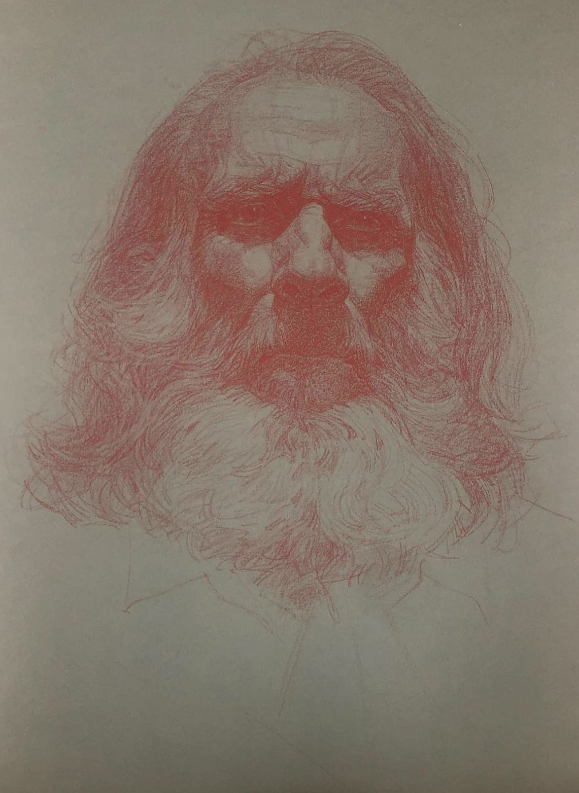
3. Expanding to Three Values: Light, Midtone, Shadow

Process: Add a third value—midtone—between the light and shadow.
Purpose: Creates smoother transitions and adds more realism, giving the face dimension and roundness.
Tip: Use softer pressure for midtones to keep them distinct from shadows.
Common mistake: Making the midtone too dark, which flattens the separation between light and shadow.
4. Deepening Shadows
Process: Reinforce the darkest shadows, especially in areas like under the nose, chin, and eye sockets.
Purpose: Strengthens contrast, adds depth, and makes the form feel more three-dimensional.
Tip: Always compare the darkest darks to the lightest lights to balance your values.
Common mistake: Over-darkening everywhere. Reserve the strongest shadows for the most important areas.
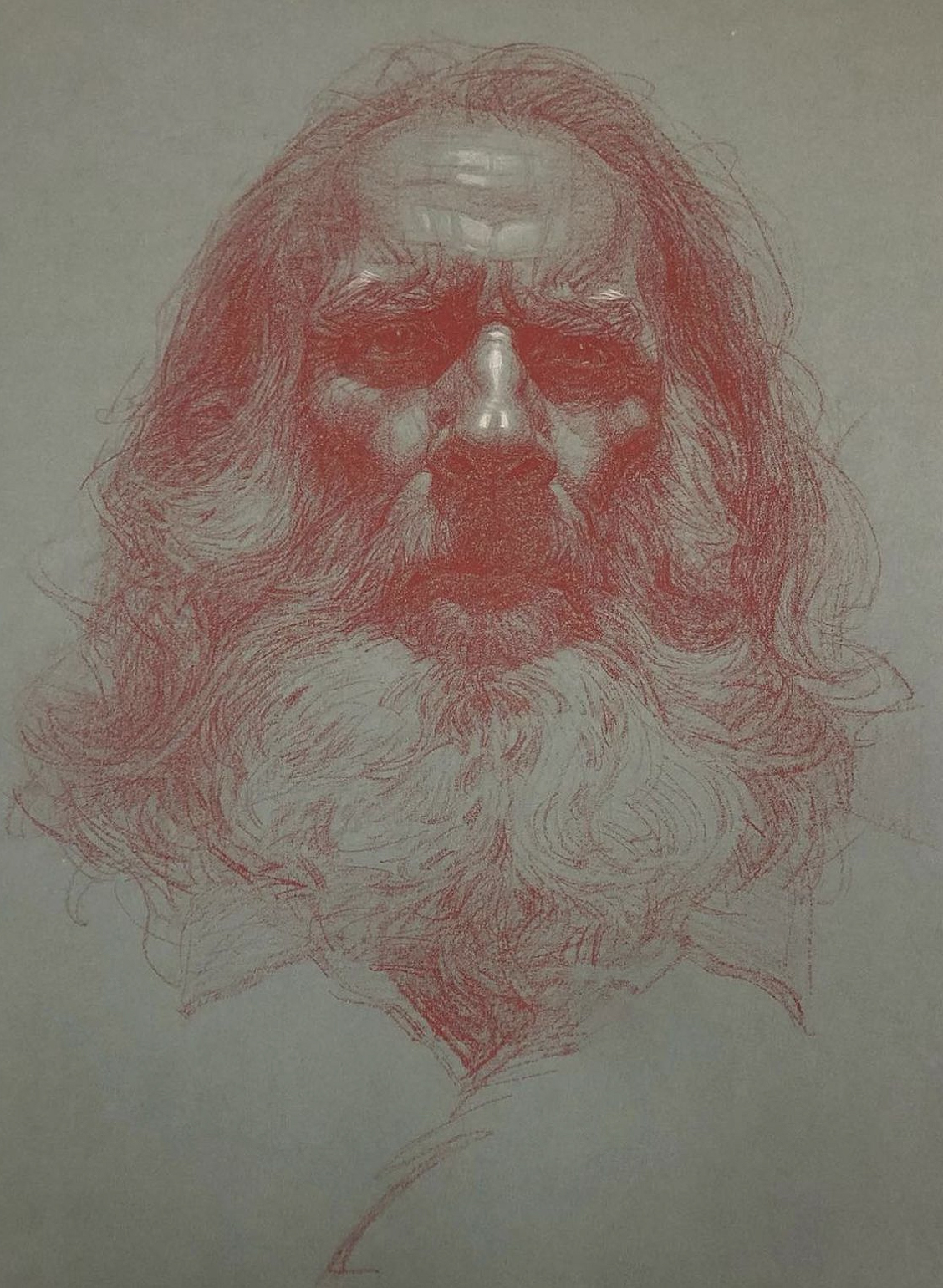
5. Accenting with Highlights

Process: Use a Stabilo #100 CarbOthello white pastel pencil to apply highlights. Place them only on untouched toned paper, not on shaded areas, to keep them crisp.
Purpose: Highlights bring life, sparkle, and depth to the portrait. They also direct the viewer’s eye to key focal points.
Tip: Apply highlights sparingly—less is more. Strategic placement has greater impact.
Common mistake: Overusing white. Too many highlights flatten the drawing and reduce contrast.
6. Finished Drawing
Helpful Links
- Connect with the artist at www.oliversinart.com.
- Learn more in Oliver Sin’s new art workshop! Click here for details.
- Become a Realism Today Ambassador for the chance to see your work featured in our newsletter, on our social media, and on this site.

”")
