In this episode of Art School Live featuring Jared Cullum, learn how to create form by building a simple four-value scale and painting objects as planes facing light. Plus: Practical tips for opaque, controllable marks.
Painting starts to feel much more alive when it stops being an outline filled with color. As artists, the goal is to think sculpturally: to move across an object with paint, identifying the surfaces that turn toward light, tip away from it, or disappear into shadow.
That is the language of planes. A construction loader makes a terrific subject because it is blocky and clear, but the same approach works for an apple, a face, a coffee cup, a cat, a white house, or a skyscraper. Everything can be simplified into basic forms receiving light.
Step 1: Set Up Gouache for Opaque, Controllable Marks
Gouache is technically related to transparent watercolor, but its opaque additive lets it behave more like acrylic or oil paint when the consistency is right. That consistency matters tremendously. Too much water produces a translucent wash, which is useful for glazing but not ideal when the goal is to build strong, solid planes.
For opaque gouache, load the brush fully with paint, then tap off excess water on a paper towel or absorbent cloth. Flower sack cloths work especially well because they wick water quickly and can be washed and reused.
The aim is a dry-brush-like consistency: loaded enough to make a confident shape, but not so wet that the layer underneath dissolves. This slightly chalky, almost cakey quality can make beautiful soft edges. It also allows a painter to layer light paint over dark passages without turning the whole sketch into mud.
For brushes, a modest synthetic brush is generally perfect. Natural hair brushes can be too soft, while stiff hog bristles can leave every stroke overly obvious. Gouache benefits from a brush with enough resilience to push paint around.
Step 2: Create a Value Scale Before Painting
Before tackling color, establish a simple value structure. Mix four distinct “buckets” of value:
- Light: the white of the paper or the lightest paint mixture.
- Light middle: a pale gray or light version of the local color.
- Dark middle: a richer, darker gray or shadow color.
- Dark: the deepest accent, used sparingly for maximum contrast.
A practical exercise uses titanium white, a middle gray mixed from white and ivory black, a darker gray, and neat black. The purpose is not to make an elaborate chart. It is to give the eye a clear range for comparison.
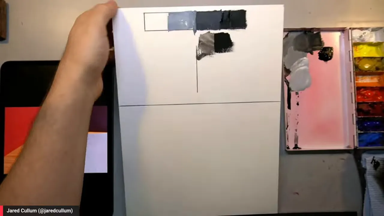
Value is relative. A middle gray can look nearly white next to black, or dark next to white. Without strong darks and clear lights, a painting can become bleached out or muddy. Keeping the full range available anchors the image and makes three-dimensional form easier to read.
Think of these four values as the constraints of a haiku. Reality is wildly complex, but a limited structure forces a clear visual statement. A painter only needs to ask: is this plane closer to the light, light middle, dark middle, or dark?
Step 3: Learn to See an Object as Planes Facing Light
A plane is simply a flat or flattened facet of a form. A cube makes the principle obvious. One side might face directly toward the light, another might turn halfway away, and another might face fully into shadow.
One useful mental exercise is to imagine a tiny arrow or pencil standing upright on each surface. Is it pointing toward the light source? Then that surface receives more light. Is it turned away? Its value drops. Another good image is to imagine a small ant walking over the object and looking upward. The amount of light visible overhead changes as the ant moves from plane to plane.
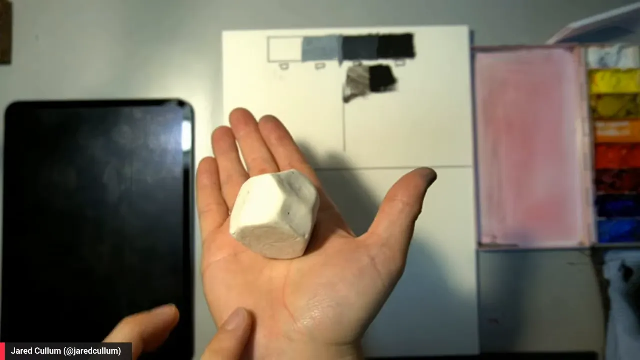
This is why simplified white objects are excellent study material. Their local color does not complicate the problem, so light behavior becomes easier to see. A white building outdoors can reveal a surprisingly broad range of warm light, cool light, reflected light, halftones, and deep occlusion shadows.
Step 4: Find the Local Color and Block in the Biggest Forms
Local color means the inherent color of an object. A red apple has red as its local color, even though its lit and shadowed areas may look orange, purple, brown, or nearly black. In the loader demonstration, the base local color is yellow ochre.
Start with the broad silhouette, sometimes called the envelope. Do not get stuck trying to draw every mechanical detail. The loader can first be understood as two big cubes: a large lower body and a raised cab. Establish those large masses before worrying about wheels, pipes, stickers, handles, or hydraulics.
Then place a middle version of the local color over the major shape. This is the starting block from which the form gets carved. The process is less like coloring inside a drawing and more like shaping clay.
Step 5: Sculpt the Form by Dividing Light, Halftone, and Shadow
Once the big local-color mass is in place, divide it according to the direction of each surface.
- Lighten the planes that face upward or directly toward the dominant light.
- Keep outward-facing planes in a middle value or halftone.
- Darken planes that turn toward the painter or away from the light.
- Add the deepest accents only where light cannot reach, such as under overhangs and inside the cab.
For the yellow loader, white lifts yellow ochre into a lighter value, although it also cools and neutralizes the color. A touch of brighter yellow keeps that mixture lively. Burnt umber mixed into yellow ochre creates a lower-value version for the shadow-facing planes.
For dark neutrals, burnt umber and ultramarine make a flexible combination. Shifting the balance slightly warmer or cooler prevents the darks from becoming dead, featureless black.
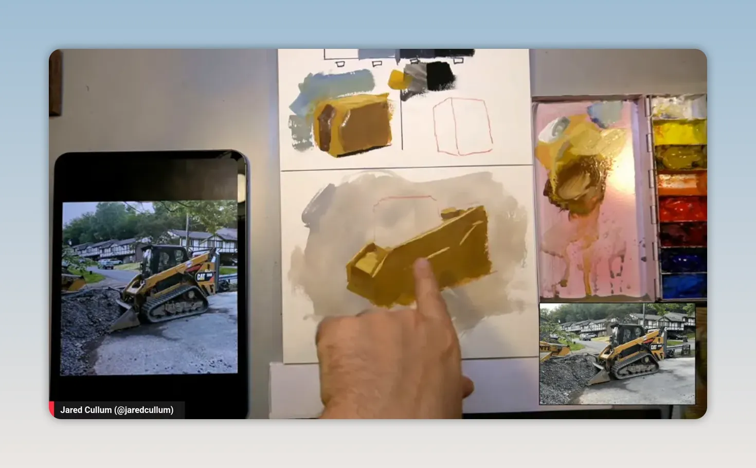
A dark underpainting is not a problem in gouache as long as water is controlled. A brush loaded with excess water will reactivate and lift the layer beneath it. A properly tapped brush can place a lighter, opaque stroke directly over a dark plane.
Step 6: Repeat the Same Plane Language in Every Smaller Part
After the large forms work, continue subdividing. A box on the back of the machine follows the same pattern as the larger body: top plane, side plane, dark plane. The arm repeats the same light logic. Even a tiny red mechanical piece needs a light-facing red plane and a darker red plane.
This is the point where detail becomes useful rather than distracting. Every new element must belong to the value language already established. Rather than guessing at what a construction part “should” look like, ask which direction its plane faces.
It can actually help to paint subjects that are unfamiliar. The mind likes to “correct” a drawing according to what it thinks a car, face, or building should be. A mysterious machine can feel more abstract, allowing the painter to observe the actual shapes and value relationships instead of relying on symbols.
Step 7: Reserve Highlights and Add Only the Details That Help
The lightest lights should be protected until late in the process. A small reflection in the cab glass, mixed from white with the slightest touch of yellow ochre, can make the glass feel convincing and keep the painting from looking cold.
Likewise, a dark interior, a narrow under-plane, or a small door handle can establish scale and clarity with very little paint. The details do not need to explain every mechanism. They only need to reinforce the larger structure of light and form.
From there, it is simply a matter of continuing the subdivision: large planes first, smaller planes second, and tiny accents last. This is a reliable way to paint quickly on location as well. A four-value statement, even made with a pencil and marker, can communicate the essential idea before the light changes.
Step 8: Apply the Method to Anything
The construction loader is only an excuse to practice. The principle remains the same for portraits, figures, landscapes, still life, buildings, pets, paint tubes, and people. Begin with the simplest possible solid, identify how the light strikes it, and sculpt the idea one plane at a time.
Painting form is not about rendering every fact of reality. It is about finding a clear, limited arrangement of values that makes an object feel like it occupies space. Once that language is established, every additional mark has a job to do.
FeedSpot has selected Realism Today as one of the Top 20 Oil Painting Blogs on the web (FeedSpot, 2026)
Take your realism art to the next level when you attend Realism Live ~ a multi-day virtual art conference led by 20+ world class artists. (No tech skills? No problem! If you can click a link, you can join our event!) Learn more at RealismLive.com!
Blog post prepared for the web by Cherie Dawn Haas, Editor of Realism Today