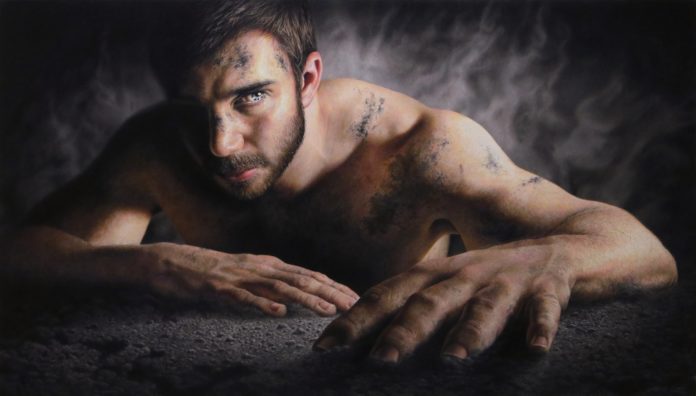
Contemporary Realism > Learn how colored pencil artist Jesse Lane uses lighting affects to create a highly emotional piece of art.
BY JESSE LANE
Many of the best artists believe that art is not about what the viewer sees, but what the viewer feels. It’s often emotion that connects the art with viewers, leaving them yearning to experience more.
It’s said that everything you can do has been done before. We see many of the same images time and time again by different artists. And eventually we can grow numb to them.
But we still experience the fascination and wonder of unique pieces. They grab us and pull us in. It’s a rare experience. We connect with them on an emotional level.
So what makes one piece of art more emotional than another?
The answer to this question has many parts. Lighting is one part. Lighting pushes viewers’ reactions to a deeper level. It’s what causes them to go from simply seeing something to experiencing it.
In a way, lighting is our most important tool. Lighting defines form, creates composition, and adds energy, drama, mystery and mood.
Less is more. As viewers, we like being told where to look. We don’t want to hunt through a cluttered image to find the meaning of a piece. With effective lighting, an artist can direct the eye, walking viewers through a piece to the emotional reward.
We focus on areas with the most contrast, saturation and detail. When these become present in a single area, a focal point is formed. Our attention centers on the focal point. The longer we look at it, the more we think about what we are seeing. In a portrait, lighting might be used to direct the viewer’s attention to the subject’s eyes, which are usually the most expressive part of a person.
This causes more emotion to show through. The more artists can control lighting, the better they can enhance the emotional impact of their work.
Principles of Lighting in Contemporary Realism
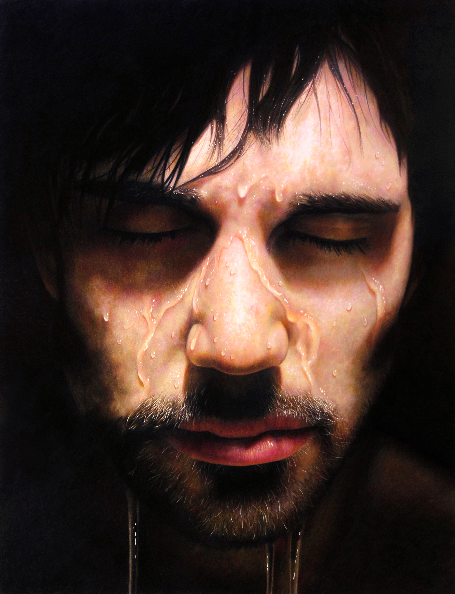
Here’s an example of how lighting enhances emotion. After the Storm is a straight-on head-shot. It’s a basic concept that has been painted many times, but the way this one emerges from shadow adds drama and mystery. It begins to evoke emotion and thought in a way it would not otherwise do.
The lighting I use is called chiaroscuro. It is high in contrast and some things completely disappear into shadow. I prefer this kind of lighting because I can hide whatever I don’t want to show and have parts of the subject dramatically emerge into warm light.
Chiaroscuro lighting is often cast at an angle, which brings out the three-dimensional quality of my subject. It has a lot of range and gives me control over what I want the viewer to see. It also lends itself well to images with a dark, mysterious mood.
In photography there is a saying that half of lighting is subtracting light. The viewer doesn’t want to be overwhelmed with imagery. When something is removed from a drawing, what remains will be more prominent, adding impact. I believe my best images are my simplest ones. Less is more.
Also, lighting can be cheated. Because light varies so much in reality, there is no one way it is supposed to look. Reworking lighting often helps to convey a vision and emotion. Almost anything can look great in good lighting, and almost anything can look ugly in bad lighting.
I light things based on their importance to my vision and the emotion I am trying to convey. What I want to be most prominent receives the most contrast, while the less important areas are given little contrast, often rendered with darks and mid-tones. Anything unnecessary is made black. Here are a few examples of the different ways I use lighting and my thinking behind them.
Related Article > On Trompe l’Oeil: A Contemporary Realism Sub-Genre
Elements of Lighting in Contemporary Realism Artworks
Contemporary Realism > Using White
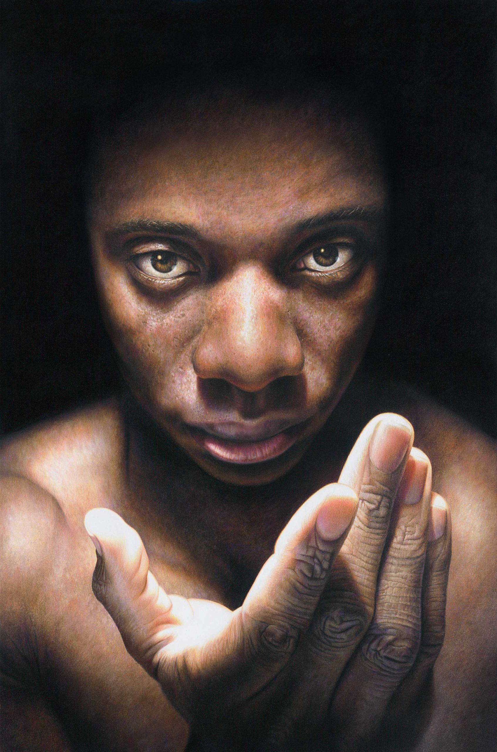
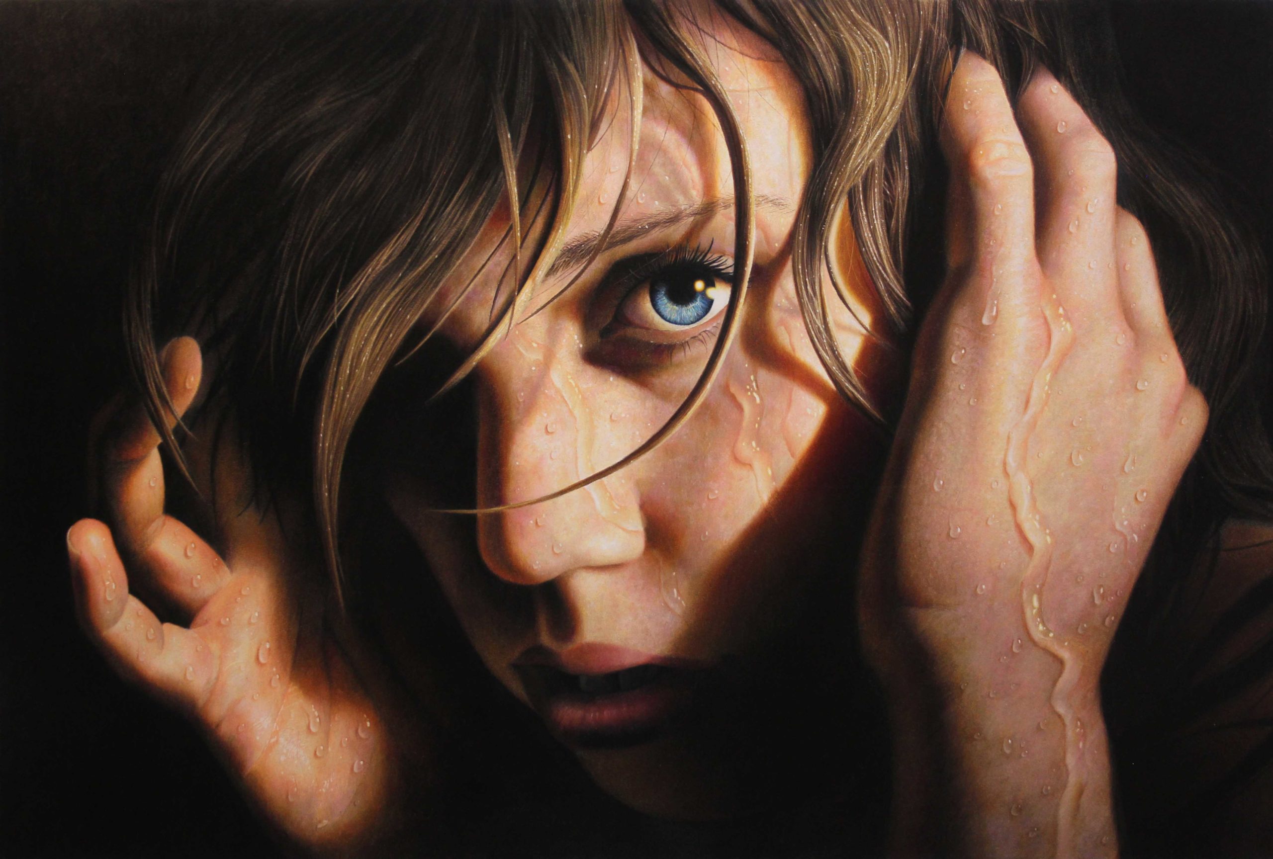
In “Manifest,” the white of the hand and eyes creates a sense of invitation and connection. Details in the hair don’t show as the forehead fades into shadow, allowing the face and eyes to emerge. The head casts a dark shadow, which emphasizes the white rim of light inside the hand. The lighting is designed to allow a few white areas to stand out. The less white I use, the more the remaining white stands out.
Color
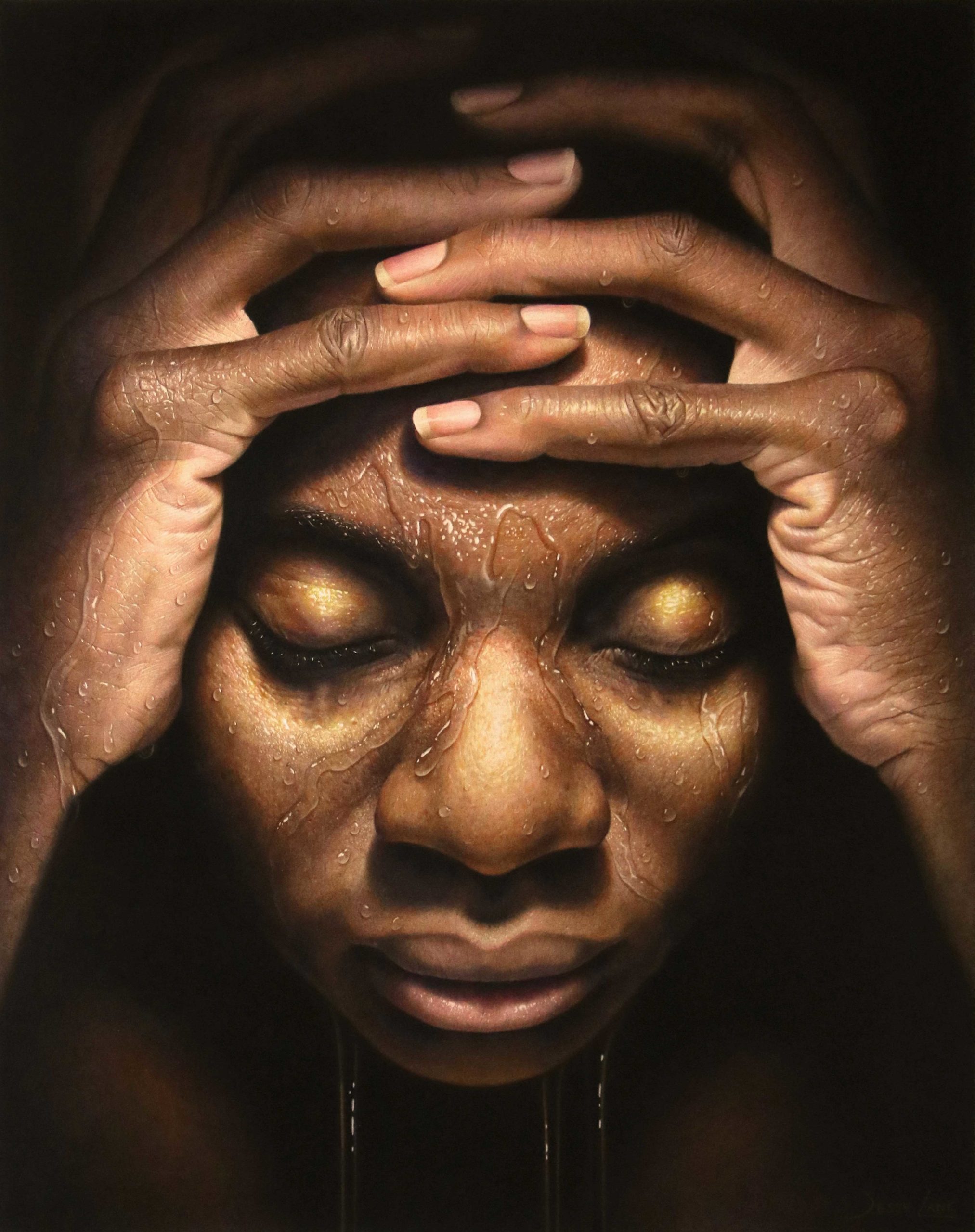
As I mentioned before, white highlights call attention to themselves in dark environments. However, sometimes I want my highlights around the focal point to feel even brighter. I’ve found that adding small bits of yellow and orange around the edge of a highlight makes it feel brighter, even though the values haven’t changed. This is done in the forehead and eye of Echoes, adding intensity. I also let the warmth eat into the edges of the neighboring shadows, which strengthens the highlight.
Details in Contemporary Realism Paintings
When one area becomes more detailed, it often becomes more prominent. As things become darker, they lose detail and become blurrier. Notice in Labyrinth how the pinky fingers show many wrinkles, while the index fingers are suggested as dark blurs. We see very little of the higher fingers as they enter shadow, yet this lack of information enhances the viewer’s experience.
The eye delights in simplicity. Even without seeing every finger clearly, the mind is still able to figure out the rest of the hands because enough information is present in the lower fingers. The darkness not only pushes attention down to the face, it also keeps the fingers from being repetitive. Each finger is slightly darker than the one below it. They all work together to create a transition from light to dark.
The detail in the face and the pinky fingers overpowers the smoother, darker areas. In this case, the lighting, details, composition and color all work together to establish the eyes as the focal points.
Overriding Composition
While composition is important, sometimes artists can’t help but have something run off the image, leading the viewer’s eye out of the picture. In “Face Reality,” I encountered this obstacle with rising trails of smoke. I decided to make the smoke darker as it approached the edge of the drawing to tone down lines that run off the image. I took the same approach with the shadows cast by the hands.
Reflected Light in Contemporary Realism
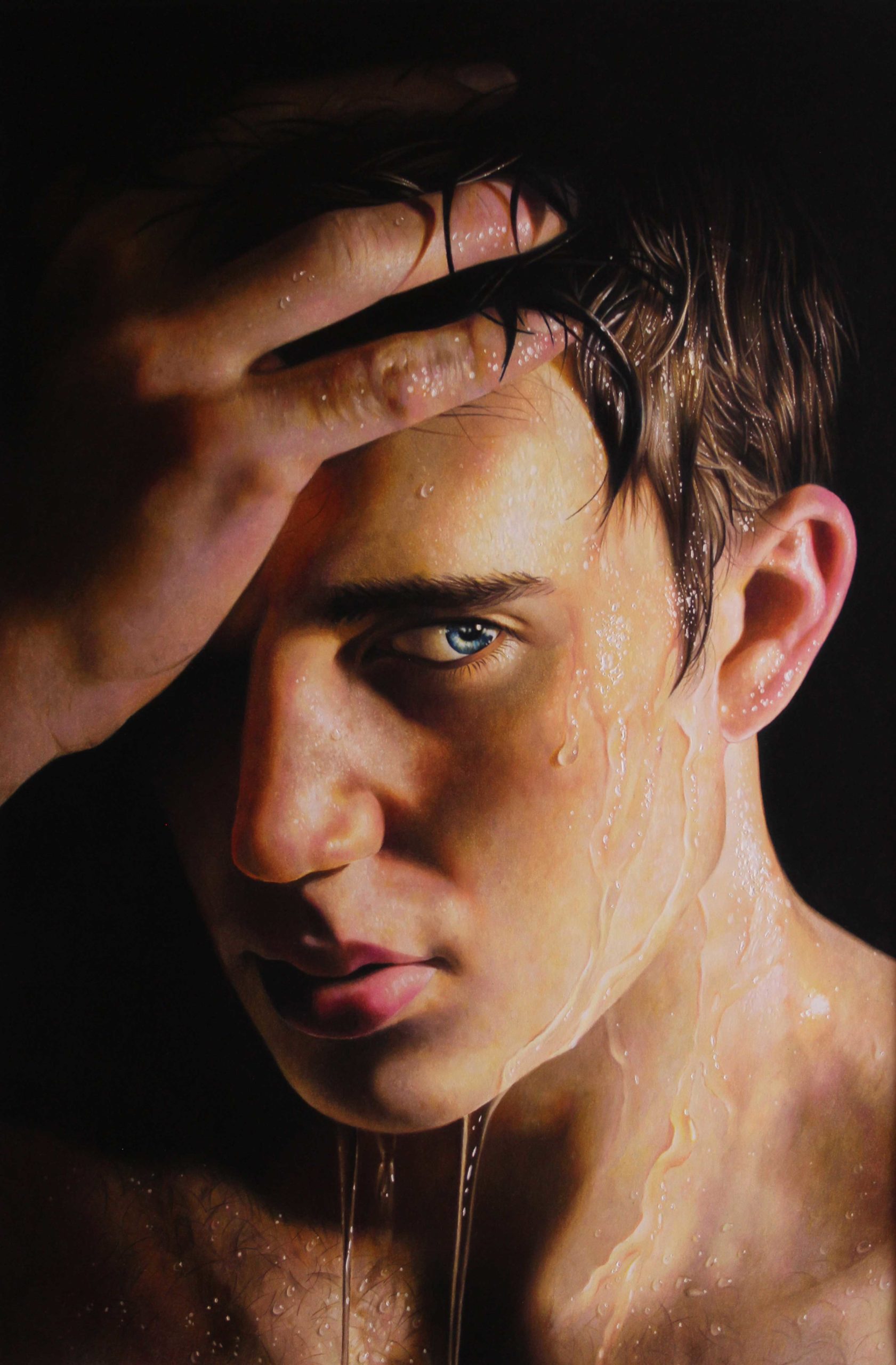
While it’s often great to let things disappear into shadow, it’s also good to know when to not let them disappear completely. Reflected light is the soft glow that gently illuminates the dark side of an object, such as in the dark side of the face in my drawing “Resolve.”
While the mouth and the skin around it become black, the reflected light keeps the head from disappearing too soon. I had the reflected light cease before reaching the eye to leave mystery, letting the hand take over. All my pieces use reflected light.
Backlighting
Another kind of lighting is rim lighting (also called backlighting). This makes the outer edges of the subject pop out.
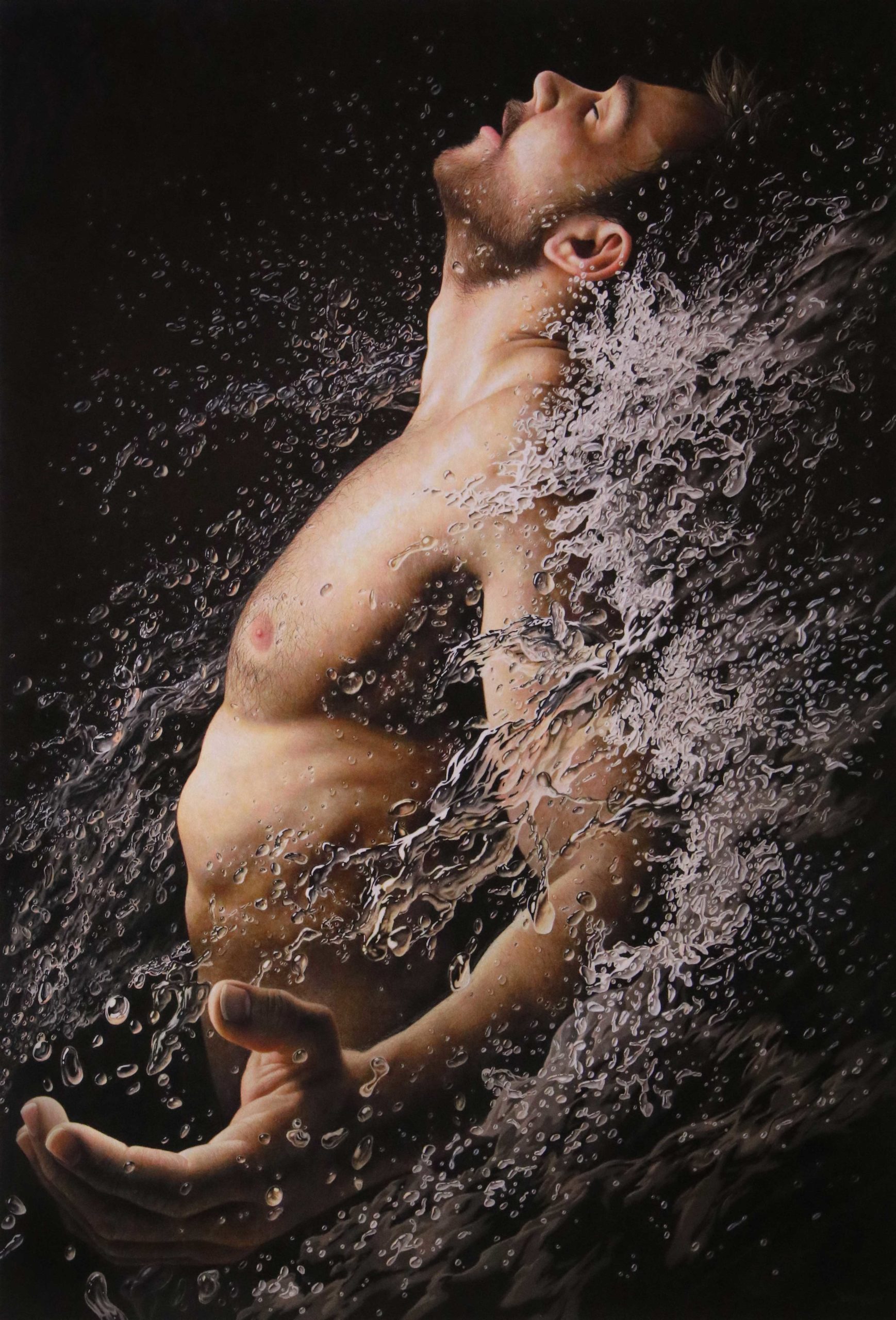
In “Adrenaline,” the key or main source of light emphasizes the pose of the figure in profile. The bright highlights on the skin contrast against the black background and darker water, creating a curve of light from the stomach to the face.
Another rim of light runs down the curve of the arm, emphasizing the outward reach of the figure. This, however, is secondary in importance, so is darker. Together the two curves of light balance each other out.
Glow
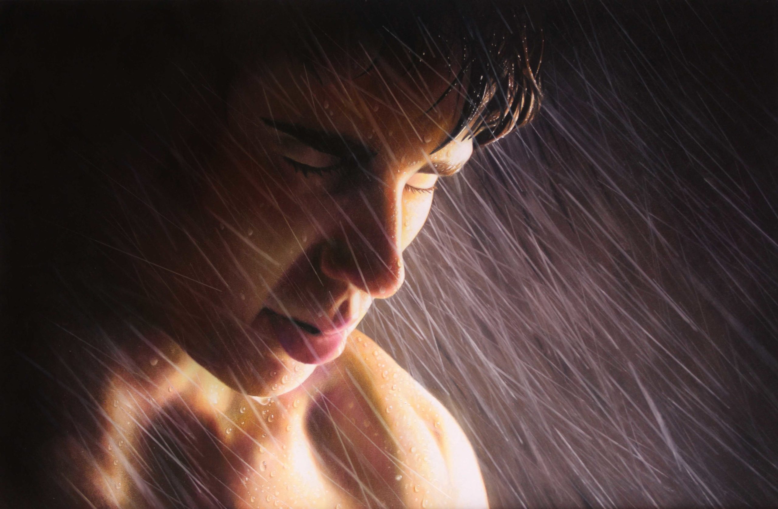
In “Endure,” the sky lightens around the face, creating a soft pool of light. This pushes the viewer’s attention to the face, rather than wandering randomly through the sky. It creates more interest and warmth to the face. Pools of light are often good for large blank areas where the eye has room to wander. It also allows that area to become a point of change, where light can fade to dark, rather than being one flat value.
Emerging & Disappearing
Perhaps my favorite feature of lighting is the way things can emerge into light and disappear into shadow. It is more interesting to see something constantly changing.
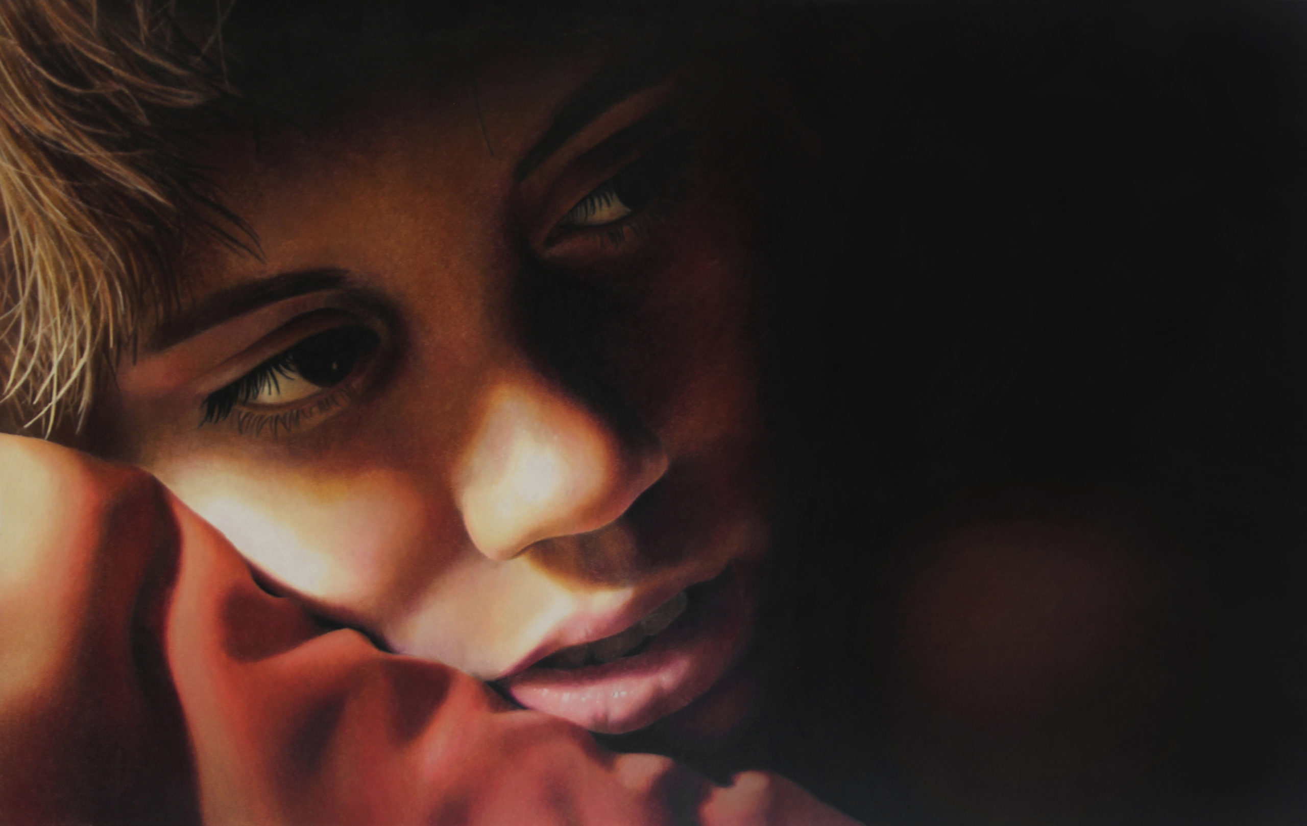
On the left side of “Drift,” the girl has several highlights, and we can see she is pressing her face into a cloth. On the right side of the drawing, notice the shadows getting darker as they begin to consume her features. Her shoulder is suggested as a dark brown blur. The black area creates a negative space for her gaze. The fact that this area is so empty leaves the viewer uncertain as to what she’s focused on, causing us to wonder what the image means. When we try to decode something, we wind up looking at it longer, ultimately forming a deeper connection to the work.
Sillhouette
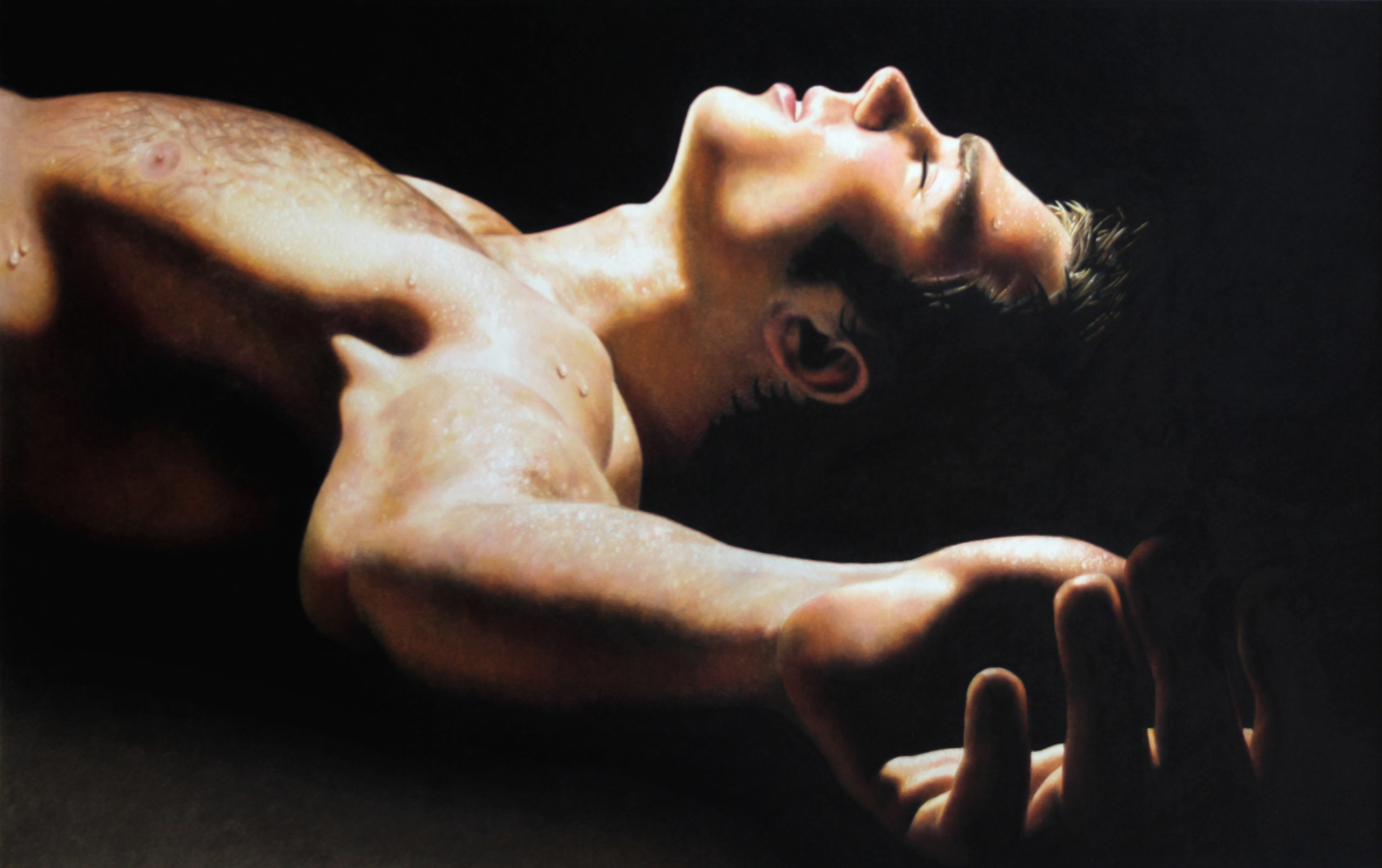
In “Gravity,” the fingers are largely defined through silhouette. This stops the hand from visually reaching off the image, while making it unique from the rest of the body. Even though we don’t see many details in the fingers, the mind is able to fill in the missing information. It adds design to the image.
Hairline
One way I like having darkness eat into my portraits is through the hair. I often prefer to draw models with dark hair because it merges well with the surrounding darkness.
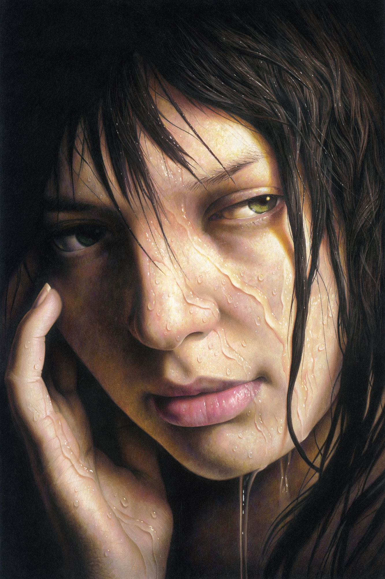
In “Riptide,” we see the hair introduced as a silhouette on the left side of the drawing. The hair becomes more detailed on the brighter side and returns to being a silhouette at the bottom of the image. This is one of those times where less is more. We don’t need to see every hair. The silhouette mixes things up and gives her hair a unique identity depending on where the viewer looks. The hairline also creates an organic edge to the lit skin, creating a series of triangular shapes.
Contemporary Realism: Let There Be Dark
Many beginning artists struggle to use enough contrast in their work. We’ve all seen pencil drawings done by beginners that look pale and washed out. They were made using a limited range of grays and the lighting is simply whatever happened to be present. Images like these lack the use of pure black and white. Most beginners who work on a white surface are afraid of using black, especially in grayscale work.
I always make sure to use the full range of values. For this reason, the first thing I do is draw a small black area to establish a true black standard for the rest of the piece. I do this because our eyes adjust to the light they are seeing. Something dark can feel black without being black. You may think you’re making your darks dark enough when they’re not.
Using black means an artist will achieve more contrast. At first, a single black spot will grab all the attention and you may find it distracting from your focal point. This is because when you work on a white surface, anything black will have the most contrast.
But just because it doesn’t look good immediately doesn’t mean it never will. I find the more black I apply, the less prominent it becomes. As the white of the paper is filled in, the brighter areas begin to call more attention to themselves. In the beginning of my pieces, large areas of pure white feel empty. They attract no attention, but in the end they boldly stand out. Everything starts out backwards and reverses as I work.
It can take a little faith to see an image through to the end. That’s why planning out a vision is critical to making an image come to life.
Using Photoshop, I’m able to edit my reference photos and create the desired lighting.
Most often, I digitally paint things to be lighter or darker, enhancing colors as I go. I’m also able to test ideas, without committing to them in my drawing.
What I create in Photoshop serves as a road map. It lets me know that even though one area may overpower the composition during the process of completion, things will balance out in the end.
The Language of Emotion
In all art, there is no one correct way of creating. These are just some of the ways I use light in my own work and my thinking behind them.
While it can be technical, lighting translates into emotion. It helps create work that touches us, and even haunts us. In visual art, light is the language of emotion. Light tells us what we are seeing.
Everything we see is light.
ABOUT JESSE LANE 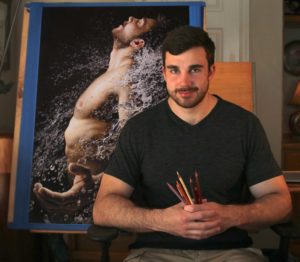
Jesse is a portrait and figurative artist based in Houston, Texas. Since launching his career, Jesse’s provocative portraits—all in colored pencil—have captured attention.
His numerous awards include top honors from the Salmagundi Club, International Artist magazine, the Colored Pencil Society of America and the Hudson Valley Art Association. He was also a finalist in the 2016 International Art Renewal Center Salon. Jesse’s work has been featured in publications including American Art Collector, Southwest Art, International Artist, Fine Art Connoisseur and on the cover of The Artist’s Magazine. Jesse is represented by RJD Gallery in Bridgehampton, New York.
View more of Lane’s contemporary realism in colored pencil: http://www.jesselaneart.com
Visit EricRhoads.com (Publisher of Realism Today) to learn about opportunities for artists and art collectors, including: Art Retreats – International Art Trips – Art Conventions – Art Workshops (in person and online) – And More!


