


Contemporary artist Jennifer Balkan on the color blue, expressionism, and distorting reality to evoke emotion. She says, “I do not think I could survive without a true blue…”
I Feel Blue Much of the Time
BY JENNIFER BALKAN
Jennifer Balkan teaches how to paint portraits with a limited palette of just four colors in her art video workshop, “Limited Palette Portraits.” Jennifer was also a faculty member of the 2019 Figurative Art Convention & Expo. The next Streamline Publishing event is Watercolor Live, an online art conference January 2021.
Blue cools it off. Our veins appear blue beneath the surface of the skin. The sky is blue because water is blue. Even when the sky isn’t blue, it’s cool in temperature color. Together, as Lord Rayleigh explained in the 1870s, the molecules of these gases “scatter the blue colors of sunlight much more effectively than the green and red colors. Therefore, a clear sky appears blue.” There are many places in the world where the haze of air pollution results in the sky appearing pale blue or creamy white. Yet the color blue was not always so accessible in painting.
Historically, the color blue was very expensive for artists to use. It was made from lapis lazuli and could be extracted only from a mountain range in Northern Afghanistan. It was reserved for the richest patrons of painting commissions. For that reason it is seen sparingly in earlier work. Early cave paintings were predominantly based in reds, blacks and ochres. In the twelfth century, the Catholic Church dictated to Rome and the rest of Europe that painters depict the Virgin Mary in the most expensive color, blue.
Since blues were so expensive to make, there was a drive to create a synthetic blue. Ultra-marine literally means “the end of the sea,” the bluest of all blues, the superlative blue. In 1824, the Société d’Encouragement offered a reward to whoever could invent a synthetic blue. German professor Christian Gmelin competed with French chemist Jean-Baptiste Guimet, and after some contention, the award was given to Guimet. It was consequently named French Ultramarine. So once blue became affordable and available, its usages soared. Thanks to the Impressionist movement, blue became the atmospheric color of choice, no longer reserved only for the raiment of the Virgin Mary.
Related article > 5 Tips for Drawing on Toned Paper
Big Blue Strokes and Planes
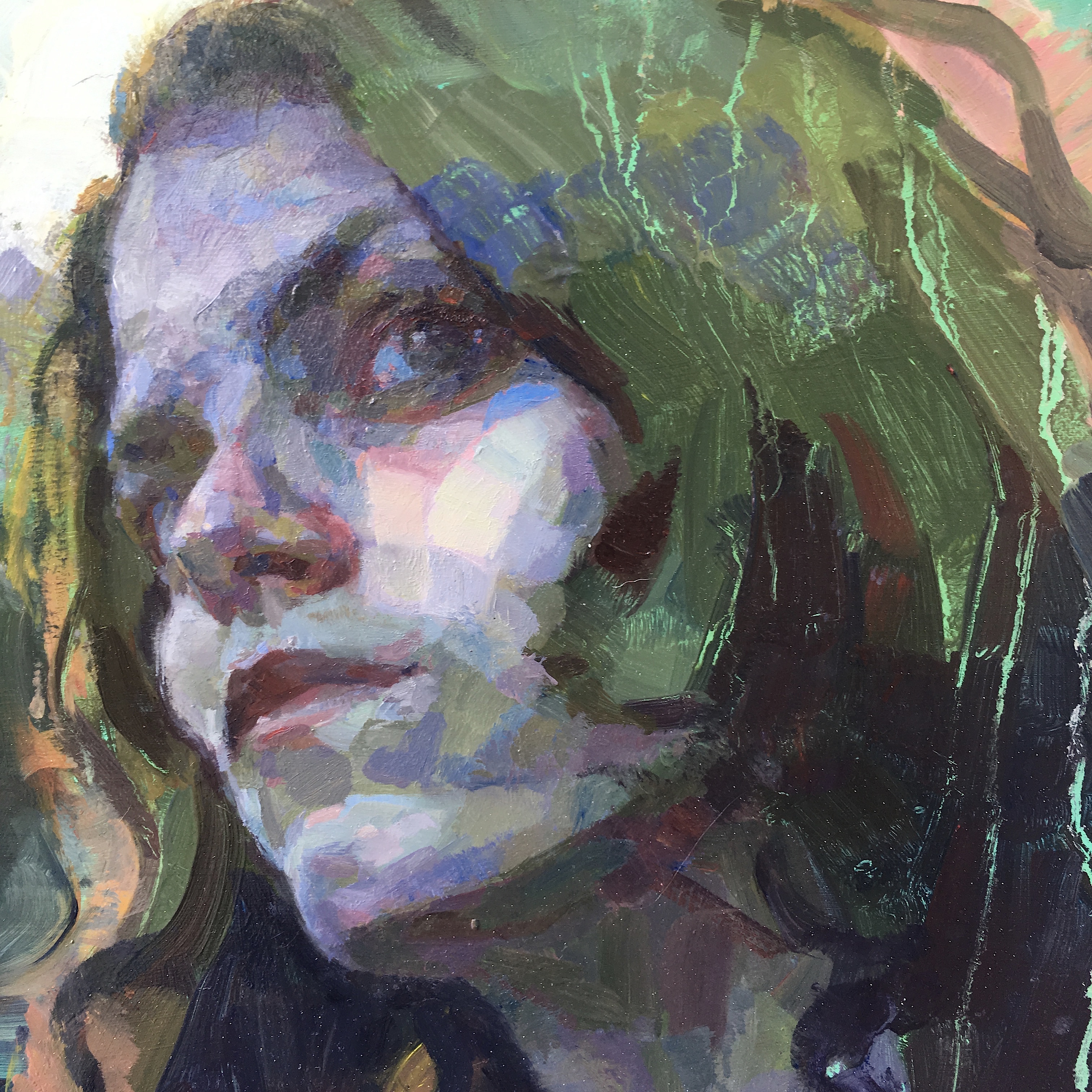
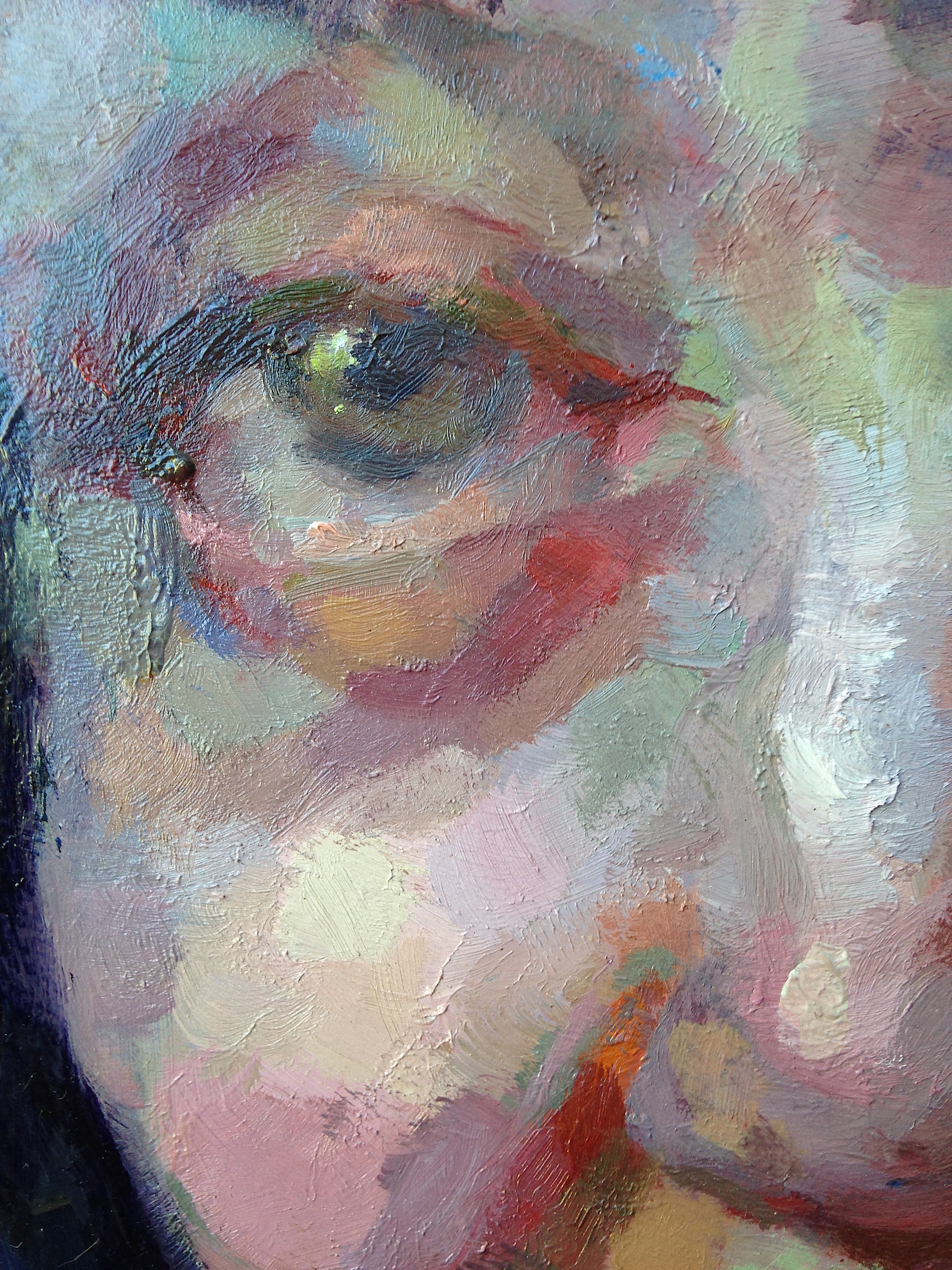
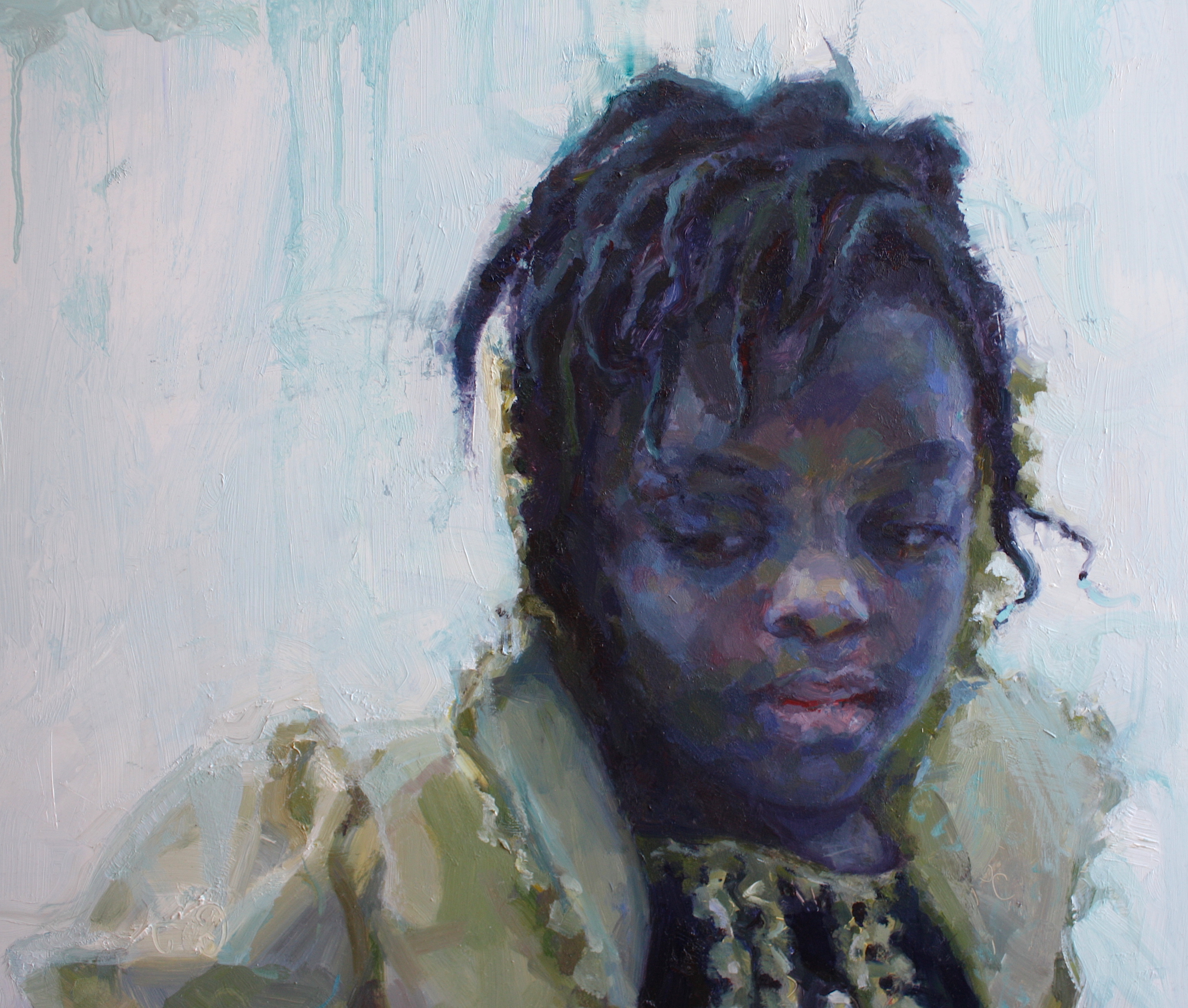
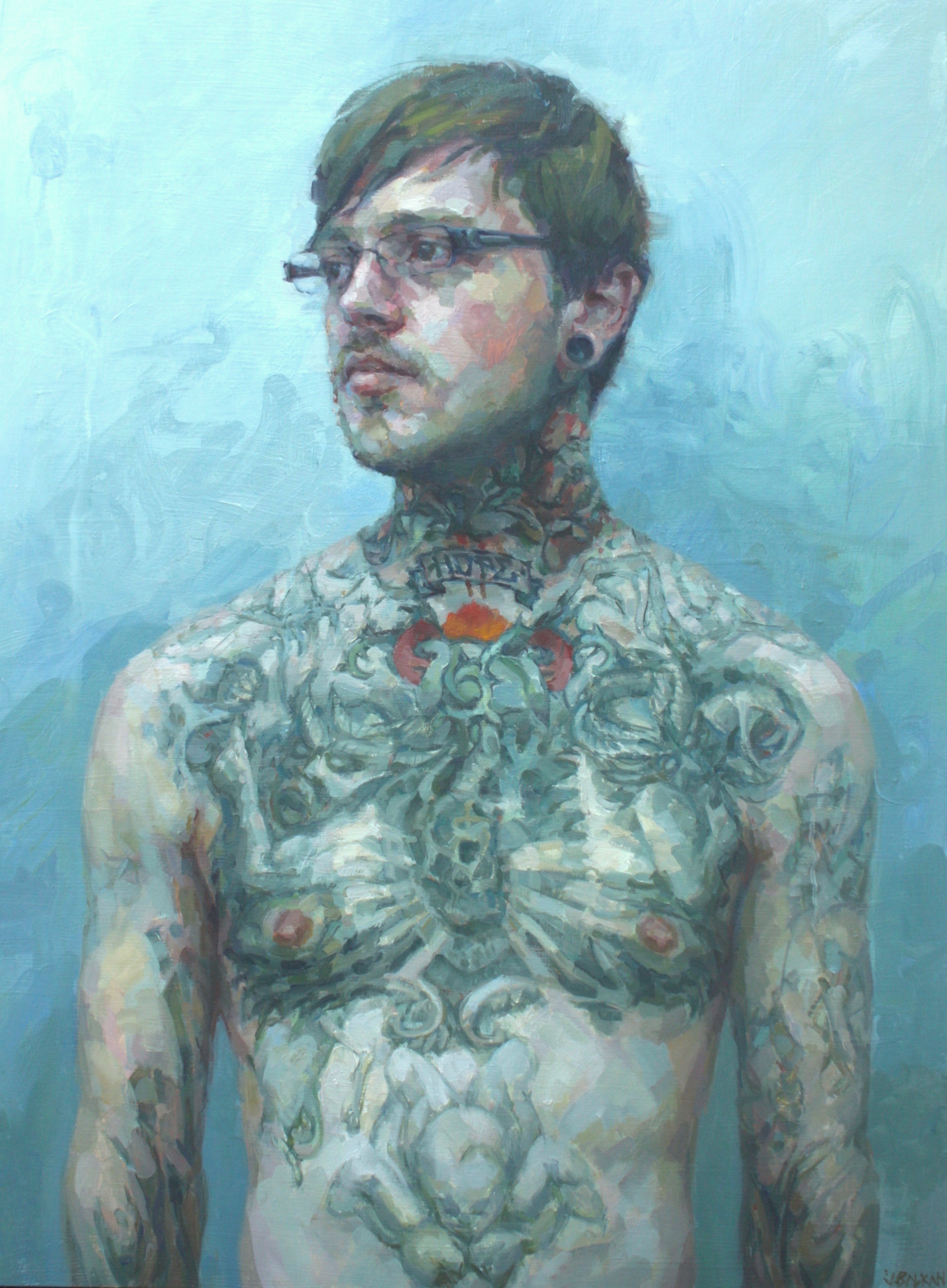
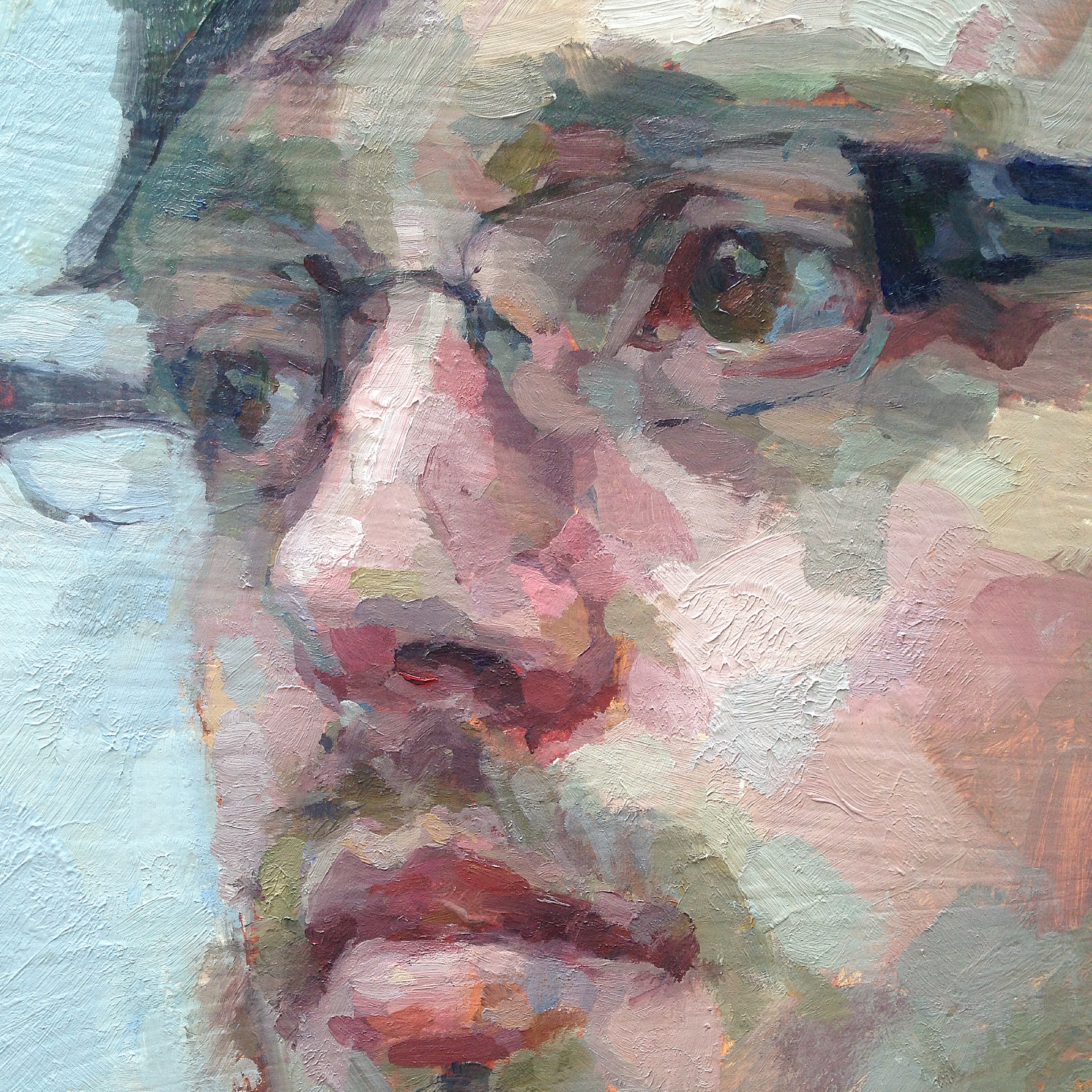
The Impressionists invented the application of alternating complements and temperatures to create a vibration in color. It’s funny now to think about inventing this idea but the Impressionists were the first to break it down in this way. Not only did they break up color fields, they alternated warm and cool color to give the viewer a sensation of light on the canvas. In this way they strived to play with our color perception. They implemented larger strokes to encompass a particular color and temperature, and laid them side-by-side, alternating these temperatures, and further decreasing saturation as the form moved into shadow or away from the viewer. Complementary colors were laid side by side. These artists intended to enable the viewer to do the mixing, so to speak. That is, the viewer’s light and color perception would work to articulate form turn and movement on the canvas. The visual story or depiction is not completely spelled out.
Though I don’t think of my work as impressionistic per se, since my paint application is not always made of large strokes together, my technique is indeed impressionist-inspired. I want the viewer to put these pieces together to perceive the visual statement. I want my painting read as very clear from far away but upon close inspection, the pieces and paint swaths become discrete to the eye. Known as optical mixing, this phenomenon is important to me.
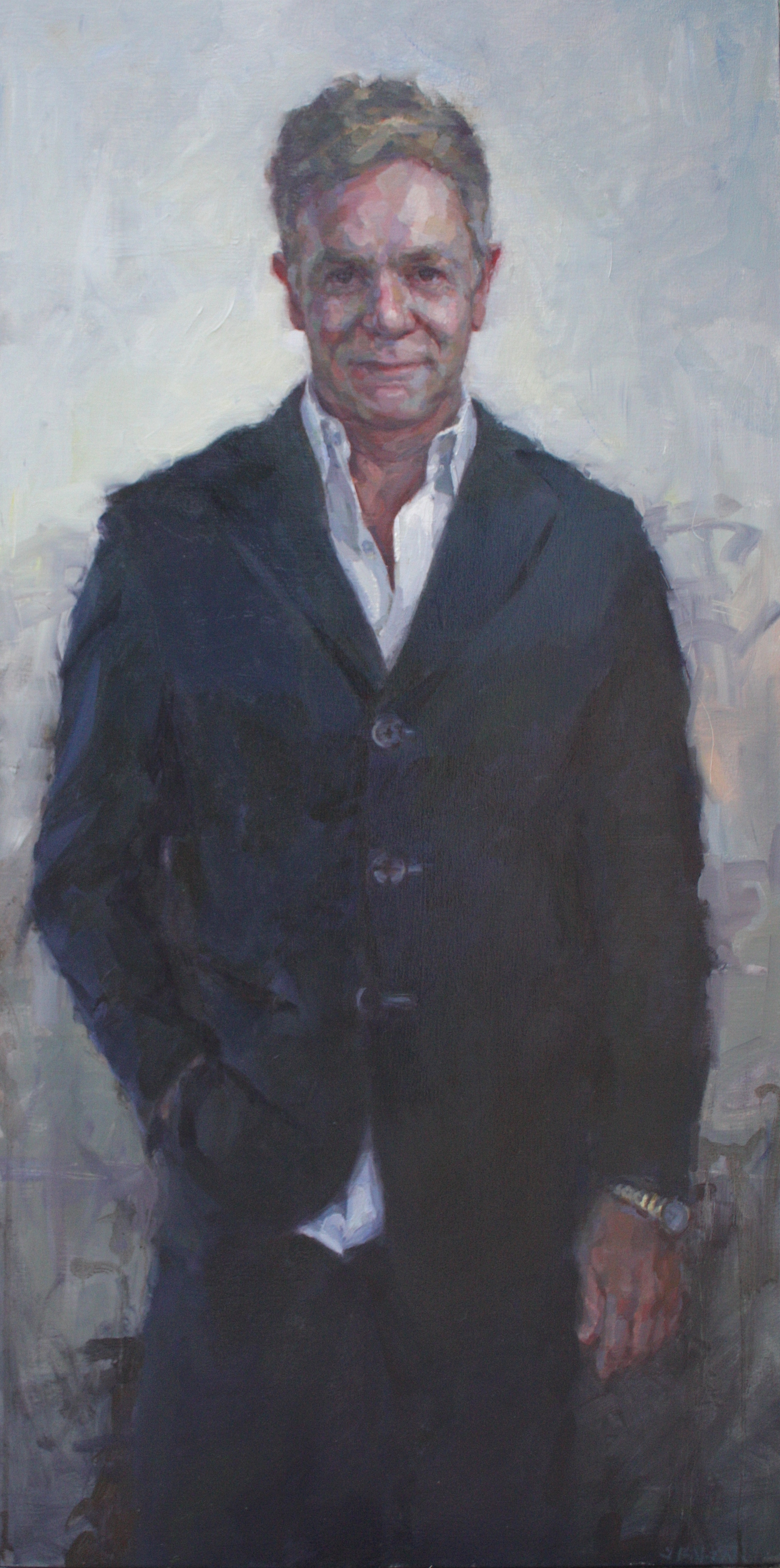
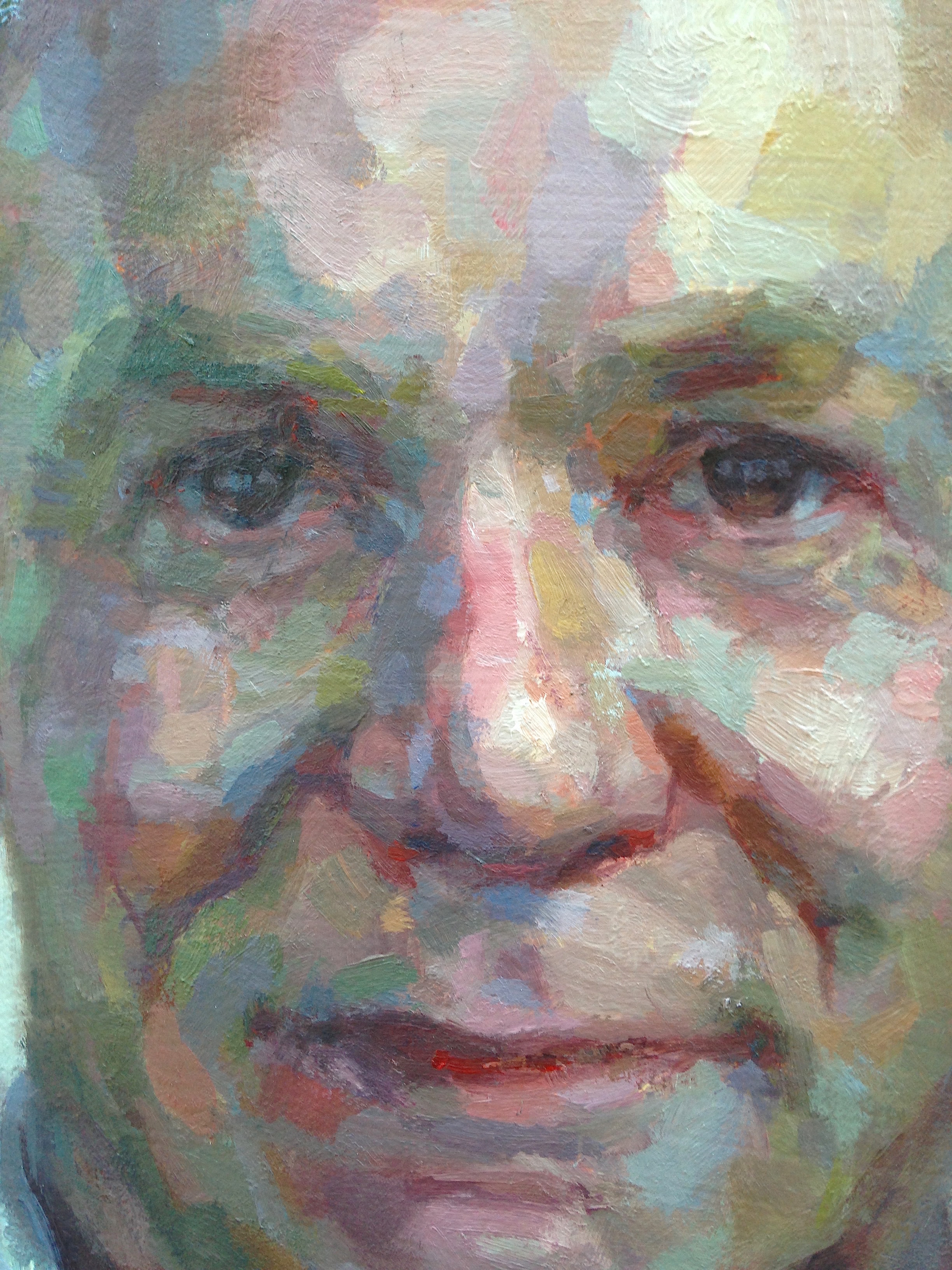
In composite my discrete patches of paint articulate form. As each one turns over the form, it cools off in temperature. More of the color blue is added. Subtle changes in color planes are no longer identifiable or labelable. The subtle and not-so-subtle adjustments in chroma, value and temperature describe nature or my reality. And as I lay down each patch, I’m conscious of keeping the integrity of those strokes. I want each swath to carry its own weight yet be abstract on its own. Yet the sum of all these parts makes up the whole. The sum is indeed greater than its parts. But I want the parts to be known and observed in themselves, and I feel giddy that they will be joined together or merged by our visual cortex. Our brains are literally working a little bit harder to make visual sense of these kinds of pictures — those which depict reality in a slightly more abstract way. Putting together these visual puzzles is currently studied in the research field of neuroaesthetics.
In this way the Impressionists laid down their blues alongside their oranges, to create movement and turning of form. Their heavy and looser application of paint inspired much of their work and has been my personal inspiration. I have always gravitated toward the kind of painting that knows it’s painting . . . big, brushy, loose strokes that still have precision and intention.
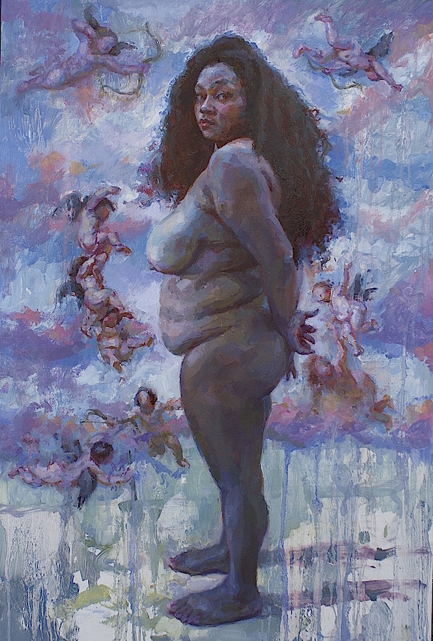
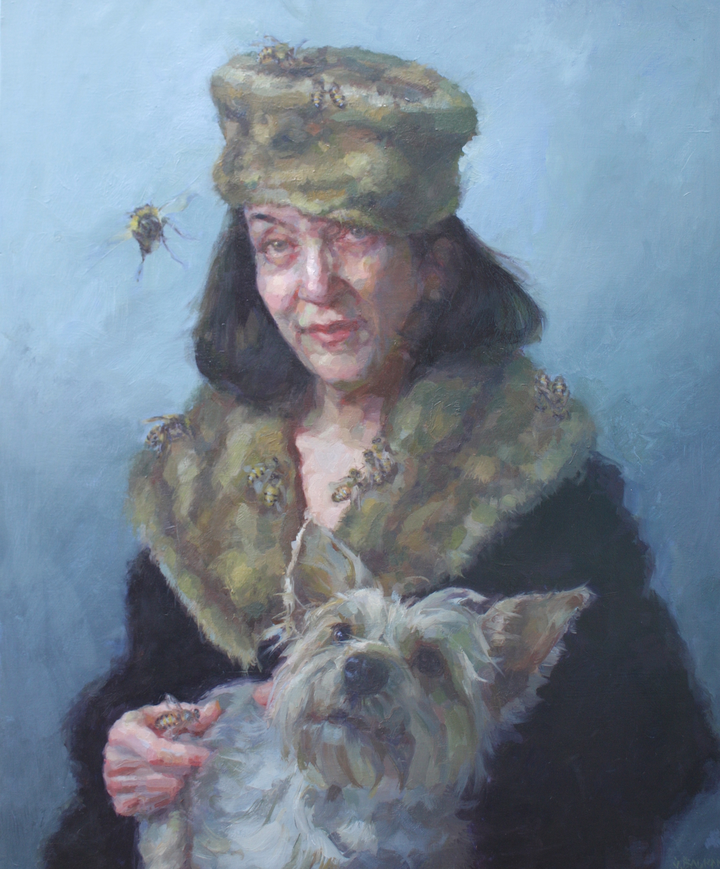
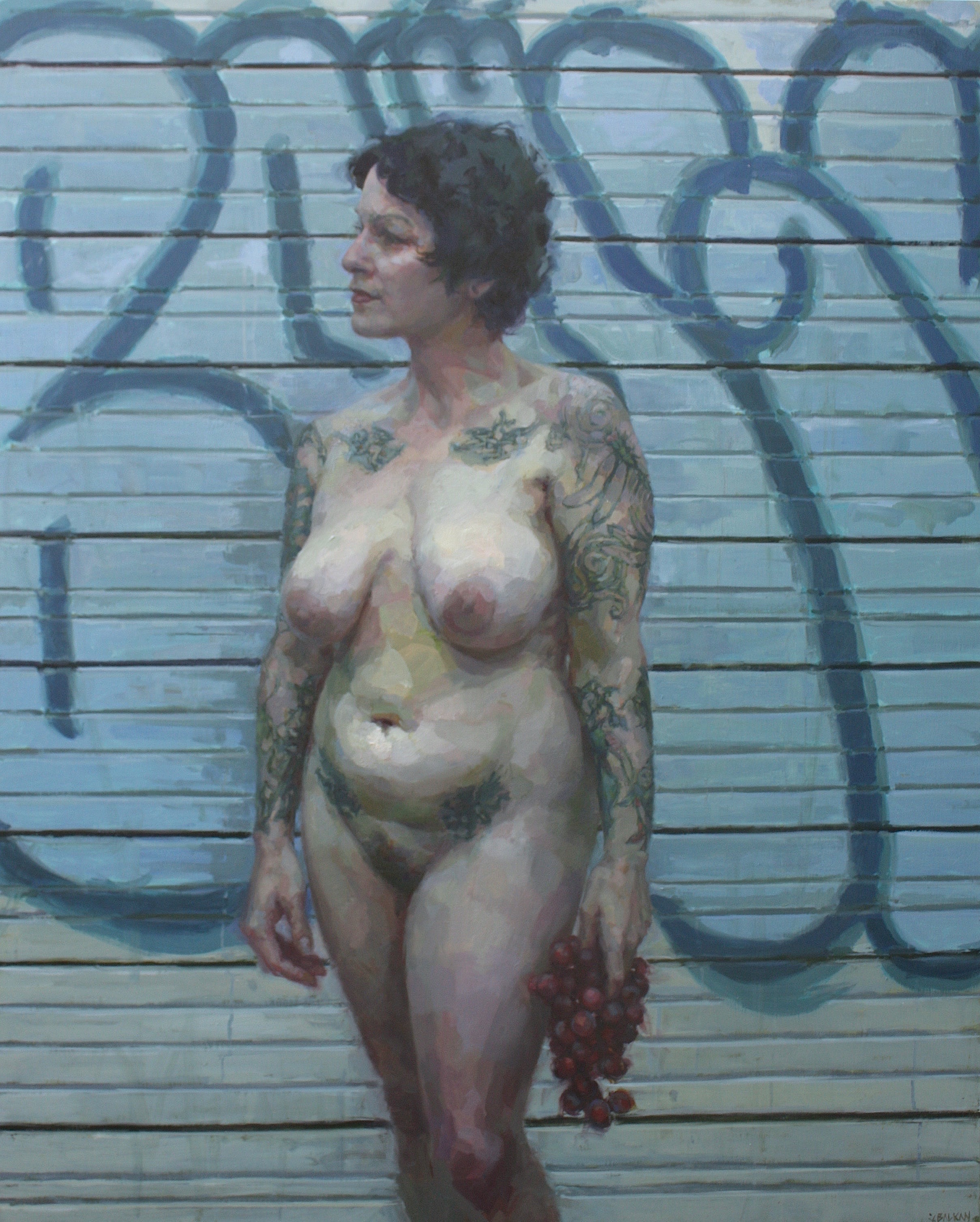
I have always been drawn to expressive realism. My true love in painting is portraying the figure, in particular the portrait. Historic painters who have inspired me tremendously are Lucian Freud, Euan Uglow, Oskar Kokochka, and John Singer Sargent. Some contemporary masters whose work I greatly admire and have consulted with are Jenny Saville, Ann Gale and Catherine Kehoe.
They are masters at capturing something I believe is beyond a likeness; the likeness is definitely true, yet in these pictures, one can feel what also lies underneath the skin. They evoke emotion. The paint application is very much part of the message. I believe it is part impressionist technique and expressionism which defines their kind of realism. Reality may be a bit distorted to evoke emotion.
Distorting My Reality to Evoke Emotion: Expressionism and the Color Blue
I think that I have always intended to paint this way. My earlier works were broad brushed as well, but my technique has evolved. Having studied direct alla prima representational methods, I have improved my approach. My strokes have a precision they did not have before. I look at my past work and it feels sloppy to me. I have become much more aware of the way by which form turns away from a light source and with close study and inspection, the idea that every round form is made up of a number of planes. So I find that I am better able to articulate form when I see it as planar and apply it as such.
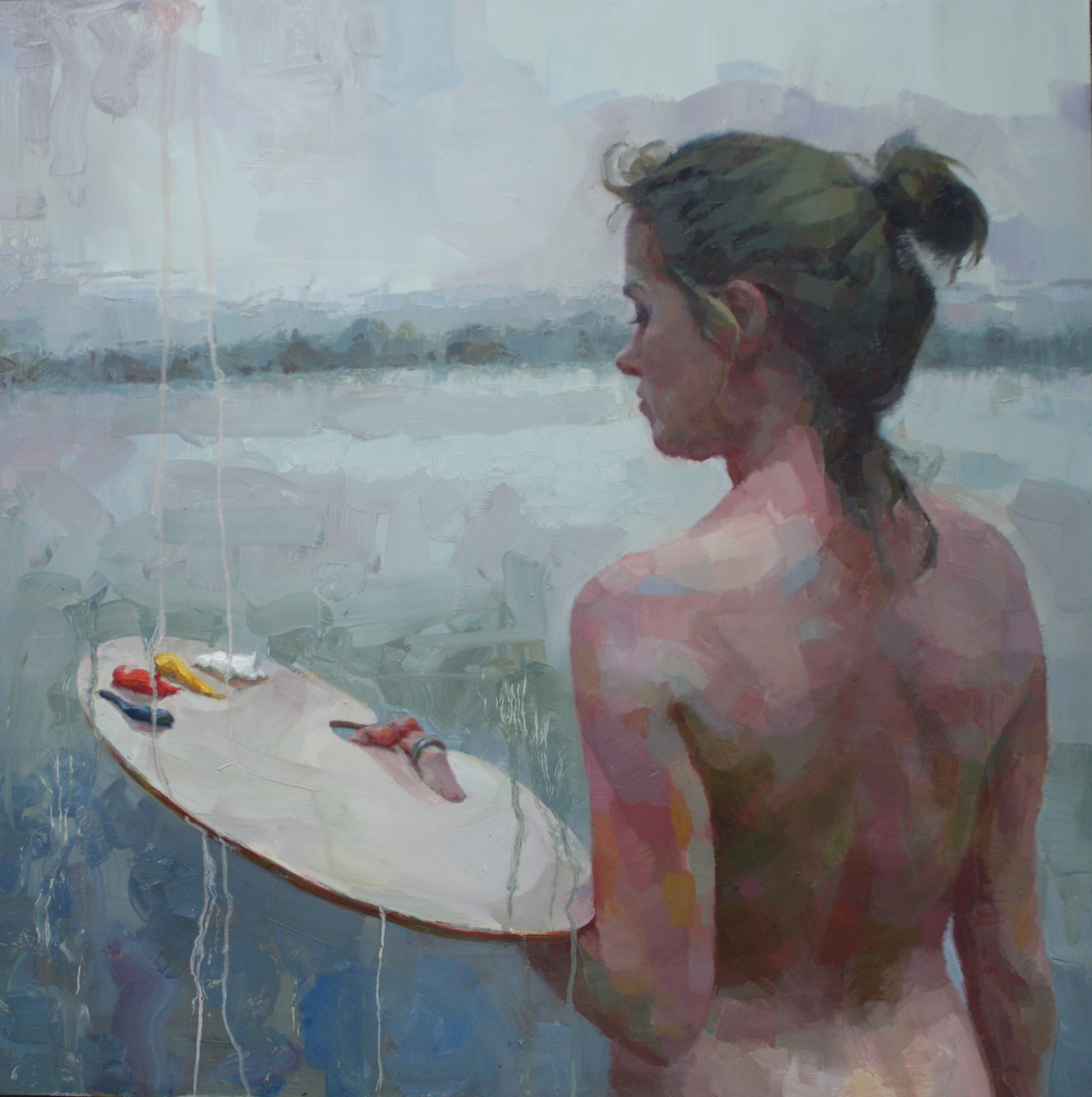
I believe the realness or naturalness of painting comes from incorporating a subject into her/his environment or context. Now this might just be a stark space — with no other visual information or objects — just the air painted. So my motive is to apply paint with an atmospheric quality. In terms of color the painted atmosphere must relate to the subject. The painted atmosphere affects the turning of form. As a form turns and a plane changes, the temperature cools off. The cooler temperature relates to a cooler environment in much of my work. This brings life into it. More often than not, I have felt that if my painted subject lacks vitality, it’s likely because there are not enough cool temperature mixtures in my paint, that is, in my transitions or half-tones.
I have been finding that in both my indoor work and my outdoor-inspired work, I rely heavily on my blues. I use only one blue — ultramarine blue, but mix it into all my other paint. In my indoor work, I use less of it but it still is an important transitional tone. And lately, I’ve preferred to use natural light indoors.
I do not think I could survive without a true blue. For the last two years, I have been using a limited palette. When I mix my colors, I shoot for coming up with mixtures that approximate reality but push the boundaries of reality. I think heavily about how to create or render the idea of form, to describe form in planes and to create color mixes that describe the constituents of a color field or plane. That is, a person’s cheek could read quickly as a pinkish yellow but upon close inspection, one can see little bits of pale pink, creamy pink, and lilac as we move into the cheekbone area, aqua moving down the bone into honey gold as we move into the flesh under the cheekbone, for example. Reflected lights can be so rich and beautiful and informative.
I like to exaggerate the chroma at times and break it down into more saturated reds and oranges. Whatever mixes I make, I find that when I create blue hues that read as blue, more life is breathed into the flesh and spirit is breathed into my subject. Turning planes take on a cooler temperature that resembles the atmospheric temperature and color. And of course there is the mood of the painting. Even the warmest of subjects I complement with a cool context. I find a beautiful and emotion-evoking experience when contextualizing my warmer and even warm-coolish subjects into a coolish environment.
I always hope that some of the challenge I experience when trying to bring life into these very intentionally juxtaposed planes of paint is matched by the perceptual experience of the viewer. And as I adjust and adjust and adjust, sometimes it seems I have to arbitrarily decide that I am finished. At some point, I decide that that plane does not need to be broken up. And I imagine as I am painting that the viewer can feel the thought behind each move, and see some of the process behind the painting. As I lay my paint down, I am hoping that each mark describes not only the outermost layer but reveals something underneath our skin.
We humans are full of emotion and even on our brightest of days, we are sensitive and vulnerable. Blue helps me bring life to my canvas. And from there, the viewer’s perception plus life experience provides connection and interpretation. And the circle is complete.
ABOUT JENNIFER BALKAN
Jennifer grew up in New Jersey and began to draw at a very young age. She studied neuroscience in college and considered pursuing a path in psychology. After living in Boulder and Seattle, she moved to Austin. She attained her Ph.D. in 2001 after conducting anthropological fieldwork in Mexico. Although her experience in Mexico was rich, Jennifer longed for artistic creativity. In August of 2001, Jennifer spent a month in Spain, France, and Italy where she saw masterworks that would become her inspiration. She then threw herself into oil painting and now paints fervently.
Jennifer has taken art classes at Laguna Gloria Art School, the Austin Fine Arts School and at the Art Students League in Denver. She currently paints in her studio and in life painting groups. She has been teaching figure and portrait painting in oils to private groups of students since 2005. Last year, she cofounded Atelier Dojo, a realist art academy in Austin, Texas. Her work has been exhibited across the United States and in Europe and has been featured in a number of national and international art publications. Her portraits have received awards by the Portrait Society of America and she has been awarded “Best Visual Artist” by the Austin Chronicle’s Readers’ Poll and nominated by the Austin Critics Table for Austin’s Best Visual Artist. She recently had her first international solo exhibition at the Chimera Gallery in Mullingar, Ireland. When not painting, she is adventuring through life with her son Karlo and husband Jeff either on bicycle or unicycle or romping around with her canine pal Archie.
Visit her website: http://www.jenniferbalkan.net
Liven Up the Color and Elegance in Your Portraits 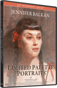
Jennifer’s obvious love for color comes through in all of her paintings. You’ll find yourself loving color more than ever when you see her portrait demonstration of “Woman in Red” as seen in her art video workshop “Limited Palette Portraits” (preview below).
She shows you how to boost what you see in subjects to liven them up with color more vibrant than is actually there, while making your paintings have that feel of taste and elegance. This is a perfect solution if you have struggled to add more life and taste to your portraits.
”")

