On Drawing > Joel Daniel Phillips shares the inspiration and techniques behind his hyperrealistic drawings in charcoal, graphite, and ink.
Drawing as a Way of Seeing: Hyperrealistic Art
BY JOEL DANIEL PHILLIPS
Upon the invention of the camera in 1816, the role of the painter and draughtsman as the capturer, and therefore arbiter, of images in society was forever changed. Many would argue that this invention was the death of the journeyman painter, and the contemporary art world has a tendency to look at realist painting and drawing as the unwelcome uncle, drunk at Christmas, who just won’t take the hint and go to bed.
200 years later, we live in a world that consumes images at an exponentially increasing rate. Smartphones, social media, and the internet have made the creation and the consumption of images not just commonplace, but unavoidable. And with this ever growing consumption comes a numbness to the complex reality of the images we gorge ourselves upon.
Le Corbusier said that “the only way to truly understand something is to draw it,” and this is the center of my work — an attempt to sincerely grasp what I see through the tip of a pencil and a piece of charcoal. My creative process is inherently about labor, and against the modern backdrop of instant, image-driven gratification, I have found the physical process involved in the painstaking, craft-driven rendering of a subject or a moment to be ever more important. The rigorous, meditative labor of observation through draughtsmanship is a means to an end. This end being, for me, a deeper and richer understanding of the world around me and the complexity of its histories.
I believe that we are living in a truly pivotal moment where the ease with which we can take photographs and the overwhelming abundance of images in our daily lives mean that people are longing for things that operate at a different pace, both from the standpoint of the creator and the viewer. Work made by hand has a powerful resonance in a world that churns out cheap Instagram images by the millions, and I believe that the anachronistic application of effort and skill will continue to stand out more and more in the years to come.
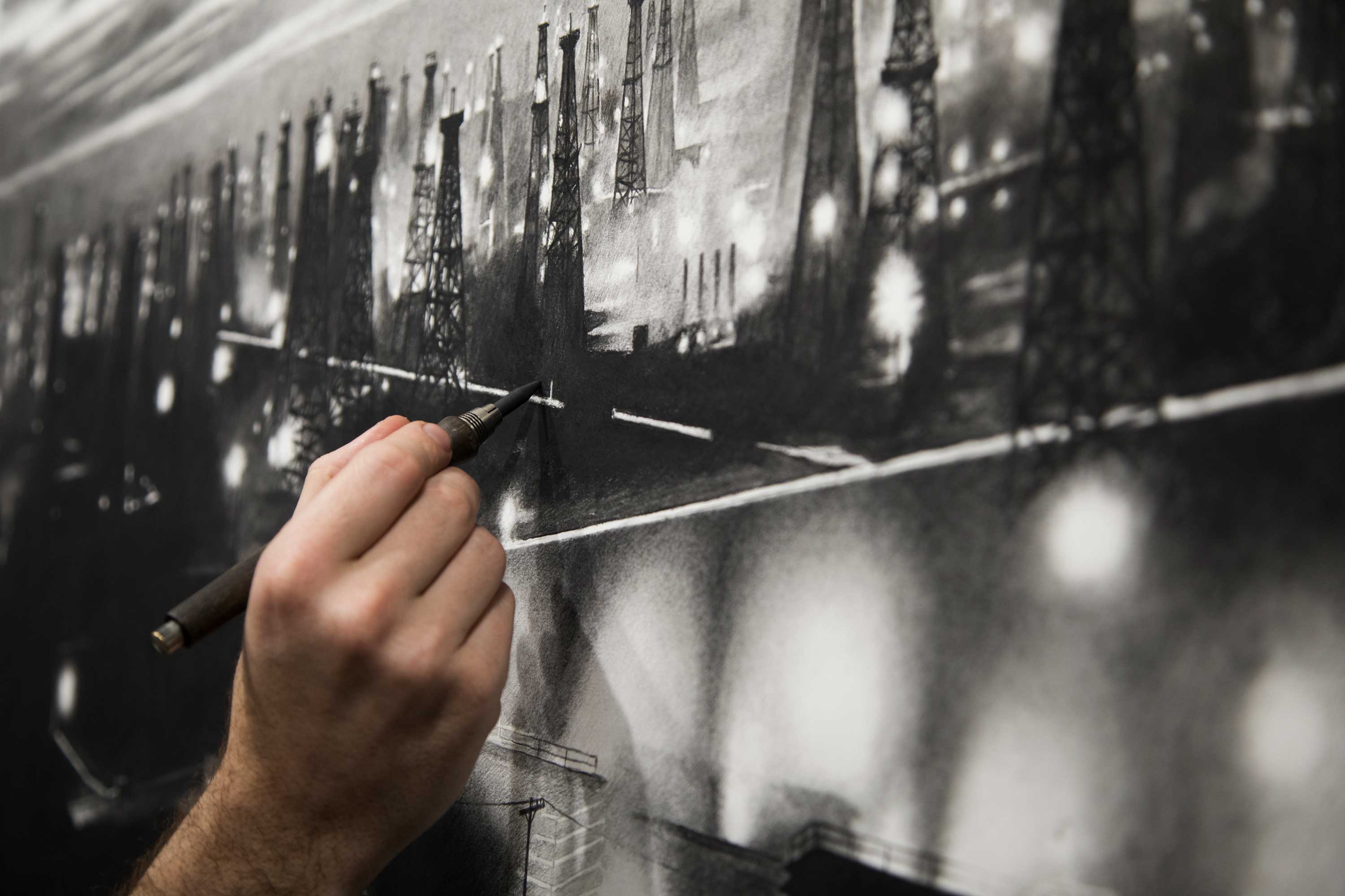
Drawing Process for Hyperrealistic Art:
My process is deeply meditative, and generally follows a fairly straightforward process. I didn’t start out as a fine artist, I actually came to the art world a bit ass-backwards, and studied graphic design in college. While I used to lament what felt at the time like a missed opportunity to have studied painting and drawing, I’ve come to realize that a graphic design background was perhaps the perfect foundation on which to build my career as an artist. Graphic design taught me how to be ruthless with my own ideas — and how to have a thick skin.
Most particularly, working in advertising taught me how to separate myself from my work and consider it through the eyes of my intended audience. While many artists would likely rebel at the idea of “worrying about what anyone else thinks,” I’ve always felt that for any art to be successful, it has to first make someone other than the artist stop and care about it. If a piece of art doesn’t actually make someone stop and take a moment to consider what was made or what is being said, it falls flat on its face before it takes a step out of the door. This visual or emotional gravity can come through many channels, be it an emotional tug, visual gravitas, intellectual stimulation, pure beauty, or even intense revulsion.
Digital Sketches
The first step in my process is likely connected to my past as a graphic designer, and I start by working through what I call (for lack of a better description) digital collages. While all of my work is based on photo references, much of the time a single piece is actually based off of many references, and I spend the time other artists might spend in a sketchbook digitally collaging bits and pieces from various images together to get the feeling right.
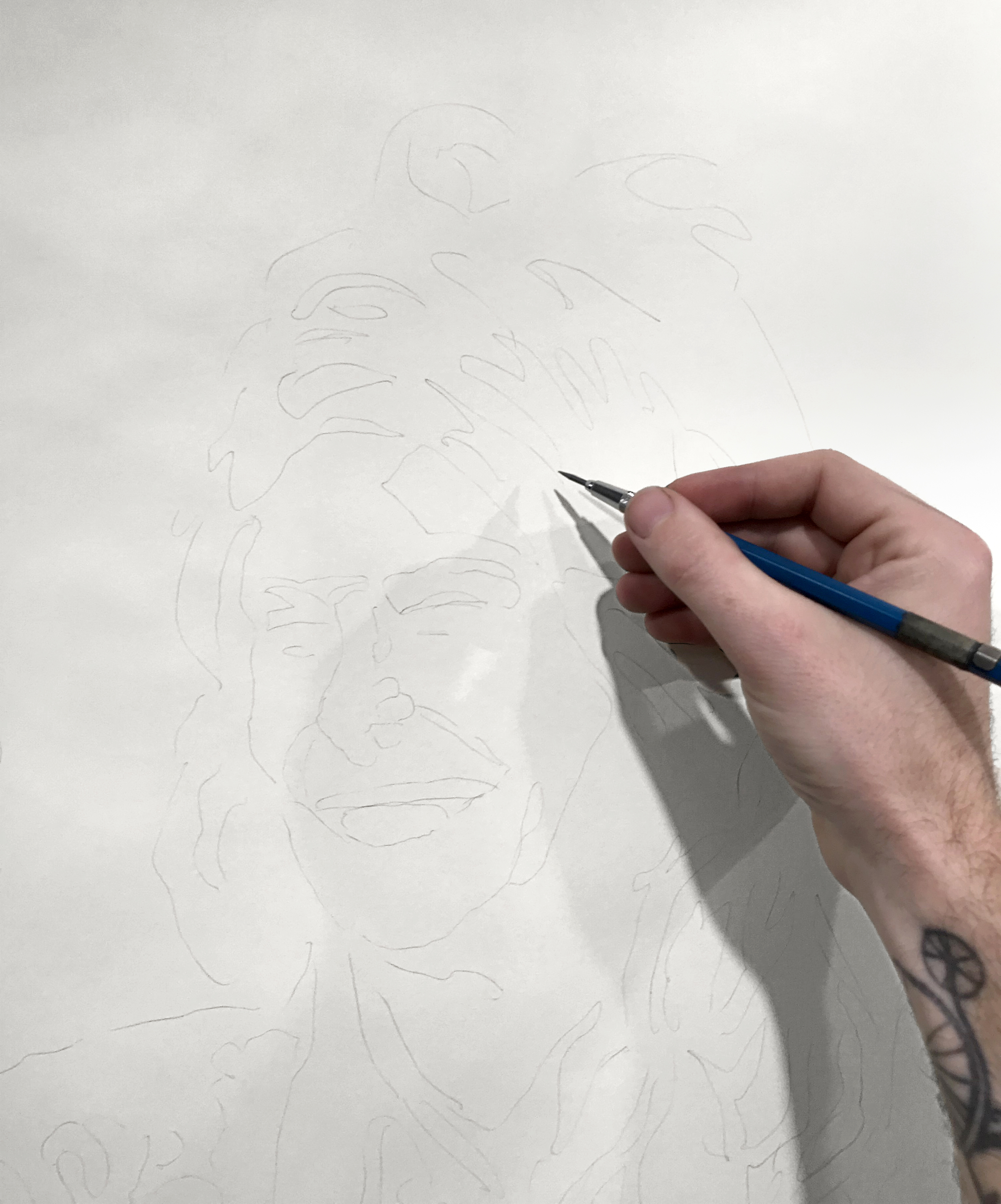
Underdrawing
Once I’ve settled on a final composition, depending on the size of the final piece and the deadline for the project, I either free hand a loose sketch using a pretty standard straight-line technique of the sort taught in ateliers and life-drawing classes, or if the work is huge or the timeline impossible, I transfer the main shapes and forms with light graphite lines via a projector.
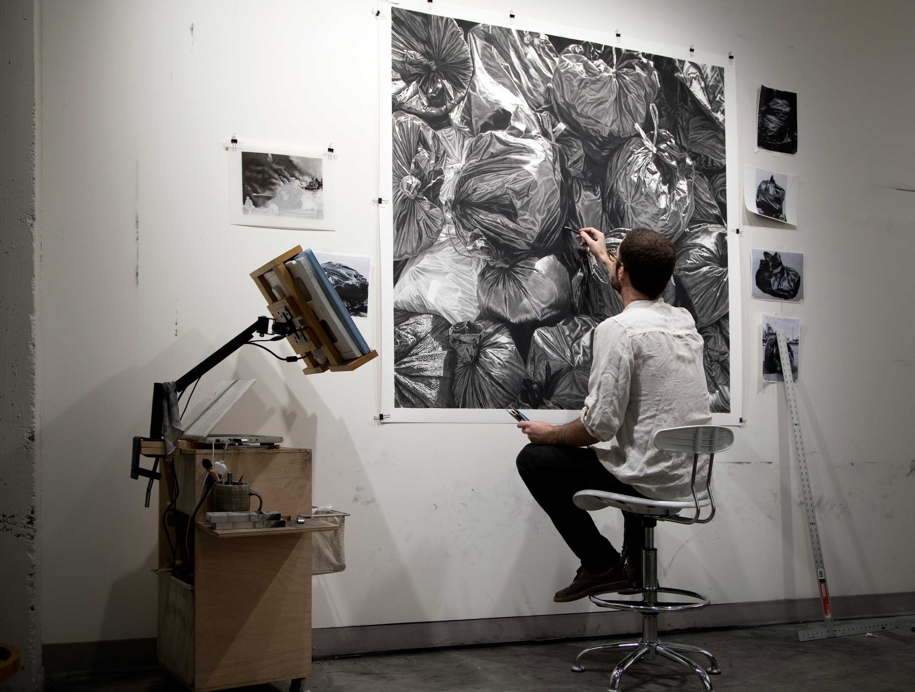
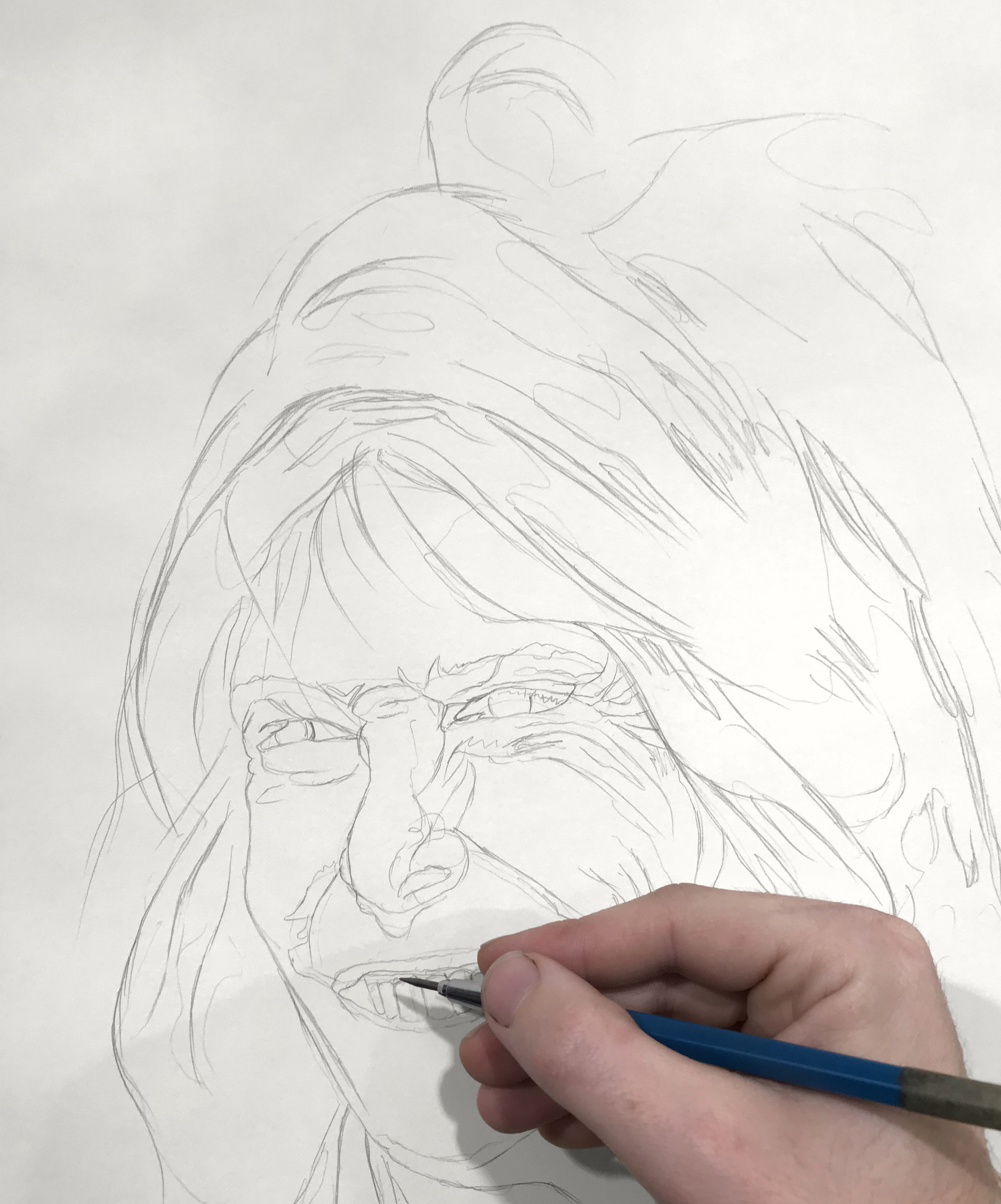
Block In Stage of the Hyperrealistic Drawing
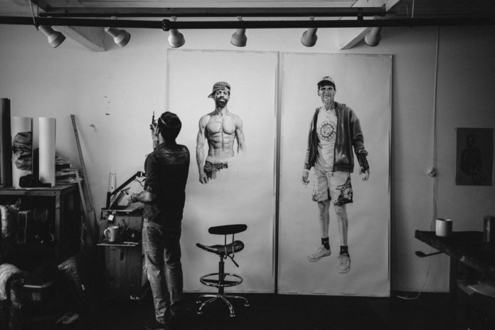
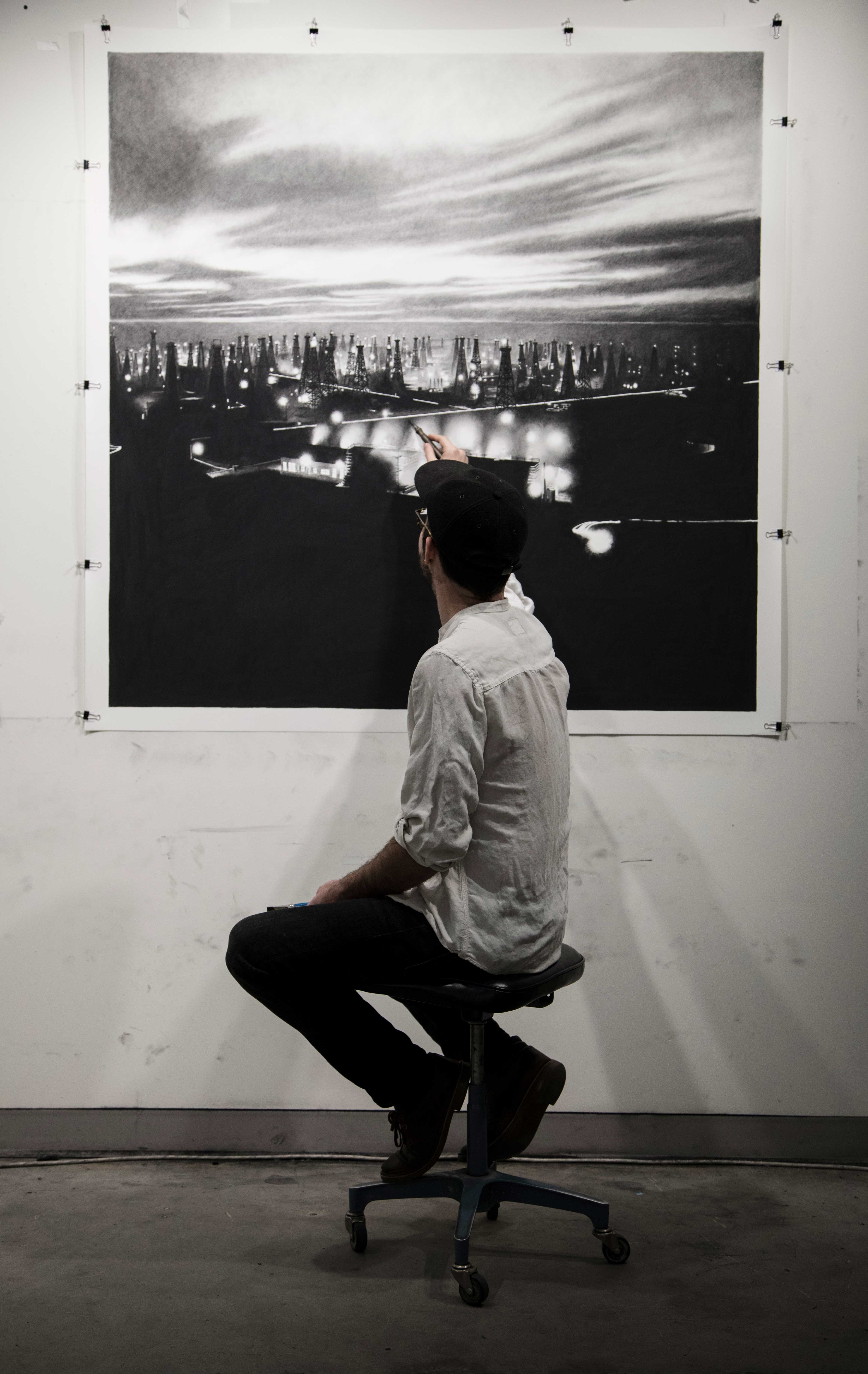
Regardless of the way I placed my initial underdrawing on the paper, the next step is the most important part of the entire process: The block in. Most of the time I work on the wall in my studio, and I built myself a rolling cart with a large screen attached on top so I can see my references from any angle. Once I’m confident that the overall proportions and placements are correct on my underdrawing, I start working over the initial graphite lines with an HB pencil, fine tuning each portion of the drawing. What results from this stage is certainly not an end in and over itself, but rather a wire-frame drawing that forms an accurate tonal map of the drawing – the lights and shadows on each form, where light turns the edge of each shape, and the physical wire-frame structure of the actual elements themselves.
Go time.
Once this process is finished, I dive straight into the actual drawing process. I’ve been told that I draw more like a painter than a draftsman, and while I’m never 100% sure how to feel about this comment, I think it’s true. Since I’m right handed, I work from the top left corner of the drawing to the bottom right so my palm can rest on the paper without smearing anything, and I more or less finish each section as I go. While this doesn’t mean that I won’t go back in and adjust small things later, Carl Dobsky (look him up) told me once that artists are always lying to themselves when they say they’ll go back in and make something better later. That’s very much proven true for me, and in general I try to make everything as dialed in as possible on this first pass.
I don’t use any white charcoal since it always has a bit of a blue tone and always feels to me like it’s a patch on a sinking ship. This means that all of my highlights have to be solidly planned in advance, since most of the charcoals I use can never be lifted off the paper back to a true white. As I go, I’m generally holding what I call “the claw” in my left hand, a set of tools that breaks down as follows:
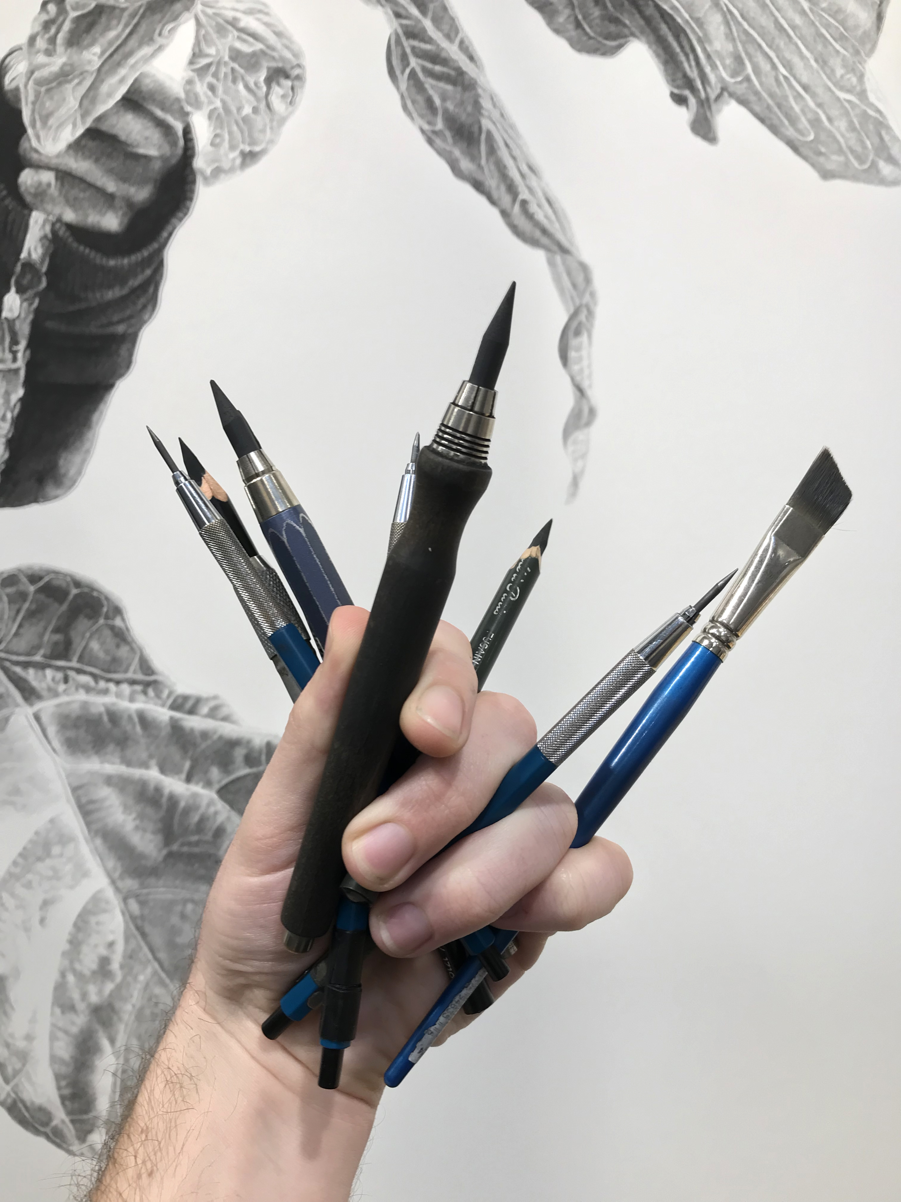
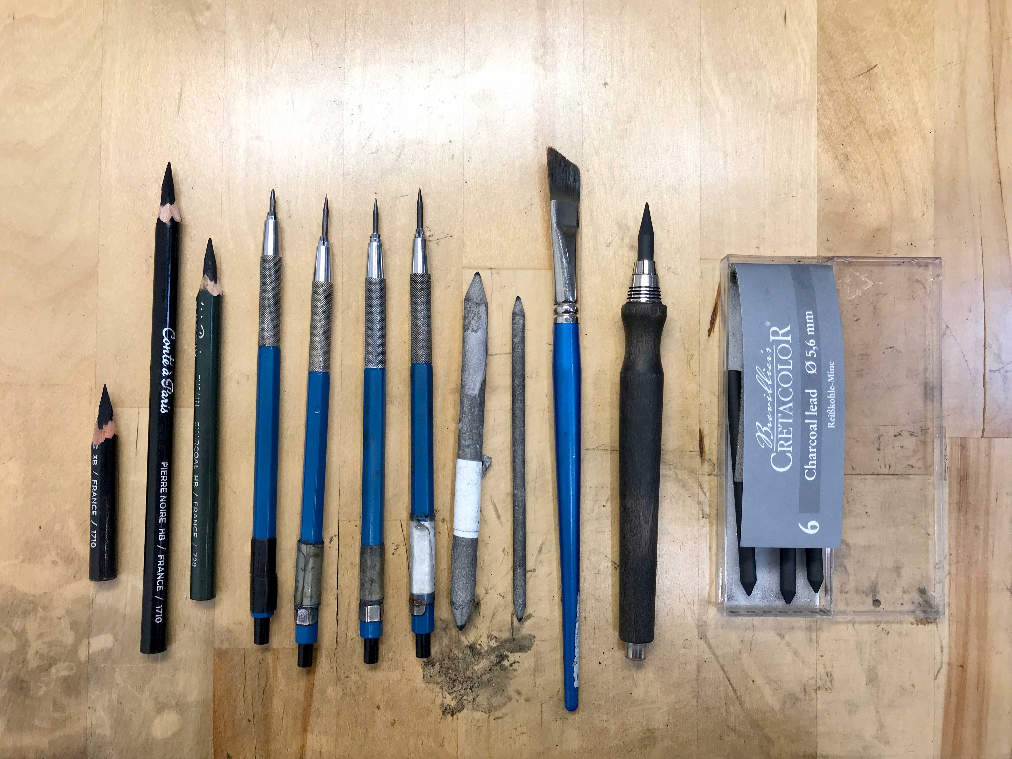
- Graphite Pencils (Mars Staedtler drafting pencils, with 2H, HB, B and 4B leads)
- Conte Pencils (Conte a Paris Pierre Noire pencils, HB and 3B)
- Cretacolor Charcoal Lead (A compressed charcoal that comes in replaceable “leads”)
- Kneaded Eraser
- Blending Stumps
- Watercolor Brush for blending on toothier paper
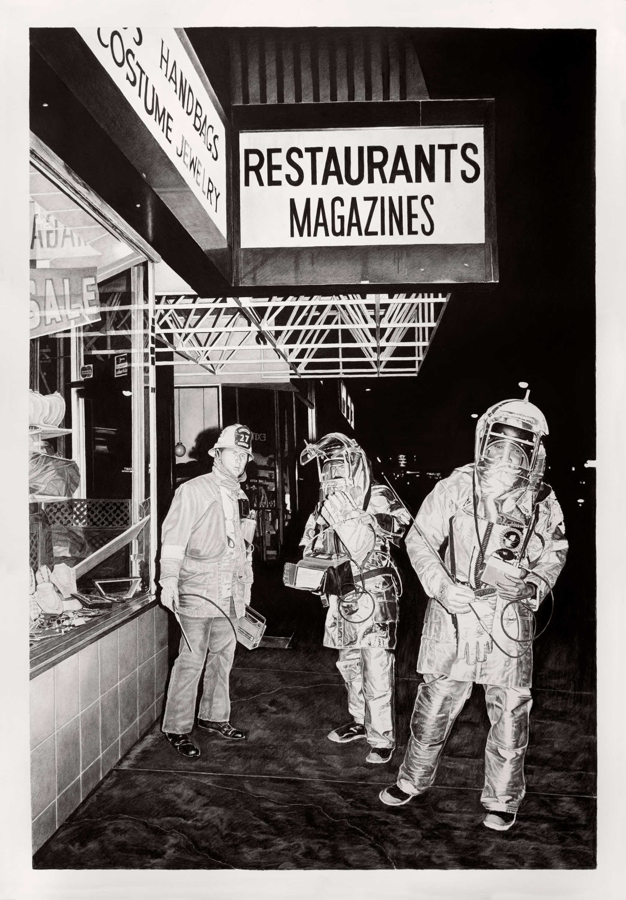
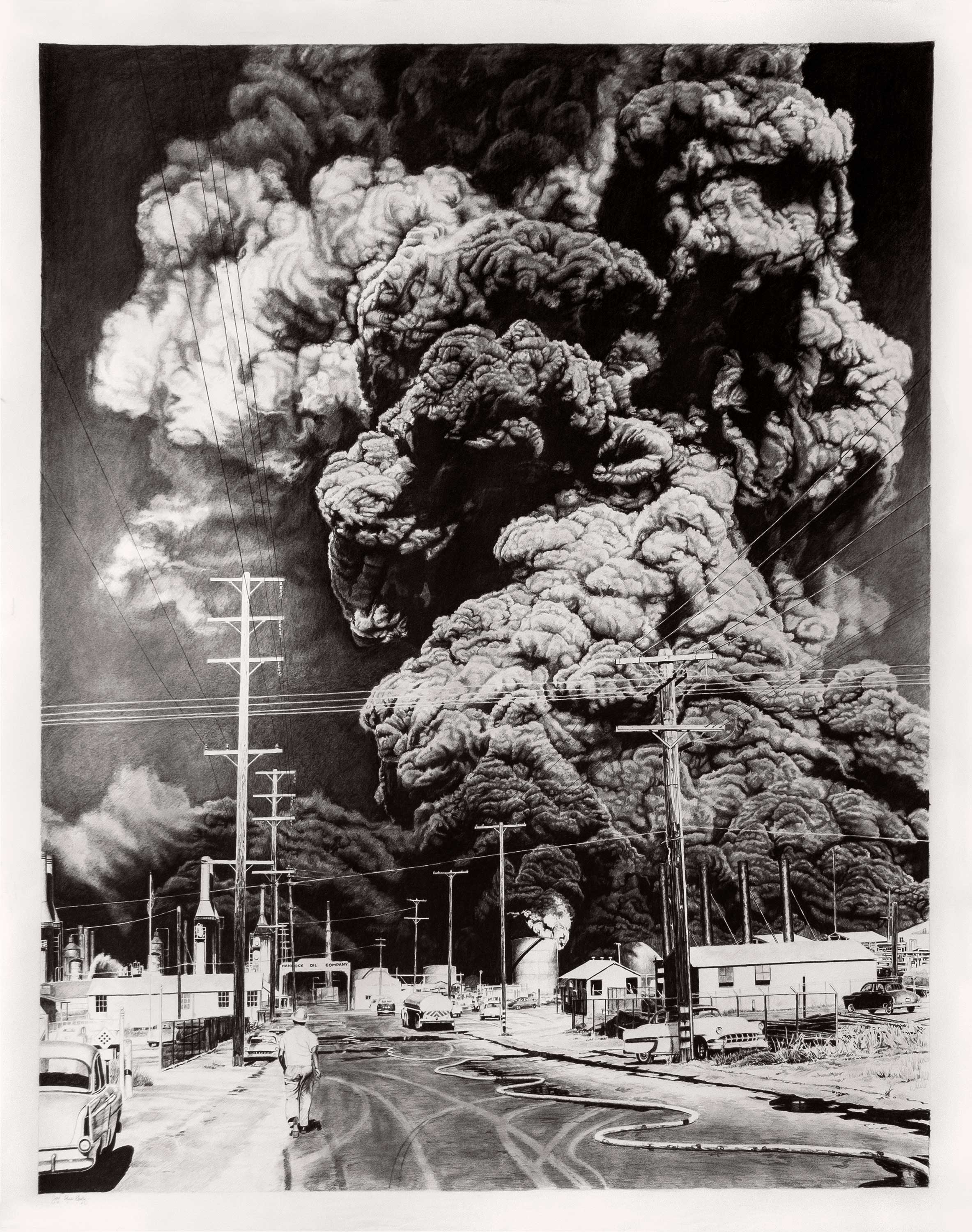
Apparently this is also breaking tons of rules, but much of my actual drawing process involves mixing both charcoal and graphite. Graphite is a wonderful medium, but due to its crystalline molecular structure, it becomes more and more reflective the darker and thicker that it is applied. I’ve always hated this about drawings that are pure graphite, with a few exceptions (like the brilliant Steven Assael) most drawings in pure graphite don’t tend to feel like they have a full value range. The graphite can only get so dark before it starts to reflect light, and particularly when this is applied to a large drawing, the viewer has the disconcerting experience where when they interact with a work, the areas that should be the darkest actually become bright highlights, totally reversing the overall value relationship.
Charcoal, on the other hand, has an amazing ability to create deep, rich blacks that seem to suck in all of the light. That said, it is very difficult to control charcoal values at the lighter end of the value spectrum, as it tends to get spotty and difficult to keep from becoming too dark very quickly. For these reasons, I work with graphite on the lighter end of the value range (say, 0%, or a true white, to 40% or so, somewhere around a medium gray.) Once I reach this medium gray where the graphite starts to become reflective I transition to charcoal, skipping the light end of the value range where charcoal is hard to control.
ABOUT THE ARTIST
Joel Daniel Phillips (joeldanielphillips.com) is an American artist whose work focuses on the tenets of classical draftsmanship employed in monumental formats. Inspired by the depth and breadth of human experience, he strives to tell the personal and societal histories etched in the faces of those around him. Through the tip of his pencil, the artist seeks to find moments where our projected senses of self are transparent, allowing deeper, more truthful emotions to become visible.
Phillips’ work has been exhibited at institutions and galleries across the United States as well as abroad, including the Smithsonian National Portrait Gallery, Tacoma Art Museum, The Art Museum of South Texas, Fort Wayne Museum of Art, Mesa Contemporary Arts Center, The Ackland Art Museum and the Philbrook Museum of Art. In 2016 he was the 3rd prize recipient in the Outwin Boochever Portrait Competition from the Smithsonian National Portrait Gallery, and the artist is currently a Fellow at the Tulsa Artist Fellowship in Tulsa, Oklahoma. Phillips drawings can be found in the public collections of the Denver Art Museum, the West Collection, the Gilcrease Museum, and the Fort Wayne Museum of Art.
The artist recently released his first monograph, “No Regrets in Life,” with Paragon Press, which can be found here.
Related Article > Drawing with Expression, Not Expectation
This article was originally published in 2019


