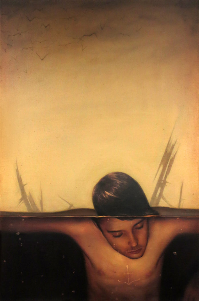
As demonstrated with the Zorn palette, limitation may be one of the strongest tools available for artists. By restricting your tools, you may find that your ideas are free to grow.
Limitation Through the Eyes of Zorn
BY SAM WOLFE CONNELLY
Anders Zorn was a Swedish painter whose work 100 years ago was often compared to that of John Singer Sargent. He is, however, most notable for his employment of what is now aptly called the “Zorn Palette,” which is comprised of only four separate paints: White, Ivory Black, Yellow Ochre, and Cadmium Red.
Though not all of his pieces utilized these limitations, the spectrum of colors that can be made with these alone is quite large. Even though the only basic hues that are used are “warm,” the inclusion of a cold black paint, like Ivory Black, adds a “cool” factor to what can be mixed as a result.
As a working artist coming out of school, I felt I didn’t have the greatest grasp on color theory. I primarily drew in graphite and when I needed color I would tend to fumble around digitally afterwards to see what color palettes would fit with a piece. Once I tried picking up oil painting, it felt like jumping into a giant pool of billions of colors and muddying it all up into a mess of confusion.
I hadn’t taken any painting courses in school and I felt like I didn’t have much perspective on how to start. For me, the easiest way to focus tends to be limiting what I have to work with so that I’m able to trust my artistic instincts, rather than having endless options point me in separate directions all at once. The basic Zorn Palette sounded like a great option to play around with because of its versatility and simplicity. In addition, the idea of limitation shouldn’t be seen as a negative, only as a building ground that growing artists can customize and add to as their own styles develop.
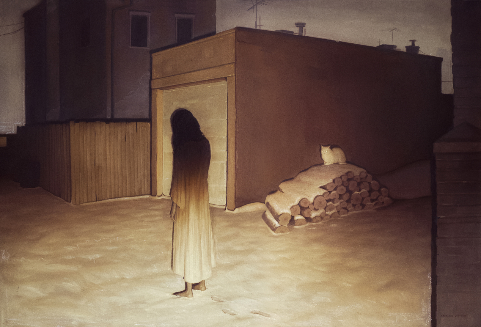
This mix of colors on the Zorn Palette really lends itself to many skin tones in neutral lighting, which is a main reason of why it is universally used. The mixing of the pure white and the pure black allows for a range of blue hues. Add some red or yellow into that mix and you can get a range of violets and greens respectively.
Working with these also trains your brain to think in terms of saturation as well, where extreme light in some images might wash out all hues and leave the darks with a high saturation of color, giving the painting depth. The Zorn Palette also helps to unify a painting by using related colors that can allow you to look at your subject through a cohesive filter.
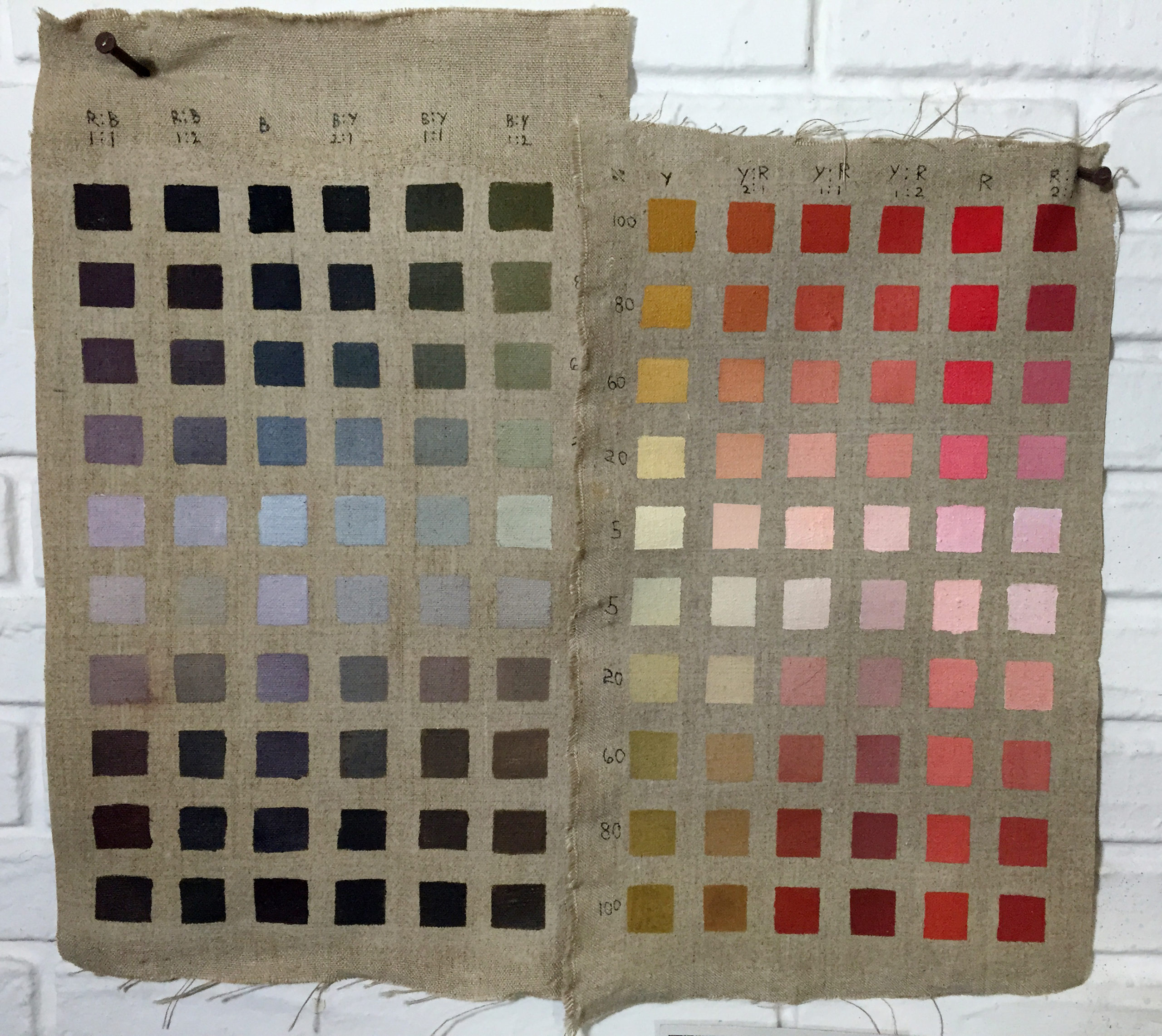
To help myself understand the color interaction, I made numerous paint swatches and labeled the ratios of what was mixed. Yes, I know, swatches are boring and they feel like going back to square one, but in this case, it was important for me to see the stretching bounds of how far I could push just two colors. It helped me in a way that was not too different from a translator—taking in a gibberish language from my eyes and transforming it into something that was legible, but still holding the necessary information like tone, tint and saturation.
With the tools that we have available now digitally, it is even easier to really tell what green that tree is exhibiting, or what we might think is actually blue in the sky.
The greatest thing I’ve learned from using the Zorn Palette has been how much relativity plays into a painting and how what we may perceive as a blue sky is actually just a cold grey when it is surrounded by warmth. For many realist painters, excess is something to be used in moderation, and I think that is something that many fresh painters don’t realize.
Subtlety doesn’t have to mean boring or withdrawn. Using the Zorn limitations I’ve learned that subtlety creates importance within a piece when it surrounds an extreme bright blazing red fire, or a glowing light source in the distance. Subtlety adds perspective to extremity.
It’s sort of like putting a photo of a riot next to footage of someone doing their taxes. Each scene within itself is a static situation, but when combined the right way, it creates a collision of interest. I know we’re just talking about some colors here, but those looking for depth, I believe, are really looking for limitation.
This is not even to say that the Zorn Palette is the key to finding that within your own art. Instead I believe it’s an idea of how the artist’s mind can take the forefront in their work as opposed to being limited by their materials.
One of the greatest exercises I was taught as a growing artist happened when I was taking a summer art course at the age of 13. In the fall the instructor took the class outside and told us all to snap a small branch off a tree in front of the studio. Once we each had our “instrument,” the rest of the day was spent drawing our model with a two-foot-long wooden switch, taped to our hands, dipped in ink on a giant sheet of newsprint.
Each drawing was limited to less than a minute and to this day I still believe that was the greatest learning experience of my art education. Even though I don’t paint my works with a twig anymore, it showed me that creativity is a powerful thing that can never be hindered by something so menial as an expensive brush or a catalog of paints. As the Zorn Palette demonstrates, simple is often best.
Make due with what you have.
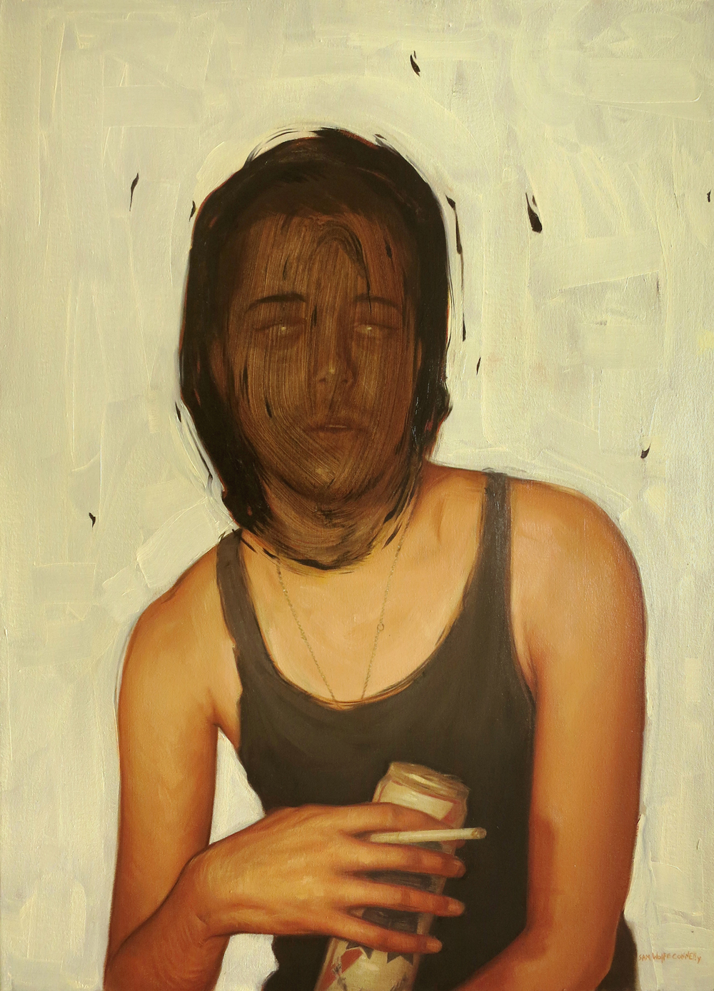
Learn more about Sam at: www.samwolfeconnelly.com
Related > Browse more articles on how to paint and draw in the style of contemporary realism.


