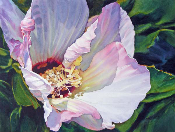
On Painting with Watercolor > Ann Pember (Vibrant Orchid & Painting in the Flow of Watercolor) earned a BFA from the Massachusetts College of Art in Boston in 1968 and worked as a free-lance commercial artist for 12 years. She has been painting in watercolor since 1960 and is a signature member of 22 art and watercolor societies.
Pember’s paintings often have a close focus and employ dramatic lighting. They have been included in more than 270 national juried exhibitions, including those of the American Watercolor Society, Transparent Watercolor Society, Rocky Mountain National and Watercolor USA and they have won more than 70 awards.
On Painting with Watercolor: Interview with Ann Pember
You make painting a petal look effortless and yet far from simple. There’s clearly a lot of information you’re portraying in those wet-in-wet washes. Could you walk us through the thinking you do and the decisions you need to make before you’re ready to pick up a brush and paint? What do you need to have figured out before you begin? How do you do that figuring out?
My watercolor painting process has evolved over some nearly 50 years. It is certainly not effortless. Years of practice, drawing, art major classes at a 4 year art college, practicing art commercially for 12 years and taking workshops in watercolor with artists whose work I admired, all helped me learn what might work best for me.
Practice alone can bring a certain amount of confidence and helps shape one’s style of working. I started drawing as a child when I was able to hold a pencil. I was introduced to watercolor in high school and in college found it calling to me more than the other mediums I tried.
Early on, my work was tight, colors were rather pale and lacked depth. I realized that the light is what created the effects I hoped to achieve as I painted various subjects. As I practiced and studied, I began to see the importance of value change, edge quality, clarity of transparent pigment, paper and brush type and so much more. Mixing colors using the primaries provided the most beautiful results for me, so I rarely use tube mixed color, gray, or black, but mix them instead.
My method is a simple one. There is a great deal of thinking and prep before painting. As much as possible needs to be figured out before I begin. I have a mental picture of the finished result and as many decisions made as possible, with a simple composition and drawing worked out and an idea, sketch, or value study of the light pattern. Then I wet my paints and brushes and paint quickly.
If I lose concentration, or question what to do, I stop until I can “see it” as I desire. Yes, sometimes changes happen as I paint and that can be a blessing, or a challenge. The creative and analytical parts of the mind are taking turns throughout the process. It becomes almost a meditation when things go well.
Every part of the process helps me learn about the subject and how I will express it on paper. That connection with the subject begins with taking my own photos, or sketches. I need an emotional connection to it to give it that “something more” than a photo.
I do work from photos I’ve taken and only do so if the lighting is exciting. I do lots of editing with the camera first; often getting in close to the subject to simplify the design. There is more editing as I develop a drawing. I now use Photoshop first, moving or eliminating elements to improve the design. I might also work from more than one photo.
Once I’m happy with a design, I enlarge the drawing, using a grid system to transfer it to the paper, keeping the lines light and simple. I work out values and color palettes in a sketchbook and usually keep to a limited palette of transparent colors. Color does vary from one paint company to another and I rely on my favorites; Winsor Newton, Daniel Smith, Maimeri and Mission Gold. I keep a generous amount of paint in a Robert E. Wood palette, filling the wells.
I paint directly, mixing color wet in wet in sections on the surface of the paper, rather than glazing in many layers, which I gave up about 15 years ago. I wet a section, float in paint and let it mingle, charging in darks before the area dries. This helps me achieve clean, luminous color quickly and to the viewer, perhaps effortlessly. Edges are softened as needed in the process. I use papers and boards that allow lifting and support this style of painting; Waterford, Fabriano, Lanaquarelle, Illustration board and watercolor board, as well as Yupo and coated surfaces.
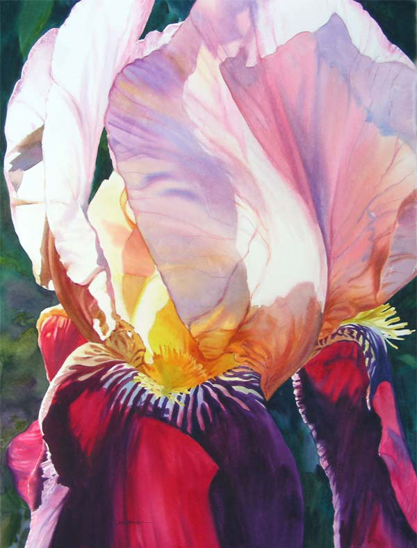
Along those lines, light plays a huge role in your work, especially in your florals. Artists talk about learning to see. What have you learned to see about light on and in flowers? What are you looking for when you’re analyzing a photograph for a painting in terms of light?
I look for an interesting light pattern and grouping of shapes. If there is no light on a flower, I wait to take photos until there is. This is essential to what I want to paint.
Sometimes I can push the effect with Photoshop to create more light, but I’d rather just see it. The light helps me “see” where edges are hard or soft, colors intense, neutral or deep. Details may wash out in places, so my work is not photo realism, like my early, tighter, hard edged paintings.
I love backlighting for the wonderful effects it creates, especially for flowers. It can merge many small shapes together to form a larger shape. I often prefer a close-focus composition, rather than a traditional painting of a whole bouquet in a vase. I usually make the design go off the paper on a few sides to avoid the look of a floating subject. Even my landscapes are usually intimate compositions, rather than vistas.
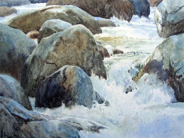
You paint from photographs. What information do you take straight from a photograph and what information do you know you’ll need to add or adjust?
I use the parts of a photo that speak to me, that have interesting shapes and patterns, eliminating extraneous elements that might detract from the design. I may pump up the color based on reflected colors I notice. That has become very important to my work. I went from painting a pink flower with tube pinks to noticing the nuances of reflected colors from earth, sky, foliage and surrounding objects. This adds a tremendous amount of lovely color mixes as a result and makes it more interesting for me to look at.
How do you get good reference photos? That seems an art form almost onto itself. Any advice for good flower reference photos? Does that advice change at all for water and landscapes?
I only work from my own photos and learned to use a camera years ago. My current small digital Nikon Cool Pix has close focus that gets in very close and has an excellent zoom for shooting streams and vistas. It has a tilt monitor to make shooting down low or up high a possibility. It gives me great results, but I always edit photos once they’re in the computer. I try to “see” the finished painting as I edit and later draw. The camera does lie and can lose the lovely subtle values and may make darks too dark. Whatever my subject, I look for the light patterns and interesting points of view when shooting.
Looking at a reference photo, how do you decide whether or not to make an edge hard or soft? How do artists learn when and where to soften or harden?
This comes with observation and practice. Hard edges generally are formed where the light is strongest and soft edges where the light is less intense. I utilize soft edges as a transition between washes of a similar value, including where a background appears next to the subject. For instance, The often seen painting of a light colored flower against a dark background may look cut out and pasted on if there are no soft edges around the areas where shade on the flower comes next to background. Variety of value and color help tremendously to give dimension to the subject. It may be subtle, but it’s there. My backgrounds are rarely dense black, but have some variety of color and value.
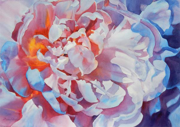
Watercolor has a reputation for being a tough medium. What about it do you think gives it that? Do you think it’s justified? Why or why not?
I suppose this notion came from comparing watercolor to mediums such as oil where you can paint in the light, rather than save it. Also, some papers do not allow lifting and manipulation of the surface without being destroyed and could easily discourage the artist. Investigation of surfaces, paints and tools can make watercolor a delight to paint with. Learning how to do anything requires knowledge and practice. The best of show award winning painting is built on years of failed paintings, that brought insight about what works.
For watercolorists especially, how important is it for an artist to know her materials? Why or why not?
It is extremely important to become familiar with your materials and use those that work with you in achieving the style of painting you’re after. Glazing requires a surface that won’t let the dry layers lift. Pouring and atomizer painting need to hold up to resists and masking. Transparent paint should be used if you desire lifting and staining colors used carefully as darks. You must learn what your tube paints look like in a wash, how they mix together and whether they lift or make mud. You also need to feel how your brushes handle. Some will not hold a point or carry enough liquid. Try both flats and rounds to see what which suits your style of painting.
Speaking of materials, could you talk about why you use the specific paper and substrates you do in your two DVD workshops? And then also how and why you choose different papers and substrates to work on in general? Why move between different surfaces?
I now use surfaces that support my style of painting, depending on what my subject is after much trial and error. Florals and some other subjects I develop in sections, painting directly wet in wet. The papers used do not require stretching, allow lifting and manipulation of the surface. They are usually Waterford, Fabriano or Lanaquarelle. All support my direct style of painting better than Arches, which I used to use for glazing. Most material catalogs let you order a package of mixed watercolor paper and it’s a great way to try many.
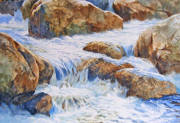
The subject of streams, water and rocks is better served with Strathmore illustration board in heavyweight plate surface, watercolor board, Yupo and coated surfaces that allow excellent lifting and the making of interesting textures. They truly assist the painting process, since the surface does not let the paint sink in much. That lets you move it around by tilting the board, spraying water into paint and lifting. I learned this by trial and error as I tried different surfaces and I still do so as new ones come on the market.
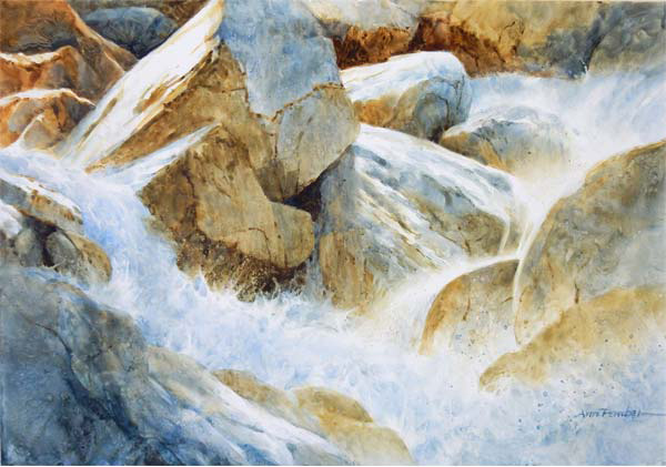
What do you look for in your pigments? Why? Beyond warm and cool, aren’t all of a single color the same?
Pigments need to be professional quality and lightfast. I am most familiar with Winsor Newton and have added some by Daniel Smith, Maimeri and Mission Gold. All are high quality and Mission Gold has very potent pigment, giving lots of bang for the buck.
I love the bright lightfast pinks and reds for florals. I use mostly transparent pigments for the luminosity of their color and am careful of transparent staining pigments where I want to lift. They do mix beautiful glowing darks.
Opaque paint can produce mud if too many are used in a wash. I usually use just one with transparent pigments. They can be useful to cover a small area with a color accent too.
I do use warm and cool versions of the primaries in mixing color on the surface. We all seem to have our favorites and that becomes a personal choice that may change over time. Several years ago my palette changed somewhat and now is often Cobalt Blue, Fr. Ultramarine Blue, Berlin Blue by Maimeri, Quinacridone Coral, Permanent Rose, New Gamboge, and both Raw and Burnt Umber. I may simplify this and use just 2 -5 colors from the group as desired. I have other colors on the palette and use them less often as desired.
Color mixing can feel overwhelming to a beginning artist. Any advice on how to start? Should an artist just buy all the colors and get started? Why or why not?
I like to suggest that beginners get a good set of warm and cool primaries and practice mixing all the other colors using them. It is very instructive. Mingling colors on a wet surface, gives lovely variation of the colors being mixed that doesn’t happen with premixed tube colors. I like Cobalt Blue, Fr. Ultramarine Blue, Berlin Blue (Maimeri), Permanent Rose, Winsor red, New Gamboge and Aureolin. These colors are mostly transparent and can mix most color combinations.
Practice is the best instructor and you will not be overwhelmed by too many colors to choose from. Avoid those pricey sets of colors that include lots of tube mixed colors. They can make you very discouraged. My recent digital books have comprehensive information on colors, mixing and techniques and materials.
The above interview originally appeared on our sister site, Creative Catalyst.
Learn more about watercolorist Ann Pember by visiting her at her website. You can see how she paints first hand by checking out her two workshops, Vibrant Orchid: Painting in the Flow of Watercolor, and Painting in the Flow of Watercolor on High Plate Illustration Board.


