


by Jeremy Mann
Modern trends are affecting painters in countless ways, and trusting in a photograph as a reference is one of the detrimental departures from where our hearts should be when painting. We should be mindful of the haste of the present and our dependence on the deceitful photograph. The first step is acknowledgment, and then to focus on challenging lazy ignorance with purposeful elegance.
Like words to a poet or notes to a composer, the marks an artist makes within a painting hold the voice of emotion. Composition is nature’s underlying geometry of beauty, incorporating an undefined layout of shapes, lines, values, and balance. Color speaks to the soul, and can release moods from the heart of a viewer. The arrangement and quality of the formal foundations are the ingredients for brilliant paintings that stir wonder and emotion in the viewer. But the grocery store of a reference photo is at best limited in its stock.
There is no substitute for nature. Study from life should be the highest priority for every artist because having a good reference makes all the difference. And life is the best reference. However, there are still plenty of us who need—or want—to work from a photograph. Culturally, we no longer dress as gentlemen, lounging in the gardens and fields, drinking wine with elegant beauties in gowns as seen in so many 19th and 20th-century works. Instead, we speed across freeways, scan the interwebs for instant gratification, get off the bus at the Grand Canyon to snap some wicked photos, before hitting up Vegas. Photograph as reference has become a norm, the quiet blight—a too simple and available tool that clouds our judgment of painterly beauty. But if we know this, let us not be lazy slobs to our culture and our audience. Let us learn to bring life back into our work with a complete disregard for the photograph’s blind team spirit.
Our lenses may be similar, but the camera lacks a soul. It cannot feel the wind in its face and witness trees bending and resisting its blow, or feel the heat of a hot summer day burning your upturned face. It cannot suddenly realize that its feet have gone numb in the snow and that it should hasten back to a fire, or enjoy the quiet of a lost field. This is plein air painting. The photograph cannot compare. How often do you see a relative’s photo album of last summer’s grand RV adventure to Yosemite, and then the standard excuse: “The photo doesn’t do it justice.”
But sit in those same backcountry fields and lakesides, forest and hills, hear the hum of a mosquito, the running of a stream, and the clank of your bear spray at your side, and you will know what nature can offer. Your first defense against the ridiculousness of photographic landscape references is to study plein air (or alla prima for figures and still life).
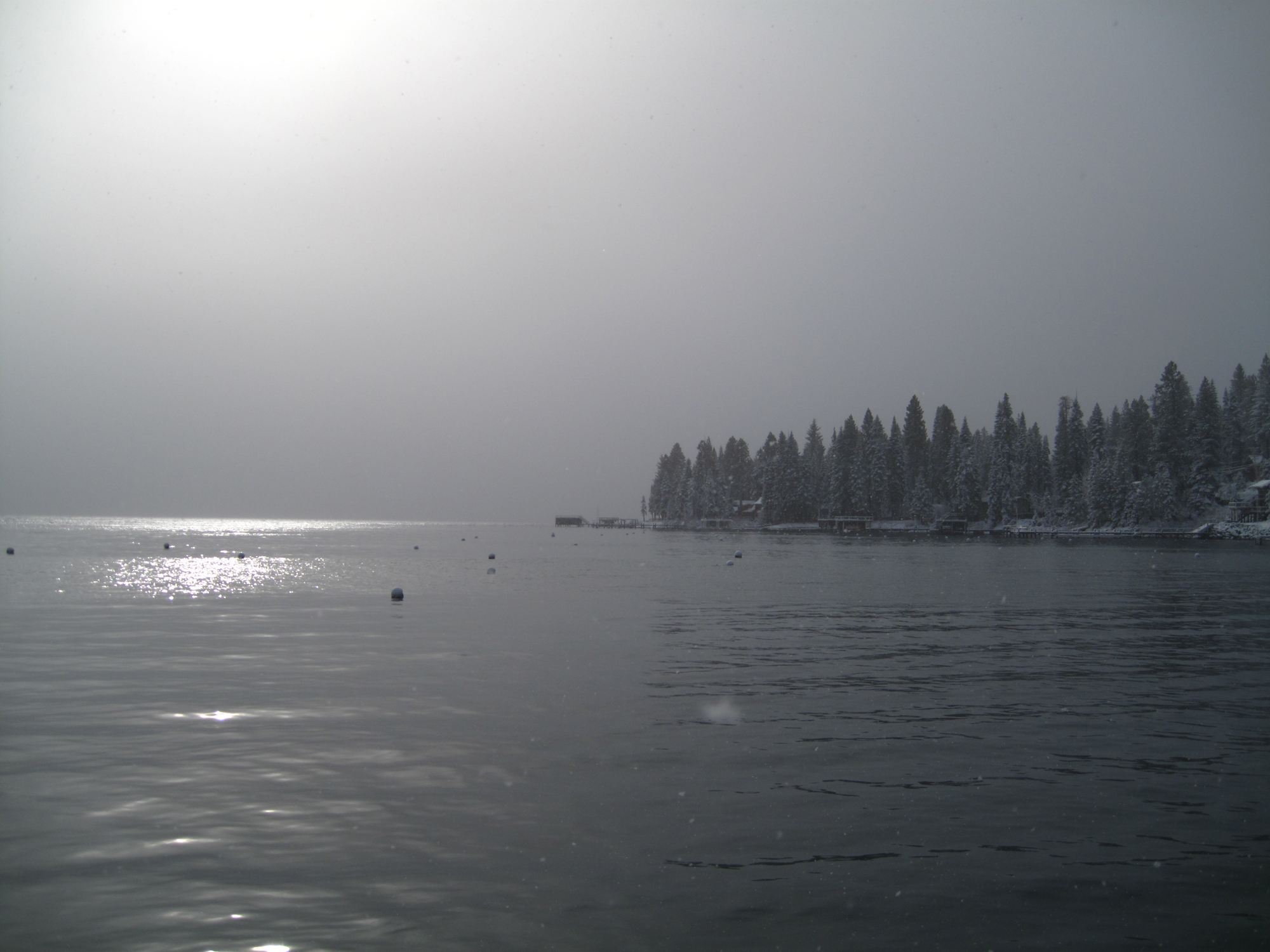
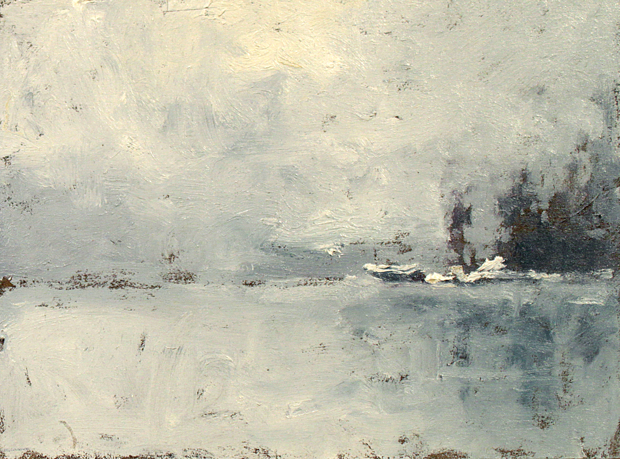
I often find the best way to capture the true feeling of an outdoor scene is to force the pace. In freezing snow, rushed and white, with a limited palette of only the necessary colors that appear before you (often whites and blues—pretty easy).
***
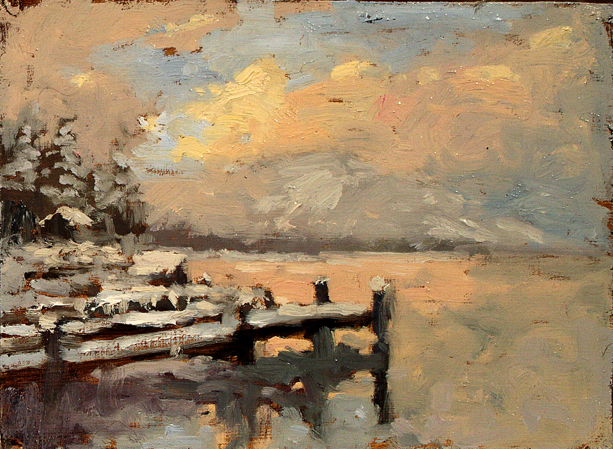
A wonderful study of changing harmonies and fleeting moments comes from a quick five-minute plein air thumbnails of the sunset. Consider pushing yourself as a way to lessen the attention you spend on what’s before you. Perhaps you just need a warm-up or quick visit to nature, as a way to focus on simply the “feeling” of the scene you are “in.” With a photograph, you work from “outside,” and doing so only encourages the viewer to also experience your painting from outside. In nature, you are immersed in it—you feel nature from within, and if you paint in nature, the viewer will be absorbed in your work, and join you there.
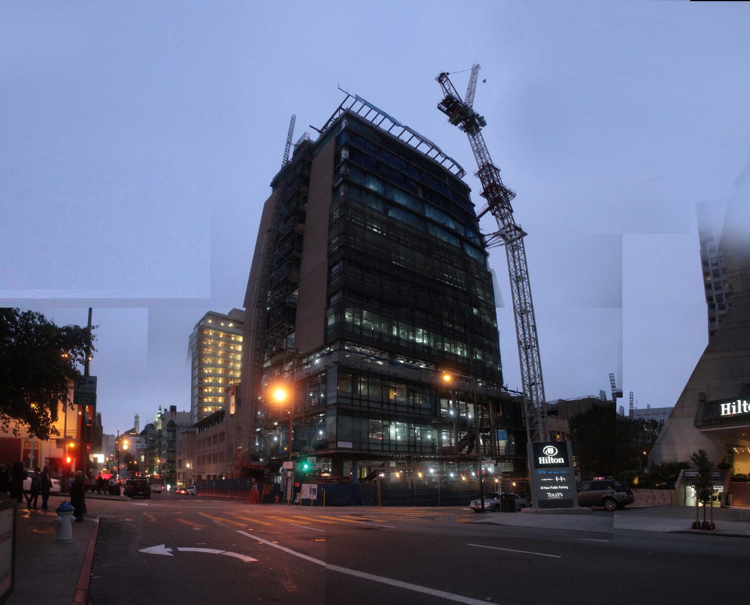
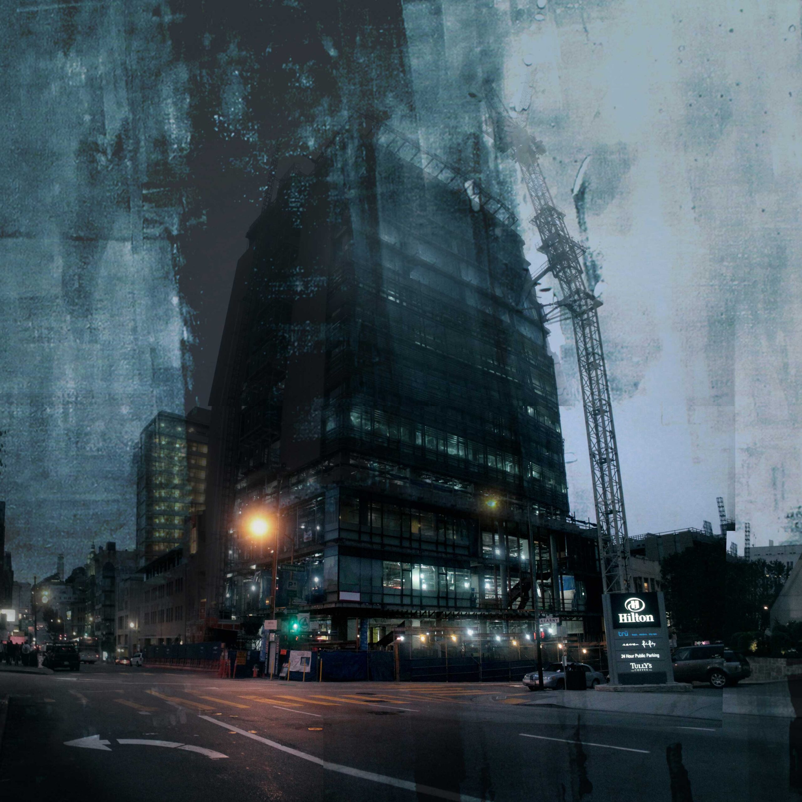
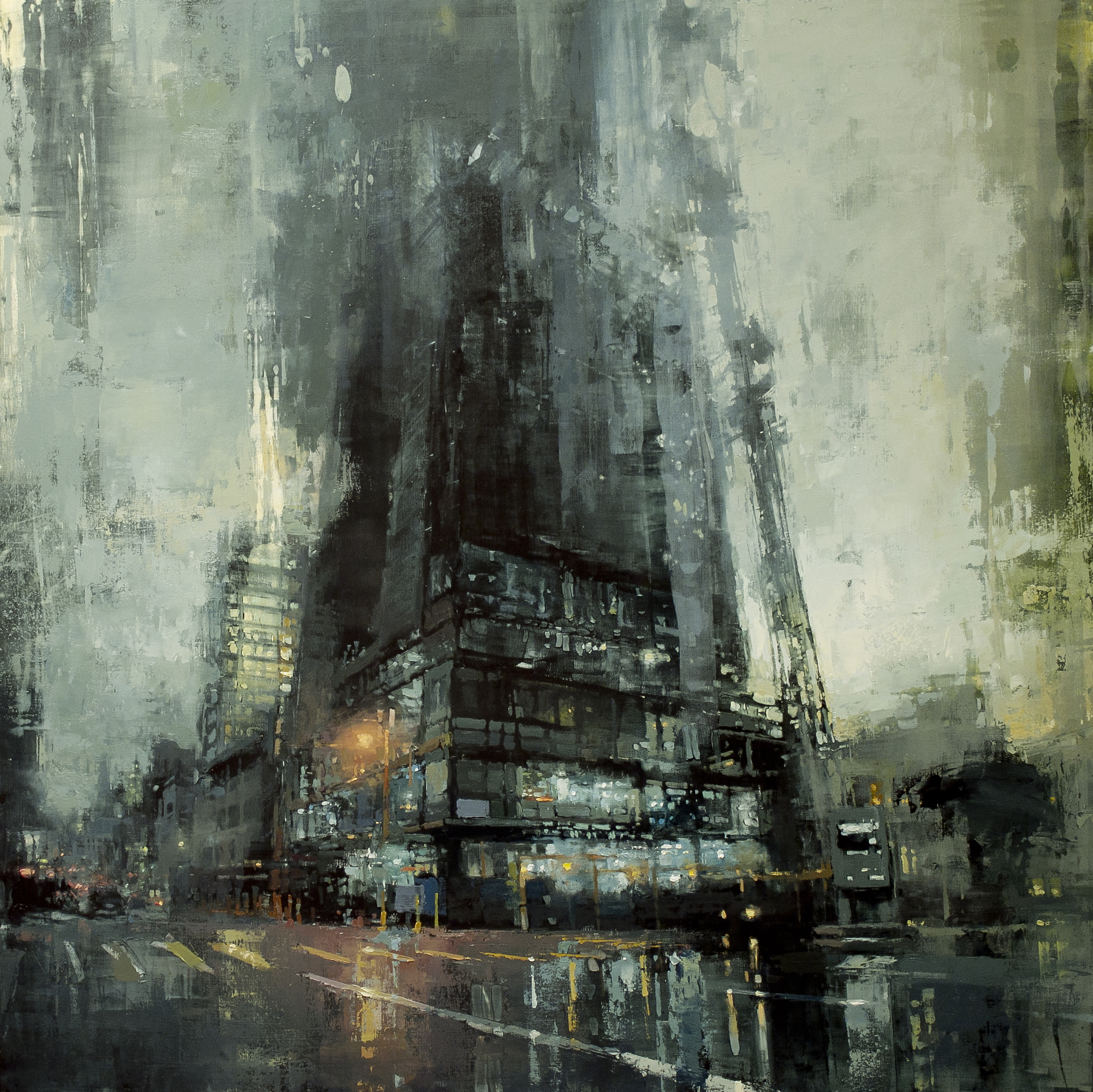
But at some point, we may find a photographic reference is the only way forward with a painting. Adjusting that reference requires a journey into the underworld of photo editing, and you should be well-versed in its astounding capabilities. I have been influenced by the brilliance of my comrades to traverse, undercover style, the wickedness of digital imagery. I’ve learned its capabilities and returned to my studio of oils and thinners to strike my reference in its weak spot. Here are a few weak spots to adjust in your photographic reference before approaching the painting.
Focal Point
Good Lord—the camera “crispifies,” and brings clarity and focus to every square inch. It’s natural for the camera to do this, and should not be admonished for it. But we artists should criticize ourselves for ignoring the differences. Eyes need a place to rest, a focal point full of details and intrigue. The eyes need to float to a secondary point of interest, then out to the depths and distance, led back then to home. Add details where necessary. Add more stuff in the area of focus—more branches, more grass, more people, cars, lights. Do so with a splendid negligence, whilst leaving other areas flat or atmospheric, “full” with less stuff.
“You need some plastic portable toilets, details like ‘stuff’ in the yard as if the place has been lived in. ‘Stuff’ as paint is just more touches, but you don’t want to know what it is, you don’t want to know they’re plastic portable toilets.” – Bill Maughan
Atmosphere
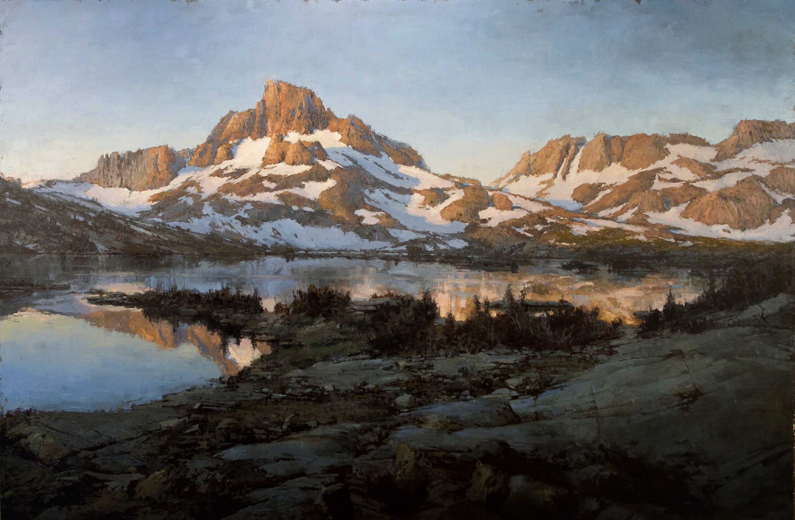
Photographs fail when it comes to understanding the landscape before them, while simultaneously comprehending the sky. Not only do photographs harden distant mountains and objects with sharp edges, but they increase the contrast, value range, and mock their true color. Why is the sky blue? (My father told me because if it was green, I wouldn’t know where to stop mowing.)
Because there is water in the sky, the more distance between you and those mountains, the more water is “in the way,” making things bluer, foggier, and more blurry (think windshield in the rain). Quite revealing once understood; unfortunately, we strive for perfection, and copying our reference is inherent—whether nature or photograph. But knowing these things, you can push the atmosphere in your painting to be more full of the atmosphere’s color (whatever that color may be—yellow sunsets, red mornings, perylene nights), while lessening the value range as distance deepens.
You can create edges lost and found and full of life, all of which will leave the viewer with a calmer and more natural state of being.
Highlights and Shadows
The camera’s dead giveaway is that it cannot see simultaneously, as we can, within the shadows and directly into the light. Bracketing your shots (shooting one underexposed, one evenly exposed, and one overexposed) will at least give you a range of reference from which to choose intelligently. Advanced editing allows you to superimpose all three together.
I learned from Coro, a good friend of mine, that even in life, shadows are always lighter than you think. Painting them as such will add vitality to your paintings. You can spot a painting done from a poor reference if there are three or more heavily highlighted areas competing for first place. The same goes for shadows. Unless you’re working on a fantasy novel cover, there probably shouldn’t be shadows so deep and black that not even light can escape—avoid painting black holes and Higgs bosons in your work (unless required by a commissioned client of course).
Color
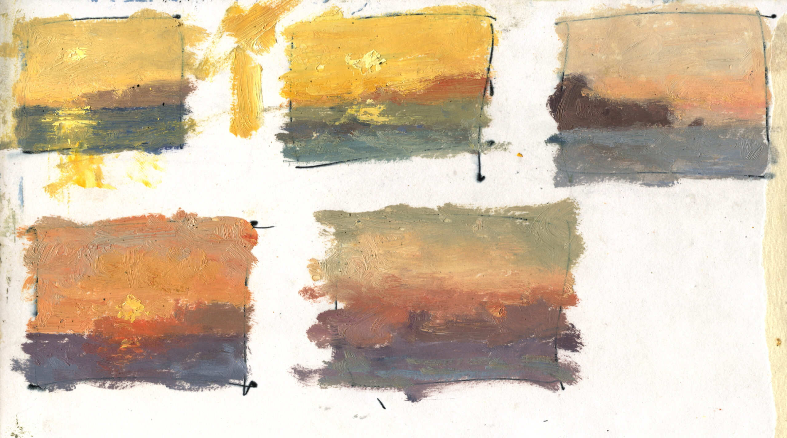
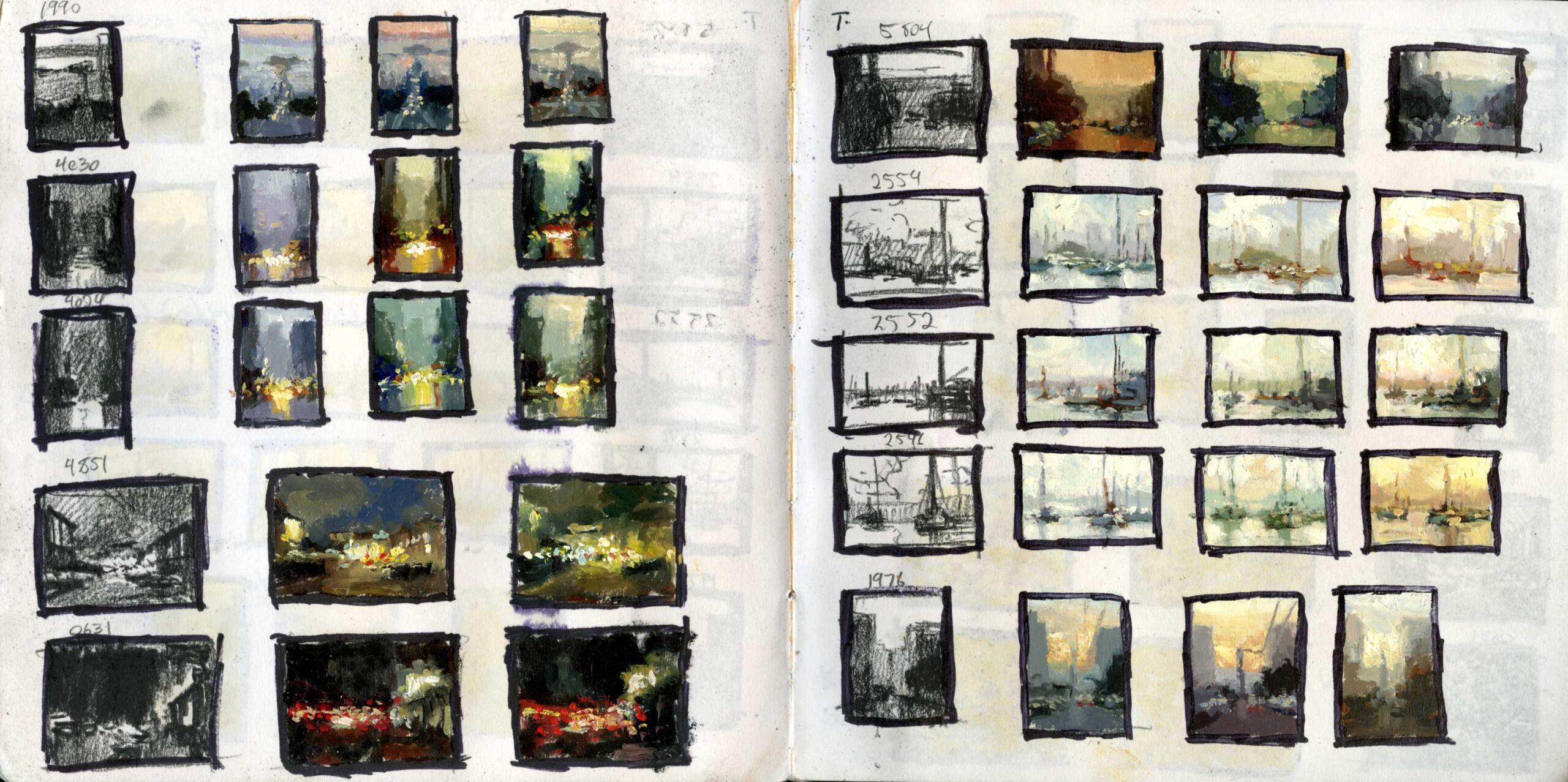
The purpose of color is to fill harmony within your work, and evoke a mood in the viewer. According to my photographs, everything in the city at midday is beige and blue. I don’t believe them. Learn to adjust the reference’s color patterns to match the mood you wish to convey, and spend a lot time doing it. If you are not sure, create many different color harmonies of the same reference, thumbnail them real quick in a sketchbook, and the answer will become much clearer.
Practice adjusting your reference in concert with alternating warm and cool patterns. Use other artists’ color choices as inspiration; use complementary or split complementary color palettes; use magazine cutouts of interesting colors. I personally de-saturate my photos to near death. It gives me more control over exactly where I wish to saturate my notes in the actual painting, and keeps me from being a slave to the rainbow of colors so easily lusted after in photographs.
I prefer to work from a large mounted monitor. Aside from giving me the physical freedom to paint with more reckless abandon, the large monitor allows me to change the reference as I choose, should I need to, but also because I paint light. With a printed photographic image, unless your reference source is a Litebright, the printed image is already dull and stunted in its value range.
Adding and Subtracting
Alfred Stieglitz once spent an hour in the snow on Madison Ave waiting for all moving elements to align. Today we do not have to use expensive silver films or colloidal wet tin plates. We can take a hundred photographs in only a few minutes. So why not do so! If there is a scene that captures you, photograph it as you would experience it from life—from many vantage points. Or remain still and take many shots of one view, as people and vehicles move by, as the light changes—capture life in still frame.
Then combine and remove these elements in your references within the studio, cutting and pasting images together as a conductor adds and quiets instruments in the orchestra. Move trees, raise buildings, remove odd facades, add people, get rid of people, kill grass, and grow flowers. Cut and paste an abstract area from one of your previous paintings onto your reference and simply play with the layer blending. I prefer mine gritty and raw; perhaps you prefer them softer or lighter. Each artist is different; be true to who you are. All efforts to control your reference first will better train it to behave later as you wish.
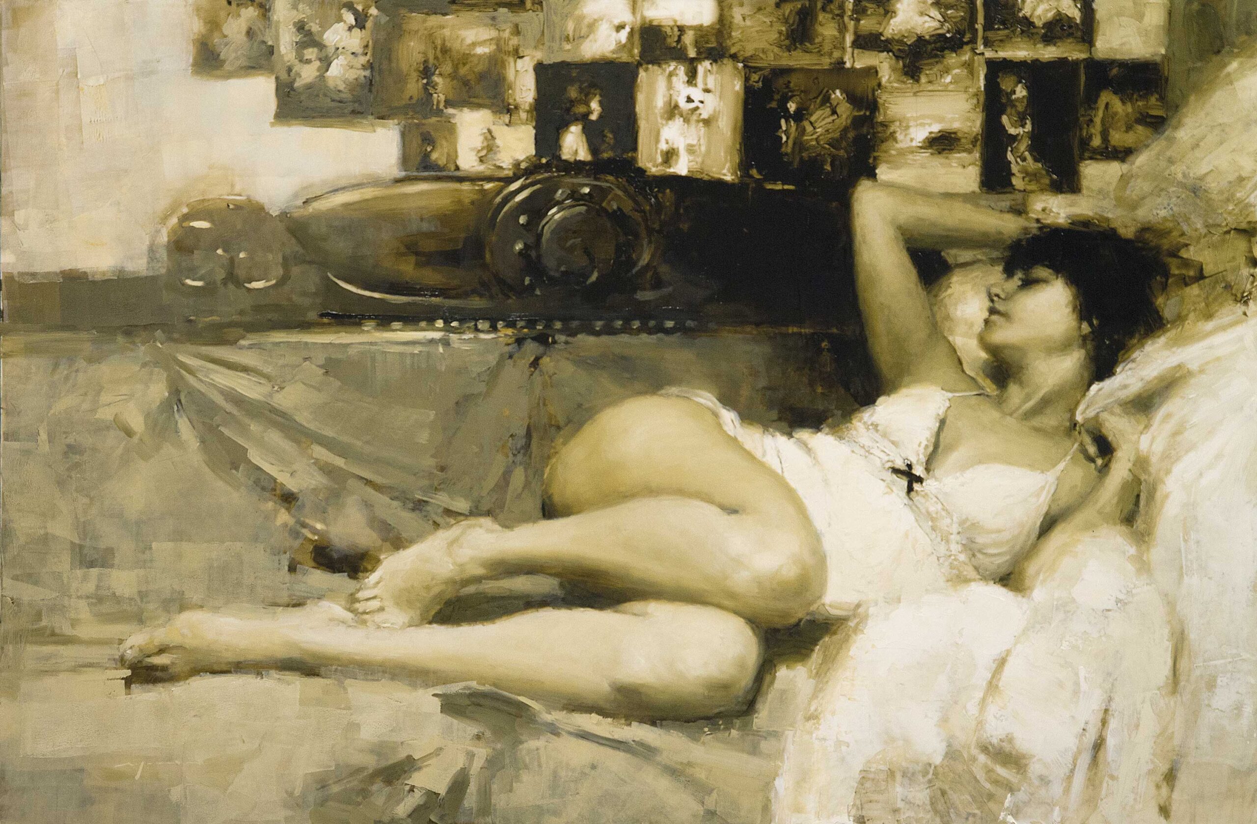
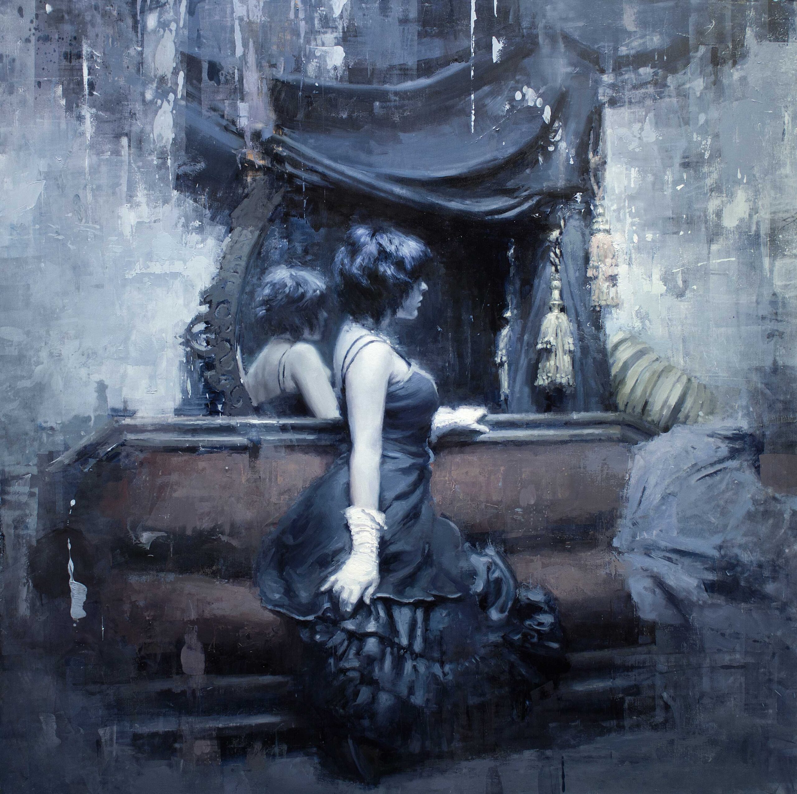
Although I focused this discussion on landscape and cityscape, the same principles apply to working from the figure photographic reference, which perhaps presents even greater difficulties. My random babblings on the alluring beauty of a figure, and my emotions for it, would wander far from this discussion, but I apply the same ideas to my figure work. In a sense they are one and the same. Strive not to be a portrait artist or a cityscape painter, but simply a painter.
The end result is this: the closer your photographic reference is to an actual painting, the better your work will be. Choose your reference well. In the beginning, choose and crop your reference with a de-saturated monitor. This eliminates the distraction of color, and focuses on the importance of composition—like smelling scents with your eyes closed. Never completely trust your photographic reference. Always remember it is a shortcut, and the emotion behind your painting must come from within you. Learn to control the reference, and don’t say, “Oh, I’ll fix that area when I paint it.” Just fix it now and save yourself the struggle.
There are many other ways to mold your reference to have better manners as an aid in painting, but we must always remember that it is just that—an aid. A more expensive and flashy hammer won’t build a better palace, and attempting to construct your painting without the scaffolding of fundamental knowledge, study, and artistic experience will only end up in a terrible waste of time.
Study from life, always. Paint with a purpose, a reason, about something you respond to and that fills you with emotion—whatever the emotion that burns you. And make sure the voice in your marks, the flow and balance of the piece, the mood, and the harmony of colors; make sure all qualities you paint give justice to your subject’s beauty.
Connect with Jeremy Mann at redrabbit7.com.
Take your realism art to the next level when you attend Realism Live ~ a multi-day virtual art conference led by 20+ world class artists. (No tech skills? No problem! If you can click a link, you can join our event!) Learn more at RealismLive.com!
Edited and prepared for the web by Cherie Dawn Haas, Editor of Realism Today

”")
