


See how contemporary realism artist Christina Grace Mastrangelo created the portrait painting “Introspection,” which was the catalyst for the series “In Our Nature,” in which she painted women to represent different states of being.
“Introspection” Portrait Painting Step by Step
By Christina Grace Mastrangelo
My painting “Introspection” was the catalyst for the series “In Our Nature,” in which I painted women to represent different states of being. The subject in “Introspection” is centered, strong, and resilient, with eyes closed and hands held close, focused only on her inner self. Surrounded by blue and green elements symbolic of nature and water, it’s as if she were so submerged in this thoughtful act that nothing else exists. Viewing this embodiment of self-centered peace is meant to bring calm to the viewer. I often find I enter into my own state of inner-reflection while gazing at her depiction – it’s as if she is giving me permission and space to not be distracted.
“Introspection” Process Images in 10 Steps
Step 1: Imprimatura, Set-Up, and Placement Lines

I began with a large brush, washing on an imprimatura of raw umber thinned with odorless mineral spirits all over the white gessoed linen panel. Then I wiped it down with a paper towel so that it was about a value 5.
My reference, captured during a photoshoot with my model, was printed the same size as my panel in black and white. I set it next to the panel and, standing the whole time and stepping back often for perspective and accurate mark-making, I laid in the first lines with raw umber. This method is sight-size. I used one plumb line to ground my guesses, and focused solely on working big-to-small using straight lines to place the height and width of her head, then her face, then her features and other landmarks.
The background layer dried very quickly, so it didn’t interfere. Next I worked on constructing simplified shadow shapes, and she began to emerge.
Step 2: Construct, Articulation, and Massing in Shapes
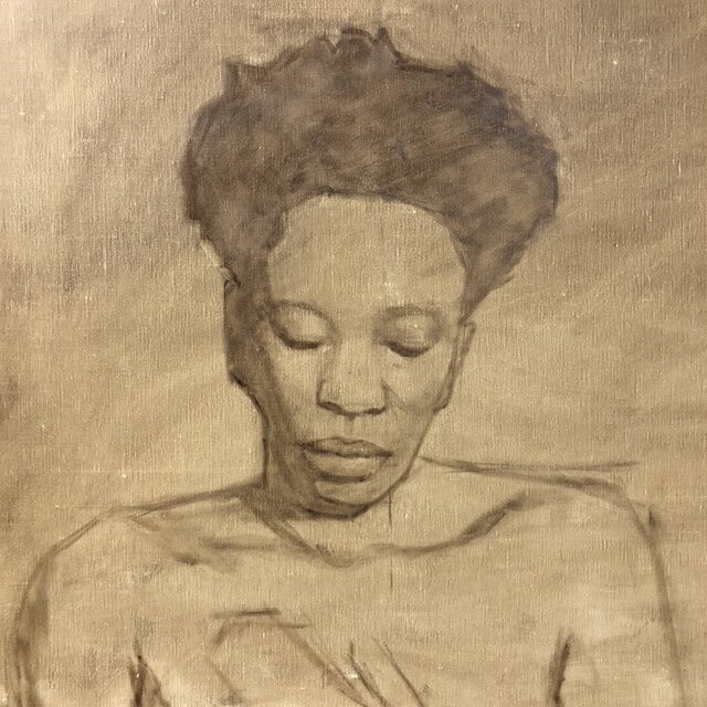
Next I worked on adding the simplified construct of her upper body and hand. My lines are fairly thick and blocky so as to not be overly definitive, because it is still a “push and pull” approach at this stage. If I made a mistake I would use a paper towel to rub off the paint, which would come off pretty easily.
At this point I found it easier to see her if I massed in the shadows, so that came next. This allowed me to see her likeness better, and I worked on articulating the shapes on her face. It was helpful to put in a ghost of halftone to break up some of the larger light shapes on the face, but I tried to keep it simple. These two steps were done in one day, and once the raw umber dried it could not be erased.
Step 3: Laying in Shadows with Color
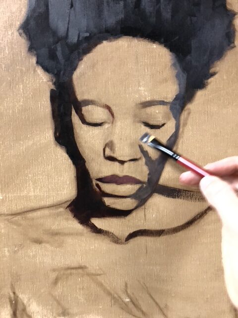
I knew I needed to refine her face more, but the raw umber was dry so I went ahead and started laying in color. I almost always begin by laying in the darkest dark, do the shadows first, and work my way out from there. This image illustrates this method beautifully, because you can see I’m working around her face and value-by-value.
Because my reference was printed in black and white, I’m exploring different hues as I paint her skin. I’m laying in opaque paint in blocky strokes, changing shapes as I see them.
Step 4: First Layer of the Face in Color
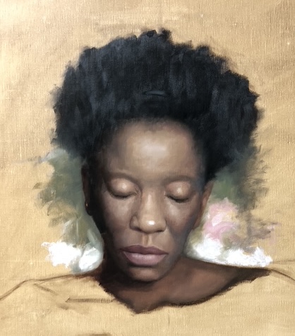
I worked out of the shadows stepping one value shift at a time until the lightest lights were laid in. By purposefully working through the value scale like this I am better able to achieve form. As I lay in these blocks of color, I’m also thinking about anatomy and likeness. I’m additionally trying to vary the hue and chroma so that her skin looks more lifelike.
The goal of this stage is to cover the entire face in a first layer so that I can then assess my values better, and see if they need adjusting. This is why I put in some of the background, so I could see how the parts would work as a whole. There’s purposefully no details, no care for blending – this layer serves to inform those on my next layer. For example, the forehead looks voluminous, so those values are successful. My next layer would then match those values, and possibly play with hue or chroma while doing a pass that’s smoother. But that comes after I catch up the whole painting to the same level, which means ignoring anything else I need to do while putting in a first layer for the entire painting.
Step 5: Premixing the Palette
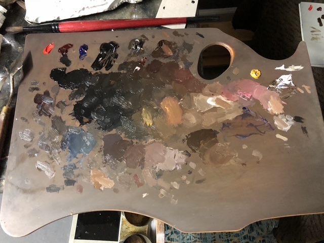
The colors I use are always the same base of 8 or so tubes from Winsor and Newton’s Artist Oil Colors line. From right to left, they are titanium white, yellow ochre pale, burnt umber, raw umber, ivory black, French ultramarine blue, alizarin crimson, and cadmium red. It’s a versatile array, with a low and high chroma for red, yellow, and blue.
I premix my colors before starting, with my darks on the left. As the mixtures go to the right they get lighter, and I also mix variations in hue and chroma because these change across natural skin.
Step 6: Covering the Entire First Layer with Color
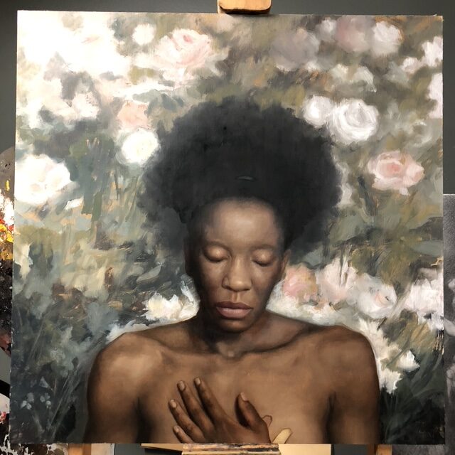
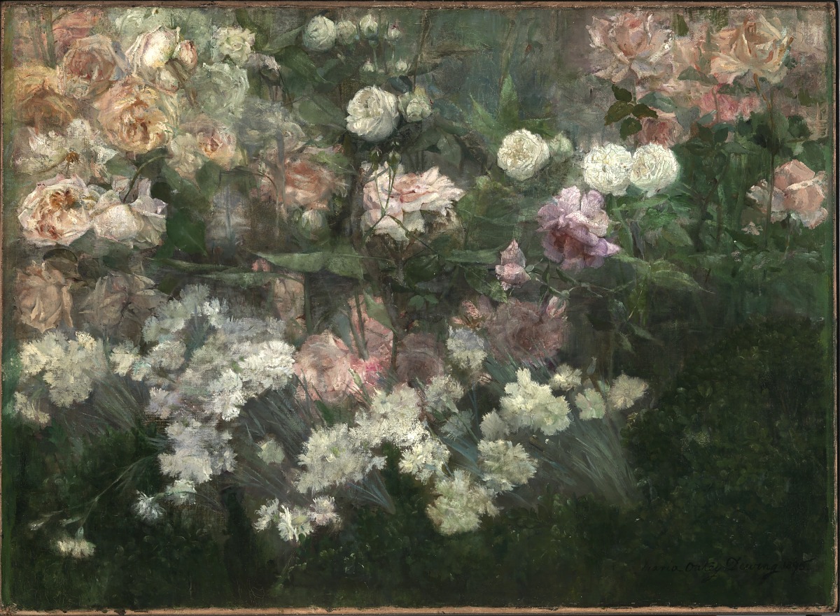
I work pretty quickly to cover the entire canvas with my first pass so that I can see the piece as a whole. This background was inspired by Maria Oakey Dewing’s painting, “Garden in May” (below). I wanted to use her colors and movement as a guide and then later to lay in some more realistic flowers. At this point, though, it was about design and how it interacted with the figure. I liked how it was going, so I pushed forward to do the next layer.
Step 7: Changes
After much trial and error with the background (painting a bunch of realistic roses on the lighter shapes of the design above her head and then frustratingly scraping them off), I decided to switch gears. The flowers were not working, and the light shapes behind her were looking too light, spherical, and isolated.
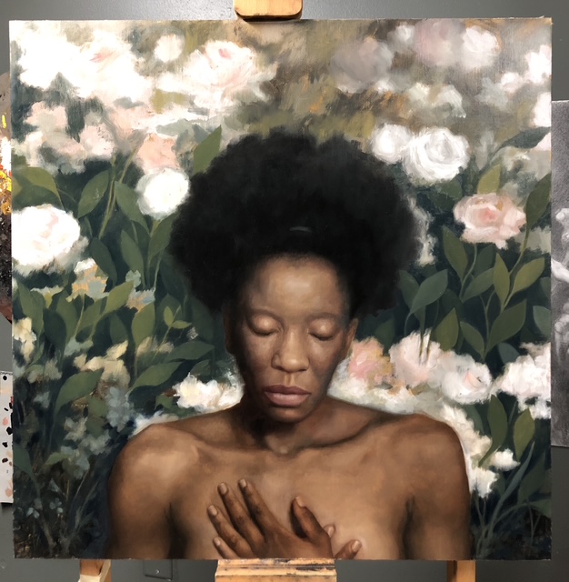
At the moment this photo was taken I had entered into a state of play, putting in flat green leaves so they made an organic upward-movement around the figure. Flat green leaves have been a recurring theme in my work since I graduated from the Angel Academy of Art in 2009, so doing this felt natural and fun. I was – and still am – obsessed with blues and greens, so I mixed a bunch of varieties for the green leaves and a rich blue with ultramarine blue for the negative shapes between them.
As I laid in the leaves, I tried to make depth by varying their values and edges, while also leaving some negative spaces for a type of subdued flower. I knew I wanted the flowers to have asymmetrical shapes but I didn’t yet know which ones I would use – that was okay, and I didn’t let that stop the spontaneity of designing the background as it was going in this moment.
Step 8: The Composition Settles
Because I was inventing so much, it took awhile to lock down the composition. Ideally I would have had some sort of color study or drawing that informed this plan, but I didn’t – instead it emerged naturally and spontaneously. At this point I could see the painting was going where I wanted it to go, and even though it looked more low-chroma than I wanted, and even though her skin was still blotchy looking, I knew now that I was clearly heading into the home stretch of putting in the final layer.
Step 9: Final Pass on the Hands
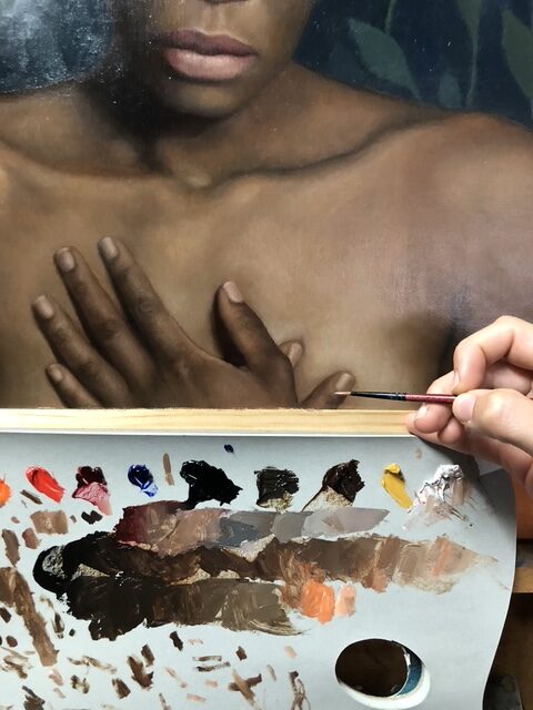
Here you can see how I premixed all of my colors for the final layer of the hands. I’m not using nearly as much paint as the first layer – I used small brushes and slowly painted over the entire hand one finger at a time. I was now focusing on edges, including blending between halftone shifts. It was meticulous work, and very slow.
Step 10: Putting a Final Layer on Everything
What’s not shown between these last few images is the massive amount of time spent on the final layer of each part of this painting. I painted her face three times, for example – each time I would find something I didn’t quite like about the blending, anatomy, or form.
The background was pushed so that the blues went much lighter and darker at the top and bottom, and this effect really emphasized the depth, as if it were mimicking water.
The flowers ended up being inspired by a late-blooming native flower in my yard – when I saw it I instantly knew it was perfect. Just as the leaves were summarized, so were the flowers – their shapes, values, and positions fell secondary to the compositional effect.
In the end, what emerged was a peaceful painting that some have said resembles an Ophelia. To me, rather, she is calmly present with a mind submerged in self-reflection, and thus the idea for the series “In Our Nature” was born.
Connect with the artist at www.christinamastrangelo.com.
Related article by Christina Grace Mastrangelo > A Step-by-Step Still Life: “Tree of Life (Under Which Sits the Mother of All the Buddhas)”


”")