


In this guest blog post on art supplies, Carolyn Anderson takes us behind the scenes and answers a common question: What’s on your palette? Also, learn what type of brush she uses almost exclusively, and the surfaces she recommends.
Paints, Brushes, and Surfaces
BY CAROLYN ANDERSON
(From CarolynAnderson.com/blog)
I sometimes get questions about my palette, so here is a version of my art workshop materials list for those of you who may be interested.
I prefer Holbein paints for their consistency and quality. They are neither oily nor too stiff and that allows me to work without having to use excessive medium. I prefer to keep my painting as ‘dry’ as possible, but if I do need brush flow, I will use a little Gamsol in the beginning stages of a painting. When I do use medium, I prefer M. Graham & Co. Walnut Alkyd Medium.
My palette colors are:
Cadmium Red Light or similar red
Terra Rosa (not necessary but sometimes helpful)
Gold Ochre or Yellow Ochre – I usually use the gold ochre
Permanent Yellow Deep
Permanent Yellow Light
Permanent Orange
(the permanent colors are substitutes for cadmiums)
Terra verte
Viridian
Ultramarine Blue Deep
Mineral Violet
Crimson Lake (similar to Alizarin)
Burnt Sienna
Holbein Permanent White
Keep your options available. I don’t necessarily use all these colors for all my paintings, and sometimes I will add other colors. For example, cerulean blue is another blue option I will occasionally add. This is my studio palette.
Terra verte, mineral violet, and gold ochre are specific colors to Holbein. Gamblin’s manganese violet is similar to mineral violet. I have not come across any other terra vertes that are the same color as the Holbein brand. Also, I find permanent orange to be far more useful than cadmium orange.
If you want to try a few new colors on your palette, I recommend mineral violet and terra verte. Both colors play very well with others and both can be modified as warmer-cooler very easily. I use a mixture of mineral violet and gold ochre to start most of my paintings since it is fairly neutral but, depending on the mixture of the two, can go either warmer or cooler.
Terra verte is a green that does not go to yellow, but is not nearly as blue-green as viridian. It’s very useful for both portraits and landscapes. Mixed with mineral violet, it can also be a great ‘grayish’ color.
On Paint Brushes for Artists
I use flat bristle brushes almost exclusively. Most are Robert Simmons Signet Series 40, sizes 4, 6, 8, 10 and 12. I also use a smaller size synthetic round, e.g. 2 or 4, such as Rosemary Ivory Round or Princeton Aspen Round. Note: Robert Simmons brushes have been bought out by Princeton so I am not sure of their current status or availability.
On Painting Surfaces
For my art workshop students I recommend linen panels, Claessens 15 or 66 canvas, or gessoed panels. I use two to three coats of Liquitex Professional Gesso for panels, and apply the gesso with a small foam roller.
Hint: Never wash the foam roller out. Just wrap the whole thing in plastic wrap, drop it in a plastic bag and throw it in the freezer until next time.
Extra hint: The plastic bag ensures your frozen foods will not have gesso on them.
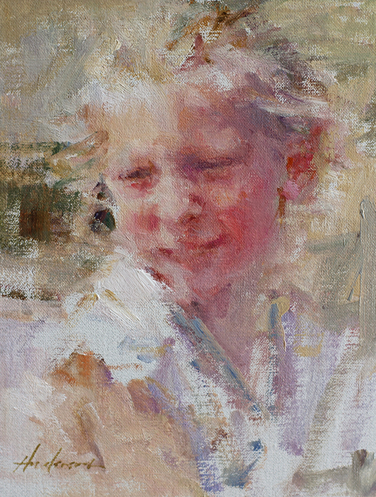
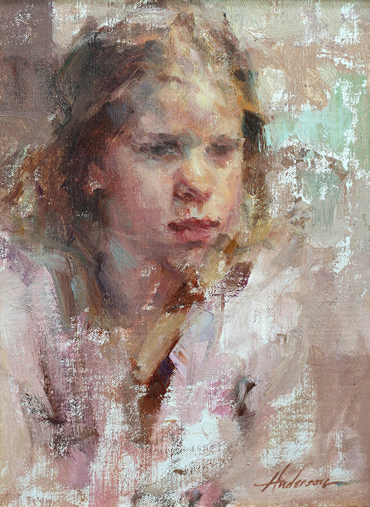
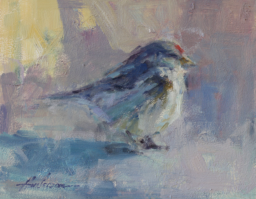
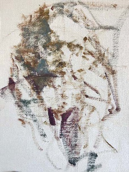
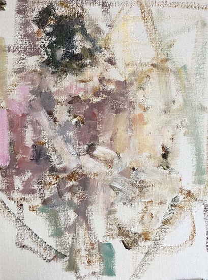
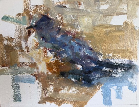
Some of My Paintings:
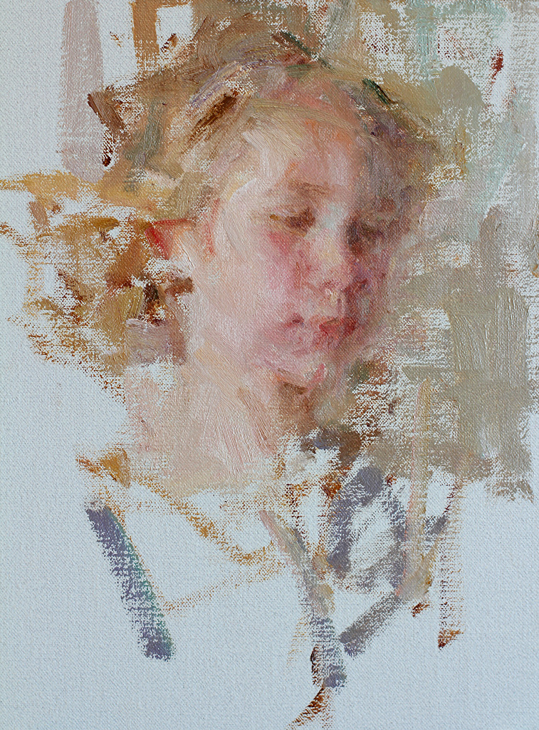
Beginnings
Here are a few images of how I start a painting. I am averse to outlines and the coloring book approach to painting. You can read more about this in this post.
Connect with Carolyn Anderson at carolynanderson.com. Read more of her guest posts about art here.

”")
